The dairy industry runs on precision. A small drop in yield, a slight increase in downtime, or uncontrolled utility usage can directly impact profitability. However, when data is scattered across departments, decision-making becomes slow and reactive.
You need more than reports.
You need real-time intelligence.
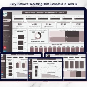
The Dairy Products Processing Plant Dashboard in Power BI is a powerful, interactive business intelligence solution designed to give dairy manufacturers complete control over production, cost, quality, yield, downtime, and resource usage — all in one dynamic platform.
With advanced visuals, drill-down capability, and smart slicers, this dashboard transforms raw plant data into clear, actionable insights.
This is not just a report.
It is your plant’s real-time performance command center.
🚀 Key Feature of Dairy Products Processing Plant Dashboard in Power BI
📊 Executive Overview with KPI Cards
Instantly monitor Revenue, Production Cost, Quality Score, Yield %, and Machine Downtime.
🎯 Interactive Slicers & Drill-Down Filters
Filter by Year, Month, Plant Location, Product Category, Shift, and Supplier.
🏭 Multi-Plant Performance Comparison
Compare revenue, cost, water usage, and energy consumption across locations.
🧀 Product-Level Profitability Insights
Analyze output quantity, yield %, and cost by product category.
⚙️ Operational Efficiency Monitoring
Track downtime, energy usage, and water consumption by shift.
🛡 Quality Performance Tracking
Monitor approval rate, rejection count, and monthly quality trends.
⚡ Dynamic Power BI Visuals
Get interactive charts, comparisons, and instant performance breakdowns.
📦 What’s Inside the Dairy Products Processing Plant Dashboard in Power BI
This advanced Power BI solution includes 5 structured analytical pages:
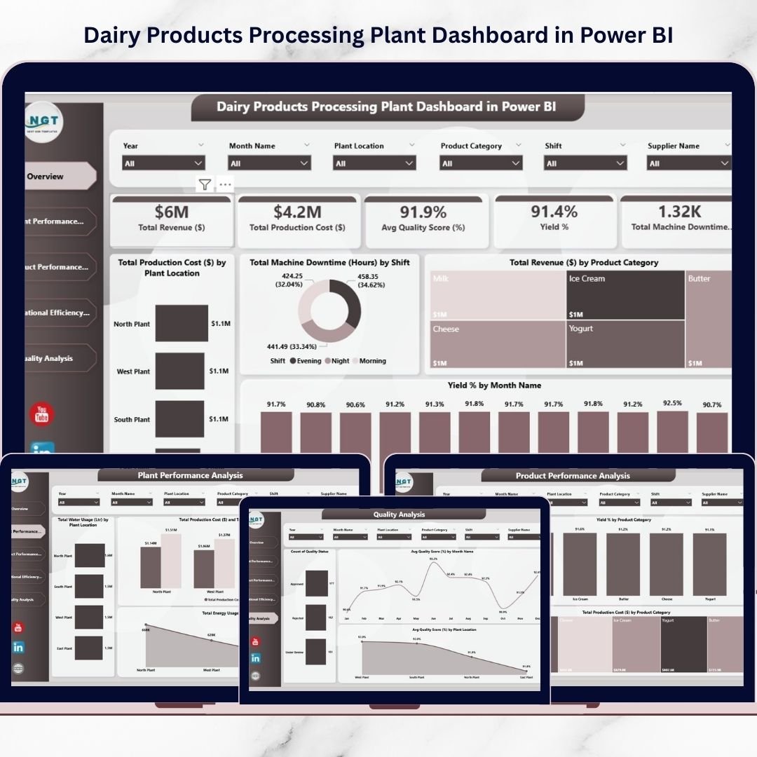
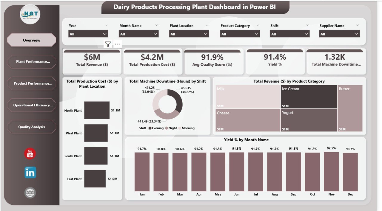
📊 Overview Page
The executive summary dashboard displaying:
-
Total Revenue
-
Total Production Cost
-
Average Quality Score
-
Yield Percentage
-
Total Machine Downtime
Includes visuals such as Revenue by Product, Cost by Plant, Downtime by Shift, and Yield % by Month.
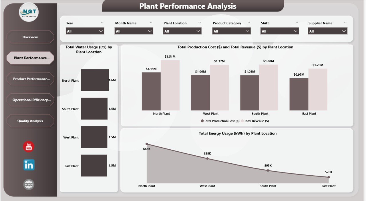
🏭 Plant Performance Analysis
Compare plant locations using:
-
Revenue vs Production Cost
-
Total Energy Usage (KWh)
-
Total Water Usage (Liters)
Identify which plant operates most efficiently.
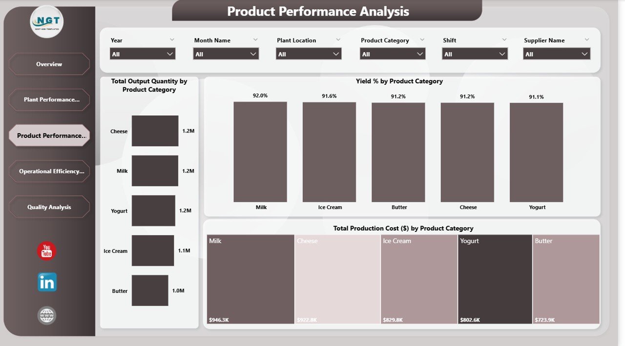
🧀 Product Performance Analysis
Evaluate:
-
Output Quantity by Product
-
Yield % by Product Category
-
Production Cost by Product
Pinpoint high-yield and high-cost products.
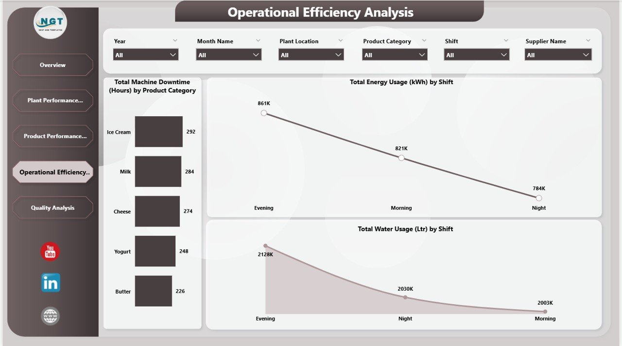
⚙️ Operational Efficiency Analysis
Track:
-
Machine Downtime by Product
-
Energy Usage by Shift
-
Water Usage by Shift
Optimize shifts and reduce operational losses.
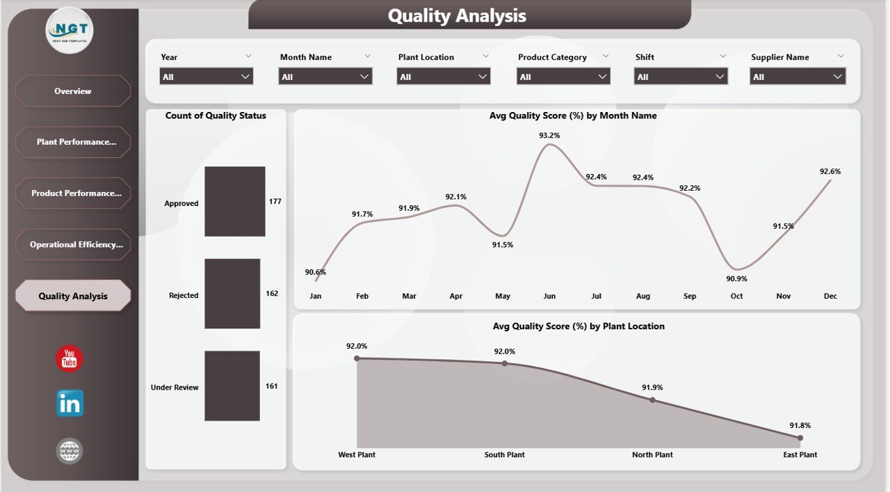
🛡 Quality Analysis Page
Monitor:
-
Approved, Rejected, Under Review counts
-
Monthly Quality Score Trends
-
Quality Score by Plant
Ensure consistent product quality and compliance.
🛠 How to Use the Dairy Products Processing Plant Dashboard in Power BI
Using this dashboard is simple and strategic:
1️⃣ Connect your plant data to the Power BI file.
2️⃣ Refresh data to update visuals automatically.
3️⃣ Use slicers to filter by plant, shift, product, or supplier.
4️⃣ Analyze KPI cards on the Overview page.
5️⃣ Drill into plant, product, or operational insights.
6️⃣ Take data-driven corrective action immediately.
Because Power BI supports automatic refresh, you always see updated plant performance.
👥 Who Can Benefit from This Dairy Products Processing Plant Dashboard?
This dashboard is ideal for:
🏭 Dairy Plant Owners
📊 Operations Managers
💰 Finance Directors
⚙️ Maintenance Heads
🛡 Quality Control Managers
📦 Supply Chain Managers
Whether you manage a single processing unit or multiple plants, this dashboard delivers structured performance intelligence.
Data-driven plants outperform competitors.
With centralized analytics, interactive filtering, and real-time KPIs, you can reduce cost, optimize utilities, improve yield, and maintain quality standards consistently.
Stop reacting to problems.
Start preventing them with real-time insights.
Click here to read the Detailed blog post
Watch the step-by-step video tutorial: