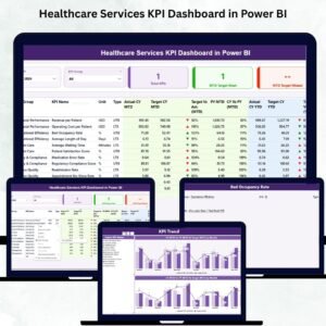
Healthcare organizations deal with constant changes—patient volume, staff workload, treatment timelines, operational shifts, and compliance requirements. To manage these challenges effectively, healthcare leaders need visibility, accuracy, and clear insights. That’s exactly what the Healthcare Services KPI Dashboard in Power BI delivers.
This ready-to-use dashboard transforms your healthcare data into meaningful visuals, making it easier to track performance, identify gaps, and make timely decisions. With automated calculations, dynamic visuals, and Excel-based data entry, this tool is perfect for hospitals, clinics, labs, nursing homes, and diagnostic centers.
If you want to improve service quality, increase patient satisfaction, streamline operations, and maintain consistent reporting across departments—this dashboard is your one-stop solution.
✨ Key Features of the Healthcare Services KPI Dashboard in Power BI
This dashboard is designed to give healthcare teams everything they need to monitor both operational and clinical performance.
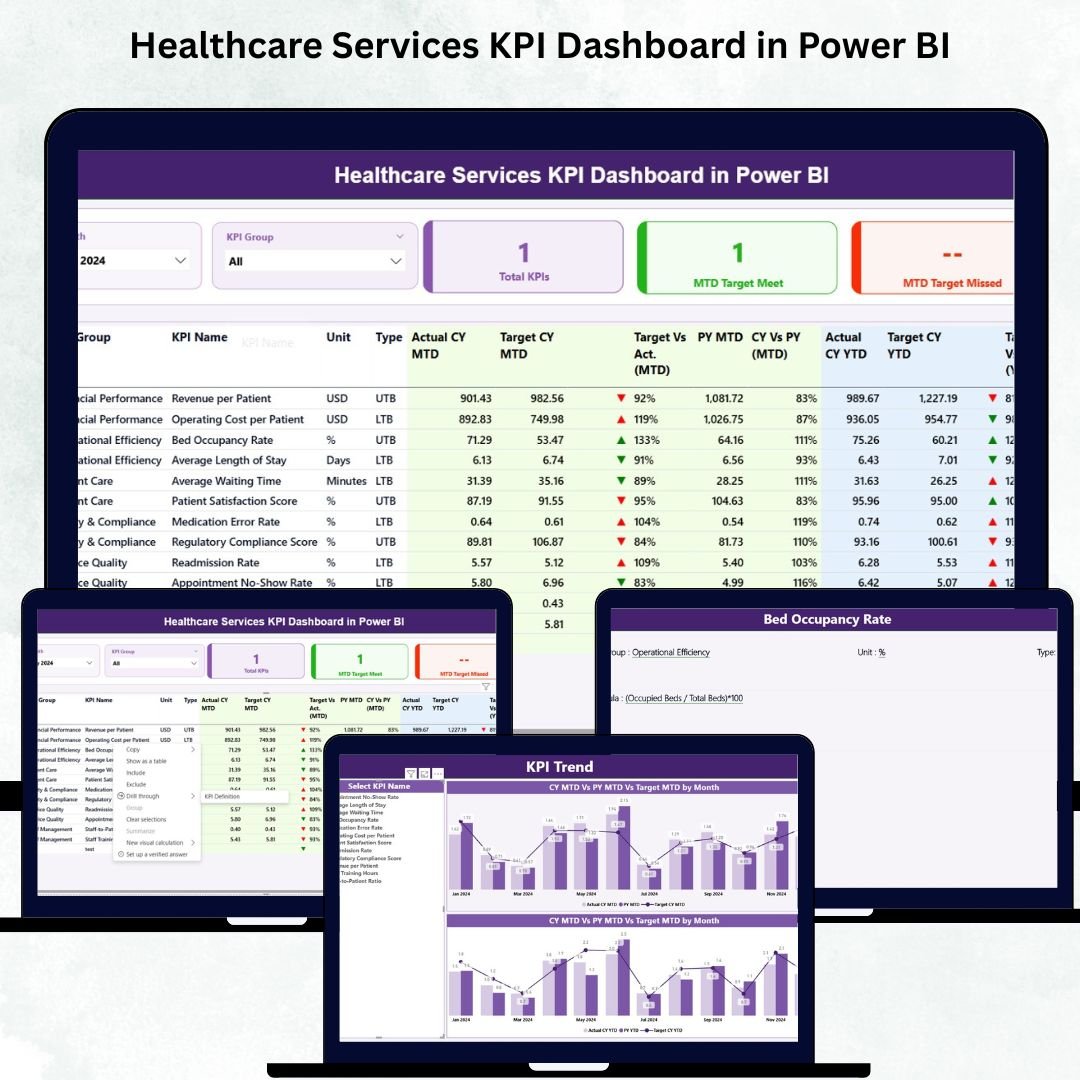
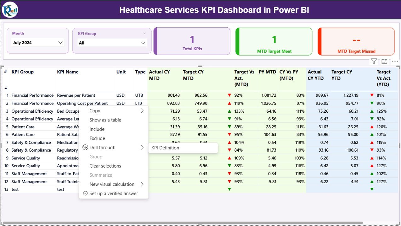
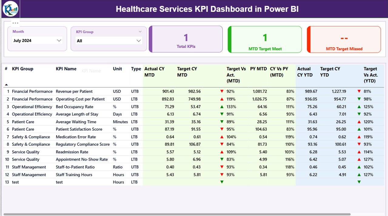
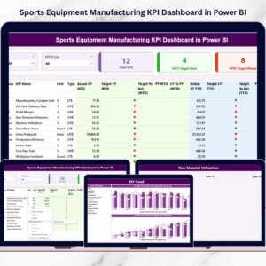
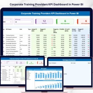
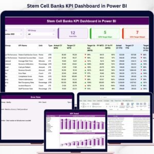
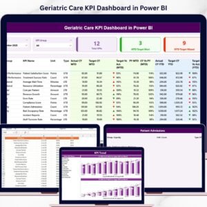
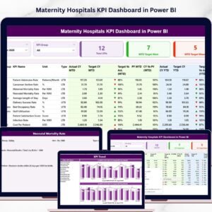
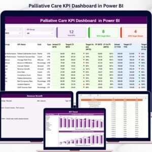
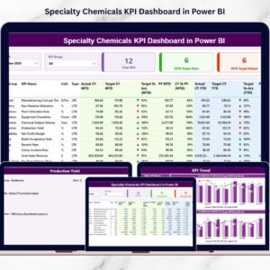
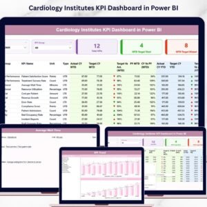
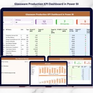
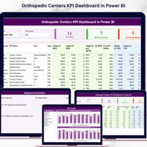
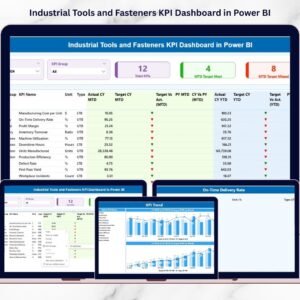
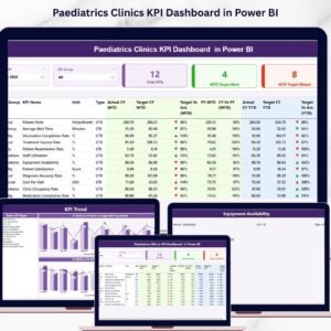
📊 Real-Time Summary Page
-
Month slicer for instant monthly performance view
-
KPI Group slicer for department-level insights
-
KPI performance cards for:
-
Total KPIs Count
-
MTD Target Met
-
MTD Target Missed
-
-
Detailed KPI table including:
-
KPI Name, Group, Unit
-
Actual vs Target (MTD & YTD)
-
Current Year vs Previous Year comparison
-
Performance icons (Up/Down arrows with color coding)
-
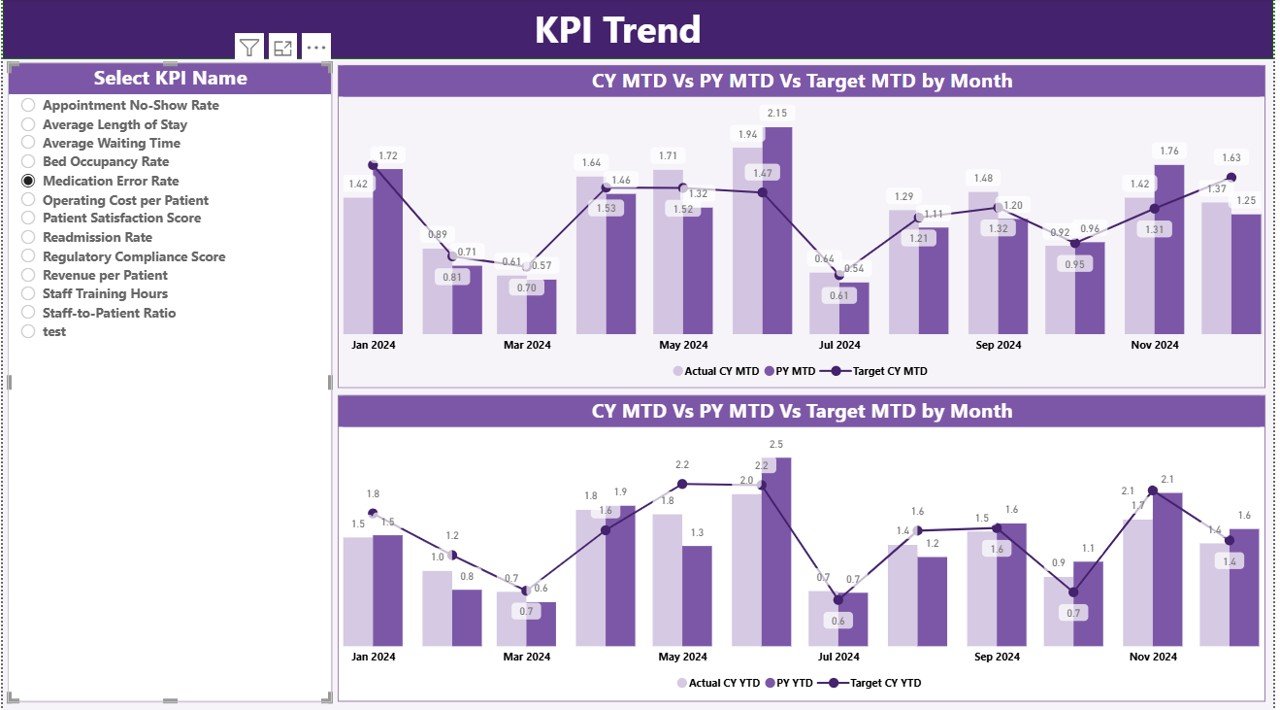
📈 KPI Trend Insights
-
Monthly trend analysis for each KPI
-
MTD & YTD combo charts
-
CY vs PY comparison lines
-
KPI Name slicer for deeper analysis
-
Perfect for understanding patterns, seasonality, and improvement areas
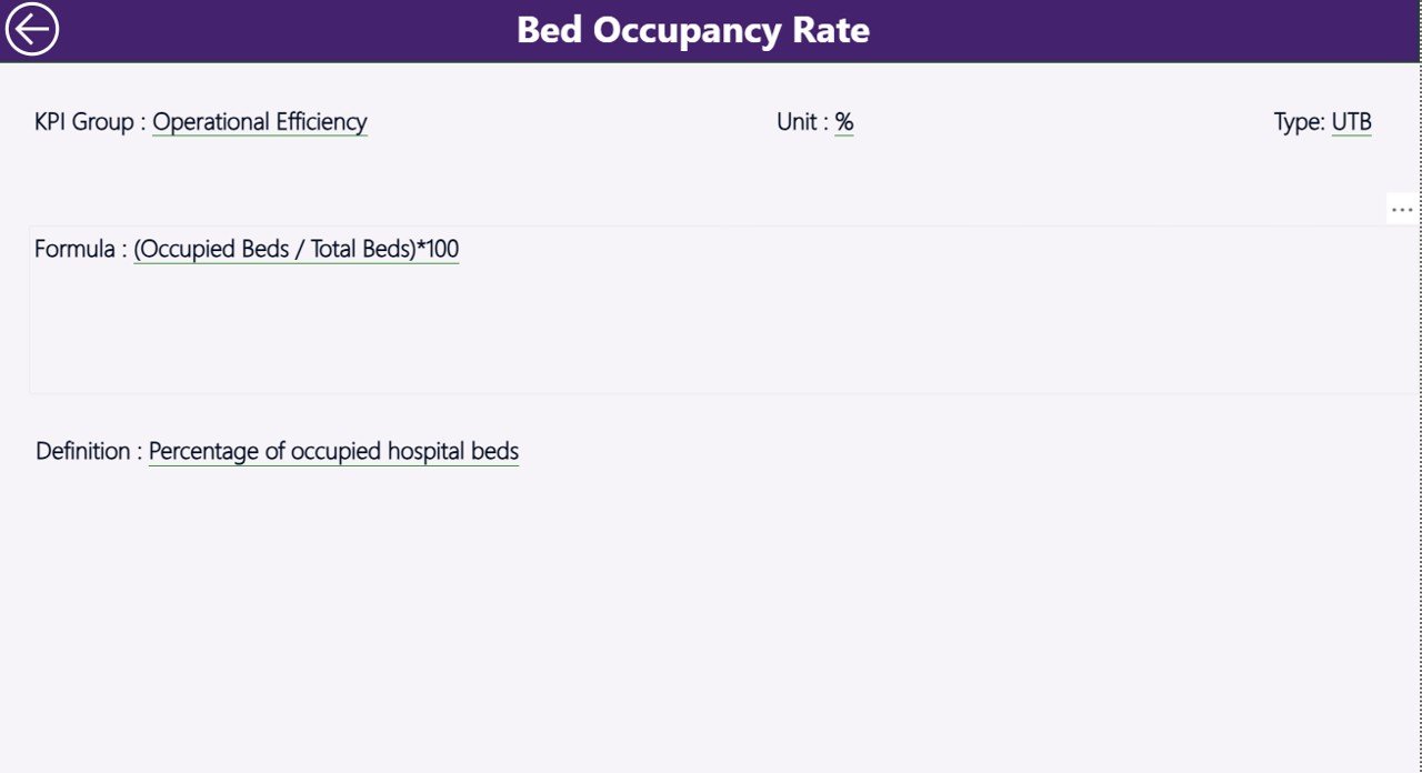
📘 KPI Definition Page
-
Drill-through support
-
Shows KPI formula, definition, type (UTB/LTB)
-
Essential for new team members or training purposes
📂 What’s Inside the Healthcare Services KPI Dashboard in Power BI
This digital product comes with:
🟦 Power BI File (.pbix)
A completely built, fully automated dashboard with slicers, cards, charts, and drill-through pages.
🟩 Excel Data Source File
Includes three worksheets for clean data management:
-
Input_Actual – enter Actual MTD & YTD
-
Input_Target – enter Target MTD & YTD
-
KPI Definition Sheet – KPI name, group, formula, unit, type
📝 Clean & Ready-to-Use KPI Structure
No complex formulas needed—simply enter your data each month, refresh Power BI, and everything updates instantly.
🛠️ How to Use the Healthcare Services KPI Dashboard in Power BI
Using this dashboard is extremely simple—even for non-technical users.
👉 Step-by-Step Usage
-
Open the Excel file and update Actual and Target numbers.
-
Enter data in monthly format (first date of each month).
-
Save the Excel file.
-
Open the Power BI dashboard and click Refresh.
-
Review the updated visuals on the Summary, Trend, and Definition pages.
-
Use slicers to filter by Month or KPI Group.
-
Use the Trend page to check deep analytics.
-
Use the Definition page to understand each KPI clearly.
No coding. No formulas. Just smart data entry and instant results.
👥 Who Can Benefit from This Healthcare Dashboard?
🏥 Hospitals and Multi-Specialty Centers
Track clinical, operational, financial, and safety KPIs easily.
🧪 Diagnostic Centers & Labs
Monitor testing turnaround time, accuracy, and operational performance.
🩺 Clinics & Outpatient Centers
Improve patient flow, appointment management, and staff efficiency.
🏨 Nursing Homes & Care Facilities
Measure service quality, safety, hygiene, and care metrics.
📊 Healthcare Administrators & Managers
Get real-time insights for planning, budgeting, and decision-making.
👨⚕️ Department Heads & Team Leaders
Track department-level KPIs using KPI Group filters.
Whether you’re running a single clinic or a large healthcare network, this dashboard helps you improve patient care, reduce operational inefficiencies, and build a data-driven culture.
### Click here to read the Detailed blog post
Watch the step-by-step video tutorial:


Reviews
There are no reviews yet.