In today’s digital world, user experience (UX) and user interface (UI) design directly influence customer satisfaction, engagement, and business success. Companies invest heavily in design improvements, yet many teams struggle to measure design performance objectively. Without structured metrics, UX/UI success often relies on opinions instead of data, making decision-making inconsistent and difficult.
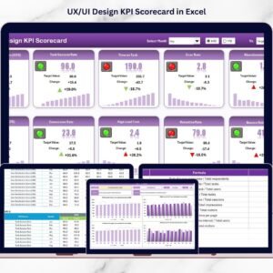
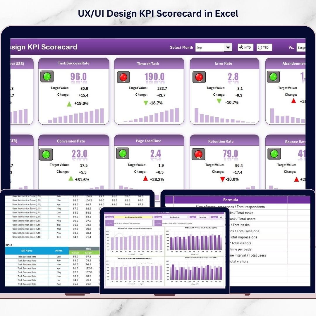
The UX/UI Design KPI Scorecard in Excel is a powerful, ready-to-use performance monitoring solution designed to transform creative design outcomes into measurable insights. Built entirely in Microsoft Excel, this professional scorecard allows design teams to track key performance indicators (KPIs), analyze trends, and evaluate design effectiveness through automated dashboards and visual indicators.
Instead of reviewing scattered reports or subjective feedback, teams can monitor UX/UI performance in one centralized dashboard. The template automatically compares actual results against targets and previous year performance, helping organizations identify improvement opportunities quickly. 🎯📊
Designed for simplicity and flexibility, this scorecard requires no advanced analytics tools. Users simply update performance data, and the dashboard instantly refreshes metrics, charts, and performance indicators. This enables design teams, product managers, and stakeholders to make data-driven decisions confidently.
Whether improving website usability, optimizing mobile apps, or evaluating product interfaces, this KPI scorecard bridges the gap between creativity and measurable business outcomes.
## Key Features of UX/UI Design KPI Scorecard in Excel
📊 Interactive UX/UI Performance Dashboard – Monitor all design KPIs from a single scorecard interface.
🎯 Actual vs Target Analysis – Instantly evaluate whether design goals are achieved.
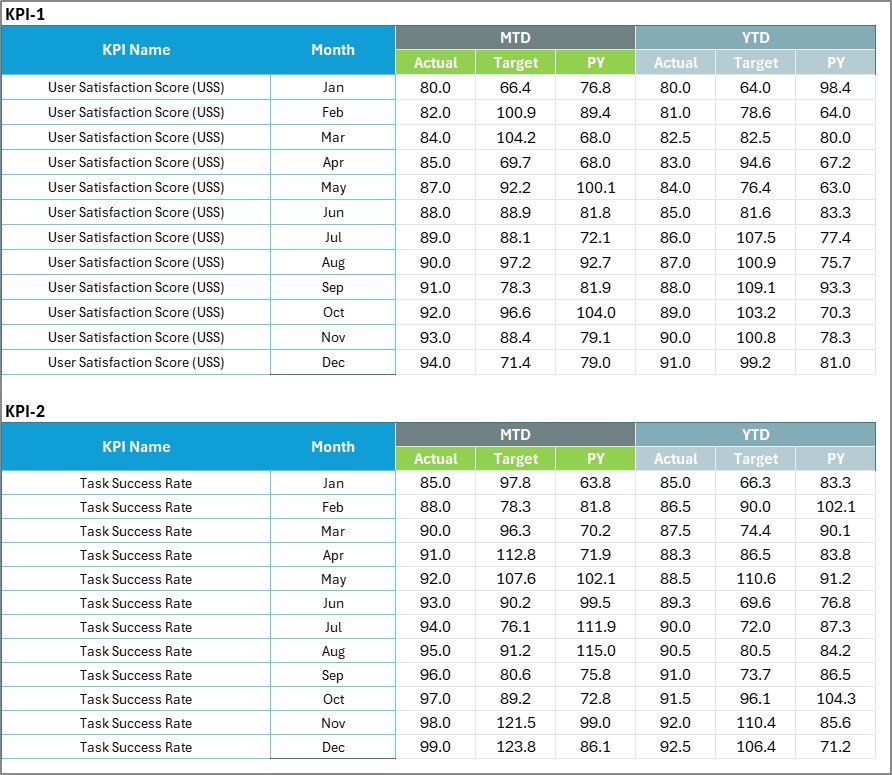
📅 MTD & YTD Performance Tracking – Analyze short-term and long-term design results.
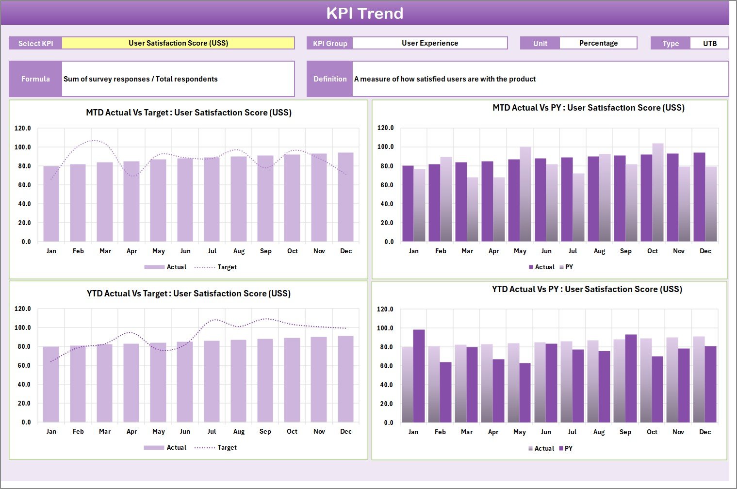
📈 Dynamic KPI Trend Analysis – Visual charts display performance evolution over time.
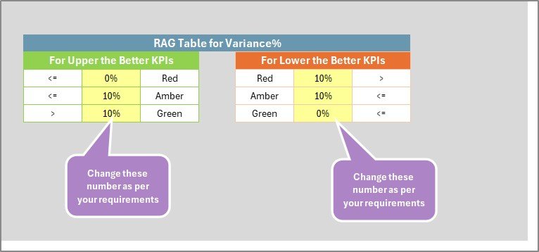
🟢 Color-Coded Performance Indicators – Quickly identify strong and weak performance areas.
⚡ Automated Calculations – Reduce manual analysis and reporting effort.
📂 Centralized Data Entry System – Maintain organized KPI records in one sheet.
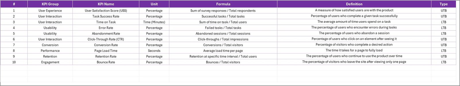
📘 KPI Definition Library – Standardize KPI formulas and measurement logic.
These features turn Excel into a structured UX analytics and performance management system.
## What’s Inside the UX/UI Design KPI Scorecard in Excel
This ready-to-use template includes four professionally structured worksheets:
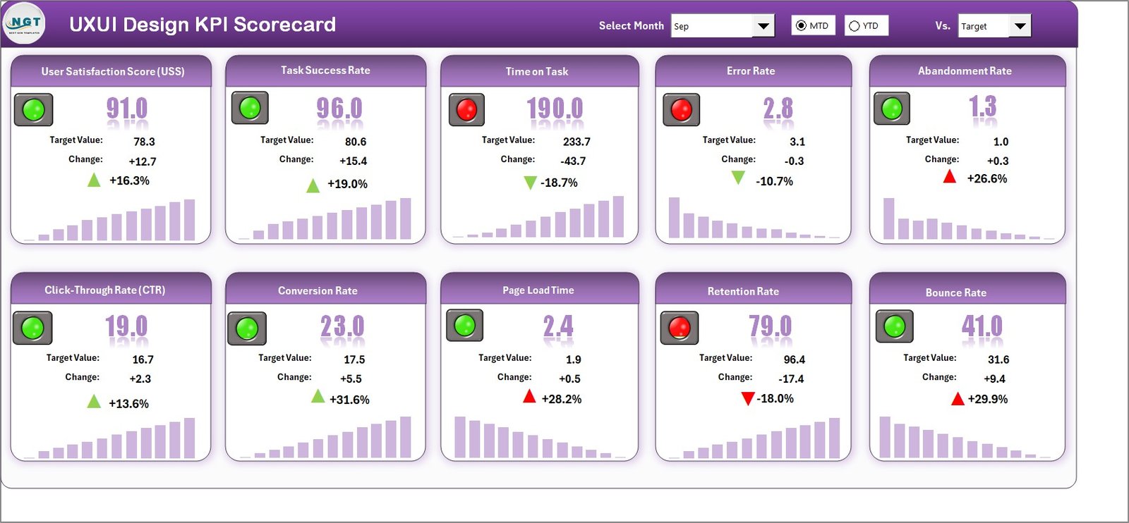
✅ Scorecard Sheet – Main dashboard displaying KPI performance, comparisons, and visual indicators.
✅ KPI Trend Sheet – Detailed analysis showing KPI trends, formulas, and performance history.
✅ Input Data Sheet – Central location for entering KPI actual and target values.
✅ KPI Definition Sheet – Repository documenting KPI groups, units, formulas, and definitions.
Together, these sheets provide a complete UX/UI performance measurement framework.
## How to Use the UX/UI Design KPI Scorecard in Excel
Using the template is simple and efficient:
1️⃣ Define KPIs in the KPI Definition Sheet.
2️⃣ Enter targets and performance data in the Input Data Sheet.
3️⃣ Select Month, MTD, or YTD analysis using dropdown menus.
4️⃣ Review KPI results in the Scorecard Dashboard.
5️⃣ Analyze performance patterns using the KPI Trend Sheet.
6️⃣ Take improvement actions based on insights.
Within minutes, teams can begin tracking UX/UI performance professionally.
## Who Can Benefit from This UX/UI Design KPI Scorecard in Excel
This template is ideal for:
🎨 UX designers and UI designers
📱 Product managers and product owners
📊 Digital analysts and performance teams
🚀 SaaS and technology companies
🏢 Design agencies and consultants
💻 Product development teams
From startups to enterprise organizations, any team focused on improving digital experiences can benefit from structured KPI tracking.
Measuring UX/UI performance is no longer optional — it is essential for continuous improvement. By combining automated dashboards, trend analysis, and centralized KPI tracking, the UX/UI Design KPI Scorecard in Excel enables teams to move from subjective opinions to data-driven design decisions.
The result is improved collaboration, optimized user experiences, and stronger business outcomes. ✅
### Click here to read the Detailed blog post
Visit our YouTube channel to learn step-by-step video tutorials:
👉 YouTube.com/@PKAnExcelExpert