In today’s fast-moving transportation industry, speed, accuracy, and efficiency are key to profitability. Managing fleets, routes, fuel costs, and deliveries across multiple locations requires real-time performance tracking — and that’s exactly what the Transportation Services KPI Dashboard in Power BI 🚛📊 delivers.
This interactive Power BI dashboard empowers logistics managers, transport operators, and supply chain leaders to monitor KPIs, identify performance gaps, and optimize fleet operations — all from one centralized dashboard. Built on Power BI and connected to Excel, it transforms complex transportation data into actionable insights that drive smarter decisions and measurable improvements.
⚡ Key Features of Transportation Services KPI Dashboard in Power BI
✅ Dynamic Summary Dashboard: View all key KPIs — from on-time delivery rates to fuel efficiency — in one visual control center.
✅ Interactive Slicers: Filter results by Month or KPI Group to analyze performance by department, region, or time period.
✅ Actual vs Target Analysis: Instantly compare real results with business goals and identify areas needing attention.
✅ Visual Indicators: Color-coded icons (🟢🔴) and trend arrows show performance status at a glance.
✅ Drill-Through Functionality: Click on any KPI to access detailed definitions and formulas.
✅ MTD & YTD Comparisons: Evaluate Month-to-Date and Year-to-Date performance metrics side by side.
✅ Excel Data Integration: Pulls real-time data directly from Excel sheets for automated updates.
✅ Customizable & Scalable: Easily modify KPIs, visuals, and colors to match your business model.
✅ No Manual Reporting: Automated calculations eliminate repetitive data entry and human error.
This Power BI solution provides a single source of truth for transportation analytics — helping you move from reactive management to proactive performance improvement.
🧩 What’s Inside the Transportation Services KPI Dashboard in Power BI
The dashboard is divided into three powerful analytical pages, each with a distinct function:
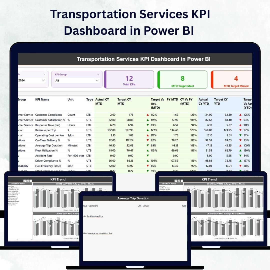
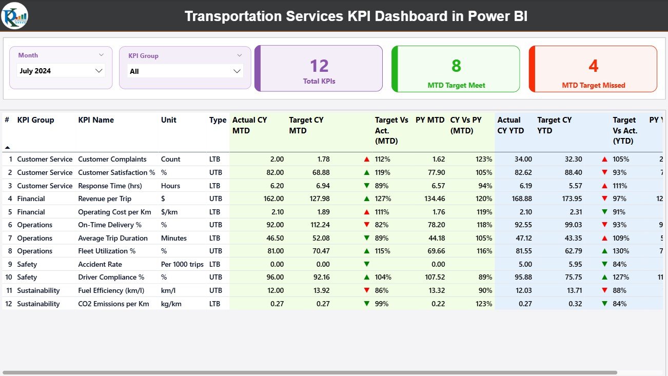
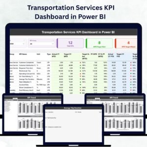
1️⃣ Summary Page:
The main control center, displaying KPI cards, slicers, and a detailed KPI table.
Includes fields such as:
-
KPI Number & Name
-
KPI Group & Unit
-
Type (LTB/UTB)
-
Actual vs Target (MTD/YTD)
-
Previous Year Comparison
-
Performance Icons (▲▼)
This page provides a 360° overview of business performance — perfect for management reviews and daily monitoring.
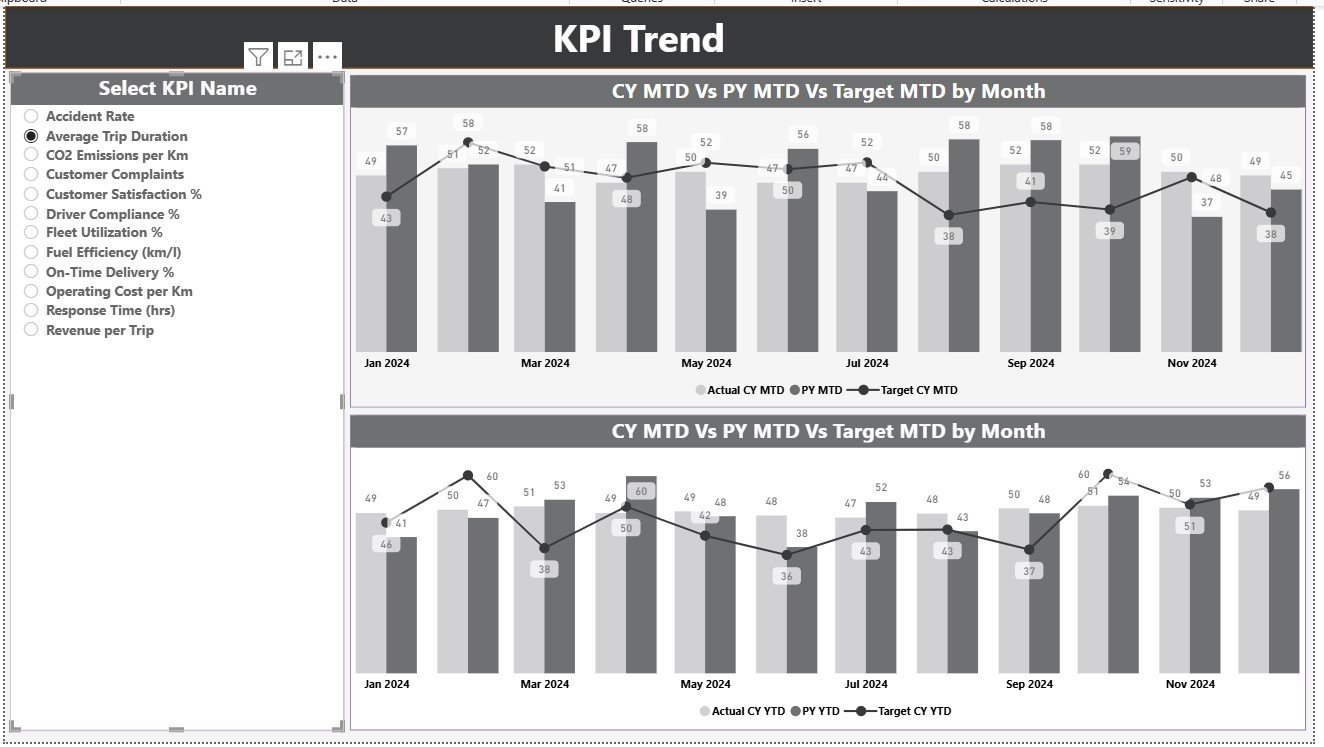
2️⃣ KPI Trend Page:
Dive deeper into data trends using MTD and YTD combo charts that compare Actual, Target, and Previous Year data.
Interactive slicers allow you to choose a KPI and visualize how performance evolves over time — ideal for identifying patterns or seasonal fluctuations.
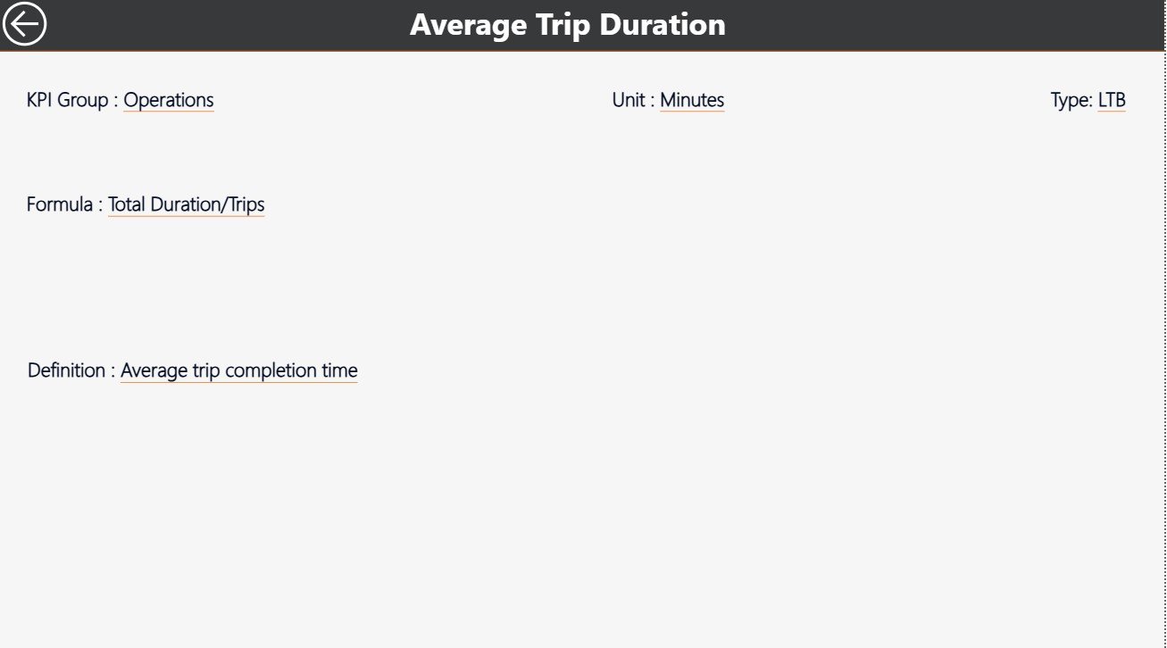
3️⃣ KPI Definition Page:
A drill-through page that lists KPI formulas, units, and definitions for transparent communication across teams.
Each definition ensures consistent interpretation of metrics across departments like Operations, Finance, and Logistics.
🧠 How to Use the Transportation Services KPI Dashboard in Power BI
⚙️ Step 1: Update the Excel file (Input_Actual, Input_Target, and KPI Definition sheets).
📊 Step 2: Connect Power BI to your Excel workbook.
🔁 Step 3: Refresh the data model — all visuals update automatically.
📈 Step 4: Navigate between Summary, KPI Trend, and KPI Definition pages for different analytical perspectives.
🎯 Step 5: Use drill-through and slicers for customized insights.
Within minutes, your entire transportation performance ecosystem is live, visual, and data-driven — ready to guide decisions at every level.
👥 Who Can Benefit from This Transportation Services KPI Dashboard
🚛 Fleet Managers: Monitor vehicle utilization, fuel efficiency, and downtime.
📦 Logistics Teams: Track delivery timelines and shipment performance.
💼 Finance Departments: Analyze transport costs and budget deviations.
🧭 Operations Heads: Manage performance by region, route, or driver.
🏢 Executives & Directors: Gain real-time visibility into the overall health of the transportation network.
Whether you manage a local fleet or a global logistics network, this Power BI dashboard provides clear, actionable insights for continuous improvement.
🔗 Click here to read the Detailed Blog Post
🎥 Visit our YouTube channel to learn step-by-step video tutorials
👉 YouTube.com/@PKAnExcelExpert


Reviews
There are no reviews yet.