Keeping servers online is no longer optional. In today’s digital business environment, every minute of downtime can affect customer trust, business operations, revenue, and service quality. Whether you manage websites, cloud applications, SaaS products, or enterprise systems, you need a simple and reliable way to track uptime performance. That is where the Server Uptime KPI Dashboard in Google Sheets becomes a must-have tool.
This ready-to-use dashboard helps IT teams, system administrators, DevOps professionals, and business owners monitor uptime KPIs in one organized and easy-to-use Google Sheets file. Instead of jumping between multiple reports and scattered monitoring records, you can review actual performance, compare targets, analyze previous year values, and identify trends in a single place. Moreover, this dashboard transforms raw server data into clear KPI insights that support faster action and smarter decisions. If you want to reduce downtime, improve SLA compliance, and strengthen IT reliability without investing in expensive tools, this dashboard is the perfect solution for your team.
Key Feature of Server Uptime KPI Dashboard in Google Sheets
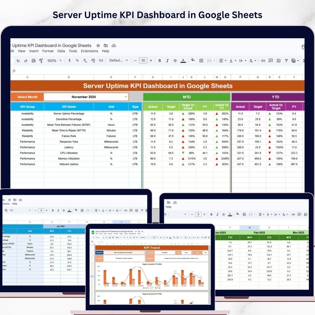
🖥️ Ready-to-Use 6-Worksheet Dashboard
This dashboard includes 6 structured worksheets designed to manage KPI tracking, trend analysis, target setting, historical comparison, and KPI definitions.
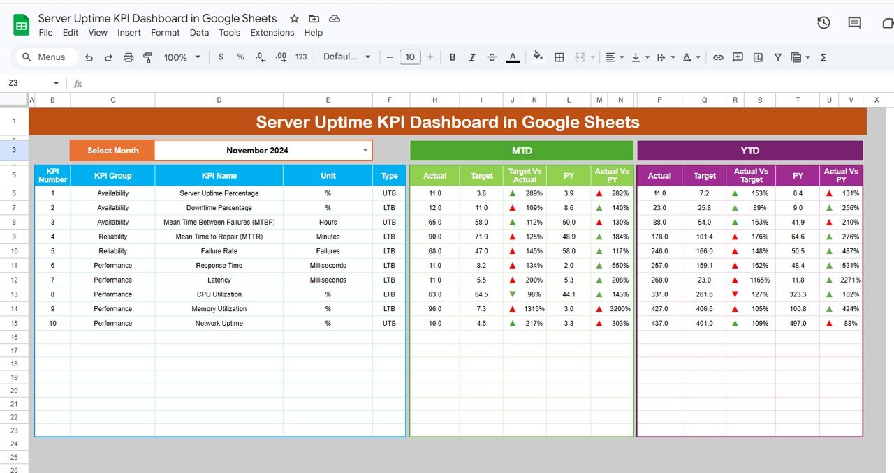
📊 Interactive Dashboard Sheet
The main dashboard sheet gives you a complete performance view with a Month Selector in Cell D3, allowing all KPI results to update instantly for the selected month.
📈 MTD and YTD Performance Tracking
Monitor both Month-to-Date (MTD) and Year-to-Date (YTD) metrics so you can understand short-term and long-term uptime performance clearly.
🎯 Target vs Actual Comparison
Compare actual uptime KPI values against defined monthly targets to identify whether performance is on track or needs improvement.
📅 Previous Year vs Actual Analysis
Measure current performance against previous year values to spot long-term changes and benchmark system reliability over time.
🚦 Conditional Formatting Indicators
Use up and down arrows with conditional formatting to quickly see whether KPI performance is improving or declining.
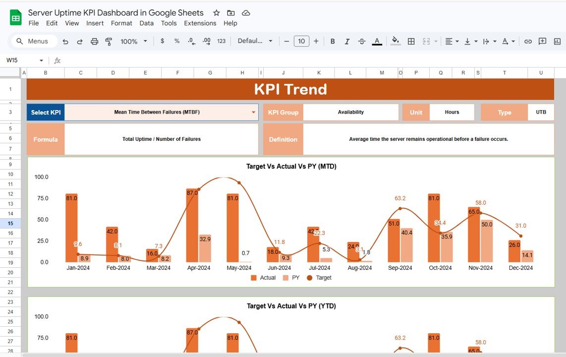
📘 Dedicated KPI Trend and Definition Insights
Select a KPI from the dropdown in the KPI Trend Sheet and instantly review KPI group, category, unit, type, formula, and definition.
📝 Simple Data Entry Structure
The dashboard includes dedicated sheets for Actual Numbers, Targets, Previous Year Data, and KPI Definitions, making it easy to update and maintain.
☁️ Built in Google Sheets for Easy Collaboration
Because it is built in Google Sheets, teams can collaborate in real time, update data from anywhere, and review performance together.
What’s Inside the Server Uptime KPI Dashboard in Google Sheets
📌 Dashboard Sheet
This is the central performance page where you can view selected month KPIs, MTD and YTD values, target vs actual results, previous year comparisons, and visual indicators.
📈 KPI Trend Sheet
This page helps you analyze individual KPIs in detail. It includes a KPI selection dropdown in Cell C3 and shows KPI group, category, unit, type, formula, and definition.
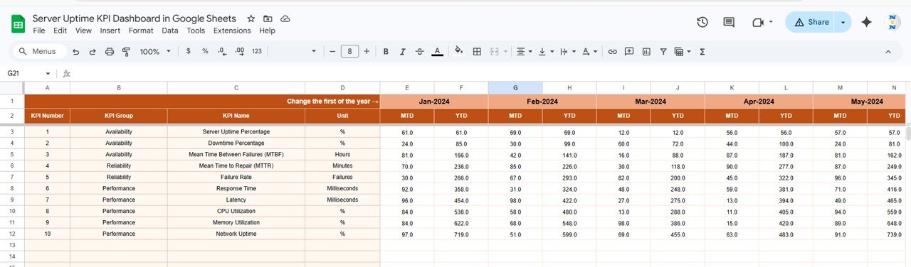
📊 Actual Number Sheet
Use this sheet to enter actual KPI performance data in a structured format. It also includes Month Selection in Cell E1 for organized updates.
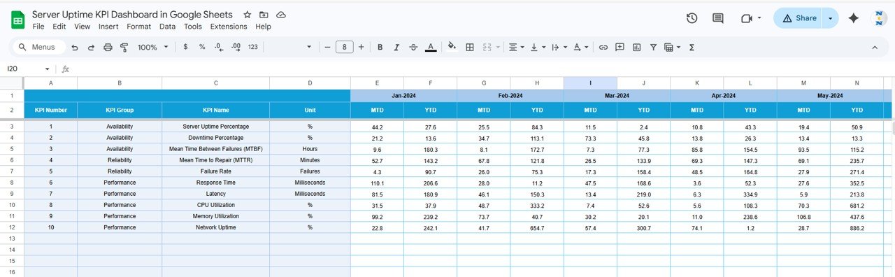
🎯 Target Sheet
This sheet stores KPI targets for each month, making it easier to compare goals against actual system performance.
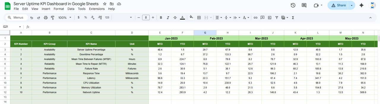
📅 Previous Year Sheet
Track historical KPI values here so you can perform year-over-year comparisons and identify long-term performance changes.
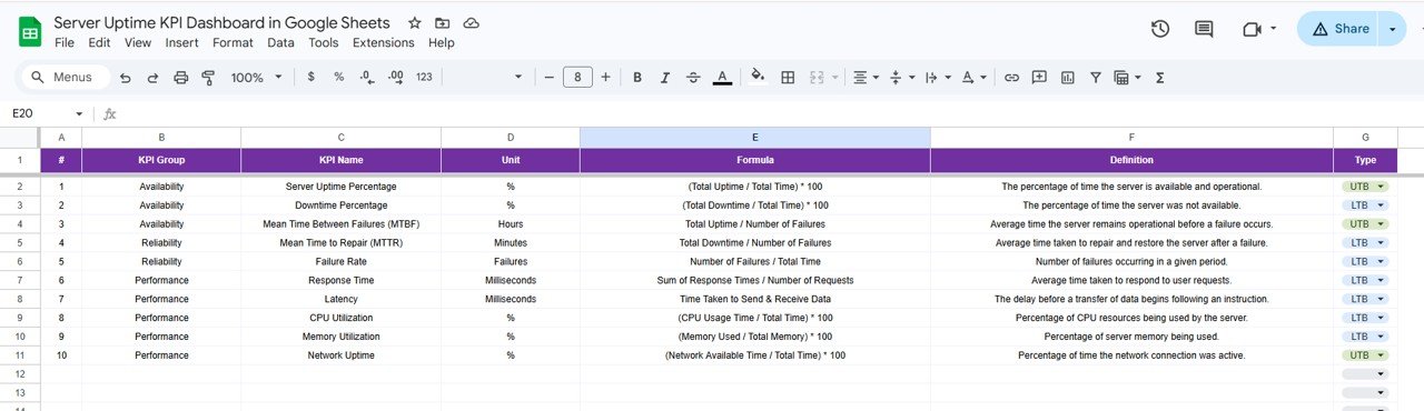
📘 KPI Definition Sheet
This sheet acts as the KPI master file and includes KPI name, group, unit, formula, and definition for clear understanding.
How to Use the Server Uptime KPI Dashboard in Google Sheets
✅ Enter actual server KPI values in the Actual Number Sheet
✅ Update monthly KPI targets in the Target Sheet
✅ Add previous year values in the Previous Year Sheet
✅ Maintain KPI names, formulas, and definitions in the KPI Definition Sheet
✅ Select the month from Cell D3 in the Dashboard Sheet
✅ Review MTD and YTD KPI performance instantly
✅ Use the KPI Trend Sheet to analyze specific metrics in detail
✅ Compare actual vs target and actual vs previous year results for better decision-making
This simple workflow helps your team move from manual reporting to structured IT performance tracking with ease.
Who Can Benefit from This Server Uptime KPI Dashboard in Google Sheets
👨💼 IT Managers who want a central view of system reliability and KPI performance
⚙️ DevOps Teams who need to monitor uptime, downtime, and operational trends
🧑💻 System Administrators who want better visibility into server health and performance
🌐 Network Engineers who need structured KPI reporting for service reliability
🏢 Business Owners who want to protect service quality and customer experience
📊 Operations Teams who need clear and cost-effective uptime reporting
This dashboard is ideal for any organization that depends on strong server availability and wants a practical way to track it.
Click hare to read the Detailed blog post
Read the detailed blog post to explore all dashboard worksheets, KPI tracking methods, advantages, and best practices.
Visit our YouTube channel to learn step-by-step video tutorials
Watch useful tutorials and practical walkthroughs to get the most out of your KPI dashboards and reporting tools.