

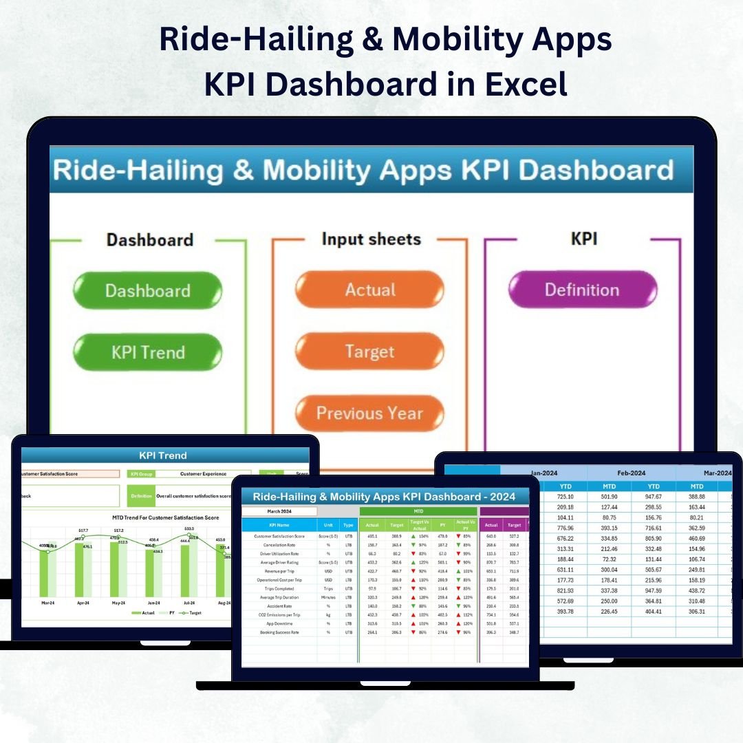

Ride-Hailing & Mobility Apps KPI Dashboard in Excel The ride-hailing and mobility industry runs on speed, reliability, and razor-thin margins. Every trip, driver, and rating counts. The Ride-Hailing & Mobility Apps KPI Dashboard in Excel 💡 turns this constant flow of operational data into clear, actionable insights — helping mobility startups and established fleets alike track efficiency, profitability, and service quality in real time.
Ride-Hailing & Mobility Apps KPI Dashboard in Excel This ready-to-use Excel-based dashboard simplifies analytics for fleet operators, logistics managers, and app-based mobility teams. It consolidates all your vital KPIs — rides, drivers, cancellations, costs, and revenue — into one interactive workbook. Built entirely in Microsoft Excel, it requires no coding, runs anywhere, and scales effortlessly with your growing operations.
⚡ Key Features of Ride-Hailing & Mobility Apps KPI Dashboard in Excel
✅ Centralized Performance Tracking: See total rides, active drivers, fuel cost, ratings, and cancellations — all in one place.
✅ Automated Analysis: Instantly calculate MTD and YTD results, Target vs Actual %, and PY comparisons.
✅ Dynamic Dashboard View: Dropdown filters update all charts instantly.
✅ Color-Coded Insights: Green ▲ for improvement, Red ▼ for decline — no guesswork needed.
✅ Drill-Down Trend View: Visualize KPI performance across months for deeper insights.
✅ Excel-Powered Automation: Formulas and conditional formatting handle all calculations automatically.
✅ Customizable KPIs: Add or edit metrics easily — from customer ratings to revenue per ride.
✅ Professional Design: Clean navigation hub and interactive charts make it boardroom ready.
✅ Cost-Effective and Accessible: No extra licenses — just Excel.
This dashboard brings the analytical power of business intelligence to Excel, helping you make smarter, faster, and more profitable decisions.
🧩 What’s Inside the Ride-Hailing & Mobility Apps KPI Dashboard
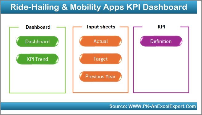
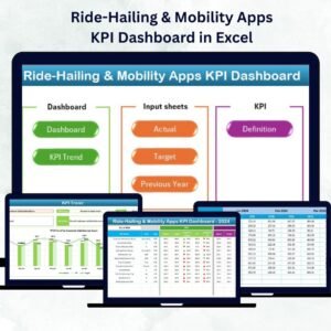
The template contains seven interactive worksheets, each built for clarity and action.
1️⃣ Home Sheet – Navigation Hub
A clean, button-based menu links directly to every major page — Dashboard, KPI Trend, Actual Numbers, Target, Previous Year, and KPI Definition.
It feels less like a spreadsheet and more like a mini application.
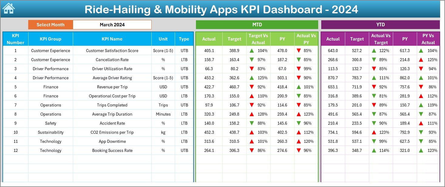
2️⃣ Dashboard Sheet – Your Command Center
Month selector in cell D3 updates everything instantly.
Shows MTD and YTD Actual, Target, and PY values side by side.
Conditional formatting arrows highlight KPI status.
Ideal for quick performance reviews and executive summaries.
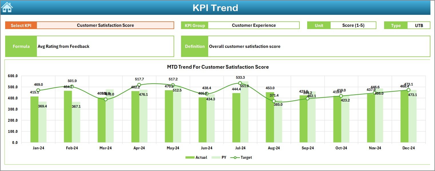
3️⃣ KPI Trend Sheet – Analyze Progress Over Time
KPI dropdown (cell C3) lets you focus on one metric at a time.
Displays KPI Group, Unit, Type (UTB/LTB), Formula, and Definition.
Two charts compare MTD and YTD Actual vs Target vs PY.
Perfect for spotting trends in driver efficiency or ride volume.
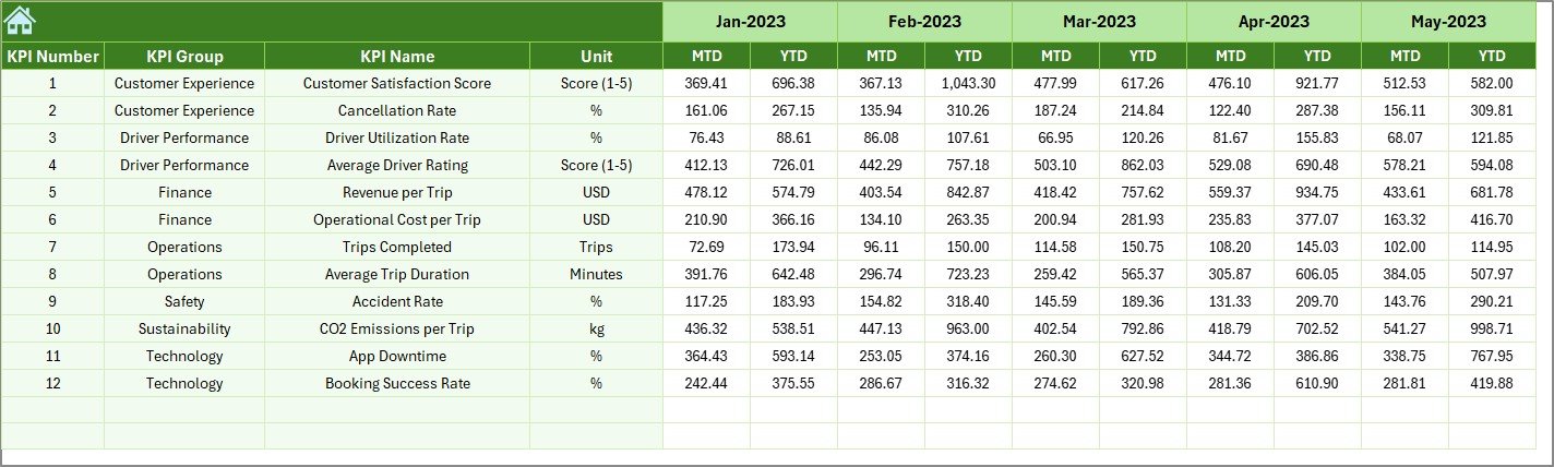
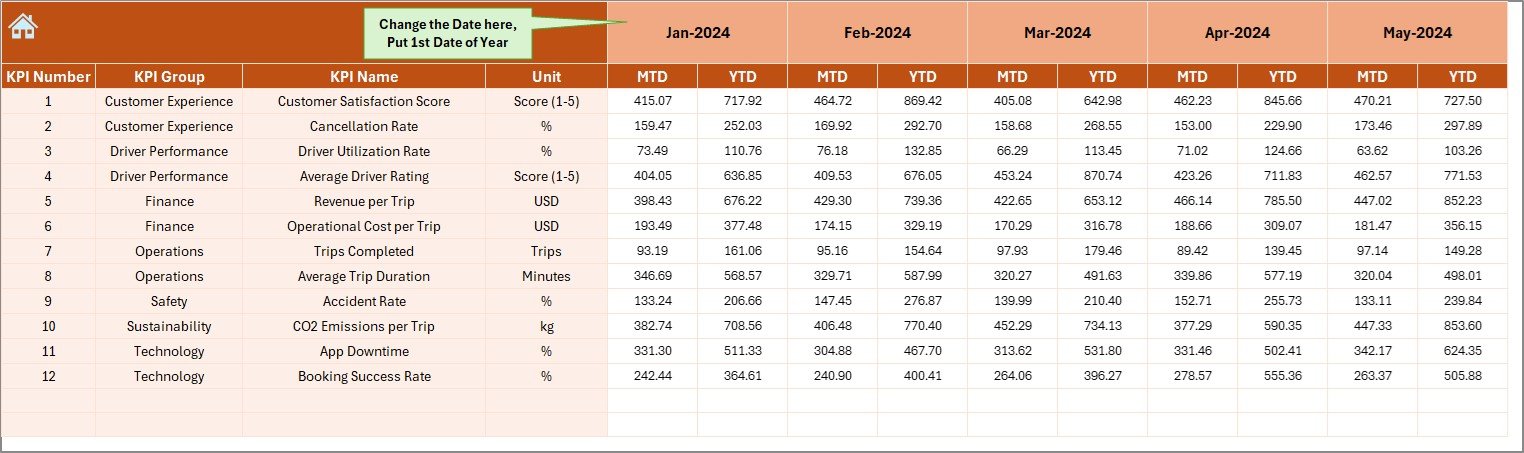
4️⃣ Actual Numbers Input Sheet – Record Real Performance
Set start month in cell E1.
Enter MTD and YTD figures for each KPI.
Dashboard and charts update automatically.
5️⃣ Target Sheet – Set Your Goals
Define MTD and YTD targets for each KPI by month.
Enables automatic Target vs Actual comparisons.
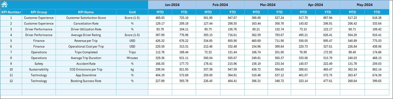
6️⃣ Previous Year Sheet – Track Historical Data
Store PY MTD/YTD numbers for growth analysis.
Enables YoY performance tracking.
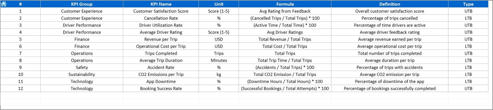
7️⃣ KPI Definition Sheet – Reference Library
Lists KPI Name, Group, Unit, Formula, and Definition.
Keeps everyone aligned on how each metric is measured.
🧠 How It Works
🚗 Step 1: Enter current month’s Actual data in the “Actual Numbers” sheet.
🎯 Step 2: Input targets and previous year values in their respective tabs.
📈 Step 3: Dashboard and Trend pages update automatically with charts and icons.
📊 Step 4: Use the Home Sheet buttons for quick navigation.
💡 Step 5: Analyze MTD, YTD, and YoY trends to optimize operations.
Within minutes, you’ll have a live performance report that’s ready for team meetings or investor reviews.
👥 Who Can Benefit from This Dashboard
🚖 Operations Managers: Monitor fleet utilization and ride fulfillment rates.
📱 App Developers & Product Teams: Analyze customer ratings and cancellation patterns.
💰 Finance Teams: Track revenue, costs, and profitability by month.
👷♂️ Fleet Owners & Partners: Compare driver performance and efficiency.
📊 Executives & Investors: Get a clear, visual summary of business health.
Whether you manage a local taxi startup or a global mobility network, this dashboard adapts to your scale and goals.
🔗 Click here to read the Detailed Blog Post
🎥 Visit our YouTube channel for step-by-step tutorials
👉 YouTube.com/@PKAnExcelExpert
Watch the step-by-step video tutorial:
Compatibility and Requirements
- Works in Microsoft Excel desktop (Excel 2016 or later, or Microsoft 365).
- You pick the month and the KPI from dropdown lists. Microsoft explains dropdowns in Create a drop-down list.
Frequently Asked Questions
Which worksheets are included?
Seven worksheets: Home, Dashboard, KPI Trend, Actual Numbers, Target, Previous Year and KPI Definition.
How do I update the dashboard?
Enter your MTD and YTD figures in the Actual Numbers sheet, your goals in the Target sheet and last year’s figures in the Previous Year sheet. Then pick the month in cell D3 of the Dashboard sheet and the charts update.
Can I compare results with last year and with targets?
Yes. The Dashboard shows MTD and YTD Actual, Target and Previous Year values side by side, with green up arrows and red down arrows for status.
How do I see the trend for one KPI?
Open the KPI Trend sheet and choose a KPI in cell C3. It shows the KPI group, unit, type (UTB or LTB), formula and definition, plus two charts comparing Actual, Target and Previous Year.
Can I add or change KPIs?
Yes. The KPI list is editable, and the KPI Definition sheet holds the name, group, unit, formula and definition of each metric.
Is there a Power BI version?
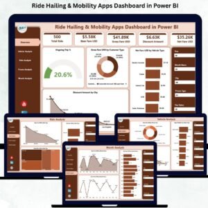
Yes. See the Ride-Hailing & Mobility Apps KPI Dashboard in Power BI.
Related Mobility Templates
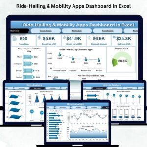
- Ride-Hailing & Mobility Apps Dashboard in Excel: a dashboard-style view for the same business
- Ride-Hailing & Mobility Apps KPI Dashboard in Power BI: the same KPIs in Power BI
- Ride-Sharing KPI Dashboard in Excel: KPI tracking for ride-sharing operations
- Ride-Sharing KPI Dashboard in Google Sheets: a Google Sheets option
- Micro-Mobility Platforms Dashboard in Excel: for scooter and bike platforms
Browse all Excel KPI dashboards.










Reviews
There are no reviews yet.