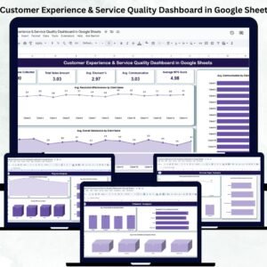
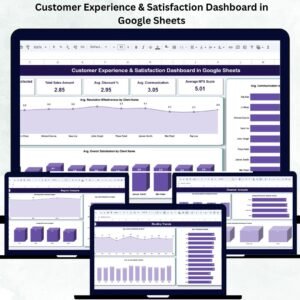
Customer satisfaction is the foundation of business success — it influences loyalty, retention, and overall brand perception. The Customer Experience & Satisfaction Dashboard in Google Sheets is a ready-to-use data visualization tool that helps you capture, analyze, and interpret customer feedback with ease. 💬📊
Built entirely in Google Sheets, this dashboard centralizes all customer feedback data into one visual interface. With real-time metrics, dynamic charts, and automatic KPI updates, it gives managers and teams instant visibility into how customers truly perceive your products and services — enabling faster, data-driven decisions.
🔑 Key Features of the Customer Experience & Satisfaction Dashboard in Google Sheets
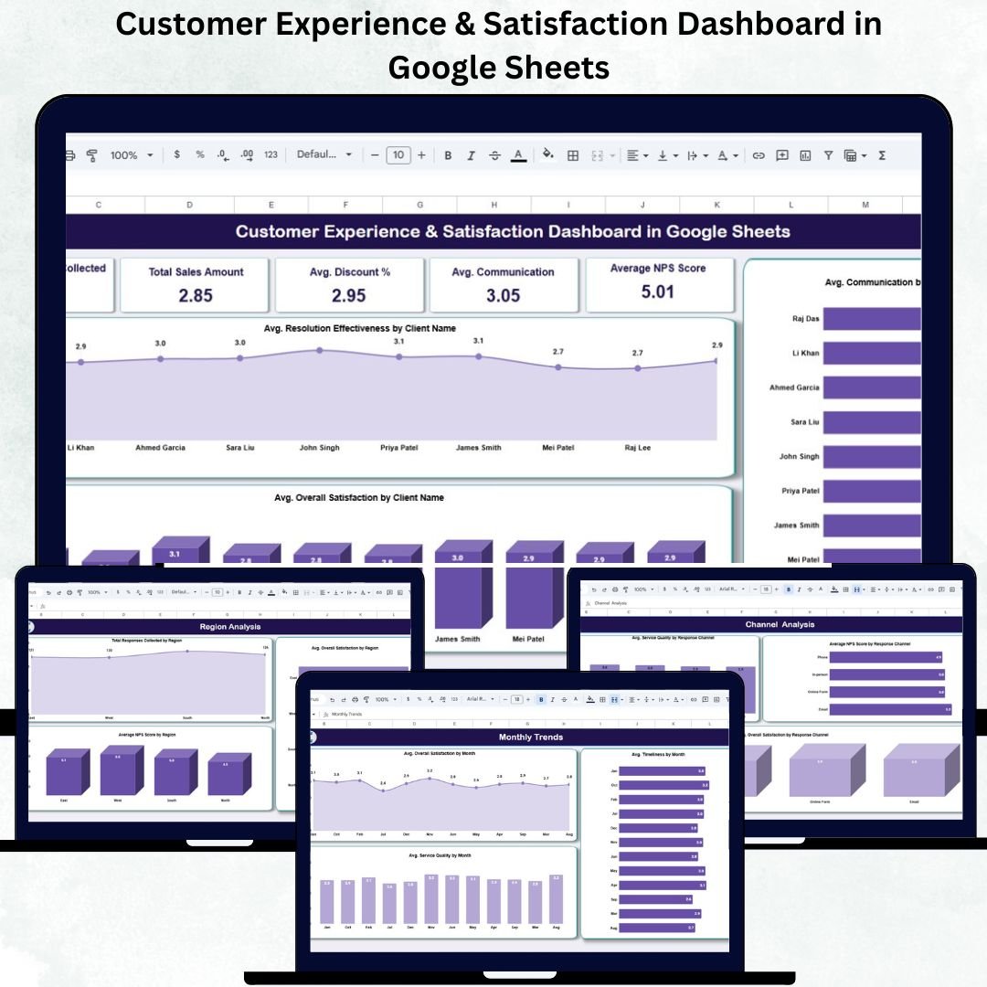
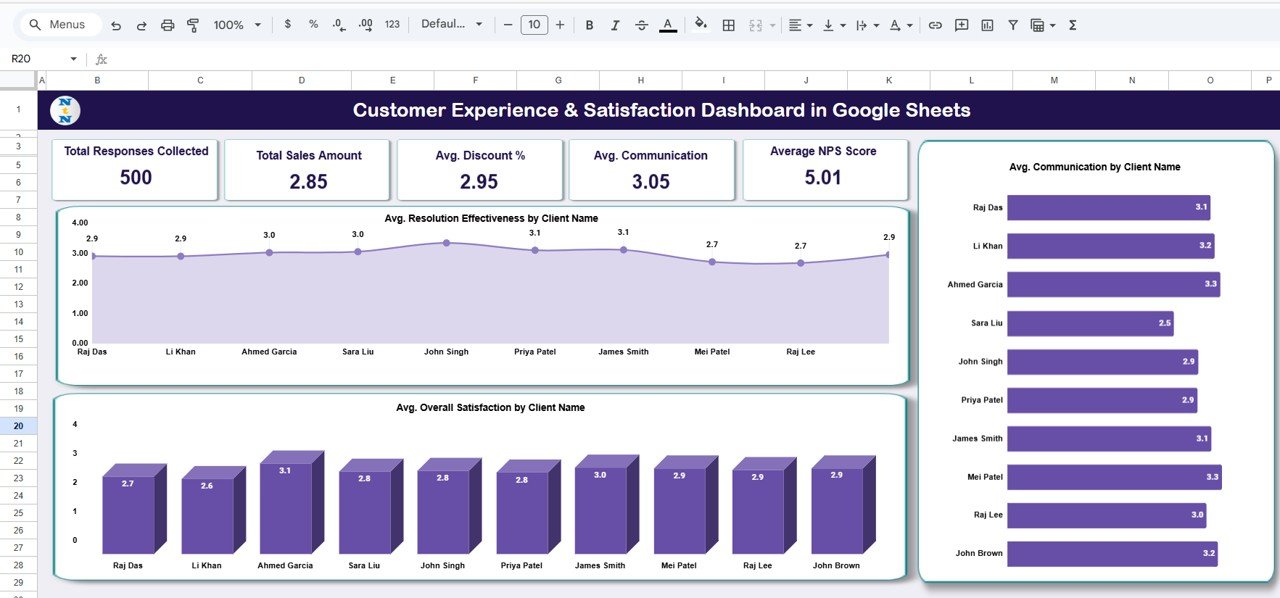
📋 Overview Sheet Tab (Main Dashboard)
Get a complete snapshot of your customer experience metrics in one place.
Cards Displayed:
-
Total Responses Collected: Total number of survey responses or feedback entries.
-
Avg. Overall Satisfaction: Average satisfaction rating from all customers.
-
Avg. Service Quality: Indicates overall service delivery performance.
-
Avg. Communication: Measures the quality of communication and support interactions.
-
Average NPS Score: Calculates Net Promoter Score to assess customer loyalty and advocacy.
Charts Included:
-
📈 Avg. Resolution Effectiveness by Client Name – Identify which clients are satisfied with issue resolution.
-
💬 Avg. Overall Satisfaction by Client Name – Monitor satisfaction trends across major accounts.
-
📞 Avg. Communication by Client Name – Measure communication quality to strengthen customer relationships.
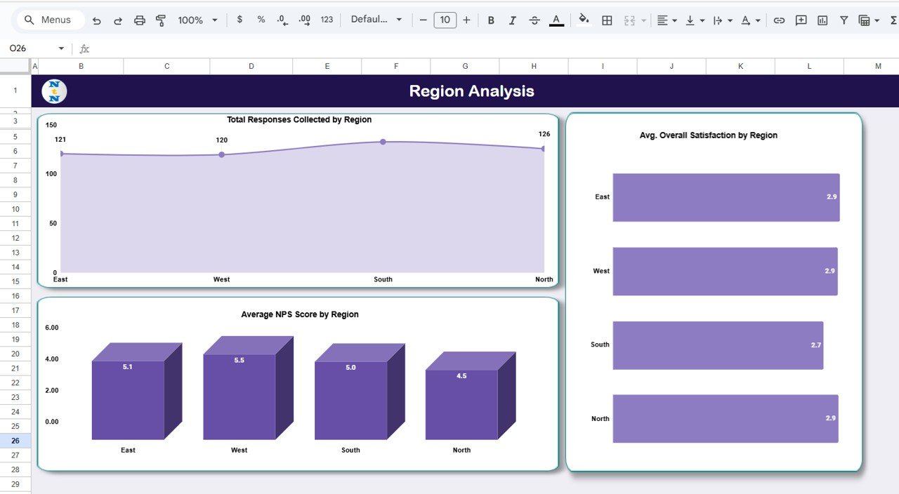
🌍 Region Analysis Tab
Analyze how satisfaction levels vary geographically.
Charts Included:
-
Total Responses Collected by Region – Track engagement levels across locations.
-
Avg. Overall Satisfaction by Region – Identify high- and low-performing regions.
-
Average NPS Score by Region – Measure loyalty and advocacy scores region-wise.
These insights help target service improvements where they’re needed most.
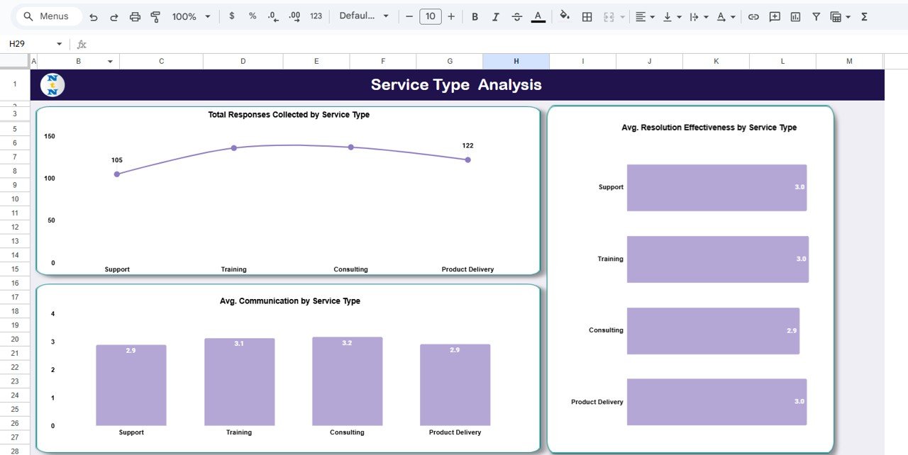
🧩 Service Type Analysis Tab
Understand satisfaction by service category (e.g., Technical Support, Training, Implementation).
Charts Included:
-
Total Responses Collected by Service Type
-
Avg. Resolution Effectiveness by Service Type
-
Avg. Communication by Service Type
This analysis highlights which service areas deliver the highest and lowest satisfaction.
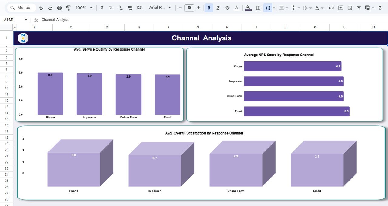
💬 Channel Analysis Tab
Evaluate customer feedback across communication channels.
Charts Included:
-
Avg. Service Quality by Response Channel
-
Average NPS Score by Response Channel
-
Avg. Overall Satisfaction by Response Channel
Determine whether customers are happier with phone support, email, chat, or in-person interactions.
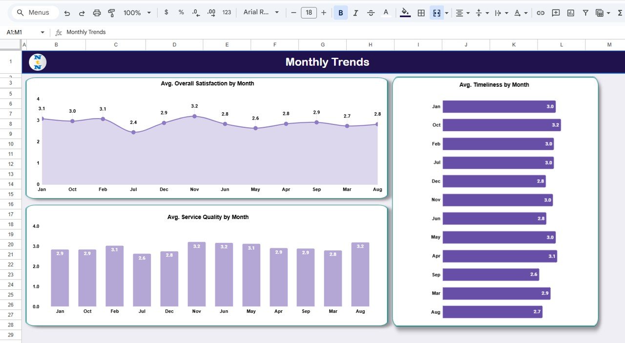
📅 Monthly Trends Tab
Track how customer experience evolves over time.
Charts Included:
-
Avg. Overall Satisfaction by Month
-
Avg. Timeliness by Month
-
Avg. Service Quality by Month
Spot trends, monitor improvement initiatives, and identify recurring issues seasonally.
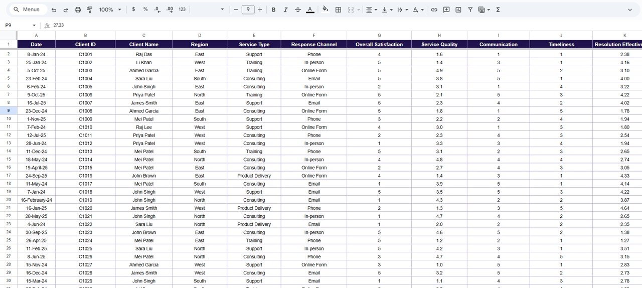
🧾 Data Sheet Tab (Input Data Source)
All feedback records are stored here. As new data is added, dashboards update automatically — eliminating manual work and ensuring real-time accuracy.
📦 What’s Inside the Dashboard
✅ Fully interactive Google Sheets dashboard
✅ Pre-built charts for clients, regions, and service types
✅ Automated KPIs for NPS, satisfaction, and service quality
✅ Data validation for accurate input
✅ Cloud-based collaboration for multiple users
✅ Export-ready visuals for reports and presentations
✅ 100% customizable fields, KPIs, and visuals
Everything you need to turn customer feedback into business growth — fast and effectively. 🚀
🧑💼 Who Can Benefit from This Dashboard
🎯 Customer Success Managers – Monitor satisfaction and retention.
📈 Support Teams – Identify communication and service quality issues.
🏢 Operations Leaders – Gain clarity on regional and departmental performance.
💬 Marketing & CX Teams – Track NPS and overall brand perception.
💼 Executives – Make strategic, data-driven improvements across the organization.
Perfect for startups, agencies, and enterprises that value customer-centric decision-making.
🧪 How to Use the Dashboard
1️⃣ Collect Feedback Data – Import responses or connect Google Forms.
2️⃣ View KPIs – Monitor satisfaction, NPS, and service quality instantly.
3️⃣ Analyze by Region/Service Type – Identify areas of strength and improvement.
4️⃣ Track Monthly Trends – Monitor progress over time.
5️⃣ Share Insights – Collaborate live in Google Sheets or export visuals for review.
💡 Pro Tip: Automate feedback collection with Google Forms integration for seamless updates!
🌟 Why Choose This Dashboard
-
Real-time satisfaction and NPS tracking
-
Region, service type, and channel-based analytics
-
Intuitive visualizations — no coding needed
-
Fully cloud-based and collaborative
-
Customizable KPIs for any customer program
-
Drives faster, data-backed improvements
The Customer Experience & Satisfaction Dashboard in Google Sheets empowers businesses to listen, act, and grow by turning feedback into measurable action. 🌟
🔗 Click here to read the Detailed blog post
Watch the step-by-step video Demo:


Reviews
There are no reviews yet.