


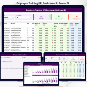
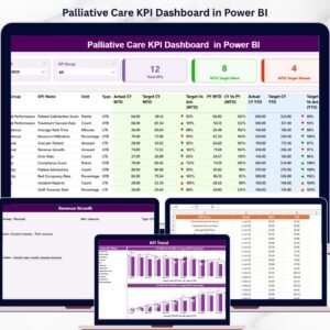
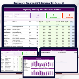
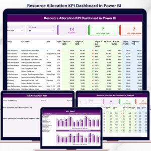
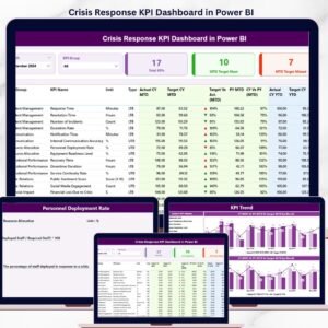
The Crisis Management KPI Dashboard in Power BI is an invaluable tool designed to help organizations track critical performance metrics during a crisis. This ready-to-use dashboard allows real-time monitoring of essential KPIs such as response time, resolution time, and customer satisfaction, empowering decision-makers to act quickly and effectively. By utilizing data from Excel, this dashboard gives organizations a comprehensive view of their crisis management performance, offering insights that drive informed, data-driven decisions.

🔑 Key Features of the Crisis Management KPI Dashboard:
-
Real-Time Data Monitoring: Track real-time performance against targets, enabling quick decision-making and crisis response.
-
KPI Comparison: Compare current performance with both the previous year’s data and set targets to identify improvements or areas needing attention.
-
Detailed Data Visualizations: Leverage various charts and slicers to analyze and interpret crisis management data efficiently, even for non-technical users.
-
Customizable to Your Needs: Easily customize the dashboard to track your organization’s unique crisis management KPIs, targets, and goals.
-
User-Friendly Interface: With intuitive slicers and drill-through capabilities, the dashboard makes it simple to dive deeper into each KPI’s performance.
What’s Inside the Crisis Management KPI Dashboard 📉🔍
This Crisis Management KPI Dashboard is composed of three essential pages, each designed to analyze different aspects of crisis management performance:
-
Summary Page: The central hub of the dashboard, providing an overview of all KPIs and performance indicators. Features include:
-
Slicers for filtering data by month and KPI group.
-
Cards displaying total KPIs count, target met count, and target missed count for the month-to-date (MTD).
-
KPI Table with detailed information on KPI performance, including actual vs target comparisons for MTD and YTD, as well as previous year comparisons.
-
-
KPI Trend Page: This page tracks the performance of each KPI over time, helping identify trends and patterns. Key features:
-
Combo Charts to visualize current year vs. previous year data for both MTD and YTD performance.
-
KPI Dropdown: Select a specific KPI from the dropdown to view its trend over time.
-
-
KPI Definition Page: Provides detailed definitions, formulas, and other relevant information for each KPI, allowing users to dive deeper into the data and better understand the metrics being tracked.
-
Drill-Through: Click on any KPI from the Summary Page to access detailed information, including formulas, units, and definitions.
-
How to Use the Crisis Management KPI Dashboard 📅⚡
To leverage the Crisis Management KPI Dashboard to its fullest, follow these easy steps:
-
Download and Open the Template: Open the Power BI dashboard connected to your Excel data sources.
-
Input Data: Regularly input actual data into the Excel file, ensuring that it feeds into the Power BI dashboard for real-time updates.
-
Track Performance: Use the Summary Page to view KPI performance in real-time and compare it with targets and historical data.
-
Analyze Trends: Use the KPI Trend Page to analyze performance trends over time, identifying patterns that require attention.
-
Drill-Through for Detailed Insights: Click on any KPI to access detailed information about its definition, formula, and performance.
Who Can Benefit from This Crisis Management KPI Dashboard? 🏢🚨
The Crisis Management KPI Dashboard is designed for any organization that needs to track key performance metrics during a crisis. It is particularly valuable for teams managing emergency responses, crisis communications, and business continuity.
-
Crisis Managers: Track performance in real-time and make data-driven decisions to mitigate risks.
-
Operations Teams: Monitor operational efficiency and identify bottlenecks in crisis response.
-
Customer Service Managers: Track customer satisfaction and resolution times to ensure effective crisis management.
-
Senior Executives: Use the dashboard to make high-level decisions based on real-time crisis management data.
Advantages of Using the Crisis Management KPI Dashboard 📈💡
-
Real-Time Monitoring: Stay on top of performance with live data that allows for swift action during a crisis.
-
Performance Comparison: Quickly compare current data with targets and historical data to assess your organization’s crisis management strategies.
-
Easy Data Interpretation: Visual charts and slicers simplify the process of analyzing data, even for non-technical users.
-
Efficient Reporting: Streamline KPI tracking and reporting with a centralized tool that automatically updates as data is inputted.
-
Customizable: Adapt the dashboard to meet your organization’s unique crisis management needs, including customized KPIs and targets.
Click here to read the Detailed Blog Post 📖
Watch the step-by-step video Demo:


Reviews
There are no reviews yet.