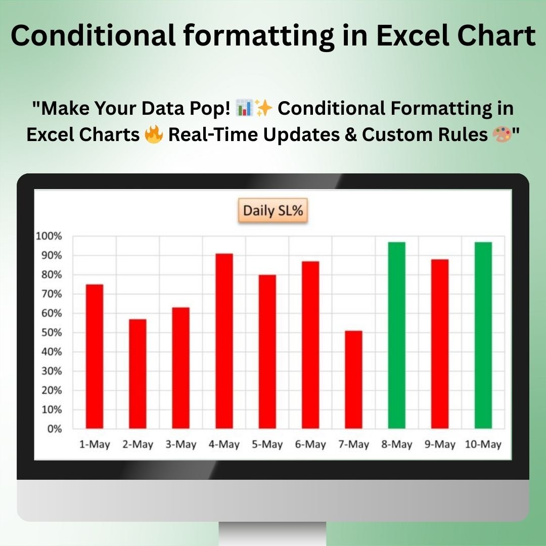
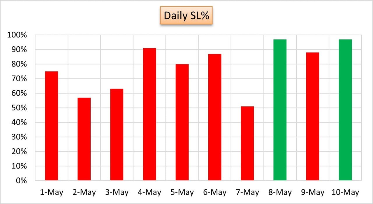
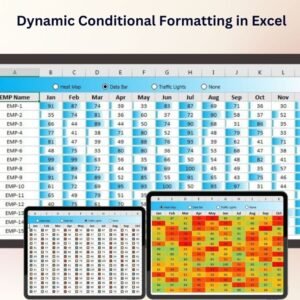
The Conditional Formatting in Excel Chart is a powerful tool that allows you to apply dynamic formatting to your charts based on specific conditions or rules. With this feature, you can change the appearance of your charts in real-time, highlighting key data points, trends, and outliers in a way that makes your analysis more intuitive and engaging.
This template enables you to apply conditional formatting to your charts, such as changing the color of bars, lines, or pie slices based on value thresholds, trends, or other criteria. Whether you’re working with sales data, financial performance, or any other type of data, this feature helps you create charts that are not only informative but also visually dynamic and impactful.
Key Features of Conditional Formatting in Excel Chart
📌 Dynamic Chart Formatting
With conditional formatting, you can dynamically alter the colors and appearance of your charts based on specific conditions or thresholds. For example, you can change the color of a bar chart segment if it exceeds a certain value, or highlight a line in a trend chart when it crosses a specific threshold.
🛠 Customizable Rules
You can set custom rules to determine how your chart should be formatted. Whether you’re tracking performance, comparing data, or looking for trends, you can define specific criteria that trigger formatting changes based on the values in your data.
💡 Instant Data Visualization
Conditional formatting makes it easier to visualize key trends, outliers, and insights in your data. By automatically adjusting the chart’s appearance based on data values, you can quickly identify which data points require attention or highlight the most significant trends.
🔢 Real-Time Data Updates
As your data updates, the conditional formatting is applied automatically, ensuring that your charts reflect the latest data in real time. This feature makes it easier to track performance, progress, and other metrics without needing to manually adjust the chart.
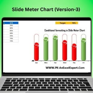
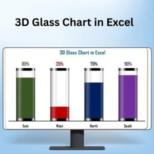
🚀 Multiple Chart Types Supported
This tool works with a wide variety of chart types, including bar charts, line charts, pie charts, and more. Apply conditional formatting across different chart types to ensure your data is presented in the most meaningful way.
📊 Improved Data Interpretation
Conditional formatting makes it easier to interpret large sets of data by visually distinguishing between different data points. Use it to draw attention to high-performing areas or flag values that fall outside of expected ranges.
⚙ Easy Setup and Customization
Setting up conditional formatting in your charts is simple with this template. With clear instructions and easy-to-follow steps, you can quickly implement dynamic formatting without needing advanced Excel skills.
🚀 Why You’ll Love Conditional Formatting in Excel Chart
✅ Dynamic and Interactive – Your chart’s appearance automatically adjusts based on the data. ✅ Customizable Rules – Set your own rules to control when and how the chart changes. ✅ Real-Time Updates – Automatically reflect the latest data with instant formatting changes. ✅ Multiple Chart Types – Apply conditional formatting to bar charts, line charts, pie charts, and more. ✅ Easy to Use – Simple setup with clear instructions, even for Excel beginners.
📂 What’s Inside the Conditional Formatting in Excel Chart?
- Dynamic Chart Formatting: Automatically adjust your chart’s appearance based on predefined rules.
- Customizable Data Rules: Define the rules that trigger chart formatting changes.
- Real-Time Updates: Watch your chart update and format as your data changes.
- Multiple Chart Types: Apply conditional formatting to a variety of chart types.
- Clear Setup Instructions: Simple and easy steps for implementation.
🔍 How to Use Conditional Formatting in Excel Chart
1️⃣ Download the Template – Get instant access to the Excel file upon purchase. 2️⃣ Input Your Data – Enter the data that you want to analyze and track. 3️⃣ Set Custom Rules – Define the rules that will trigger conditional formatting on your chart. 4️⃣ Watch the Changes – See your chart automatically update and adjust based on your data. 5️⃣ Present and Share – Use the dynamic charts in reports, dashboards, or presentations.
🎯 Who Can Benefit from Conditional Formatting in Excel Chart? 🔹 Business Analysts
🔹 Project Managers
🔹 Sales Teams
🔹 Financial Analysts
🔹 Marketing Teams
🔹 Anyone needing to visualize and track data trends effectively
Enhance your data analysis and reporting with Conditional Formatting in Excel Chart. With dynamic formatting, real-time updates, and customizable rules, you can present your data in a more meaningful and visually appealing way.
Click here to read the Detailed blog post
https://www.pk-anexcelexpert.com/conditional-formatting-in-excel-chart/


Reviews
There are no reviews yet.