

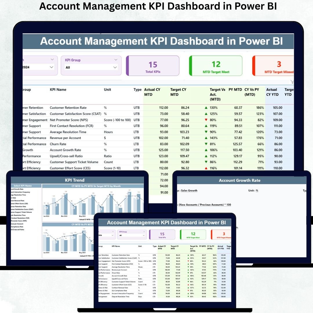

Managing a Account Management KPI Dashboard when KPIs are scattered across multiple Excel sheets, outdated reports, or manual summaries 📄⏳. Account management teams deal with renewals, upselling, client communication, ticket handling, and service coordination every month—and without a smart reporting tool, decisions become slow and unclear. That’s why businesses rely on the Account Management KPI Dashboard in Power BI.
This dashboard gives you a complete, real-time view of all account KPIs. From monthly performance to yearly trends, from target comparisons to previous-year results—everything appears in one clean, interactive dashboard. Built with slicers, dynamic charts, detailed tables, and drill-through features, this Power BI dashboard simplifies reporting and gives managers the clarity they need to make confident decisions.
🔥 Key Features of the Account Management KPI Dashboard in Power BI
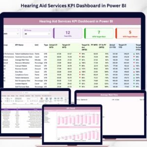
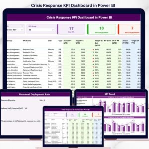
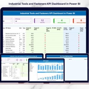
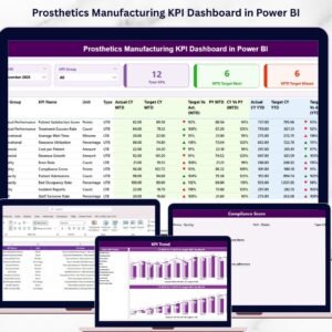
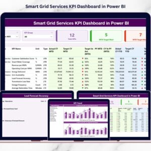
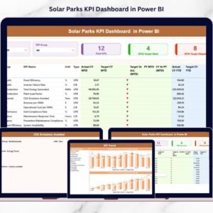
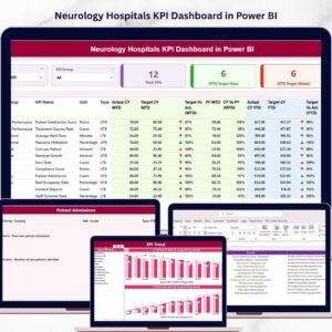
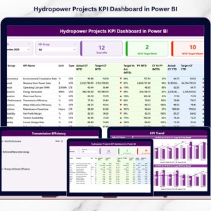
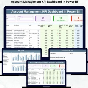
📊 Summary Page – Track MTD & YTD performance with KPI cards, slicers, and a powerful KPI table.
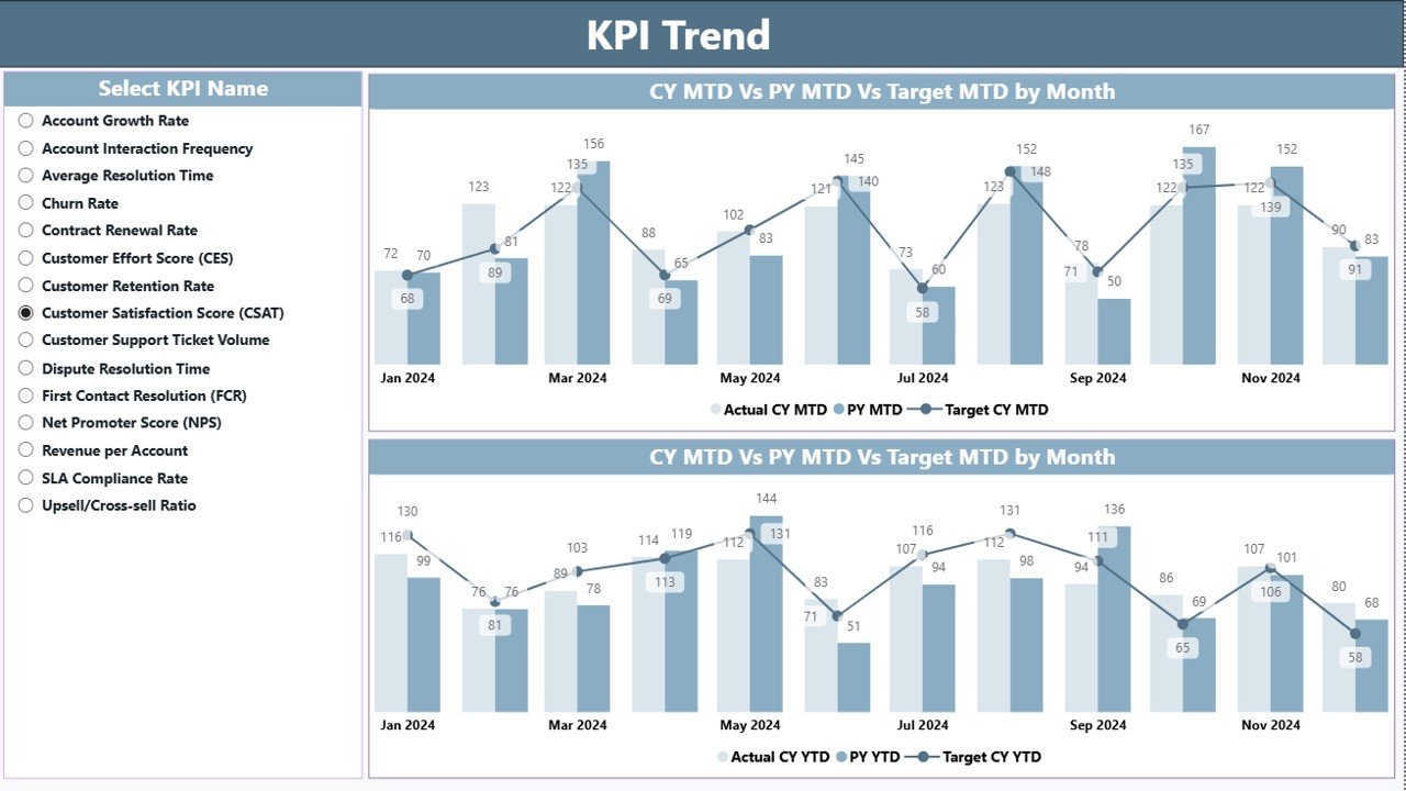
📈 Trend Analysis Page – Visual combo charts showing Actual vs Target vs Previous Year for all KPIs.
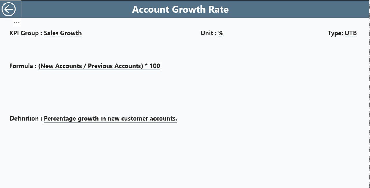
🔍 KPI Definition Page – Drill-through page showing formula, definition, unit, type, and KPI details.
📅 Month & KPI Filters – Filter KPIs by category or select any month to refresh the entire dashboard instantly.
💡 Real-Time Insights – Refresh the Excel data source and the dashboard updates automatically.
📥 Excel-Based Input – Three structured sheets (Actual, Target, Definition) make data management simple.
🟢 Instant Status Icons – Green ▲ means the KPI meets/exceeds target; red ▼ shows performance gaps.
👨💼 Perfect for Client Reviews – Clean visuals ideal for client presentations, strategy meetings, and leadership reporting.
📂 What’s Inside the Account Management KPI Dashboard
1. Summary Page – The Core Performance View
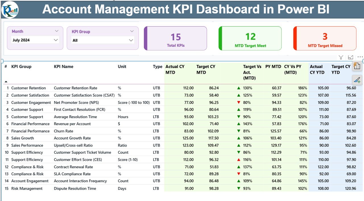
This page gives you everything you need at a glance:
Month & KPI Group slicers
Cards showing total KPIs, met KPIs, and missed KPIs
A full KPI table with MTD/YTD, Actual vs Target %, Previous Year comparisons, and color-coded icons
This page acts as the “control room” of account performance.
2. KPI Trend Page – Track KPI Movement Over Time
This page includes:
KPI selector to choose any KPI instantly
MTD combo chart (Current Year vs Previous Year vs Target)
YTD combo chart (Cumulative comparison with last year)
This helps identify monthly patterns, growth gaps, and seasonal behaviors.
3. KPI Definition Page – Clear KPI Logic and Formulas
This drill-through page shows:
KPI Number
KPI Group
KPI Name
Unit
Formula
Definition
KPI Type (UTB or LTB)
This ensures clarity for teams, managers, and clients during reporting.
🛠️ How the Dashboard Works With Excel Data
The dashboard reads all KPIs from a connected Excel file:
Input_Actual Sheet – Stores month-wise Actual MTD & YTD values
Input_Target Sheet – Stores Target MTD & YTD values
KPI Definition Sheet – Stores KPI names, formulas, units, and logic
Just update the Excel file → click refresh → the dashboard updates instantly.
👥 Who Can Benefit from This Dashboard
Account Managers
Customer Success Teams
Sales & Retention Teams
Business Analysts
Client Relationship Managers
Leadership & Strategy Teams
It’s perfect for tracking performance, improving retention, identifying upselling opportunities, and preparing business reviews.
### Click here to read the Detailed blog post
Visit our YouTube channel to learn step-by-step video tutorials

Reviews
There are no reviews yet.