

OEE (Overall Equipment Effectiveness) is the single number that combines Availability, Performance and Quality into one score, and the 10 metrics below are the downtime and efficiency KPIs that build it. The fastest way to track them is an OEE calculation Excel template that captures the raw formulas and benchmarks automatically, so you read the score instead of building it.
Last updated: September 2026
Key takeaways
- OEE = Availability × Performance × Quality. World-class is 85%, but the discrete-manufacturing average sits near 60%, so most plants have 20–25 points of hidden capacity to reclaim.
- Every metric here ships with an exact formula and a benchmark range — Availability targets 90%, Performance 95%, Quality 99.9%, and MTTR under 5 hours.
- Downtime is the biggest OEE killer: unplanned stops should stay under 10% of planned production time, yet unmanaged lines routinely lose 15–20%.
- The Manufacturing Efficiency Dashboard in Excel ($17.99) calculates all three OEE factors from a single data table — our best overall pick.
- For a cloud, share-anywhere option the Logistics Efficiency KPI Dashboard in Google Sheets is the best value at $9.99.
OEE & downtime dashboard templates compared
| Template | Format | Best for | Price |
|---|---|---|---|
| Manufacturing Efficiency Dashboard (Best overall) | Excel | OEE, Availability, Performance & Quality in one workbook | $17.99 |
| Agricultural Equipment Production Dashboard | Power BI | Real-time plant-floor production & downtime by plant | $17.99 |
| Agricultural Equipment Production Dashboard | Excel | Offline production output & defect tracking | $13.99 |
| Energy Efficiency KPI Dashboard | Excel | Utilization & energy-per-unit (TEEP) | $14.99 |
| Warehouse Efficiency Dashboard | HTML | Throughput & cycle time on the web | $12.99 |
| Logistics Efficiency KPI Dashboard (Best value) | Google Sheets | Cloud collaboration on throughput KPIs | $9.99 |
How we picked these metrics and templates
We searched NextGenTemplates’ catalog of 2,000+ business templates for dashboards that calculate genuine plant-floor efficiency — not generic charts. Each of the 10 metrics below is drawn from the same framework used by the Vorne OEE standard and ISO 22400, the international specification for manufacturing operations KPIs. We excluded software that only visualises data you have already computed elsewhere; every template here holds the formula itself, so the numbers update the moment you paste a shift log. Prices are live USD from the store and range from $9.99 to $17.99.
The 10 OEE & downtime metrics to track in 2026
Track these in order. The first four are the OEE core; the rest are the downtime and throughput metrics that explain why your OEE is where it is. For a live version of the whole set, an OEE calculation Excel template does the arithmetic for you and flags anything below benchmark in red.
| # | Metric | Formula | Benchmark | Where to see it |
|---|---|---|---|---|
| 1 | OEE | Availability × Performance × Quality | 85% world-class / 60% typical | Manufacturing Efficiency Dashboard |
| 2 | Availability | Run Time ÷ Planned Production Time | 90%+ | Manufacturing Efficiency Dashboard |
| 3 | Performance | (Ideal Cycle Time × Total Count) ÷ Run Time | 95%+ | Production Dashboard (Power BI) |
| 4 | Quality | Good Count ÷ Total Count | 99.9%+ | Production Dashboard (Excel) |
| 5 | MTBF | Total Operating Time ÷ Number of Failures | Trend up vs baseline | Manufacturing Efficiency Dashboard |
| 6 | MTTR | Total Repair Time ÷ Number of Repairs | < 5 hours | Production Dashboard (Power BI) |
| 7 | Unplanned Downtime % | Unplanned Downtime ÷ Planned Production Time | < 10% | Production Dashboard (Power BI) |
| 8 | TEEP | OEE × Utilization | Reveals hidden capacity (20–60%) | Energy Efficiency KPI Dashboard |
| 9 | Throughput | Good Units ÷ Time Period | vs takt / design capacity | Warehouse Efficiency Dashboard |
| 10 | Scrap / Defect Rate | Scrapped Units ÷ Total Units | < 2% | Production Dashboard (Excel) |
1. Overall Equipment Effectiveness (OEE)
Definition: OEE is the percentage of planned production time that is truly productive — making good parts, at full speed, with no stops.
Formula: OEE = Availability × Performance × Quality.
Benchmark: 85% is world-class for discrete manufacturing; 60% is a realistic average; anything under 40% signals a line in trouble.
Common mistake: Reporting a single blended OEE across mixed products or shifts. Roll it up only after you have calculated it per asset, per shift — otherwise a good line masks a failing one.
2. Availability
Definition: The share of planned production time the equipment was actually running, after all stops.
Formula: Availability = Run Time ÷ Planned Production Time, where Run Time = Planned Production Time − Downtime.
Benchmark: 90% or higher is the world-class target; 80–90% is common on managed lines.
Common mistake: Excluding minor stops and micro-stoppages “because they only last a few seconds.” They belong in Performance loss, not hidden — omitting them inflates Availability and hides your biggest OEE leak.
3. Performance
Definition: How close the line ran to its theoretical maximum speed while it was running.
Formula: Performance = (Ideal Cycle Time × Total Count) ÷ Run Time.
Benchmark: 95% is world-class; slow cycles and micro-stops usually pull real lines to 85–95%.
Common mistake: Using an optimistic “nameplate” ideal cycle time no operator has ever hit. Set the ideal cycle time to the fastest sustained rate you have actually recorded, or Performance will read above 100% and become meaningless.
4. Quality
Definition: The proportion of produced units that met spec the first time, without rework.
Formula: Quality = Good Count ÷ Total Count.
Benchmark: 99.9% is world-class; 95–99.9% is typical depending on process maturity.
Common mistake: Counting reworked units as “good.” Reworked parts consumed capacity and cost twice — count them as quality loss so the number reflects true first-pass yield.
5. Mean Time Between Failures (MTBF)
Definition: The average running time between one breakdown and the next — a measure of equipment reliability.
Formula: MTBF = Total Operating Time ÷ Number of Failures.
Benchmark: There is no universal figure; benchmark against your own baseline and demand a rising trend. Best-in-class critical assets push MTBF into the hundreds or thousands of hours.
Common mistake: Mixing planned maintenance stops into the failure count. MTBF counts unplanned failures only; folding in scheduled downtime makes reliable machines look fragile.
6. Mean Time To Repair (MTTR)
Definition: The average time it takes to restore an asset to production after it fails, including diagnosis, repair and restart.
Formula: MTTR = Total Repair Time ÷ Number of Repairs.
Benchmark: Aim for under 5 hours on general assets and under 2 hours on critical lines; lower is always better.
Common mistake: Starting the clock when the technician arrives, not when the line stopped. Measure from stop to full restart, or MTTR will understate the downtime your customers actually feel.
7. Unplanned Downtime Percentage
Definition: The share of planned production time lost to breakdowns, changeovers that overran, and unscheduled stops.
Formula: Unplanned Downtime % = Unplanned Downtime ÷ Planned Production Time.
Benchmark: Keep it under 10%; world-class lines hold under 5%, while unmanaged plants routinely bleed 15–20%.
Common mistake: Logging downtime without a reason code. A number with no cause cannot be fixed — every stop needs a category (mechanical, changeover, material, operator) so a Pareto chart can find the vital few.
8. Total Effective Equipment Performance (TEEP)
Definition: OEE stretched across all calendar time, not just planned production time — it exposes capacity you are leaving on the table by not scheduling the asset.
Formula: TEEP = OEE × Utilization, where Utilization = Planned Production Time ÷ All Time.
Benchmark: TEEP of 20–60% is normal; the gap between OEE and TEEP is your untapped shift-expansion opportunity.
Common mistake: Confusing TEEP with OEE and concluding you need new equipment. Often the “missing” capacity is idle weekend or third-shift time you already own.
9. Throughput (Production Rate)
Definition: The volume of good units a process delivers over a set period — the metric the business actually ships.
Formula: Throughput = Good Units ÷ Time Period (per hour, shift or day).
Benchmark: Compare against takt time or design capacity rather than an absolute; sustained throughput within 90% of design capacity is strong.
Common mistake: Celebrating high throughput while ignoring quality. Pushing units faster only helps if first-pass yield holds — otherwise you are just producing scrap more efficiently.
10. Scrap / Defect Rate
Definition: The proportion of output that had to be scrapped or reworked because it failed inspection.
Formula: Scrap Rate = Scrapped Units ÷ Total Units (First Pass Yield = 1 − Scrap Rate).
Benchmark: Under 2% is a healthy target; world-class processes hold scrap under 1%.
Common mistake: Tracking scrap in units but costing it at material value only. Scrap also burned machine time, labour and energy — cost it fully or you will under-invest in the fix.
OEE calculation Excel: the canonical worked example
Here is the standard OEE calculation, the exact routine a good OEE calculation Excel template automates. Take one 8-hour shift:
| Input | Value |
|---|---|
| Shift length | 480 minutes |
| Planned breaks | 60 minutes |
| Planned Production Time | 420 minutes |
| Unplanned downtime (stops) | 42 minutes |
| Run Time | 378 minutes |
| Ideal cycle time | 1.0 min/unit |
| Total units produced | 340 |
| Good units | 330 |
Availability = 378 ÷ 420 = 90.0%.
Performance = (1.0 × 340) ÷ 378 = 89.9%.
Quality = 330 ÷ 340 = 97.1%.
OEE = 0.900 × 0.899 × 0.971 = 78.6%.
At 78.6% this line beats the 60% average but still sits below the 85% world-class mark — and the maths tells you exactly where to look first: the 42 minutes of unplanned downtime dragging Availability down. That is the whole point of tracking all 10 metrics together instead of one headline number.
Mid-post CTA: stop rebuilding the formulas by hand
If you would rather not wire up 10 formulas and a benchmark colour scale from scratch, this OEE calculation Excel dashboard — the Manufacturing Efficiency Dashboard in Excel ($17.99) — already contains every calculation above, updates on paste, and flags any metric below benchmark automatically. See it in action on the NextGenTemplates YouTube channel.
6 ready-made dashboards that calculate these metrics
Each template below already computes a slice of the 10 metrics, so you paste a shift log and read the answer. Ranked best-first for OEE and downtime tracking.
1. Manufacturing Efficiency Dashboard in Excel — best overall
What it is: A ready-made OEE calculation Excel workbook that turns a production log into OEE, Availability, Performance, Quality, downtime and scrap — no add-ins.
Who it is for: Plant managers and production engineers who live in Excel and want the full OEE stack without a BI licence.
- Calculates all three OEE factors and the headline score automatically.
- Downtime Pareto with reason codes to find the vital few stops.
- Benchmark colour scale that reds out any metric below target.
- Trend views for MTBF and scrap over time.
Use it to run a daily OEE stand-up, to justify a maintenance hire with MTTR data, or to prove a changeover project moved Availability from 82% to 90%. Price: $17.99. Get the Manufacturing Efficiency Dashboard.
Best for: the complete OEE calculation in Excel, start to finish.
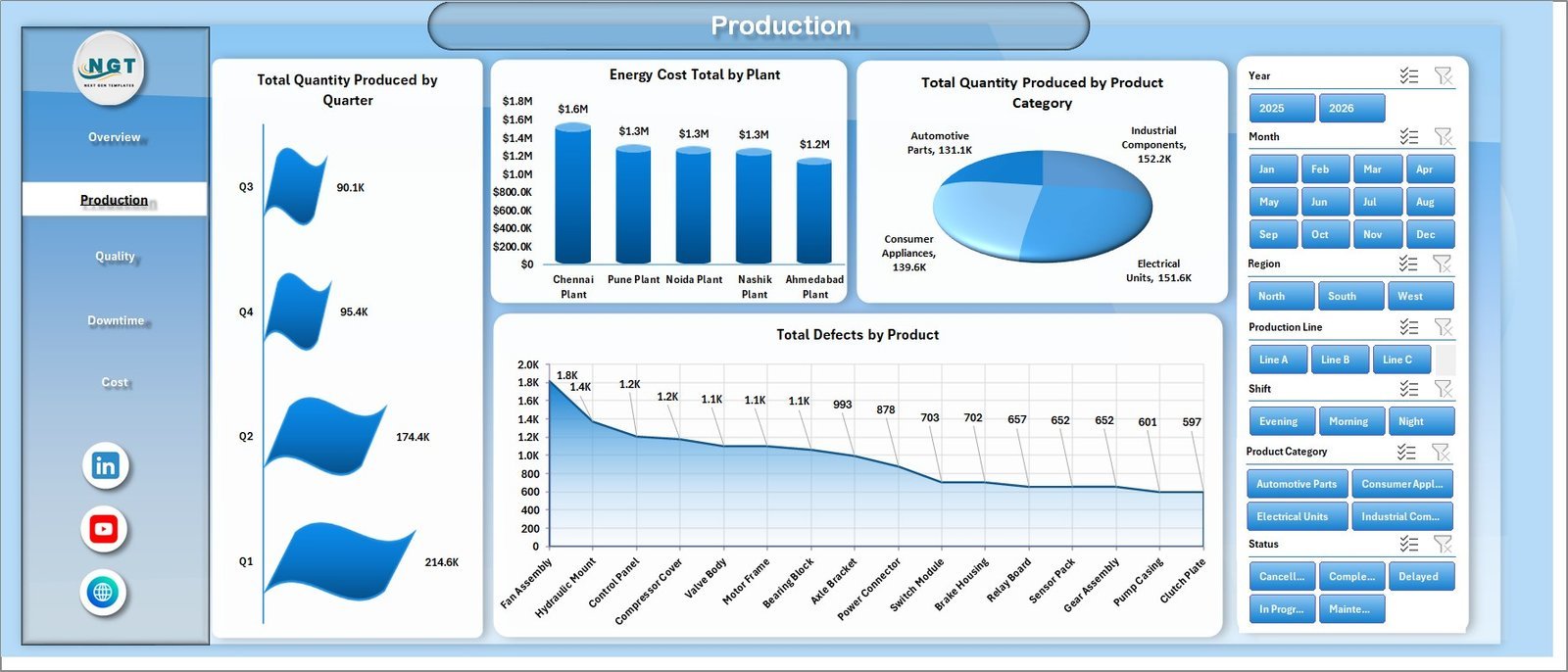
2. Agricultural Equipment Production Dashboard in Power BI — best for real-time plant floor
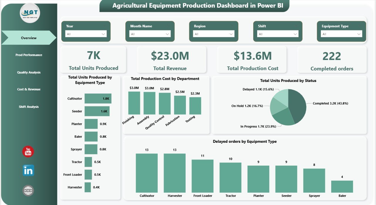
What it is: A Power BI production dashboard that slices output, defects and downtime by plant, line and product category with live refresh.
Who it is for: Multi-site operations that need Performance, MTTR and Unplanned Downtime % on a screen everyone can see.
- Total quantity produced by quarter, plant and product category.
- Defect-by-product Pareto for Quality analysis.
- Filterable by shift, line and region for per-asset OEE roll-ups.
Point it at a scheduled refresh and the morning meeting sees last night’s throughput and downtime without anyone touching a spreadsheet. Price: $17.99. Get the Power BI production dashboard.
Best for: shared, always-on plant-floor visuals.
3. Agricultural Equipment Production Dashboard in Excel — best offline tracker
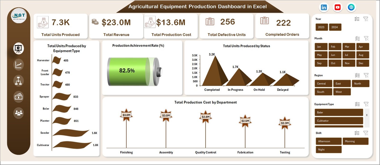
What it is: The Excel twin of the Power BI dashboard — the same production, defect and throughput tracking with no server or licence needed.
Who it is for: Lines with restricted IT, air-gapped plants, or teams that simply prefer a portable workbook.
- Production output and scrap/defect rate by product.
- Throughput trends per quarter and shift.
- Runs entirely offline — email it, no cloud dependency.
Ideal when you need Quality and Throughput on the shop floor but cannot install Power BI. Price: $13.99. Get the Excel production dashboard.
Best for: offline production and defect tracking.
4. Energy Efficiency KPI Dashboard in Excel — best for utilization & TEEP
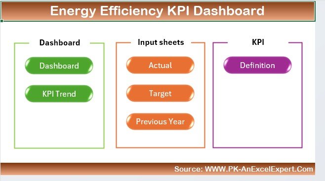
What it is: A KPI dashboard that tracks energy consumed per unit and asset utilization — the inputs behind TEEP and the true cost of scrap.
Who it is for: Energy-intensive plants that need to connect utilization to cost, not just to OEE.
- Utilization and energy-per-unit KPIs with monthly trends.
- Cost overlays so scrap is costed at full burden, not material only.
- Feeds the Utilization figure your TEEP calculation needs.
Pair it with the OEE dashboard to see how much of your energy bill is being consumed making scrap. Price: $14.99. Get the Energy Efficiency KPI Dashboard.
Best for: utilization, TEEP and energy-per-unit.
5. Warehouse Efficiency Dashboard in HTML — best for throughput on the web
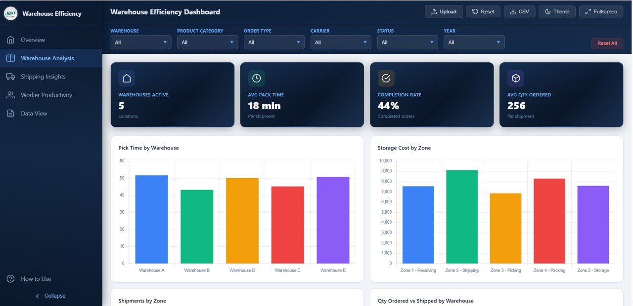
What it is: A browser-based dashboard for throughput, cycle time and order accuracy that opens on any device without Excel.
Who it is for: Warehouse and fulfilment teams tracking the downstream throughput that OEE ultimately feeds.
- Throughput and cycle-time KPIs in a responsive web page.
- Order-accuracy and efficiency views for logistics handoffs.
- Opens in any browser — no software install.
Use it to watch whether the units your line produces actually move at the same rate they are made. Price: $12.99. Get the Warehouse Efficiency Dashboard.
Best for: throughput and cycle time in a browser.
6. Logistics Efficiency KPI Dashboard in Google Sheets — best value
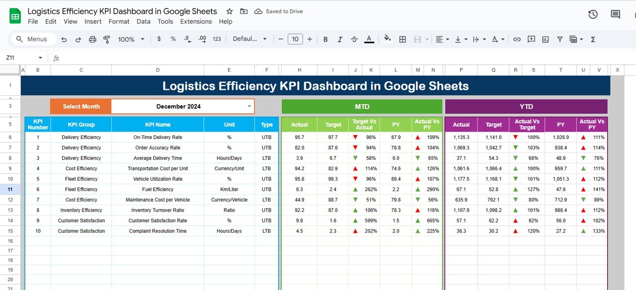
What it is: A cloud KPI dashboard for delivery, dispatch and throughput metrics that the whole team can edit at once.
Who it is for: Distributed teams who want live, shareable efficiency KPIs for the price of a coffee.
- Throughput and on-time KPIs updating in real time in Google Sheets.
- Share a link — no file versions, no email attachments.
- The cheapest entry point into efficiency dashboards at $9.99.
Start here if you want to prove the concept before committing to the full Excel OEE build. Price: $9.99. Get the Logistics Efficiency KPI Dashboard.
Best for: best value, cloud collaboration.
How to choose between them
| If you need… | Choose | Format |
|---|---|---|
| The full OEE calculation in one file | Manufacturing Efficiency Dashboard | Excel |
| Live, shared plant-floor screens | Agricultural Equipment Production Dashboard | Power BI |
| Offline production & defect tracking | Agricultural Equipment Production Dashboard | Excel |
| Utilization, TEEP & energy cost | Energy Efficiency KPI Dashboard | Excel |
| Throughput on any device | Warehouse Efficiency Dashboard | HTML |
| Cheapest cloud option | Logistics Efficiency KPI Dashboard | Google Sheets |
Rule of thumb: start with the OEE calculation Excel dashboard for the OEE core, then add the format that matches how your team already works — Power BI for shared screens, Google Sheets for remote collaboration. For a wider set of plant tools, compare the full range in our manufacturing dashboard templates guide, and see how formats stack up in Excel vs Google Sheets vs Power BI.
When a template is NOT the right answer
A spreadsheet OEE dashboard is the right tool up to a point. Be honest about where it stops:
- You need real-time machine data. If you want OEE updating every second straight from PLCs or sensors, you need a dedicated MES or IIoT platform, not a paste-in workbook. A template is for shift-level and daily tracking.
- You run hundreds of assets across many sites. At enterprise scale, governance, row-level security and automated data pipelines matter — compare purpose-built options in our Power BI dashboard templates ranked by industry and Power BI Premium alternatives roundups.
- You have no clean downtime data yet. No template can compute Availability from stops nobody logged. Fix the reason-code discipline on the floor first; the dashboard rewards good data, it cannot invent it.
For most SMB and single-plant teams, though, a $9.99–$17.99 template captures 90% of the value of a five-figure system — which is exactly why we recommend starting here. Teams comparing full BI suites can also weigh the Sisense alternatives and Domo alternatives before spending more.
Frequently asked questions
What is the OEE formula?
OEE = Availability × Performance × Quality. Availability is Run Time divided by Planned Production Time, Performance is (Ideal Cycle Time × Total Count) divided by Run Time, and Quality is Good Count divided by Total Count. Multiply the three percentages together for a single effectiveness score.
How do I do an OEE calculation in Excel?
Log Planned Production Time, downtime, total count and good count per shift. Compute Availability, Performance and Quality with the three formulas, then multiply them. An OEE calculation Excel template like the Manufacturing Efficiency Dashboard wires these together so the score updates the moment you paste new data.
What is a good OEE score?
85% is considered world-class for discrete manufacturing. The typical plant averages around 60%, and 40% is common for lines that have never been measured. Rather than chase an absolute, target a steady upward trend and close the gap toward 85%.
What is the difference between OEE and TEEP?
OEE measures effectiveness against planned production time; TEEP measures it against all calendar time. TEEP = OEE × Utilization. The gap between the two is capacity you already own but are not scheduling — often idle weekends or a third shift.
What is the difference between MTBF and MTTR?
MTBF (Mean Time Between Failures) measures reliability — how long an asset runs between breakdowns. MTTR (Mean Time To Repair) measures maintainability — how quickly you restore it after a failure. High MTBF and low MTTR together mean equipment that rarely stops and recovers fast when it does.
What counts as unplanned downtime?
Any stop during planned production time that was not scheduled: breakdowns, material shortages, overrun changeovers, and operator absences. Scheduled maintenance and planned breaks are excluded from Planned Production Time entirely, so they do not count as unplanned downtime.
Which OEE factor should I improve first?
Calculate all three, then attack the lowest. For most plants that is Availability, because unplanned downtime is the largest single loss. Use a downtime Pareto with reason codes to find the vital few stops, fix those, and re-measure before moving to Performance.
Can I track OEE in Google Sheets instead of Excel?
Yes. The same formulas work in Google Sheets, which adds live sharing and no version conflicts. The Logistics Efficiency KPI Dashboard in Google Sheets ($9.99) is the best-value cloud starting point, though the full OEE stack is most complete in the Excel dashboard.
How often should I update OEE metrics?
Capture data every shift and review OEE daily in a short stand-up. Review MTBF, MTTR and scrap trends weekly, and TEEP monthly when you plan capacity. Daily cadence catches problems while the shift crew still remembers what happened.
Do these templates work for any industry?
Yes. Although two are branded for agricultural-equipment production, the OEE, downtime and throughput formulas are industry-agnostic. Replace the sample product names with your own SKUs and the calculations hold for food, pharma, automotive, textiles or any discrete or batch process.
Get more OEE & manufacturing templates
Start with the Manufacturing Efficiency Dashboard in Excel ($17.99) for the full OEE calculation, or the Logistics Efficiency KPI Dashboard in Google Sheets ($9.99) if you want the cheapest cloud entry point. Browse the complete range in our manufacturing dashboard templates guide, and if you also run back-office numbers, see payroll calculation in Excel. Watch full walkthroughs on the NextGenTemplates YouTube channel.