
Advocacy is about impact. Campaigns, stakeholder engagement, fundraising drives, research initiatives — everything is focused on creating measurable change. But if your organization is still managing performance using scattered spreadsheets and manual reports, you are missing clarity and control.
What if you could track campaign reach, engagement rates, fundraising performance, and policy outcomes in one structured dashboard?
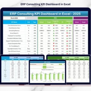
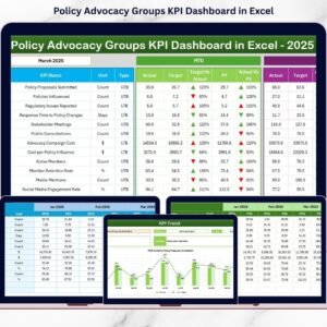
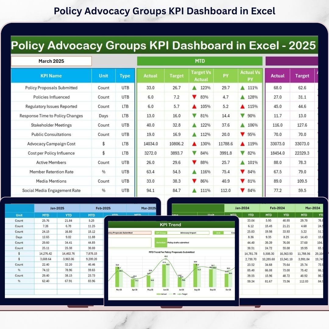
The Policy Advocacy Groups KPI Dashboard in Excel is a ready-to-use performance monitoring system designed specifically for advocacy organizations, NGOs, and social impact groups. It centralizes all key performance indicators into one powerful Excel file and converts raw numbers into meaningful visual insights.
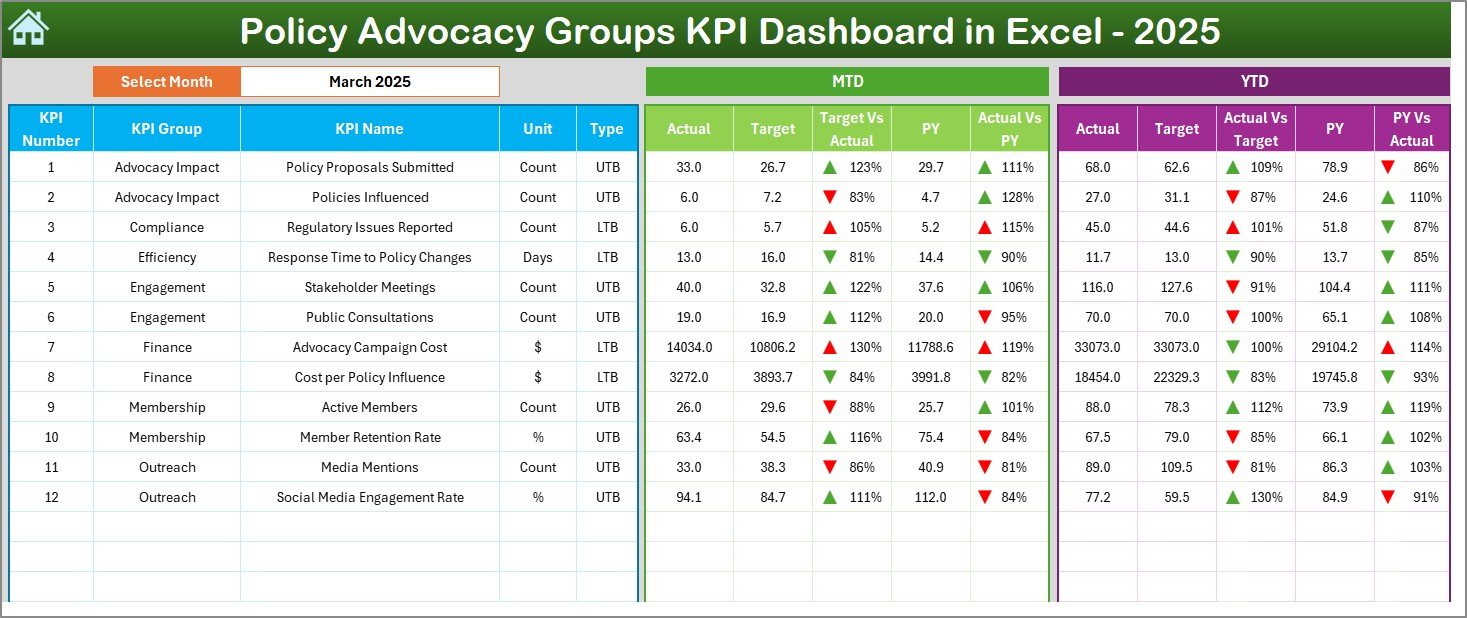
Instead of spending hours preparing monthly reports, simply select a month and instantly analyze MTD (Month-to-Date) and YTD (Year-to-Date) results.
Stop guessing your impact. Start measuring it. 🚀
🚀 Key Features of Policy Advocacy Groups KPI Dashboard in Excel
📊 Interactive Monthly Dashboard
Select the desired month from a drop-down (Cell D3) and the entire dashboard updates automatically. Instantly review MTD and YTD performance.
🎯 Target vs Actual Comparison
Monitor how each KPI performs against defined targets with automatic variance calculations.
📈 Previous Year Comparison
Compare current year results with last year’s data to measure growth and progress.
🟢🔴 Performance Direction Arrows
Conditional formatting indicators clearly show improvement or decline at a glance.
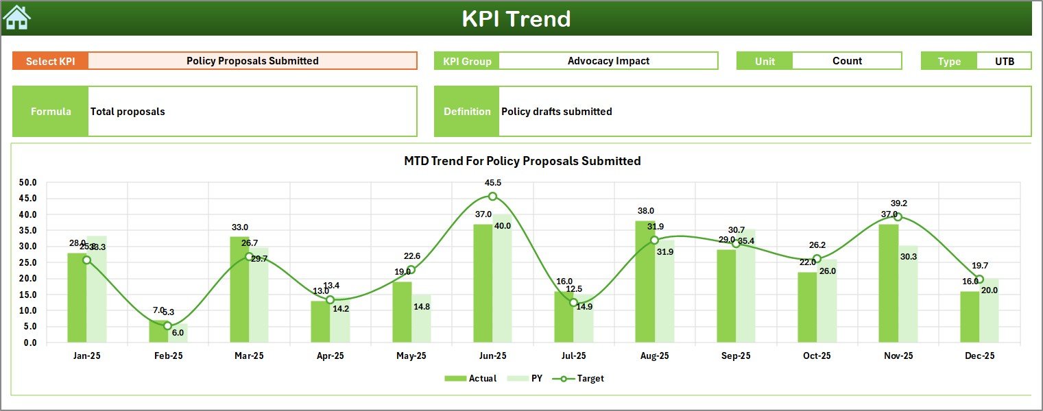
📉 KPI Trend Analysis
Analyze monthly and yearly trends using dynamic trend charts for better strategic planning.
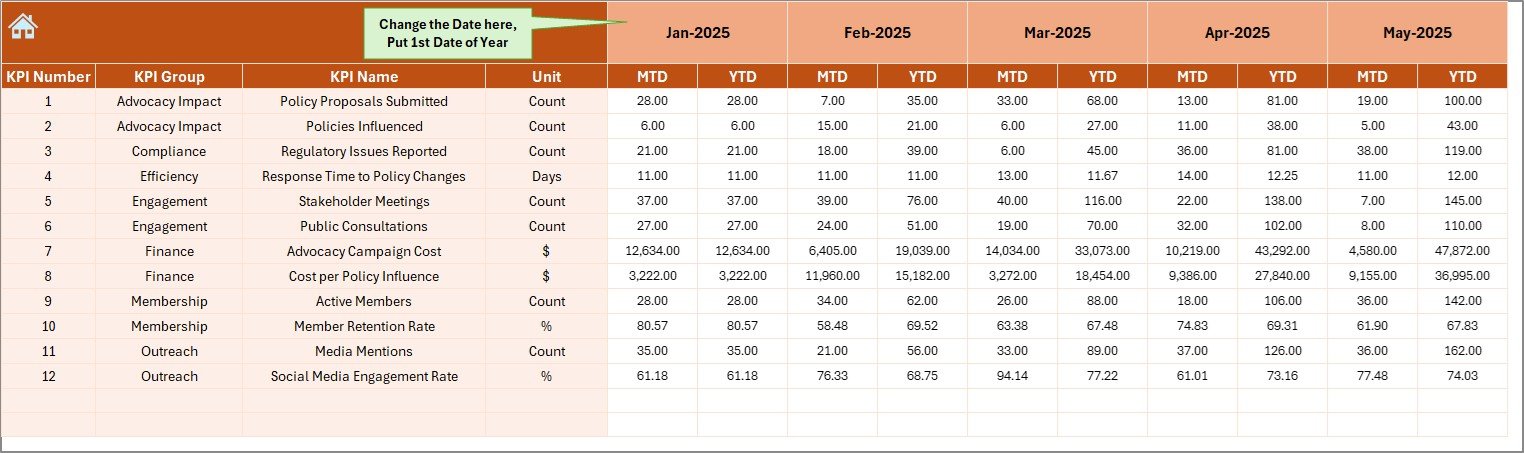
🧾 Structured Data Entry Sheets
Organized sheets for Actuals, Targets, Previous Year, and KPI Definitions ensure clean and consistent data management.
🧭 Easy Navigation Home Sheet
Quick navigation buttons allow smooth movement between worksheets without confusion.
⚙️ Fully Customizable Framework
Add new KPIs, modify targets, or adjust groups easily using Excel’s flexible structure.
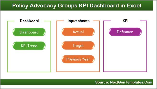
📦 What’s Inside the Policy Advocacy Groups KPI Dashboard in Excel
This dashboard includes 7 professionally designed worksheets:
-
🏠 Home Sheet – Navigation hub for easy access
-
📊 Main Dashboard Sheet – MTD & YTD performance overview
-
📈 KPI Trend Sheet – Detailed KPI-level trend analysis
-
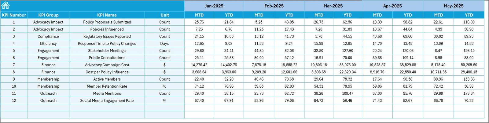
✏️ Actual Numbers Sheet – Monthly performance data entry
-
🎯 Target Sheet – Monthly & YTD target tracking
-
📅 Previous Year Sheet – Historical comparison data
-
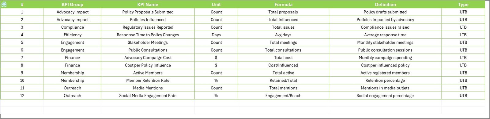
📘 KPI Definition Sheet – KPI name, formula, group, and logic
You can track essential advocacy KPIs such as:
-
Campaign Reach
-
Stakeholder Engagement Rate (%)
-
Petition Signatures Collected
-
Policy Meetings Conducted
-
Media Mentions
-
Social Media Engagement Rate
-
Fundraising Amount
-
Volunteer Participation Rate
-
Policy Adoption Rate
-
Event Attendance
Everything is structured for clarity, accountability, and transparency.
🛠 How to Use the Policy Advocacy Groups KPI Dashboard in Excel
Using the dashboard is simple:
1️⃣ Enter monthly actual performance data in the Actual Numbers Sheet
2️⃣ Define monthly and YTD targets in the Target Sheet
3️⃣ Enter previous year data in the Previous Year Sheet
4️⃣ Select the desired month in Cell D3 on the dashboard
5️⃣ Instantly analyze performance results
The dashboard updates automatically once data is entered.
You can immediately see whether stakeholder engagement improved, fundraising targets were met, or campaign performance declined.
No advanced Excel skills required — everything is structured and user-friendly.
👥 Who Can Benefit from This Policy Advocacy Groups KPI Dashboard in Excel
This dashboard is ideal for:
-
Policy Advocacy Groups
-
NGOs and Non-Profit Organizations
-
Social Impact Organizations
-
Campaign Managers
-
Fundraising Teams
-
Research Institutions
-
Board Members and Leadership Teams
If you present reports to donors, board members, or stakeholders, this dashboard helps you demonstrate measurable impact clearly and professionally.
When engagement drops or campaign reach declines, you detect it instantly and adjust strategies proactively.
That’s strategic advocacy management powered by data.
Why This Dashboard Makes a Difference 💡
-
Centralizes performance tracking
-
Improves transparency and credibility
-
Simplifies donor reporting
-
Highlights performance gaps early
-
Supports data-driven strategy
-
Encourages accountability across teams
-
Saves reporting time every month
If fundraising drops below target or volunteer participation declines, you can act immediately instead of discovering the issue months later.
Impact becomes measurable — and manageable.
# Click hare to read the Detailed blog post
Visit our YouTube channel to learn step-by-step video tutorials:
👉 Youtube.com/@PKAnExcelExpert