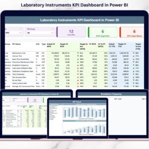
Laboratories thrive on precision, uptime, and compliance. But if your team still compiles instrument reports manually, you’re losing valuable hours every month. Laboratory Instruments KPI Dashboard in Power BI Delayed insights lead to missed calibration schedules, rising downtime, and unclear performance gaps.
What if you could monitor all laboratory instrument KPIs in one powerful, interactive dashboard?
Laboratory Instruments KPI Dashboard in Power BI the Laboratory Instruments KPI Dashboard in Power BI is a ready-to-use, professionally designed solution that converts structured Excel data into real-time visual intelligence. Instead of reviewing static reports, you can instantly analyze MTD and YTD performance, compare targets, and track year-over-year growth with just a few clicks.
This dashboard empowers laboratory managers to stop reacting late and start making proactive, data-driven decisions. 🚀
🚀 Key Features of Laboratory Instruments KPI Dashboard in Power BI
📊 Real-Time KPI Monitoring
Refresh your Power BI file and instantly view updated MTD and YTD performance metrics.
🎯 Target vs Actual Comparison
Automatically calculate performance gaps and identify whether KPIs meet or miss targets.
📈 Year-over-Year Analysis
Compare Current Year vs Previous Year data for deeper performance insights.
🔎 Interactive Slicers
Use Month and KPI Group slicers to filter data dynamically and analyze specific segments.
🟢🔴 Visual Performance Indicators
Green ▲ and Red ▼ icons instantly show performance direction based on LTB and UTB logic.
📊 Detailed KPI Performance Table
View KPI Name, Group, Unit, Actual, Target, Previous Year, and percentage variance in one structured table.
📉 KPI Trend Combo Charts
Analyze MTD and YTD trends with visual combo charts (Actual, Target, PY).
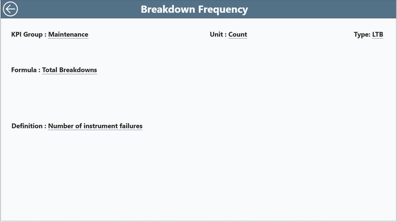
🧾 Drill-Through KPI Definitions
Right-click any KPI to view its formula, definition, unit, and logic for audit transparency.
📦 What’s Inside the Laboratory Instruments KPI Dashboard in Power BI
This solution includes 3 fully interactive Power BI pages:
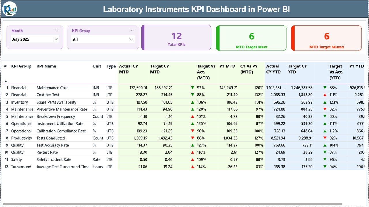
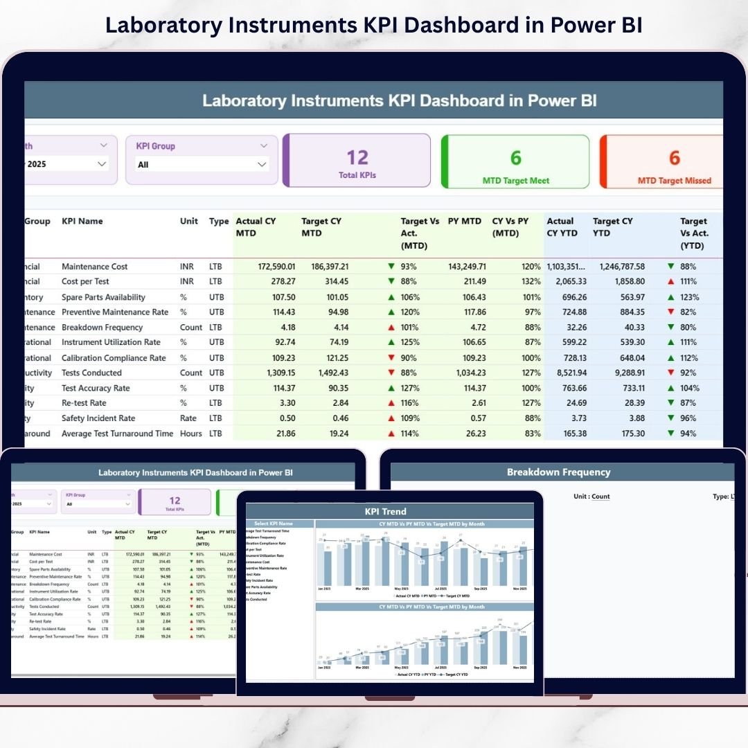
1️⃣ Summary Page
The main performance overview page featuring:
-
KPI Count Cards (Total KPIs, Target Met, Target Missed)
-
Interactive Month & KPI Group slicers
-
Detailed KPI comparison table
-
Icon-based performance indicators
This page gives you instant clarity on overall laboratory performance.
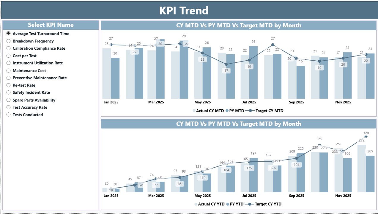
2️⃣ KPI Trend Page
A visual analysis page where you:
-
Select a KPI using a slicer
-
View MTD Combo Chart (Actual vs Target vs PY)
-
View YTD Combo Chart (Actual vs Target vs PY)
Trend analysis helps you detect declining performance early and plan corrective action.
3️⃣ KPI Definition Page (Drill-Through)
Access KPI formulas, definitions, unit types, and performance logic (LTB/UTB) directly from the Summary page. This improves compliance, transparency, and audit readiness.
🛠 How to Use the Laboratory Instruments KPI Dashboard in Power BI
Using this dashboard is simple and structured:
1️⃣ Enter KPI data into the Excel data file:
-
Input_Actual Sheet (MTD & YTD actual values)
-
Input_Target Sheet (MTD & YTD target values)
-
KPI Definition Sheet (KPI name, formula, unit, type)
2️⃣ Use the first date of each month for consistency.
3️⃣ Refresh Power BI Desktop.
4️⃣ Use slicers to analyze specific months or KPI groups.
Within seconds, you can evaluate performance gaps, compliance rates, and operational efficiency.
No complex modeling required from your side — everything is pre-built and ready to use.
👥 Who Can Benefit from This Laboratory Instruments KPI Dashboard in Power BI
This dashboard is ideal for:
-
Laboratory Managers
-
Hospital Diagnostic Centers
-
Pharmaceutical Laboratories
-
Research Institutions
-
Equipment Maintenance Teams
-
Quality Assurance Departments
Whether you manage 10 instruments or 500, this dashboard scales easily to your operational needs.
If equipment availability drops below 95% or downtime increases unexpectedly, you detect it immediately — not after monthly reporting delays.
That’s the power of real-time visibility.
Why This Dashboard Stands Out 💡
-
Reduces manual reporting time
-
Improves compliance tracking
-
Centralizes KPI data in one structured model
-
Enhances decision-making speed
-
Supports preventive maintenance planning
-
Highlights performance risks instantly
-
Ensures audit transparency
When preventive maintenance completion drops or downtime rises, you see it visually — and act before issues escalate.
This is smarter laboratory management powered by data.
# Click hare to read the Detailed blog post
Visit our YouTube channel to learn step-by-step video tutorials:
👉 Youtube.com/@PKAnExcelExpert