The dairy industry operates in a fast-changing environment 🥛📊. Milk prices fluctuate weekly. Distribution costs vary by region. Seasonal demand shifts product performance dramatically. Therefore, dairy companies must monitor sales, cost, profit margins, customer segments, and channel performance in real time.
However, many dairy businesses still rely on scattered Excel files and manual reports. As a result, managers struggle to identify profit leakage, track regional performance, and optimize product mix efficiently.
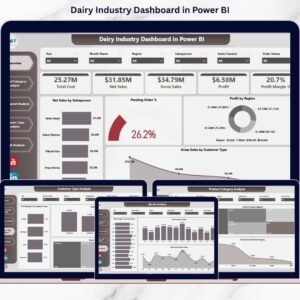
That is exactly why the Dairy Industry Dashboard in Power BI becomes a game-changing solution.
This ready-to-use Power BI dashboard transforms raw dairy sales and operational data into interactive, easy-to-understand insights. Instead of juggling multiple spreadsheets, you monitor net sales, gross sales, cost, profit margin, customer type, product category, sales channel, and monthly trends — all in one centralized system.
Because it connects directly to Excel or structured data sources, the dashboard updates instantly when you refresh. Therefore, decision-makers always work with accurate, up-to-date numbers.
If you want structured reporting, stronger margin control, and data-driven decisions, this dashboard is built for you.
🔑 Key Features of Dairy Industry Dashboard in Power BI
🥛 5 Interactive Analytical Pages
Structured pages for product, channel, customer, and monthly performance.
📊 Executive Overview Dashboard
Instant snapshot of net sales, profit, and pending orders.
📈 Profit & Margin Monitoring
Track profit margin % across products, regions, and channels.
🌍 Region & Salesperson Performance Analysis
Evaluate team and geographic profitability.
📦 Product Category Intelligence
Understand which dairy products generate real profit.
🛒 Sales Channel & Customer Type Insights
Optimize distribution and pricing strategies.
📅 Month-Wise Trend Tracking
Analyze seasonal demand and margin fluctuations.
⚡ Real-Time Data Refresh
Instantly update visuals with one refresh.
📊 Dashboard Structure – 5 Powerful Pages Explained
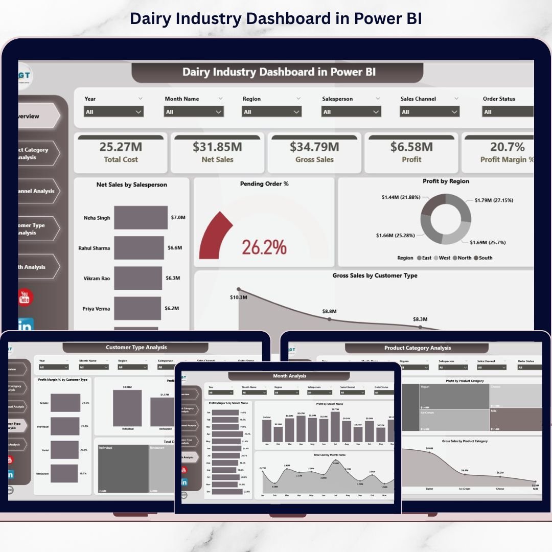
1️⃣ Overview Page – Executive Control Panel
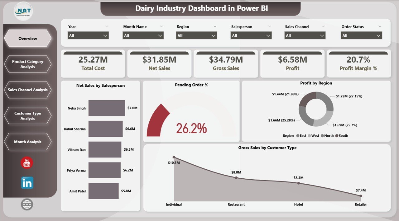
The Overview Page provides a complete business snapshot.
🔹 Dynamic Slicers
-
Year
-
Month
-
Region
-
Salesperson
-
Product Category
-
Customer Type
-
Sales Channel
🔹 KPI Cards
-
Net Sales by Salesperson
-
Pending Order %
-
Profit by Region
-
Gross Sales by Customer Type
-
Overall Profit Margin %
This page helps management instantly detect fulfillment delays, margin drops, or regional performance gaps.
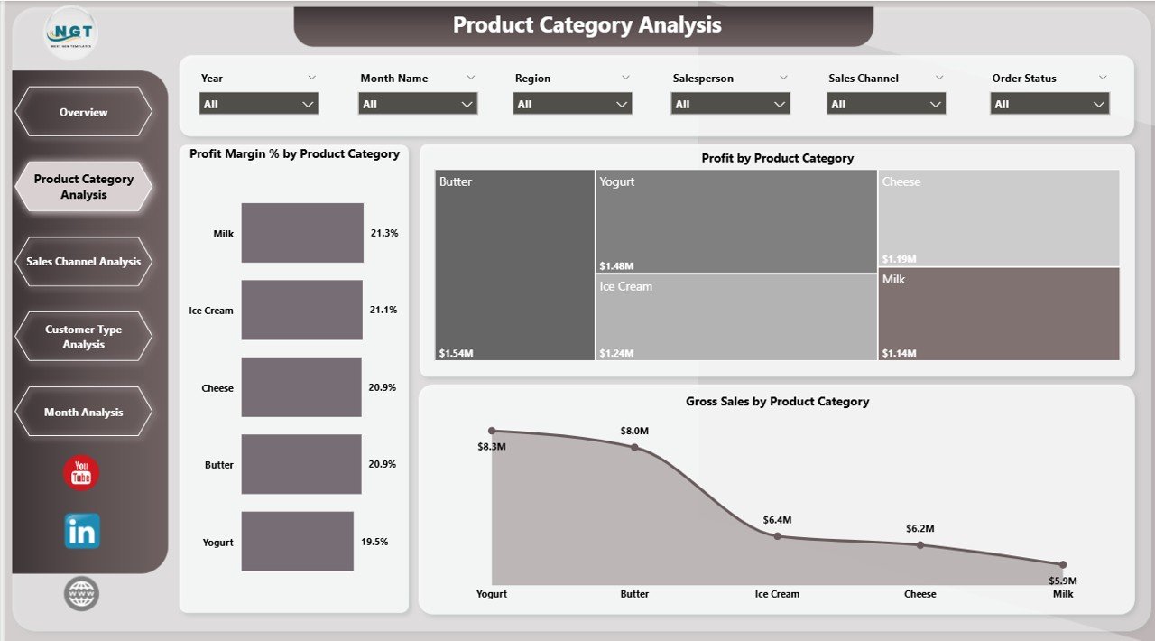
2️⃣ Product Category Analysis – Which Products Drive Profit?
Dairy businesses manage multiple categories:
Milk, Cheese, Butter, Yogurt, Cream, Ice Cream, Paneer.
However, high sales do not always mean high profit.
🔹 Charts Include:
-
Profit Margin % by Product Category
-
Profit by Product Category
-
Gross Sales by Product Category
This page helps you:
✔ Identify high-margin products
✔ Detect low-margin high-volume products
✔ Optimize product mix strategy
For example, milk may generate high revenue but lower margins, while cheese may provide stronger profitability.
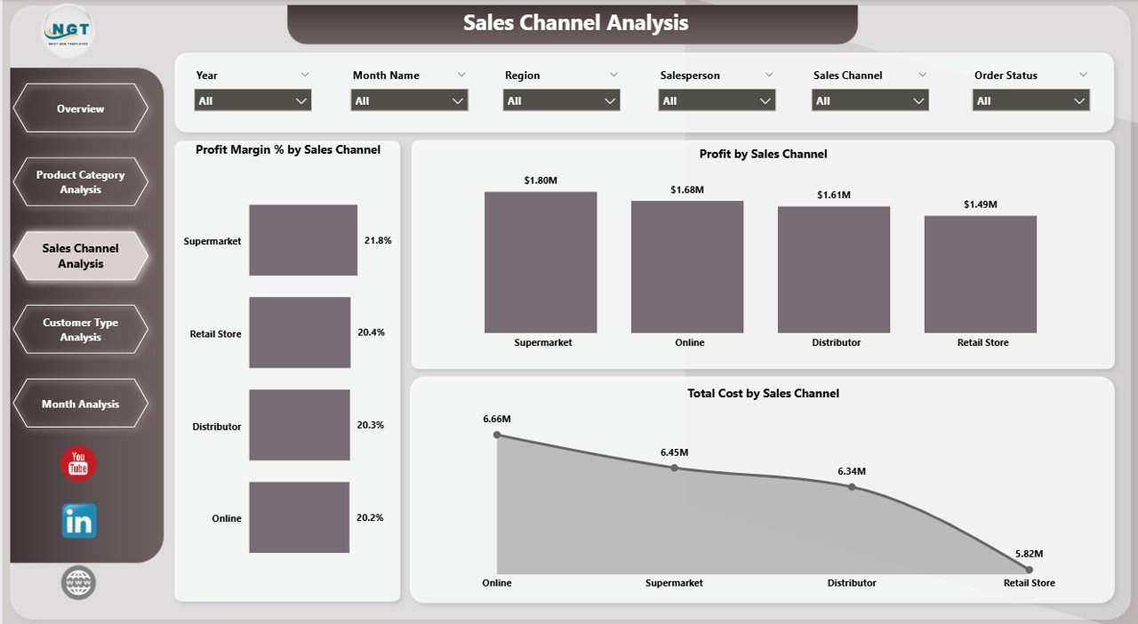
3️⃣ Sales Channel Analysis – Optimize Distribution Strategy
Dairy products move through multiple channels:
Retail Stores, Supermarkets, Distributors, Online Sales, Direct Sales.
Each channel carries a different cost structure.
🔹 Charts Include:
-
Profit Margin % by Sales Channel
-
Profit by Sales Channel
-
Total Cost by Sales Channel
You can:
✔ Identify the most profitable channel
✔ Reduce dependency on low-margin channels
✔ Improve commission and pricing structures
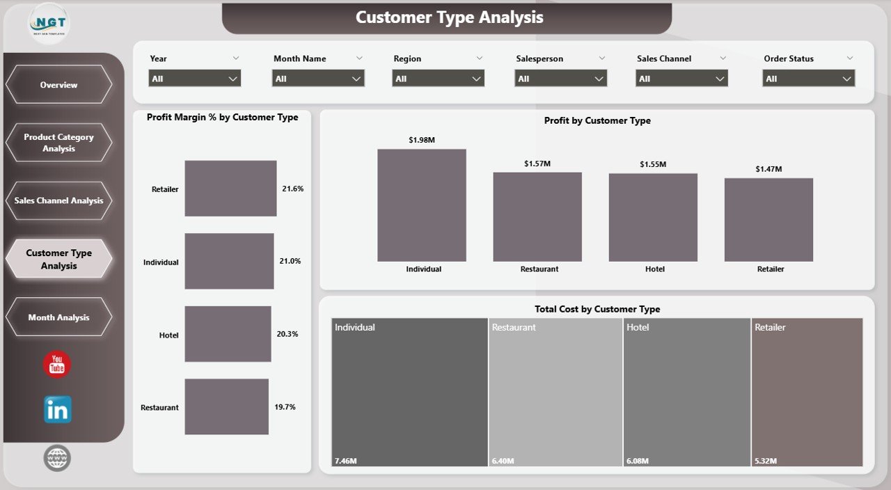
4️⃣ Customer Type Analysis – Segment for Better Profit
Not all customers generate equal value.
Common customer types include:
Wholesalers, Retailers, Institutional Buyers, Supermarkets, Restaurants.
🔹 Charts Include:
-
Profit Margin % by Customer Type
-
Profit by Customer Type
-
Total Cost by Customer Type
This page enables:
✔ Stronger customer segmentation
✔ Better discount management
✔ Strategic contract negotiations
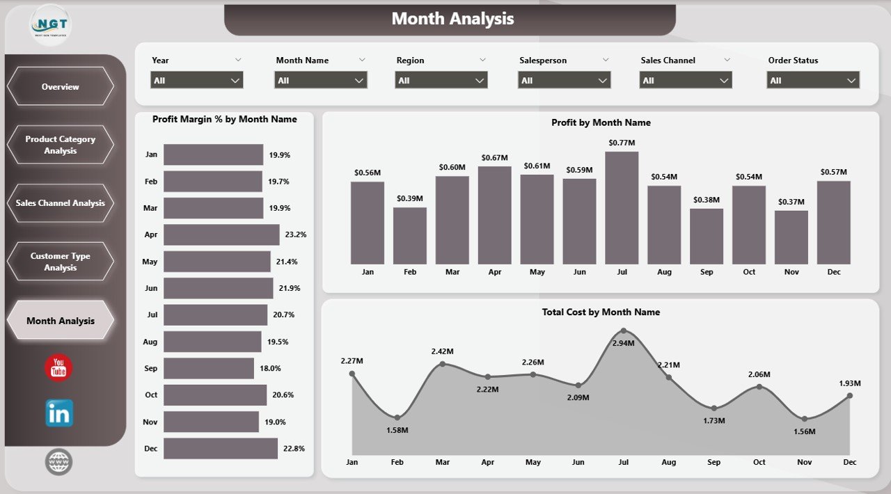
5️⃣ Month Analysis – Seasonal Intelligence
The dairy industry is highly seasonal:
☀ Summer → Yogurt & Ice Cream Demand
❄ Winter → Butter & Cream Sales
🎉 Festivals → Overall Sales Growth
🔹 Charts Include:
-
Profit Margin % by Month
-
Profit by Month
-
Total Cost by Month
This analysis supports:
✔ Seasonal forecasting
✔ Production planning
✔ Inventory optimization
✔ Demand forecasting
📌 Key KPIs Included
The dashboard tracks essential dairy KPIs:
-
Net Sales
-
Gross Sales
-
Total Cost
-
Profit
-
Profit Margin %
-
Pending Order %
-
Sales by Region
-
Sales by Channel
-
Sales by Customer Type
-
Monthly Performance Trends
Together, these KPIs provide complete operational and financial visibility.
🚀 Advantages of Dairy Industry Dashboard in Power BI
1️⃣ Real-Time Business Visibility
Make faster decisions with updated numbers.
2️⃣ Profit Optimization
Focus on high-margin products and channels.
3️⃣ Cost Control
Monitor cost drivers across customer types and regions.
4️⃣ Better Sales Strategy
Evaluate salesperson and regional performance.
5️⃣ Interactive & Dynamic Analysis
Use slicers to drill down instantly.
6️⃣ Improved Forecasting
Month-wise trends support demand planning.
7️⃣ Scalable & Professional Reporting
Power BI handles large datasets efficiently.
🛠️ How to Use the Dairy Industry Dashboard in Power BI
1️⃣ Prepare structured Excel data (Sales, Cost, Product, Customer, Date).
2️⃣ Import data into Power BI Desktop.
3️⃣ Create relationships and DAX measures.
4️⃣ Use slicers to filter by region, product, or channel.
5️⃣ Refresh data regularly for updated insights.
6️⃣ Share dashboard with stakeholders.
Within minutes, your dairy data becomes actionable intelligence.
👥 Who Can Benefit from This Dashboard?
🥛 Dairy Manufacturers
🏭 Milk Processing Units
🚚 Dairy Distributors
🏬 Retail Chains
📊 Business Analysts
💼 Finance & Operations Managers
If you manage dairy sales, distribution, or profitability, this dashboard simplifies performance tracking.
### Click here to read the Detailed blog post
🔗 Visit our YouTube channel to learn step-by-step video tutorials
👉 https://youtube.com/@PKAnExcelExpert