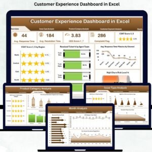
Customer experience is one of the biggest factors that decide whether a business grows or loses customers. When customers receive quick support, clear communication, and timely resolutions, they stay loyal for years. However, understanding customer satisfaction becomes difficult when important data—tickets, feedback, response time, churn indicators—sits in multiple sheets. The Customer Experience Dashboard in Excel solves this challenge instantly.
This powerful dashboard brings all customer-related KPIs into a single, clean, visual interface. It helps managers monitor performance, identify service gaps, and take fast, informed decisions. With dynamic slicers, pivot charts, and KPI cards, you can track CSAT, NPS, response time, resolution rates, complaint trends, churn risk, and product-related issues—all in one place.
Built entirely in Excel, this dashboard requires no coding or special software. It updates instantly when you refresh your data sheet, making it perfect for customer service teams, support leaders, product managers, and business owners who want clarity and actionable insights.
📊 Key Features of the Customer Experience Dashboard in Excel
This dashboard includes five analytical pages, a page navigator, and a dynamic data structure. Each page reveals powerful insights about customer behavior and service performance.
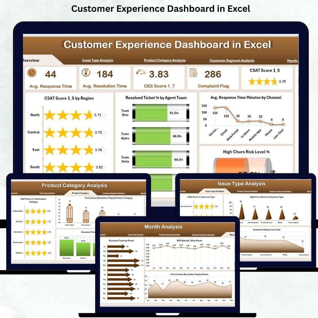
⭐ 1. Overview Page – Your Main Control Panel
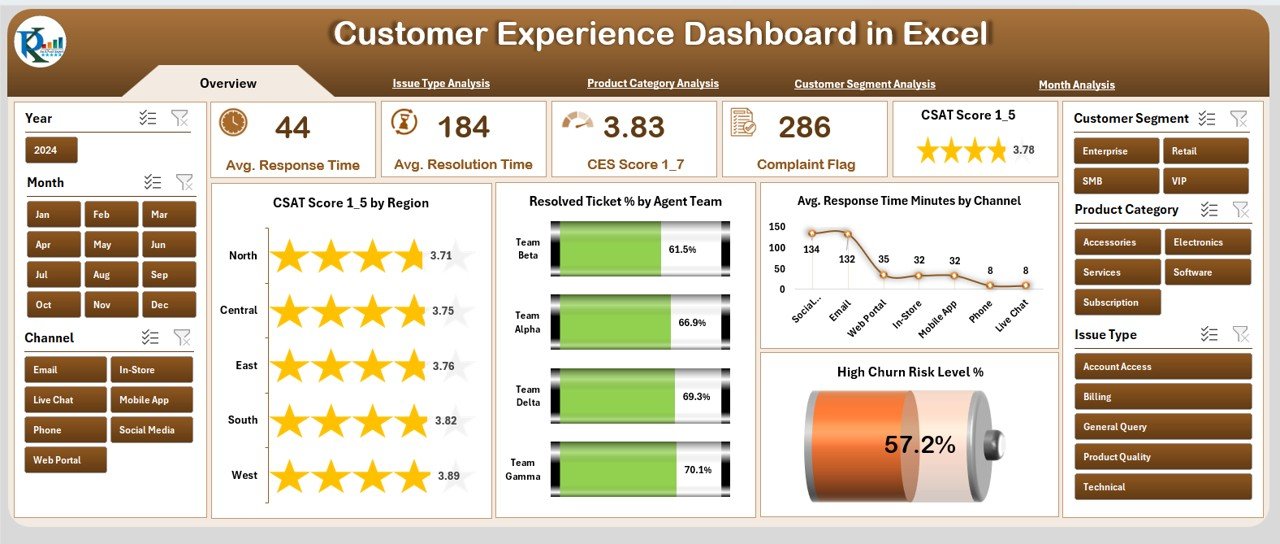
The Overview Page gives a quick snapshot of customer experience performance.
It includes:
-
✔ Page Navigator for easy movement
-
✔ Right-side slicers to filter region, product, segment, or channel
-
✔ Five KPI Cards:
-
CSAT Score
-
Resolved Ticket %
-
Average Response Time
-
High Churn Risk Level (%)
-
-
✔ Four charts showing:
-
CSAT Score by Region
-
Resolved Ticket % by Agent Team
-
Response Time by Channel
-
High Churn Risk %
-
This page helps decision-makers understand performance at a glance.
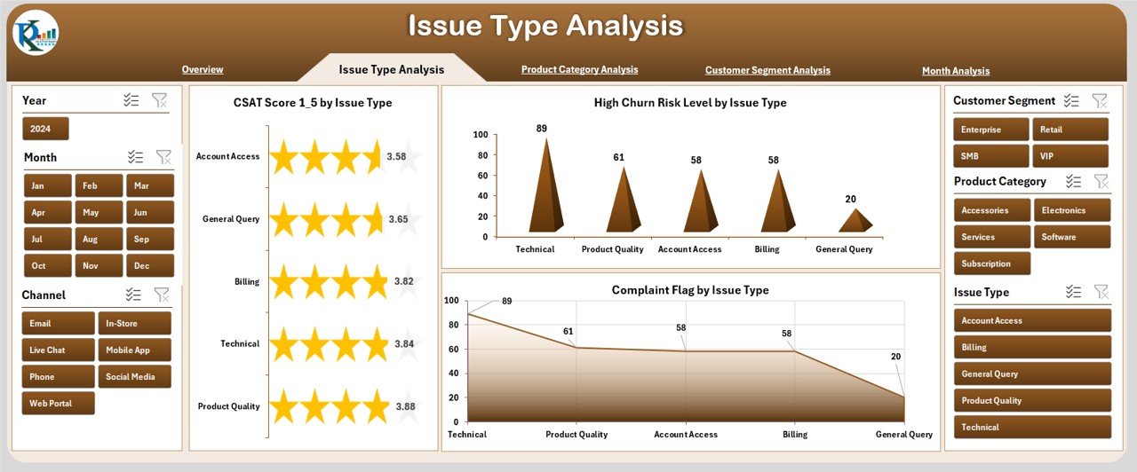
⭐ 2. Issue Type Analysis Page – Identify Critical Problem Areas
This page highlights the impact of different issue types on customer experience.
Charts include:
-
✔ CSAT Score by Issue Type
-
✔ High Churn Risk by Issue Type
-
✔ Completed Flag by Issue Type
These insights help prioritize issue categories that need immediate attention.
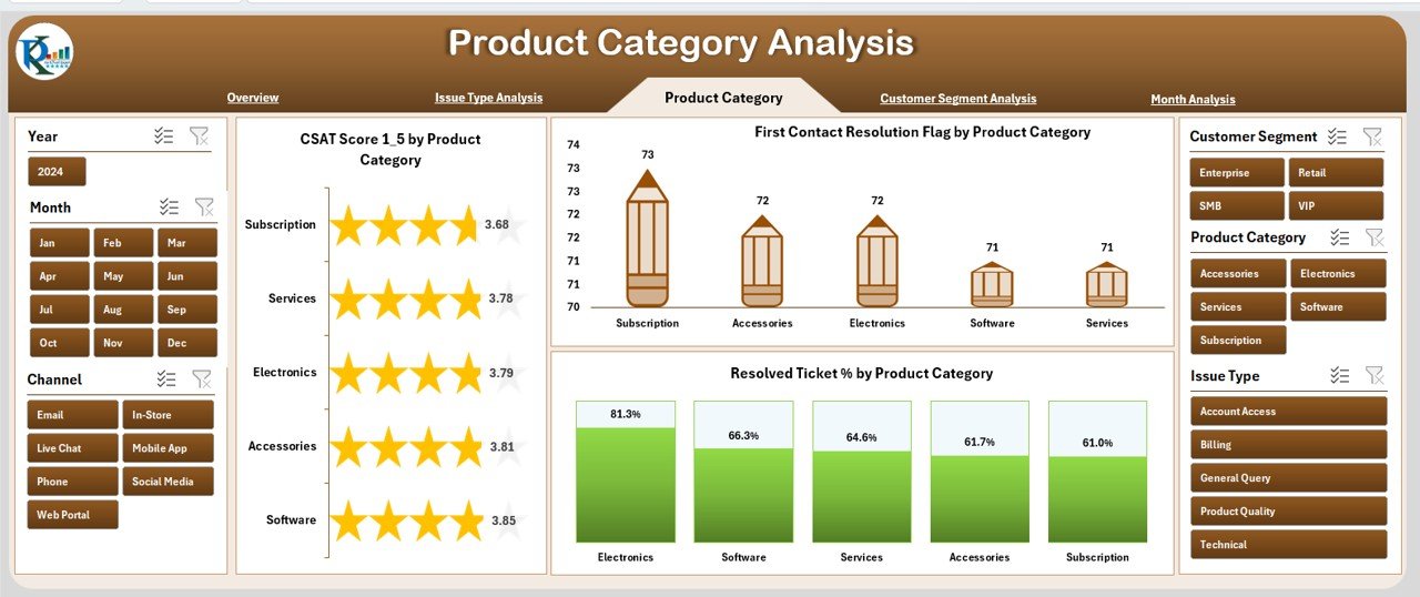
⭐ 3. Product Category Analysis Page – Track Product-Level Performance
Different products generate different types of customer concerns.
This page includes:
-
✔ CSAT Score by Product Category
-
✔ First Contact Resolution (FCR) Flag
-
✔ Resolved Ticket %
You can quickly identify which products deliver great experiences and which need improvement.
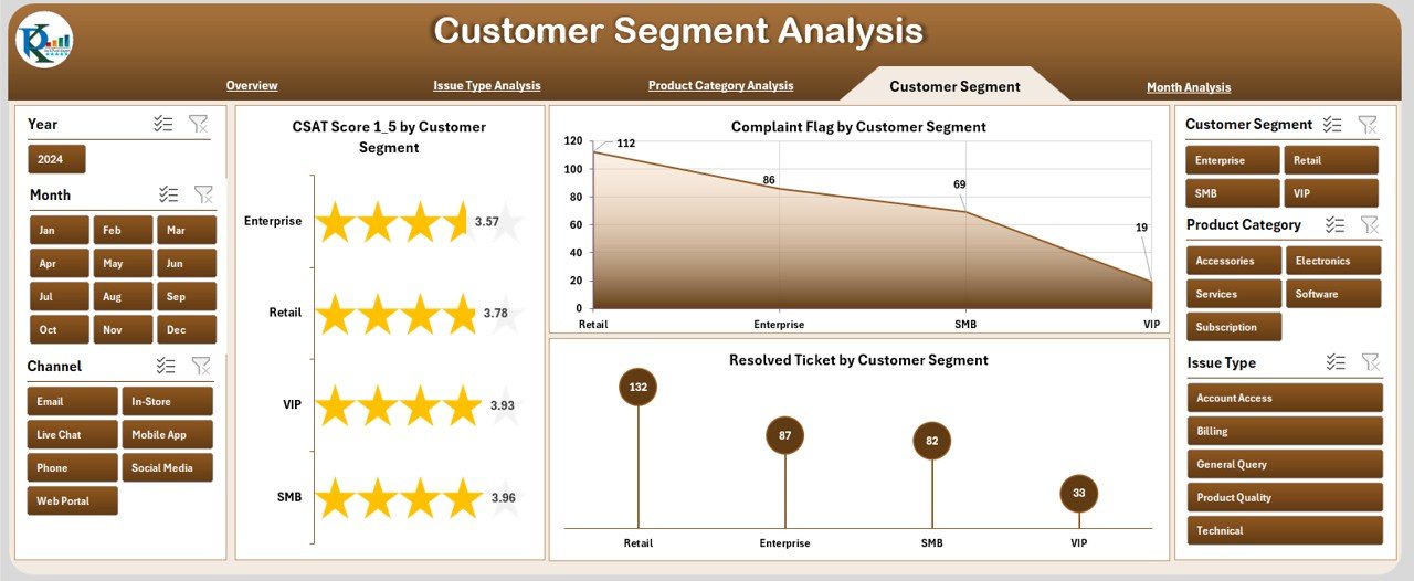
⭐ 4. Customer Segment Analysis Page – Understand Segment Behavior
Every customer segment has different expectations and support patterns.
This page helps you track:
-
✔ CSAT Score by Customer Segment
-
✔ Complaint Flag
-
✔ Resolved Ticket Metrics
These insights help personalize service strategies for each segment.
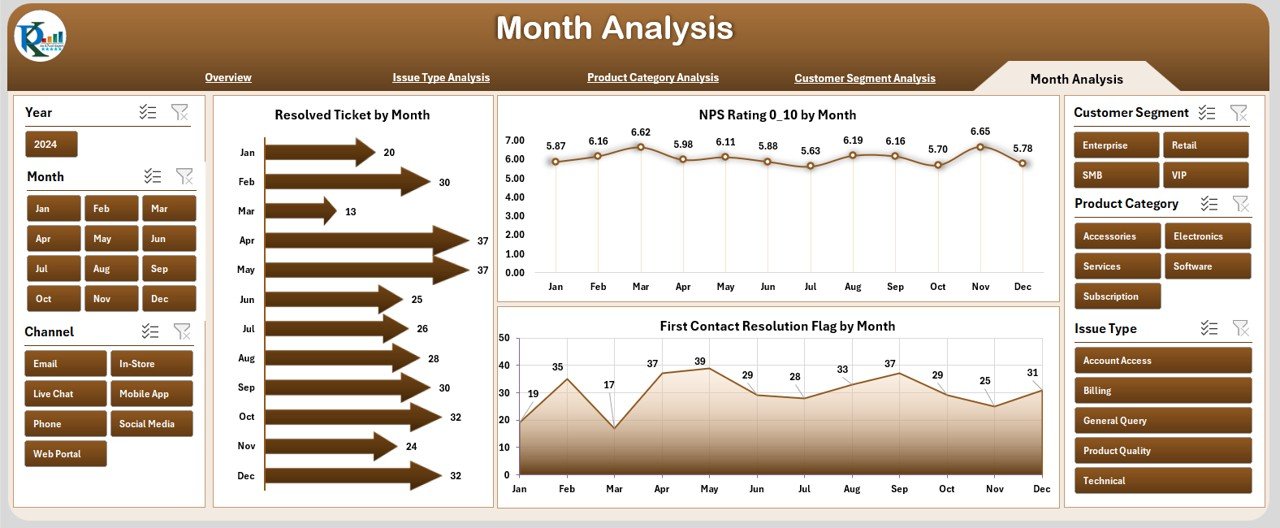
⭐ 5. Month Analysis Page – Track Monthly Experience Trends
Customer experience fluctuates monthly due to volume changes, new releases, or seasonal demand.
This page includes:
-
✔ Resolved Ticket by Month
-
✔ NPS Rating by Month
-
✔ First Contact Resolution Flag
These trends help teams identify improvements, declines, and seasonal behaviors.
📦 What’s Inside the Customer Experience Dashboard in Excel
The dashboard includes:
-
5 detailed analysis pages
-
A clean and organized Data Sheet
-
Page navigator for easy access
-
KPI cards for instant highlights
-
Slicers for dynamic filtering
-
Pivot-based charts and tables
-
Fully customizable layout
Once you update the data sheet, all visuals refresh automatically.
🧩 How to Use the Customer Experience Dashboard Effectively
Using this dashboard is simple:
-
Add customer support and feedback data into the Data Sheet
-
Refresh the pivot tables
-
Use slicers to filter by region, product, issue type, or customer segment
-
Review CSAT, FCR, NPS, and ticket resolution metrics
-
Compare monthly results
-
Identify high churn risk customers
-
Improve agent and service strategies based on insights
No coding or advanced Excel skills required.
👤 Who Can Benefit from This Dashboard
This dashboard is perfect for:
-
💬 Customer Support Teams
-
🧭 CX Managers
-
📞 Call Center Leaders
-
🛠 Product Support Teams
-
📊 Business Analysts
-
🧑💼 Operations Managers
-
🏢 Business Owners
Any company that values customer experience will benefit from this tool.
### Click hare to read the Detailed blog post
Visit our YouTube channel to learn step-by-step video tutorials
👉 Youtube.com/@PKAnExcelExpert


Reviews
There are no reviews yet.