Open Universities Dashboard in Power BI Managing university performance becomes easier when all academic, financial, and student-related data is available in one place. The Open Universities Dashboard in Power BI is a ready-to-use, interactive, and visually rich analytics solution designed especially for open universities, distance learning institutions, and higher education administrators. This dashboard transforms scattered educational data into clear, actionable insights that help leaders make faster and smarter decisions.
Open Universities Dashboard in Power BI Whether you’re analyzing payment status, GPA trends, funding sources, university comparisons, or student distribution, this powerful Power BI dashboard gives you a complete 360° view of all operations instantly. It replaces manual reporting, removes errors, and gives your team a professional analytics system that works in real time.
Let’s explore everything included inside this professional dashboard template 👇
✨ Key Features of the Open Universities Dashboard in Power BI
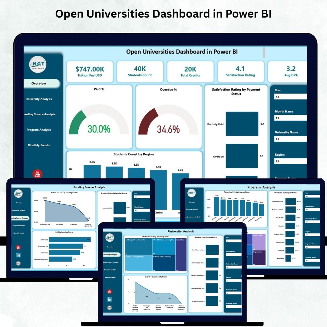
⭐ 1. Five Fully Interactive Pages
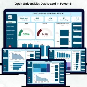
This dashboard is designed with 5 structured pages, each focusing on a specific dimension — Overview, University Analysis, Funding Source Analysis, Program Analysis, and Monthly Trends. Every page includes cards, slicers, and dynamic charts for intuitive decision-making.
📊 2. Advanced KPI Tracking
Track key metrics such as Total Students, Paid %, Overdue %, Satisfaction Rating, Avg. GPA, and more. These KPIs help university leadership stay updated at all times.
🎯 3. Smart Slicers for Instant Filtering
With slicers for Month, Region, Program, Funding Source, and University, users can adjust views instantly and explore unlimited combinations of insights.
🔍 4. Deep Academic & Financial Insights
Monitor overdue percentages, tuition fee patterns, student credit loads, GPA distribution, and program revenue — all in one dashboard.
💡 5. Easy-to-Use, No Technical Skills Required
Even beginners can work easily with this dashboard. All visuals are arranged cleanly, and the interface is beginner friendly.
📦 What’s Inside the Open Universities Dashboard in Power BI
📁 1. Overview Page
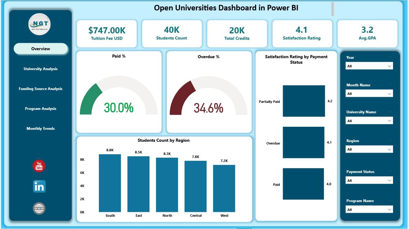
A full snapshot of operational performance using KPI cards and four impactful charts that show paid %, overdue %, satisfaction ratings, and student distribution by region.
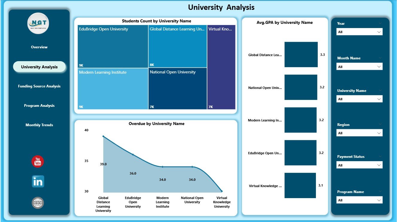
🏫 2. University Analysis Page
Get university-level academic and financial insights through charts like Student Count by University, Overdue %, and Average GPA.
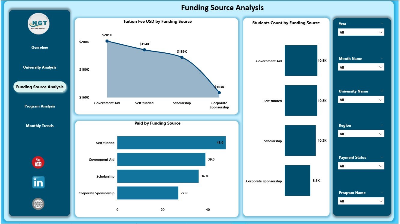
💰 3. Funding Source Analysis Page
Understand revenue and payment behavior from different funding sources such as scholarships, private grants, employer support, or government funding.
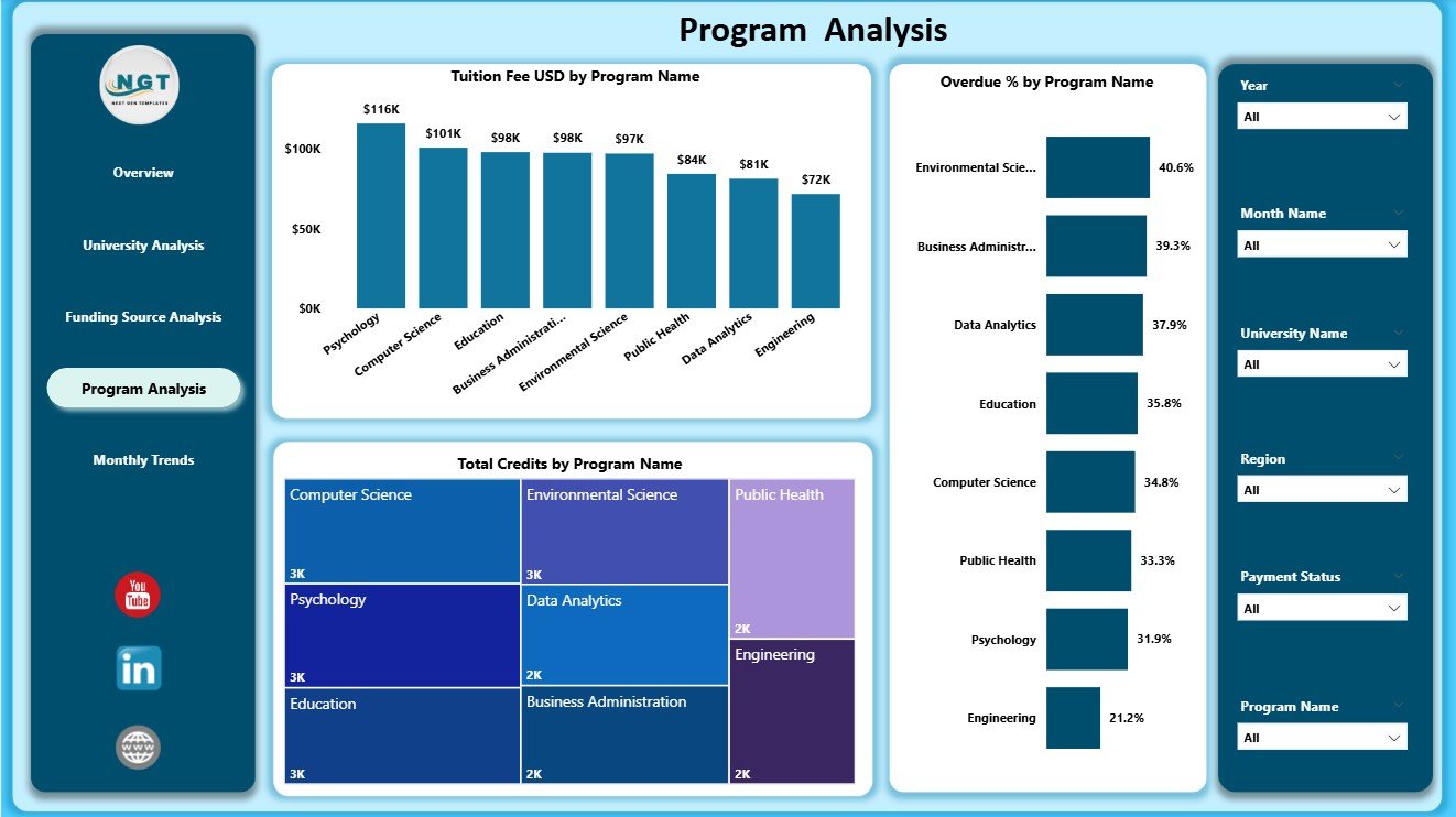
📘 4. Program Analysis Page
Explore tuition revenue, credit loads, and overdue trends for each academic program to support curriculum planning and fee management.
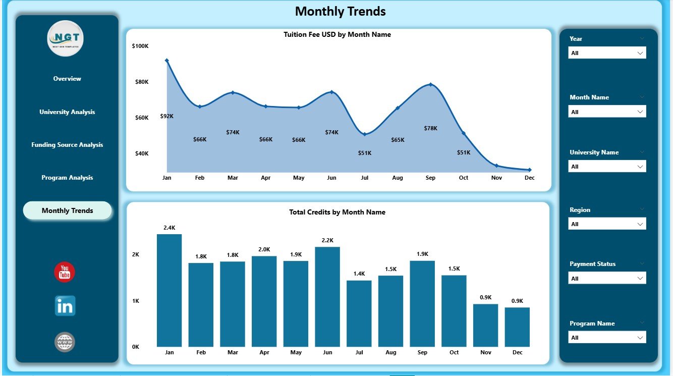
📅 5. Monthly Trends Page
Identify patterns across tuition fee collection, monthly credits, and seasonal enrollment changes.
Each page is designed to help you compare trends, filter data, and understand performance gaps quickly.
🧭 How to Use the Open Universities Dashboard in Power BI
🪄 Step 1: Load Your Dataset
Replace the sample Excel file with your actual university dataset. Follow the same column names for smooth refresh.
🔄 Step 2: Refresh the Dashboard
Click the Refresh button in Power BI Desktop to load new data instantly.
🎛️ Step 3: Use Slicers to Customize Views
Choose Month, Region, University, Funding Source, or Program to explore filtered insights.
📈 Step 4: Compare KPIs for Better Decision-Making
Review changes in GPA, tuition fee patterns, credit loads, and overdue trends to identify areas that require action.
📤 Step 5: Share Reports with Stakeholders
Publish to Power BI Service to share dashboards with your academic, finance, and administration teams.
🎓 Who Can Benefit from This Open Universities Dashboard in Power BI
👩💼 University Administrators
Track academic and operational performance in minutes instead of hours.
🧮 Finance Teams
Identify overdue payments, revenue patterns, and funding contributions easily.
📚 Academic Planners
Use GPA and credit insights to improve the quality of educational programs.
🌍 Regional & Admission Officers
Understand regional distribution, program enrollment, and trends to plan better.
📊 Education Analysts & Data Teams
Analyze student-level insights and create accurate monthly reports.
Anyone managing students, programs, payments, or funding will find this dashboard extremely useful.


Reviews
There are no reviews yet.