Managing a fast-growing ride-hailing or mobility business requires clear, accurate, and real-time insights. Whether you run taxis, motorbikes, autos, or shared rides, the numbers change every hour—fares, discounts, customer types, vehicle performance, and demand trends. If these insights stay scattered in multiple files, decision-making becomes slow and complicated.
The Ride-Hailing & Mobility Apps Dashboard in Excel solves this problem instantly. It is a ready-to-use, smart, and visually rich dashboard that transforms raw trip data into clean charts, KPIs, slicers, and comparisons. You simply paste your latest dataset, and the dashboard updates automatically—no coding, no formulas, no manual effort. 🚀
This template is specially built for mobility apps, taxi services, bike taxi operators, and ride-sharing platforms who want fast, accurate, and actionable reporting in one single Excel file.
✨ Key Features of Ride-Hailing & Mobility Apps Dashboard in Excel
This dashboard is packed with powerful features that help teams analyze performance instantly and make confident decisions.
📌 Easy Page Navigation
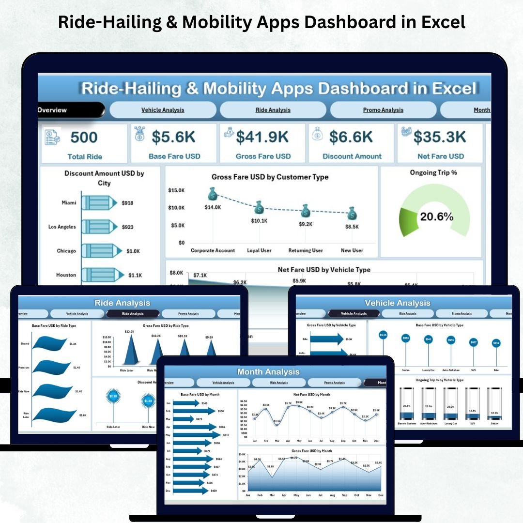
Switch between all analytical pages—Overview, Vehicle Analysis, Ride Analysis, Promo Analysis, and Month Analysis—using a left-side Page Navigator. One click and you’re on the right page.
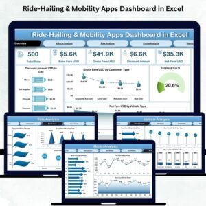
📊 KPI Cards for Instant Insights
Track key business indicators such as Gross Fare, Net Fare, Discount Amount, Trip Count, and Ongoing Trip %. These cards help leadership understand business health instantly.
📈 Clean Visual Charts
Every page uses dynamic charts that refresh automatically. Identify top-performing cities, profitable vehicle types, high-demand ride categories, promo effectiveness, and month-wise trends.
💡 Fully Automated & Beginner-Friendly
Paste your data in the Data Sheet—everything else updates automatically. No complex skills required.
📦 What’s Inside the Ride-Hailing & Mobility Apps Dashboard in Excel
This template comes with five analytical pages and backend support sheets that make reporting fast and seamless.
1️⃣ Overview Page
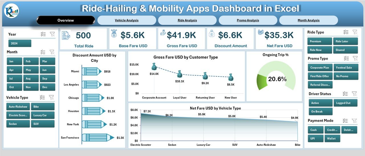
View all high-level performance indicators in one place. Includes charts for:
-
Discount Amount by City
-
Gross Fare by Customer Type
-
Ongoing Trip %
-
Net Fare by Vehicle Type
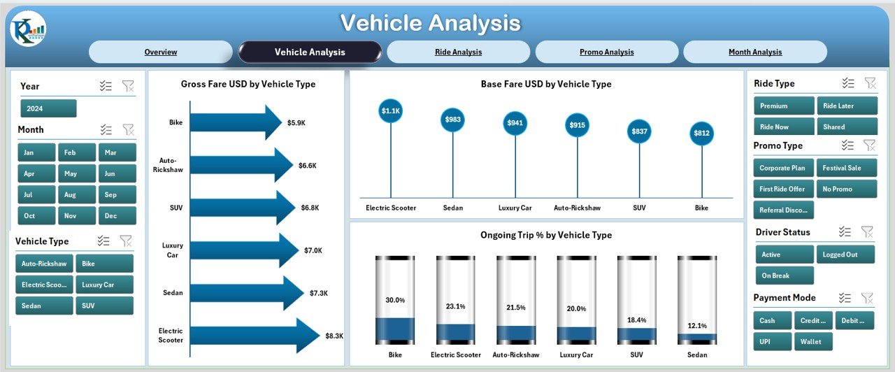
2️⃣ Vehicle Analysis Page
Understand revenue and performance across different vehicle types such as taxis, autos, bikes, and electric vehicles.
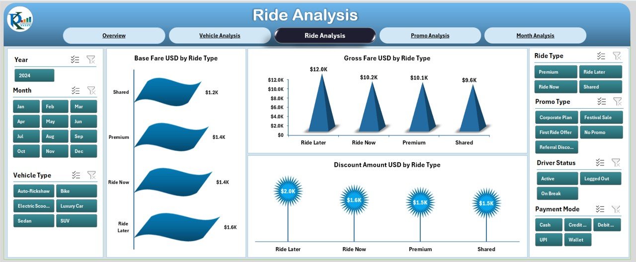
3️⃣ Ride Analysis Page
Compare performance across ride categories—mini, sedan, SUV, bike taxi, shared rides, and more.
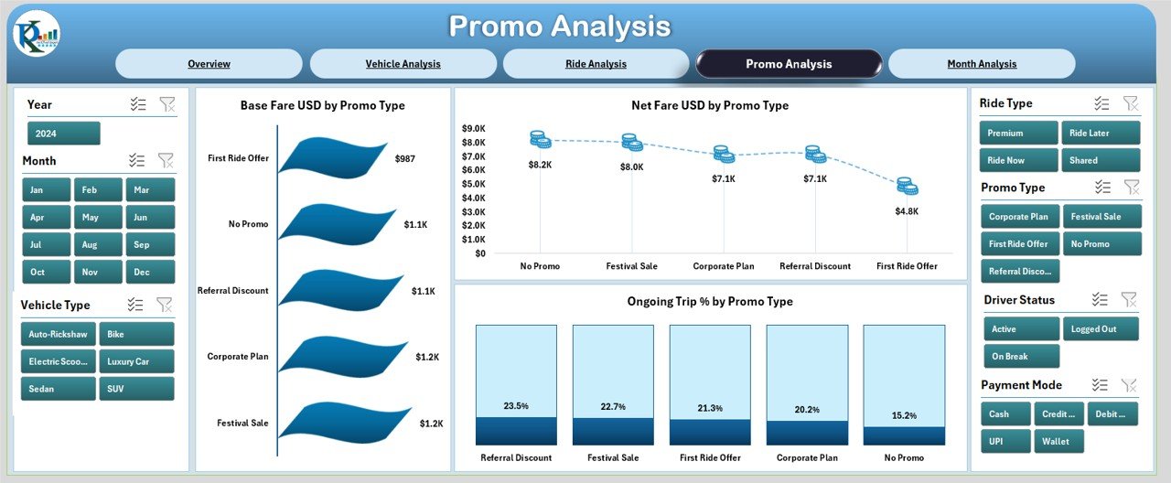
4️⃣ Promo Analysis Page
Find out which promo codes generate revenue, which reduce margins, and which increase trip volume.
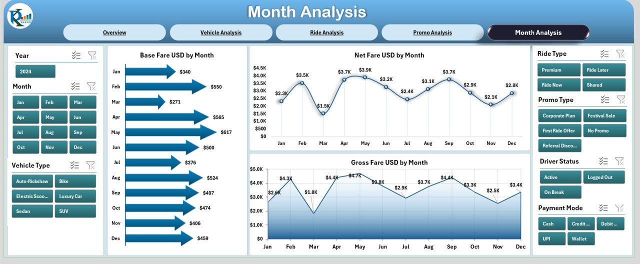
5️⃣ Month Analysis Page
Track seasonal trends and monthly performance using Gross Fare, Net Fare, and Base Fare visuals.
📑 Data Sheet (Backend)
A structured backend table where you simply paste:
Trip Date, Vehicle Type, Ride Type, Promo Type, City, Gross Fare, Net Fare, Discount Amount, Base Fare, Trip Status.
🛠️ How to Use the Ride-Hailing & Mobility Apps Dashboard in Excel
Using this dashboard is extremely simple and beginner-friendly:
1️⃣ Open the file
2️⃣ Paste your raw trip data into the Data Sheet
3️⃣ Refresh Excel (or use auto-refresh)
4️⃣ Navigate through pages using the Page Navigator
5️⃣ View updated charts, KPIs, comparisons, and trends instantly
You can also customize colors, add new KPIs, or modify visuals based on your reporting needs.
🎯 Who Can Benefit from This Ride-Hailing & Mobility Apps Dashboard in Excel
This template is perfect for professionals across mobility and transportation:
-
🚖 Taxi service owners
-
🛵 Bike taxi operators
-
🚗 Ride-sharing platforms (mini, sedan, SUV)
-
🛺 Auto-rickshaw & shuttle services
-
📊 Operations teams
-
📈 Marketing & promo teams
-
💰 Finance & pricing analysts
-
🧭 Fleet managers and mobility supervisors
Whether you manage a small fleet or a large mobility platform, this dashboard helps you track performance with clarity and confidence.


Reviews
There are no reviews yet.