


Workplace Safety KPI Dashboard in Power BI is not just a compliance requirement—it is a business priority. Every incident, near miss, or safety violation affects employees, productivity, reputation, and costs. However, many organizations still track safety data through scattered Excel sheets, emails, and manual reports. As a result, leaders struggle to see real risks, identify trends early, and take preventive action.
That is exactly why the Workplace Safety KPI Dashboard in Power BI becomes a powerful and proactive safety management solution 🚀.
This ready-to-use Power BI dashboard transforms raw safety data into clear, interactive, and actionable insights. Instead of reviewing multiple reports for incidents, training compliance, audits, and corrective actions, safety teams gain a single, centralized view of all key safety KPIs. Because the dashboard updates dynamically through slicers and visuals, decision-makers always work with current and reliable information.
Whether your organization focuses on reducing incidents, improving compliance, or building a safety-first culture, this dashboard enables faster decisions and stronger accountability.
🔑 Key Features of Workplace Safety KPI Dashboard in Power BI
🦺 Centralized Safety KPI Tracking – Monitor all safety metrics from one dashboard
🎯 MTD & YTD Performance Monitoring – Track short-term results and long-term safety trends
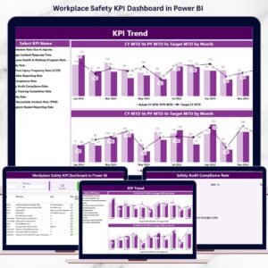
📅 Dynamic Month & KPI Group Slicers – Instantly filter safety performance by period and category
🚦 Visual Status Indicators – Green and red arrows show whether targets are met or missed
📊 Detailed KPI Table – Compare actuals, targets, and previous year values in one view
📈 Interactive Trend Charts – Analyze MTD and YTD performance over time
🔍 Drill-Through KPI Definitions – Access KPI formulas, logic, and definitions instantly
⚡ Excel-Based Data Input – Simple, flexible, and easy to maintain
📂 What’s Inside the Workplace Safety KPI Dashboard in Power BI
This digital product includes three structured analytical pages, each designed for a specific safety management purpose:

📌 Summary Page – Executive overview with KPI cards, slicers, and a comprehensive KPI performance table
📌 KPI Trend Page – MTD and YTD combo charts comparing current year, previous year, and targets
📌 KPI Definition Page – Drill-through page showing KPI formula, definition, unit, and LTB/UTB classification
Behind the dashboard, the solution connects to structured Excel sheets that store:
-
Actual safety performance data
-
Target safety values
-
Standardized KPI definitions
This structure ensures accuracy, transparency, and consistent reporting.
🛠️ How to Use the Workplace Safety KPI Dashboard in Power BI
Using this dashboard is simple and user-friendly:
1️⃣ Enter actual safety data in the Input_Actual Excel sheet
2️⃣ Update safety targets in the Input_Target sheet
3️⃣ Maintain KPI logic in the KPI Definition sheet
4️⃣ Refresh the Power BI dashboard
5️⃣ Use slicers to filter by month and KPI group
6️⃣ Review the Summary Page for instant clarity
7️⃣ Analyze trends to identify risks early
8️⃣ Drill through to KPI definitions for governance and audits
No advanced Power BI skills required—just structured data and smart insights.
👥 Who Can Benefit from This Workplace Safety KPI Dashboard in Power BI
This dashboard is ideal for:
🦺 Safety Managers & EHS Teams – Monitor incidents, compliance, and corrective actions
🏭 Plant & Operations Managers – Identify risk areas and improve workplace conditions
📋 Compliance & Audit Teams – Support regulatory reporting and inspections
👥 HR Teams – Track training completion and safety awareness
📈 Executive Leadership – Gain visibility into safety performance and accountability
🏗️ Multi-Site Organizations – Standardize safety reporting across locations
Because the dashboard is flexible, it adapts easily across industries.


Reviews
There are no reviews yet.