


In the fast-moving world of transportation and logistics, delays, rising costs, and inefficient routing can wreak havoc on your bottom line. That’s why we’ve built the Transportation & Logistics Dashboard in Power BI—a powerful, ready-to-use visual analytics tool that gives you full control over your logistics operations.
Designed for logistics professionals, supply chain managers, and business analysts, this dashboard empowers your team to monitor performance, track shipments, and uncover cost-saving opportunities in real time.
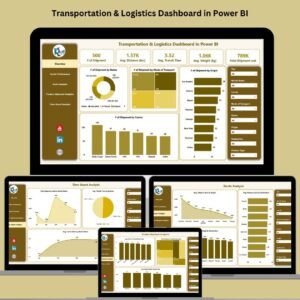
With five dedicated pages and fully interactive visuals, this Power BI dashboard is your all-in-one solution for streamlining logistics, improving carrier performance, and optimizing routes.
🔑 Key Features of Transportation & Logistics Dashboard in Power BI
🚚 Overview Page – Complete Logistics Snapshot
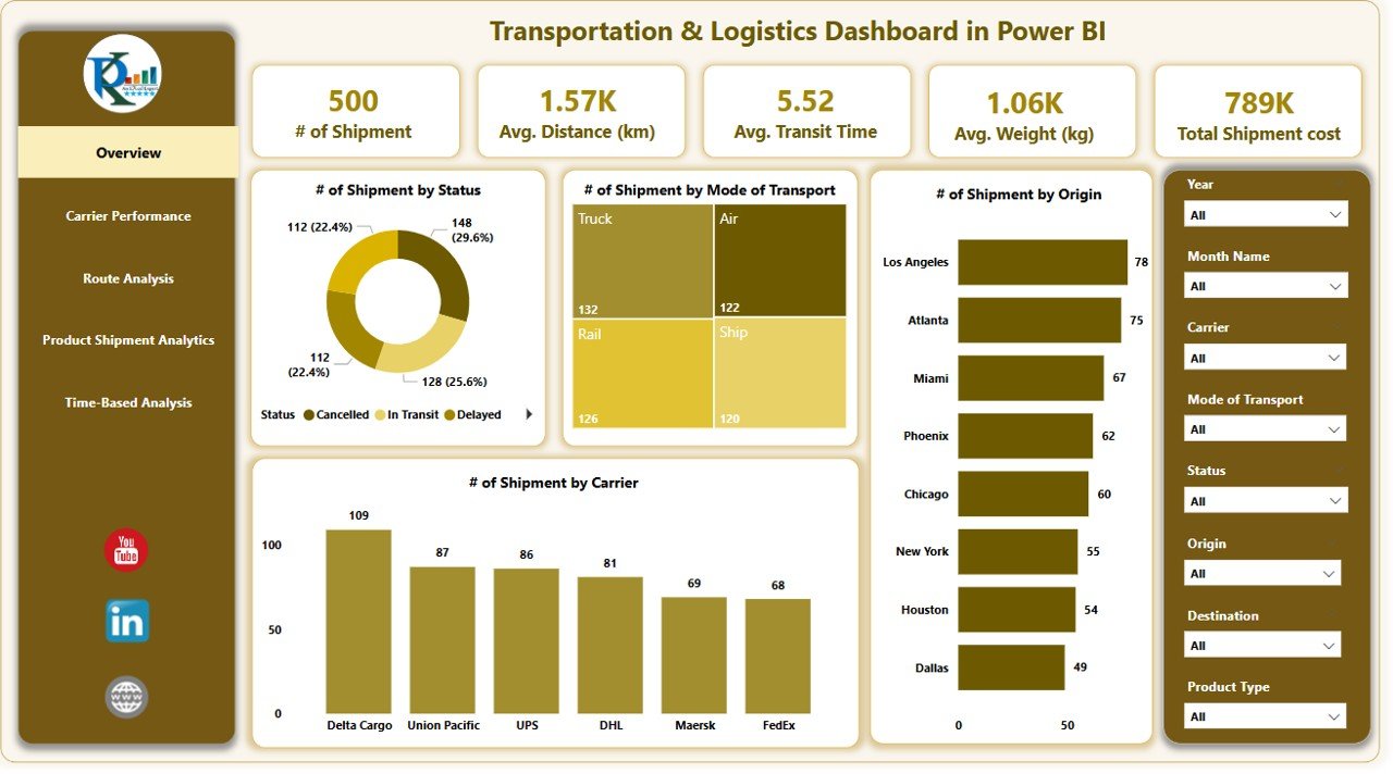
Get instant visibility into shipment statuses, modes of transport, carrier performance, and origins. Includes:
-
8 slicers for filters like carrier, date, origin, and more
-
5 dynamic KPI cards for core logistics metrics
-
4 charts showing shipment breakdowns by status, mode, origin, and carrier
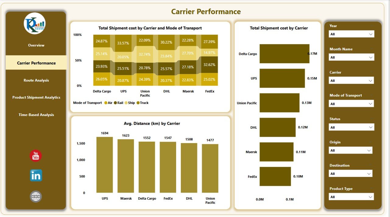
📦 Carrier Performance Page – Optimize Your Partnerships
Evaluate carrier efficiency and cost-effectiveness with:
-
Shipment cost by carrier and transport mode
-
Average shipment distance per carrier
-
Compare carrier performance with clear, impactful visuals
🧭 Route Analysis Page – Cut Costs & Save Time
Track distances by origin and destination to improve route planning:
-
Average distance by origin & destination
-
Identify inefficient routes at a glance
-
Use data to cut fuel costs and delivery delays
📊 Product Shipment Analytics Page – Smart Inventory Movement
Understand how different products impact logistics:
-
Average transit time by product type
-
Shipment cost by product
-
Average weight per product category
⏱️ Time-Based Analysis Page – Spot Seasonal Trends
Visualize logistics metrics over time for better forecasting:
-
Monthly shipment costs
-
Transit time by quarter and month
-
Identify peaks, delays, and cost fluctuations
📦 What’s Inside the Dashboard?
This Power BI report file includes 5 data-rich pages:
-
Overview Page – Central performance dashboard
-
Carrier Performance Page – Compare and optimize carrier partnerships
-
Route Analysis Page – Analyze distance data for better routing
-
Product Shipment Analytics Page – Assess transit time and cost by product
-
Time-Based Analysis Page – Identify monthly/quarterly trends
You’ll also get:
-
8 slicers per page for personalized data views
-
Clean, modern visuals tailored for easy interpretation
-
Fast refresh and smooth transitions between visuals
🧩 How to Use the Dashboard
✅ Step 1: Connect your logistics data (Excel, SQL, cloud, etc.)
✅ Step 2: Open the Power BI report file
✅ Step 3: Apply filters using slicers (carrier, date, product, etc.)
✅ Step 4: Analyze your metrics across 5 dedicated pages
✅ Step 5: Use insights to cut costs, speed up deliveries, and make data-driven decisions
Even if you’re new to Power BI, this dashboard is plug-and-play—no technical background required.
👤 Who Can Benefit from This Dashboard?
🏢 Logistics & Supply Chain Managers – Optimize delivery performance
📊 Business Analysts – Gain actionable insights from large datasets
📦 Warehouse & Ops Teams – Track shipments and reduce inefficiencies
🚚 Transportation Companies – Monitor routes, carriers, and costs
💼 Small to Large Enterprises – Scale operations with data-backed strategies
If you manage any part of the transportation chain—this dashboard is your game-changer.


Reviews
There are no reviews yet.