Shipping operations are the backbone of every logistics network. Whether a company ships thousands of parcels a day or manages global freight movement, leaders must track delivery speed, freight cost, carrier performance, customer satisfaction, and revenue impact in real time. But when information stays scattered across spreadsheets, emails, and different systems, decision-making becomes slow and inefficient.
The Shipping Dashboard in Power BI solves this challenge by combining all transportation, freight, and delivery data into one powerful, interactive analytics platform. With automated visuals, KPI cards, slicers, and drill-down pages, logistics teams can instantly analyze supply chain performance and act faster.
This ready-to-use Power BI template helps logistics managers, supply chain leaders, warehouse supervisors, and business teams understand what is happening inside their shipping operations at any moment.
📦 What Is a Shipping Dashboard in Power BI?
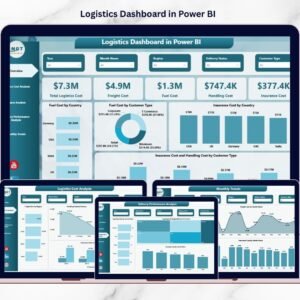
A Shipping Dashboard in Power BI is a complete visual reporting solution that tracks key performance metrics related to shipment movement, freight cost, delivery status, customer satisfaction, region-wise performance, and transport mode effectiveness. The dashboard uses Power BI’s powerful analytics engine to present insights through interactive visuals that update with a single click.
Logistics teams use this dashboard to track trends, reduce delays, compare costs across modes of transport, evaluate carrier performance, monitor regional behavior, and boost profitability. Instead of preparing manual reports, teams get instant visibility into performance — anytime, anywhere.
✨ Key Features of the Shipping Dashboard in Power BI
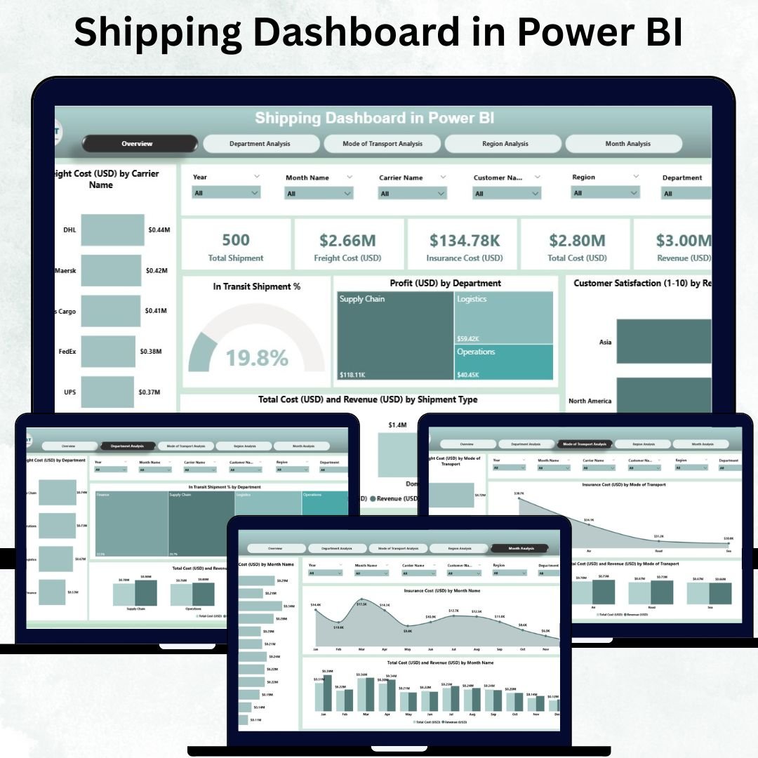
This dashboard is built with five analytical pages. Each page highlights a core area of logistics performance.
1️⃣ Overview Page — The Central Control Hub
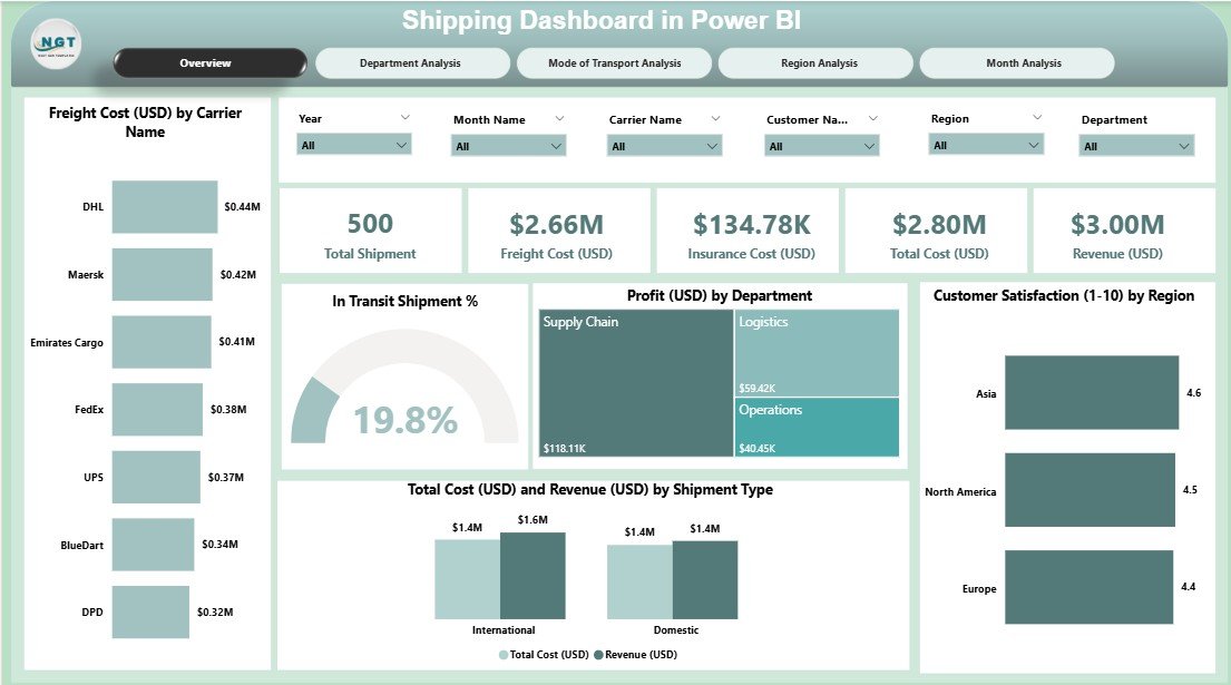
The Overview Page gives a complete snapshot of your shipping performance for the selected Month and KPI Group. This page includes:
-
Five KPI Cards for quick insights
-
Five Analytical Charts, including:
✔ Freight Cost (USD) by Carrier
✔ In Transit Shipment %
✔ Profit (USD) by Department
✔ Customer Satisfaction by Region
✔ Total Cost (USD) & Revenue (USD) by Shipment Type
This page helps leaders evaluate overall performance, compare shipping profitability, and identify high-cost or low-performing carriers and departments.
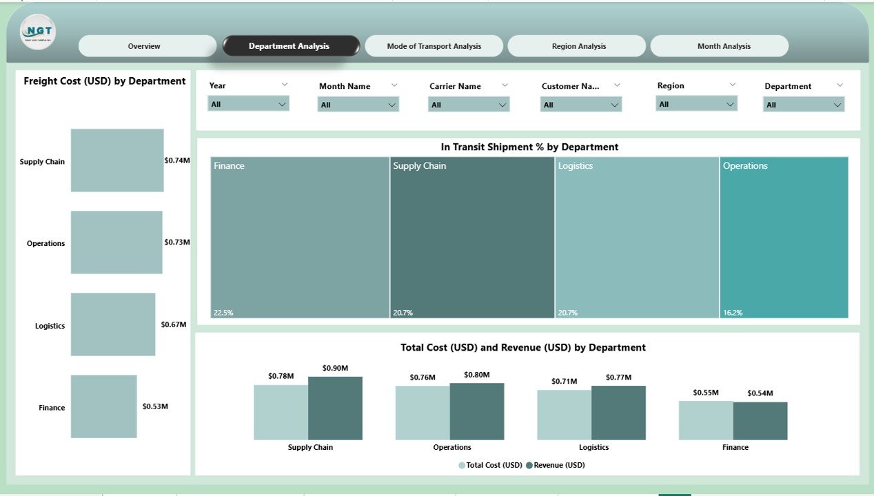
2️⃣ Department Analysis Page — Track Performance Across Teams
Different departments handle different shipment types, cost centers, and delivery responsibilities. This page helps users compare departments using:
-
Freight Cost (USD) by Department
-
In Transit Shipment % by Department
-
Total Cost (USD) vs Revenue (USD) by Department
Managers can identify high-cost areas, slow processes, and operational inefficiencies.
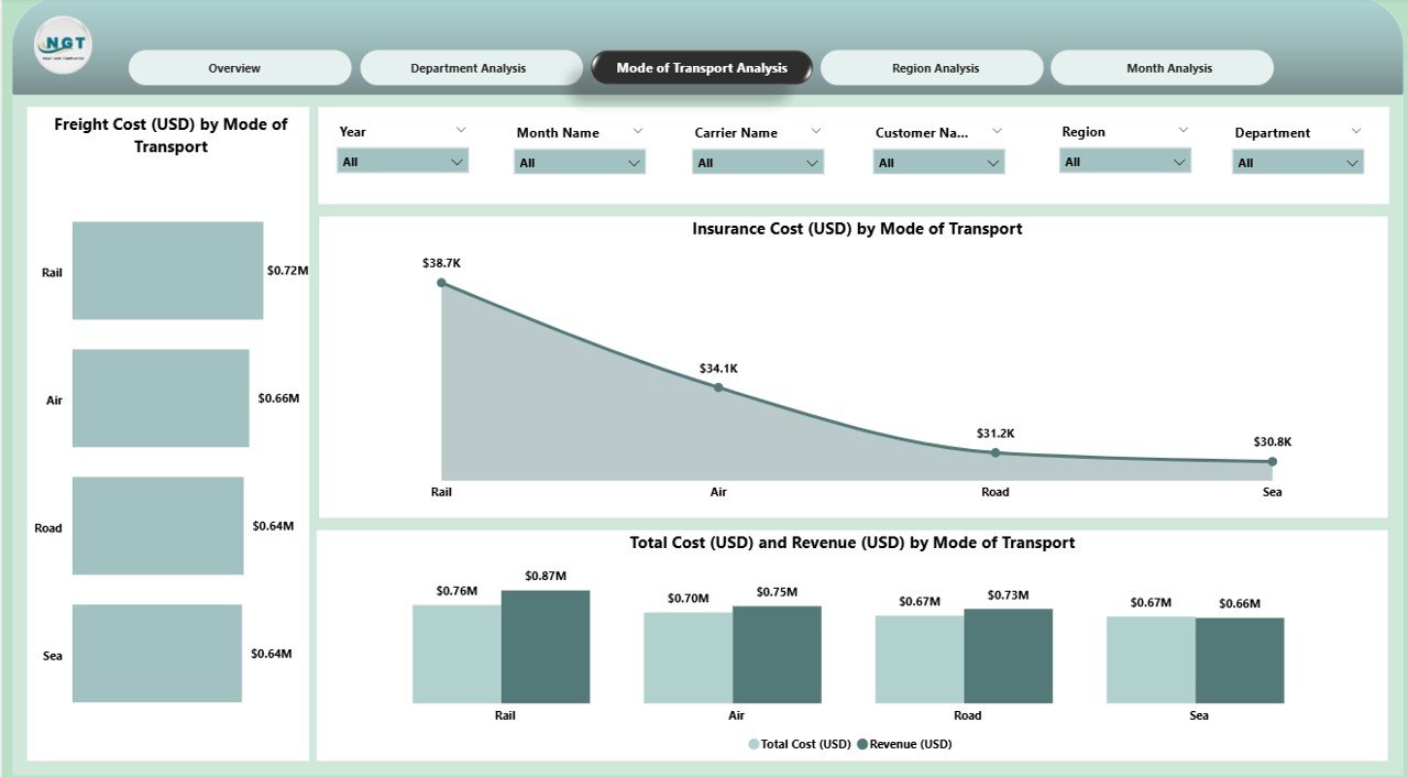
3️⃣ Mode of Transport Analysis Page — Optimize Transport Strategy
Businesses use multiple modes of transport such as Air, Road, Sea, and Rail. This page shows how each transportation mode performs.
Included visuals:
-
Freight Cost (USD) by Mode
-
Insurance Cost (USD) by Mode
-
Total Cost (USD) vs Revenue (USD) by Mode
These insights help teams select the most cost-efficient shipping method and manage insurance risks effectively.
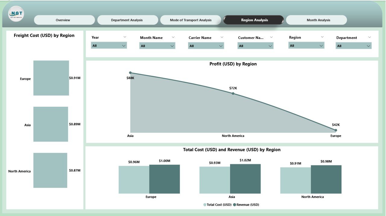
4️⃣ Region Analysis Page — Understand Regional Behavior
Every region has its own customer expectations, carrier network, and delivery behavior. This page includes:
-
Freight Cost (USD) by Region
-
Profit (USD) by Region
-
Total Cost (USD) and Revenue (USD) by Region
Regional insights help leaders allocate budgets wisely, identify problem areas, and track customer satisfaction by geography.
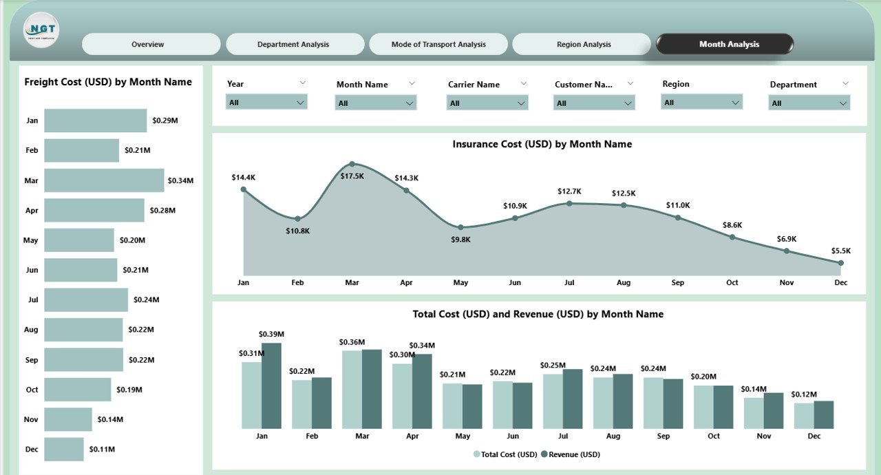
5️⃣ Monthly Trends Page — Analyze Yearly Performance Patterns
The Monthly Trends Page highlights how shipping performance evolves through the year.
Included charts:
-
Freight Cost (USD) by Month
-
Insurance Cost (USD) by Month
-
Total Cost (USD) and Revenue (USD) by Month
Logistics teams can use this page for demand forecasting, budgeting, seasonal planning, and cost-control strategies.
🚛 Why Companies Need a Shipping Dashboard in Power BI
Shipping involves multiple moving parts — carriers, freight contracts, routes, delivery timelines, customer service, returns, insurance, and more. A static spreadsheet cannot provide the clarity needed for fast decision-making.
A Power BI Shipping Dashboard:
-
Shows complete supply chain visibility
-
Tracks freight & insurance cost trends
-
Identifies shipping delays early
-
Highlights profit gaps
-
Supports vendor negotiations
-
Reduces reporting time
-
Improves customer satisfaction
🌟 Advantages of Using the Shipping Dashboard
-
✔ Better Cost Control through freight and insurance analysis
-
✔ Faster Decisions with real-time visuals
-
✔ Improved Delivery Efficiency by monitoring In Transit %
-
✔ Higher Customer Satisfaction via region-wise insights
-
✔ Better Profitability with cost vs revenue comparison
-
✔ Complete Visibility in one powerful dashboard
🛠 Best Practices for Effective Use
-
Maintain clean and updated shipping data
-
Use consistent naming for regions, carriers, and modes
-
Track KPIs monthly for accuracy
-
Compare departments regularly
-
Optimize modes of transport based on cost
-
Monitor regional performance continuously
-
Use slicers to uncover deeper insights
🏁 Conclusion
The Shipping Dashboard in Power BI empowers logistics teams with accurate, real-time insights. By consolidating freight cost, shipment modes, revenue, department performance, and regional behavior, it delivers the complete visibility required to enhance shipping efficiency.
Whether you’re a logistics manager, supply chain analyst, or business leader, this dashboard helps you reduce delays, control cost, improve customer satisfaction, and make smart, data-driven decisions.
🔗 Click here to read the Detailed blog post
Visit our YouTube channel to learn step-by-step video tutorials
Watch the step-by-step video tutorial:


Reviews
There are no reviews yet.