Satellite communication is the backbone of modern connectivity 🌍. From broadcasting and navigation to defense systems, weather monitoring, and global internet coverage, satellite networks support mission-critical operations worldwide. However, managing satellite performance without a structured monitoring system often results in inefficiencies, delayed responses, signal issues, and service disruptions. That is exactly where the Satellite Communication KPI Dashboard in Google Sheets becomes an extremely powerful solution.
The Satellite Communication KPI Dashboard in Google Sheets is a ready-to-use, interactive performance monitoring tool designed specifically for satellite operations and communication networks. Instead of working with scattered reports and manual spreadsheets, teams use one centralized Google Sheets dashboard to track Month-to-Date (MTD) and Year-to-Date (YTD) KPIs, compare actual performance with targets, analyze previous year results, and identify issues early 📊.
Because the dashboard is built in Google Sheets, it combines simplicity, flexibility, and real-time collaboration, making it ideal for both technical and management teams. As a result, organizations move from reactive issue handling to proactive satellite performance management.
✅ Key Features of Satellite Communication KPI Dashboard in Google Sheets
The Satellite Communication KPI Dashboard in Google Sheets is designed to deliver clear visibility into satellite performance metrics 🔍.
It provides a single dashboard view where all KPIs are displayed together with dynamic calculations and visual indicators. Users can select the month from a dropdown, and the entire dashboard updates automatically.
Key capabilities include:
-
MTD and YTD satellite KPI tracking
-
Target vs Actual comparison
-
Previous Year vs Actual analysis
-
Conditional formatting with up and down arrows
-
KPI-level trend and definition visibility
Because formulas handle all calculations, teams eliminate manual effort and focus on decision-making.
📦 What’s Inside the Satellite Communication KPI Dashboard in Google Sheets
This product includes six well-structured Google Sheets worksheets, each serving a specific analytical purpose:
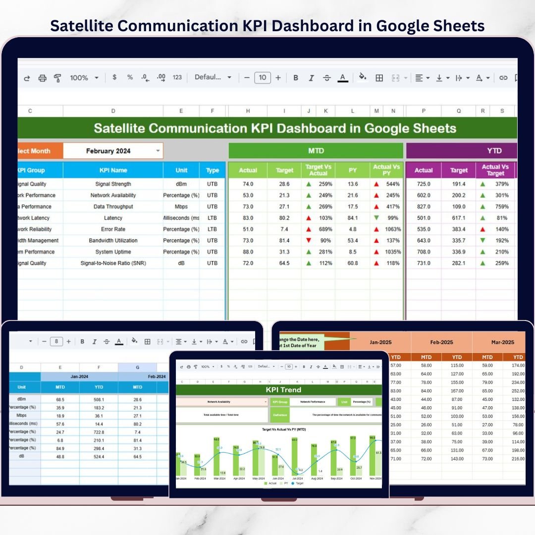
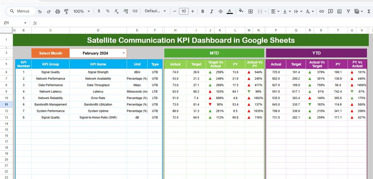
1️⃣ Dashboard Sheet
The Dashboard Sheet is the main performance view 🧭.
It displays:
-
MTD Actual, Target, and Previous Year
-
Target vs Actual (MTD) and PY vs Actual (MTD)
-
YTD Actual, Target, and Previous Year
-
Target vs Actual (YTD) and PY vs Actual (YTD)
Users select the required month in cell D3, and all values update automatically. Arrow indicators instantly highlight over-performance or under-performance.
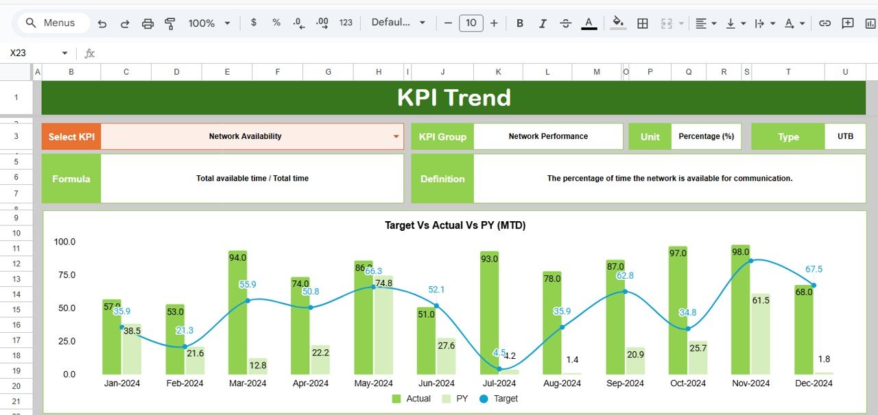
2️⃣ KPI Trend Sheet
The KPI Trend Sheet supports deep KPI-level understanding 📈.
Users select a KPI from a dropdown in cell C3 and instantly view:
-
KPI Group
-
KPI Unit
-
KPI Type (Lower the Better / Upper the Better)
-
KPI Formula
-
KPI Definition
This ensures teams fully understand each KPI before analyzing results.
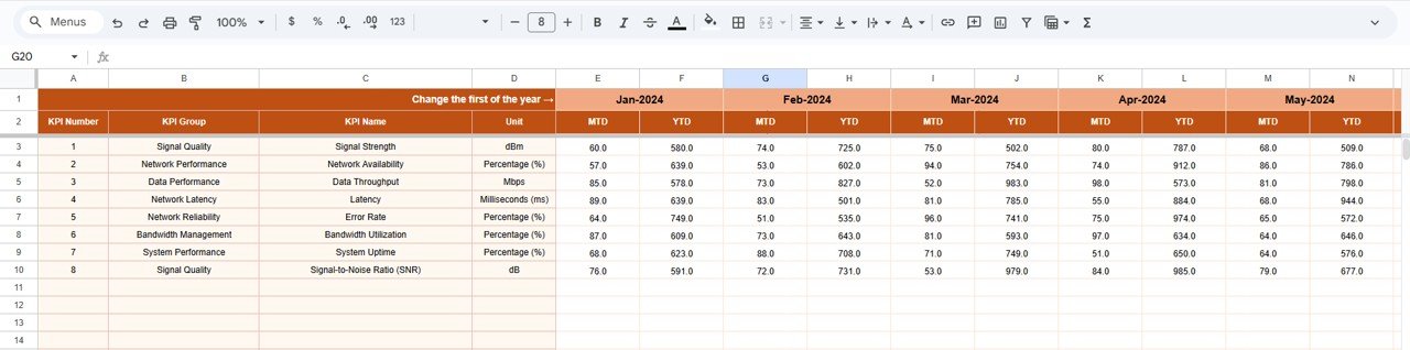
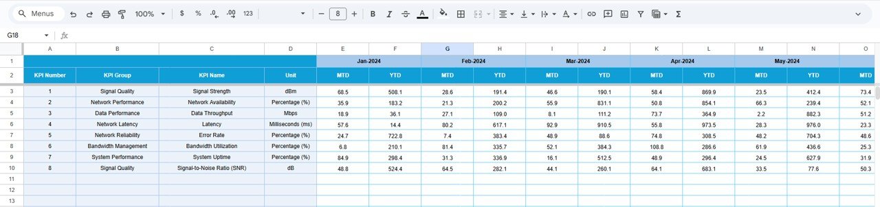
3️⃣ Actual Number Sheet
This sheet captures real satellite performance data.
Users enter:
-
MTD actual values
-
YTD actual values
-
Starting month of the year (cell E1)
Accurate data here ensures reliable dashboard insights.
4️⃣ Target Sheet
The Target Sheet stores benchmark values.
It allows users to:
-
Enter MTD target values
-
Enter YTD target values
-
Support automated performance comparison
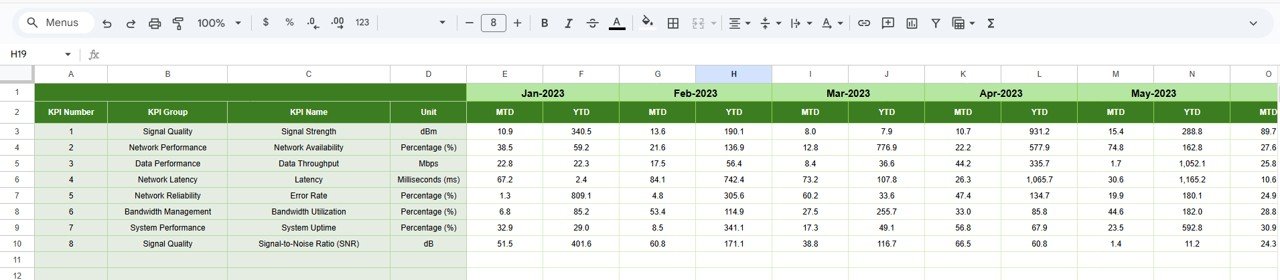
5️⃣ Previous Year Number Sheet
This sheet stores last year’s data for historical analysis.
It enables:
-
Year-over-year comparison
-
Performance improvement tracking
-
Strategic planning support
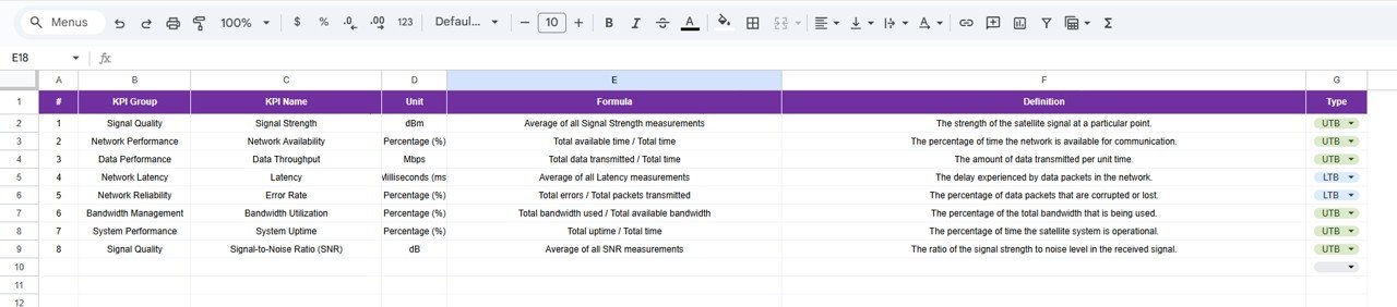
6️⃣ KPI Definition Sheet
This reference sheet ensures transparency and consistency.
It stores:
-
KPI Name
-
KPI Group
-
Unit of Measurement
-
Formula to Aggregate
-
KPI Definition
-
KPI Type (LTB / UTB)
Because KPI logic is documented, the dashboard remains easy to understand and audit-friendly.
🛠️ How to Use the Satellite Communication KPI Dashboard in Google Sheets
Using the dashboard is simple and intuitive 👍.
First, update actual, target, and previous year data in their respective sheets.
Next, select the required month from the dashboard dropdown.
Then, review MTD and YTD results along with arrow indicators.
Finally, analyze KPI logic and definitions using the KPI Trend sheet.
Because everything updates automatically, teams gain instant insights without manual recalculation.
👥 Who Can Benefit from This Satellite Communication KPI Dashboard
This dashboard is ideal for:
-
Satellite Operations Teams
-
Network Engineers
-
Performance Monitoring Analysts
-
Operations Managers
-
Strategy and Planning Teams
It works perfectly for satellite operators, telecom providers, defense organizations, and space technology companies.
🔗 Click here to read the Detailed blog post
Watch the step-by-step video tutorial: