Infrastructure projects must meet deadlines. Agricultural programs must improve productivity. Employment schemes must deliver results. Healthcare and education initiatives must show measurable impact.
Yet many rural departments and NGOs still rely on scattered spreadsheets. Reports get delayed. Targets get missed. Leadership reacts late instead of acting early.
What if you could track everything in one powerful, visual system?
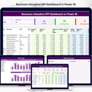
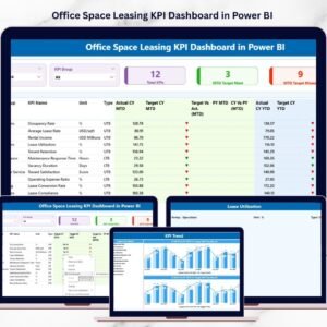
That’s exactly what the Rural Development KPI Dashboard in Power BI delivers. 🌾📊
This ready-to-use Power BI dashboard transforms Excel data into interactive insights. Instantly compare MTD, YTD, Target, and Previous Year performance. Filter by KPI group. Identify gaps. Make data-driven decisions confidently.
No manual chaos. No delayed reporting. Just structured visibility.
🚀 Key Feature of Rural Development KPI Dashboard in Power BI
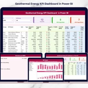
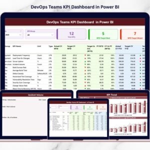
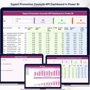
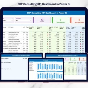
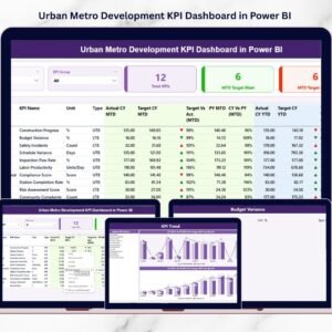
📊 3 Interactive Dashboard Pages – Summary, KPI Trend, and KPI Definition.
🎯 Target vs Actual Tracking (MTD & YTD) – Instantly see performance gaps.
📈 Year-over-Year Comparison – Measure CY vs PY growth easily.
📅 Dynamic Month & KPI Group Slicers – Filter data in seconds.
📉 Performance Icons (▲ / ▼) – Visual indicators for quick evaluation.
🧮 UTB & LTB Logic Support – Automatically evaluates KPI type correctly.
📘 Drill-Through KPI Definitions – Full transparency of formulas.
⚡ Excel Data Integration – Update Excel, refresh Power BI, done.
🌍 Scalable & Customizable Structure – Add unlimited KPIs.
📦 What’s Inside the Rural Development KPI Dashboard in Power BI
This structured solution includes 3 powerful analytical pages:
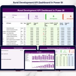
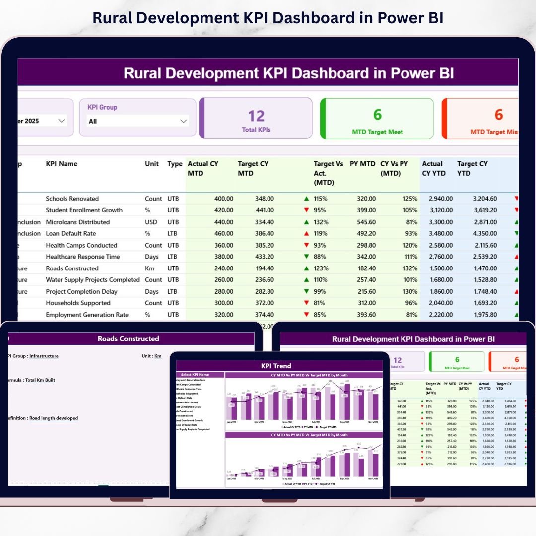
1️⃣ Summary Page – The Main Control Center
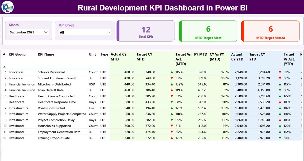
This page provides a complete snapshot of rural development performance.
✔ Top Section Includes:
-
Month Slicer
-
KPI Group Slicer
-
Total KPI Count
-
MTD Target Meet Count
-
MTD Target Missed Count
✔ Detailed KPI Table Shows:
-
KPI Number
-
KPI Group
-
KPI Name
-
Unit
-
Type (UTB / LTB)
-
Actual CY MTD
-
Target CY MTD
-
MTD Icon (▲ Green / ▼ Red)
-
Target vs Actual (MTD %)
-
PY MTD
-
CY vs PY (MTD %)
-
Actual CY YTD
-
Target CY YTD
-
YTD Icon
-
Target vs Actual (YTD %)
-
PY YTD
-
CY vs PY (YTD %)
The arrow system instantly highlights whether performance meets or misses targets.
✔ Green ▲ = On Track
✔ Red ▼ = Needs Attention
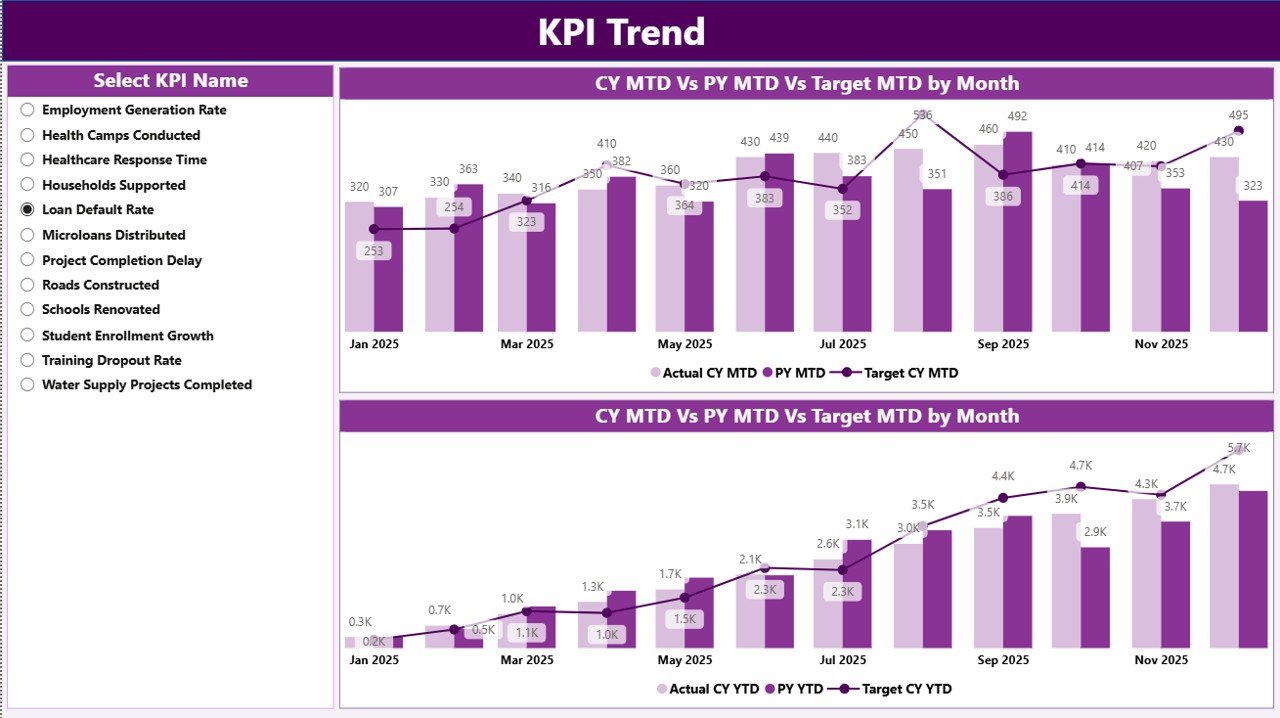
2️⃣ KPI Trend Page – Performance Over Time
This page helps you analyze movement month by month.
✔ KPI Name Slicer (Left Panel)
✔ MTD Trend Chart (Actual vs Target vs PY)
✔ YTD Trend Chart (Actual vs Target vs PY)
Identify seasonal shifts. Detect early warning signals. Compare growth against last year.
Perfect for strategic review meetings.
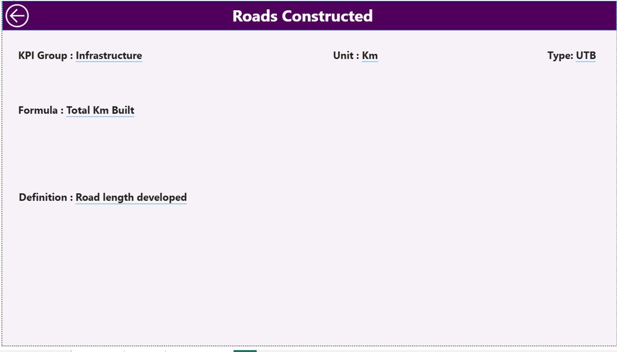
3️⃣ KPI Definition Page – Transparency & Clarity
Accessible through drill-through from Summary page.
Displays:
✔ KPI Number
✔ KPI Group
✔ KPI Name
✔ Unit
✔ Formula
✔ Definition
✔ Type (UTB / LTB)
This ensures everyone understands how performance is calculated.
🛠 How to Use the Rural Development KPI Dashboard in Power BI
1️⃣ Update Excel Data Source
2️⃣ Enter Actual & Target values
3️⃣ Maintain KPI Definition sheet
4️⃣ Refresh Power BI file
5️⃣ Start with Summary Page
6️⃣ Drill into KPI Trend
7️⃣ Use insights to guide decisions
Within minutes, generate professional rural performance reports.
📊 What KPIs Can You Track?
This dashboard supports unlimited rural KPIs such as:
🏗 Infrastructure – Roads completed, electrification %, sanitation coverage
🌾 Agriculture – Crop yield, irrigation coverage, farmer income growth
💼 Employment – Jobs created, skill programs, self-help groups
🏥 Healthcare – Vaccination %, maternal health, camp participation
🏫 Education – Enrollment rate, literacy %, dropout reduction
Group KPIs into Infrastructure, Agriculture, Employment, and Social Development for structured reporting.
🎯 Why This Dashboard Improves Rural Governance
When leaders see clear data:
✔ They detect underperforming projects early
✔ They reallocate budgets efficiently
✔ They justify funding decisions
✔ They measure long-term progress
✔ They strengthen accountability
Data clarity leads to stronger rural governance.
🔥 Advantages of Rural Development KPI Dashboard in Power BI
✅ Centralized Monitoring Platform
✅ Real-Time Performance Tracking
✅ Automated Calculations
✅ Year-over-Year Comparison
✅ Drill-Through Transparency
✅ Time-Saving Reporting
✅ Improved Accountability
✅ Clear Visual Indicators
✅ Scalable KPI Structure
This dashboard transforms reporting into strategic insight.
Best Practices for Maximum Impact
✔ Update Excel data monthly
✔ Use first date of month consistently
✔ Assign UTB / LTB correctly
✔ Validate KPI formulas regularly
✔ Group KPIs strategically
✔ Review MTD and YTD trends consistently
✔ Maintain clean Excel data
Consistency ensures accuracy and credibility.
Click here to read the Detailed blog post
Visit our YouTube channel to learn step-by-step video tutorials
YouTube Channel