In the highly competitive manufacturing and automotive supply chain sector, efficiency and precision are key to profitability. 🏭📊 The Rubber Industry KPI Dashboard in Excel is designed to give manufacturers, production planners, and plant managers a clear and actionable view of their performance.
This ready-to-use Excel dashboard simplifies how you track production, quality, safety, and cost metrics — turning complex data into easy-to-read visual insights. Whether you manage tire production, rubber components, or industrial rubber goods, this tool helps you monitor your plant’s performance in real time and make informed, data-driven decisions.
✨ Key Features of Rubber Industry KPI Dashboard in Excel
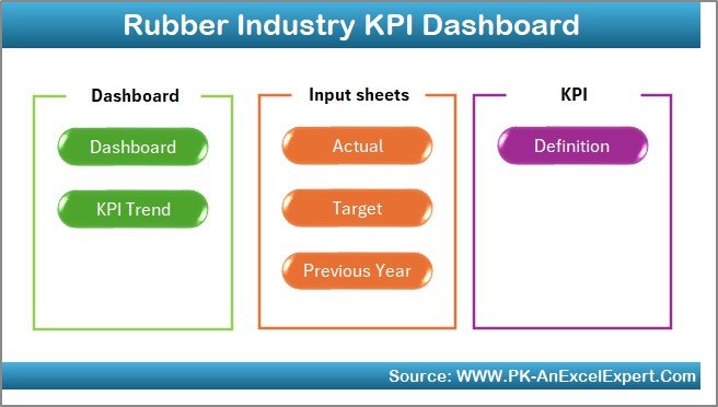
✅ 7 Organized Worksheets — Includes Home Sheet, Dashboard, KPI Trend, Actual Numbers Input, Target Sheet, Previous Year Sheet, and KPI Definition Sheet.
✅ Interactive Dashboard — View MTD (Month-to-Date) and YTD (Year-to-Date) performance with dropdown filters for monthly analysis.
✅ Actual vs Target Comparison — Instantly see whether KPIs meet targets or fall short using colored arrows (▲/▼).
✅ Previous Year Comparison — Evaluate year-over-year improvements and spot recurring challenges.
✅ KPI Trend Analysis — Analyze performance trends for individual KPIs with automated charts and historical visuals.
✅ Conditional Formatting Indicators — Red for underperformance, green for achievements — making decision-making faster.
✅ Automatic Updates — Enter data once, and the dashboard updates all linked visuals instantly.
✅ Customizable Design — Modify KPIs, formulas, or visuals to suit your plant’s needs — no advanced Excel skills required.
This dashboard delivers real-time visibility into all key areas of rubber manufacturing, ensuring your team stays focused on quality, efficiency, and profitability. 💪
📂 What’s Inside the Rubber Industry KPI Dashboard in Excel
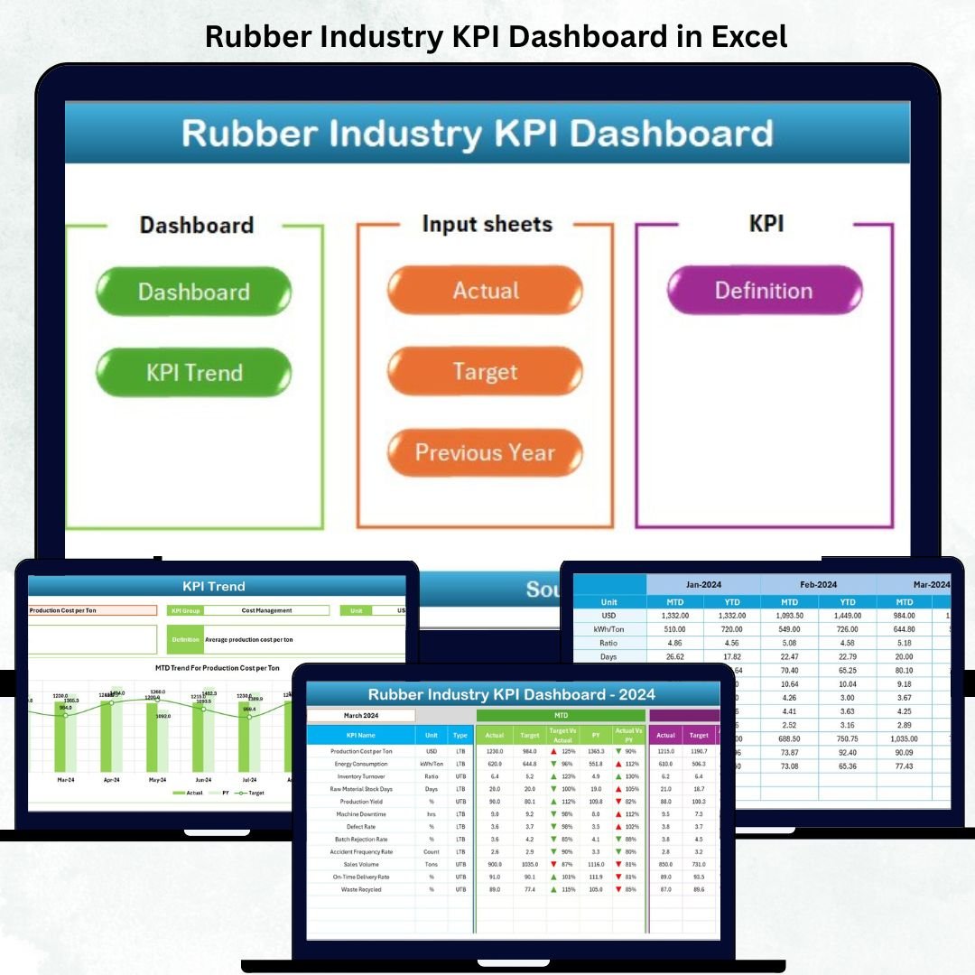
🏠 1. Home Sheet
The central navigation hub with six clickable buttons that take you directly to the main sheets — Dashboard, KPI Trend, Actual Numbers, Targets, Previous Year Data, and KPI Definition.
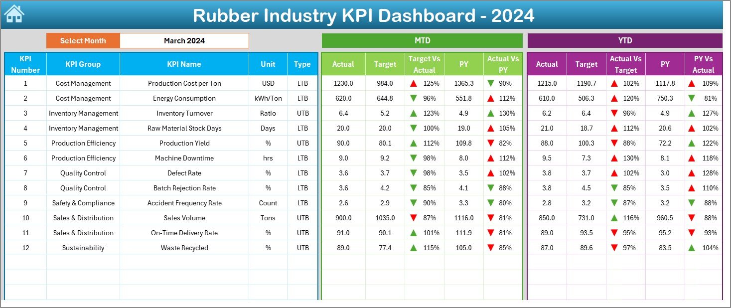
📊 2. Dashboard Sheet (Main Page)
The core visual page displaying all key KPIs with:
-
Month Selector (Cell D3) – Switch between months easily.
-
MTD and YTD Tables – Compare Actual vs Target vs Previous Year performance.
-
Conditional Formatting Arrows – Instantly highlight improving (▲) or declining (▼) performance.
This provides an at-a-glance overview of production efficiency, quality, cost control, and delivery performance.
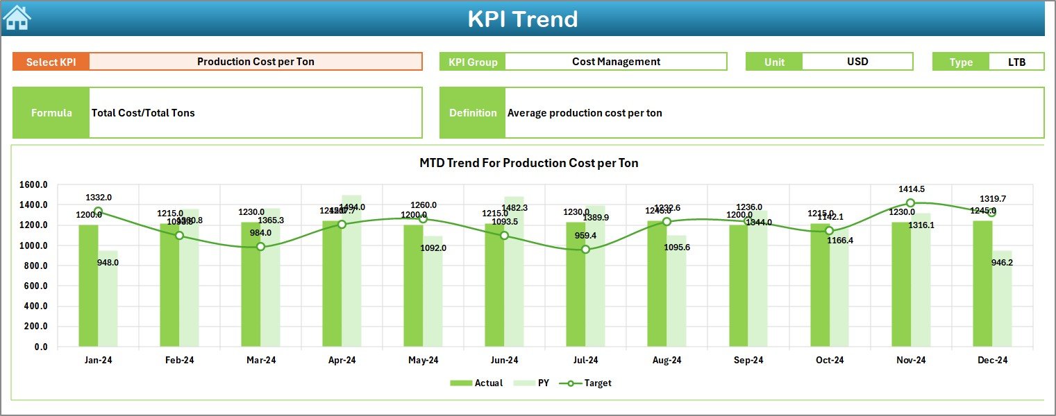
📈 3. KPI Trend Sheet
Analyze detailed performance for individual KPIs:
-
Select KPI Name from dropdown (Cell C3).
-
Displays KPI Group, Unit, Formula, and Definition.
-
Two trend charts show MTD and YTD patterns for Actual, Target, and Previous Year data.
Perfect for identifying trends, fluctuations, and performance gaps.
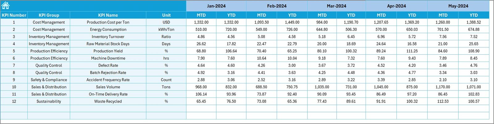
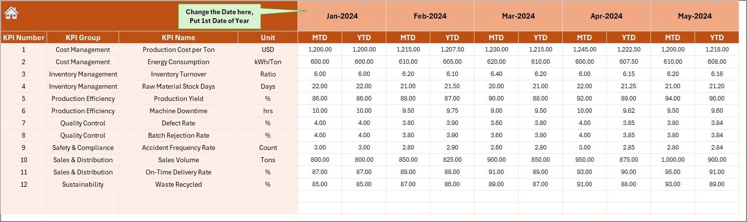
🧾 4. Actual Numbers Input Sheet
Enter monthly actual data for each KPI.
-
Includes MTD and YTD entries.
-
Auto-calculates based on your start month (Cell E1).
Simple structure for smooth data entry and accuracy.
🎯 5. Target Sheet
Set monthly and yearly targets for all KPIs.
-
The dashboard uses these values to calculate achievement percentages and variance automatically.
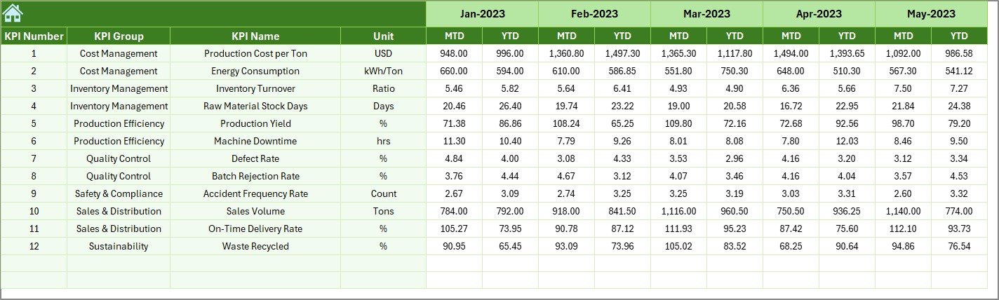
📆 6. Previous Year Sheet
Record last year’s performance for all KPIs.
-
Enables powerful year-over-year comparison to evaluate long-term improvement.
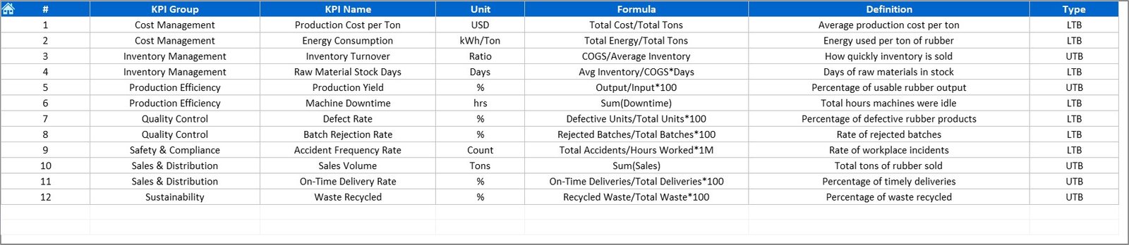
📘 7. KPI Definition Sheet
Document every metric’s details:
-
KPI Name, Group, Unit, Formula, and Definition.
This ensures standardization and transparency across teams — essential for audits and management reviews.
🧭 How to Use the Rubber Industry KPI Dashboard in Excel
1️⃣ Open the Excel file and start from the Home Sheet.
2️⃣ Navigate to the Actual Numbers Input Sheet and add current MTD and YTD data.
3️⃣ Update monthly Target Values in the Target Sheet.
4️⃣ Input Previous Year Data for performance comparison.
5️⃣ Go to the Dashboard Sheet and select a month from Cell D3.
6️⃣ Analyze MTD and YTD results — review the green/red arrows for instant insights.
7️⃣ Visit the KPI Trend Sheet to review long-term performance patterns.
With a few clicks, you’ll have complete visibility into production output, defect rates, cost efficiency, and delivery reliability. 📉📈
👥 Who Can Benefit from This Rubber Industry KPI Dashboard in Excel
🏭 Rubber Manufacturers: Track production efficiency and quality metrics.
🚗 Tire Manufacturing Units: Measure yield, defect rates, and downtime.
🏢 Industrial Rubber Goods Producers: Analyze cost per unit, scrap generation, and machine utilization.
🔧 Plant Managers: Monitor daily, monthly, and yearly trends for better operational control.
📊 Supply Chain Teams: Track on-time delivery, order fulfillment, and material usage.
💼 Executives & Consultants: Get a real-time snapshot of business performance and ROI.
No matter your size or specialization, this Excel dashboard helps turn raw factory data into intelligent performance insights.


Reviews
There are no reviews yet.