Rail transport plays a crucial role in connecting cities, supporting public mobility, and generating consistent revenue. However, managing rail performance is not easy. Passenger volumes change daily, ticket types vary, delays affect schedules, and revenue fluctuates across routes. Without proper reporting, teams struggle to understand what’s working and what needs improvement. Rail Passenger Transport Dashboard in Excel That is exactly why the Rail Passenger Transport Dashboard in Excel is the perfect solution. It gives rail operators complete visibility into revenue, trip count, passenger trends, travel class behaviour, station activity, and overall operational efficiency—right inside Excel.
This ready-to-use dashboard transforms raw transport data into clear, interactive visuals. Rail Passenger Transport Dashboard in Excel with slicers, KPIs, trend charts, and user-friendly navigation, it becomes an essential tool for rail operators, planners, and revenue managers. Whether you’re tracking busy stations, analyzing ticket types, or comparing line performance, this dashboard brings accuracy and speed to every decision.
✨ Key Features of Rail Passenger Transport Dashboard in Excel
This dashboard includes smart features designed for real-world rail operations.
🧭 Page Navigator for Smooth Navigation
A clean left-side menu makes switching between pages effortless.
💳 Ticket & Revenue Insights
Analyze ticket revenue, revenue per passenger, and revenue per kilometer instantly.
🚆 Trip & Passenger Activity KPIs
Monitor trip count, passenger demand, travel class distribution, and station behaviour.
📊 Multi-Level Analysis Pages
Dive deeper with Destination Station, Ticket Type, Line Analysis, and Monthly Trends.
📈 Interactive Charts & Slicers
View data by travel class, line type, destination station, month, and ticket category.
🔄 Easy Data Entry
No coding required—simply update the Data Sheet to refresh the entire dashboard.
🟢🔴 Visual Indicators
Quickly identify high performance vs. problem areas with conditional formatting.
This dashboard is professional, intuitive, and built for fast decision-making.
📦 What’s Inside the Rail Passenger Transport Dashboard
This dashboard contains five major reporting pages supported by a powerful data structure:
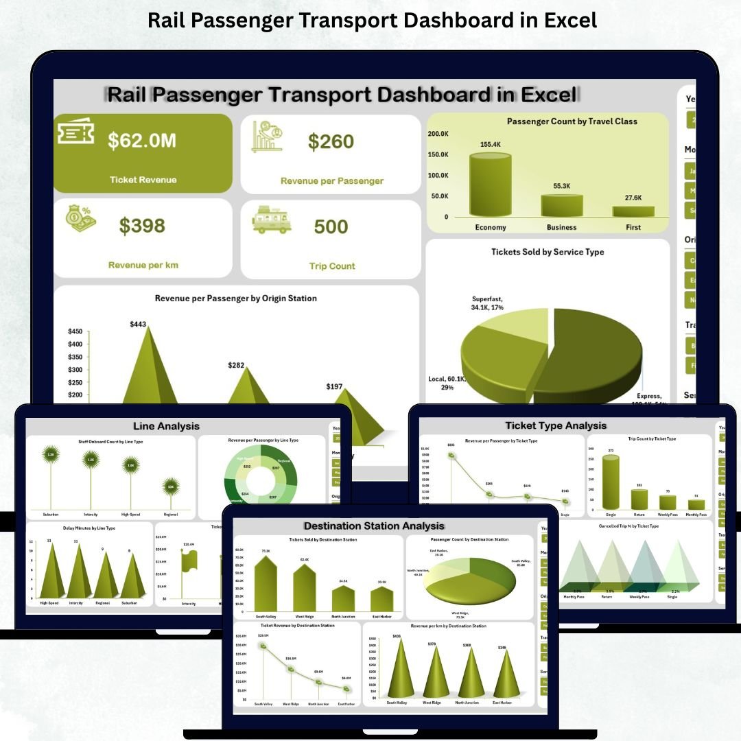
1️⃣ Overview Page – Summary of Rail Performance
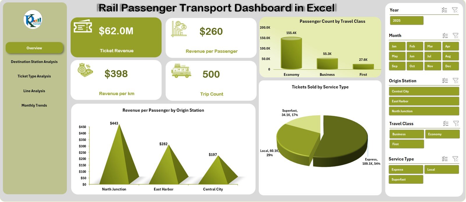
View the most important KPIs in one place:
-
Ticket Revenue
-
Revenue per Passenger
-
Revenue per Km
-
Trip Count
You also get charts showing:
📍 Revenue per Passenger by Origin Station
🪑 Passenger Count by Travel Class
🎟️ Tickets Sold by Service Type
Perfect for quick performance reviews.
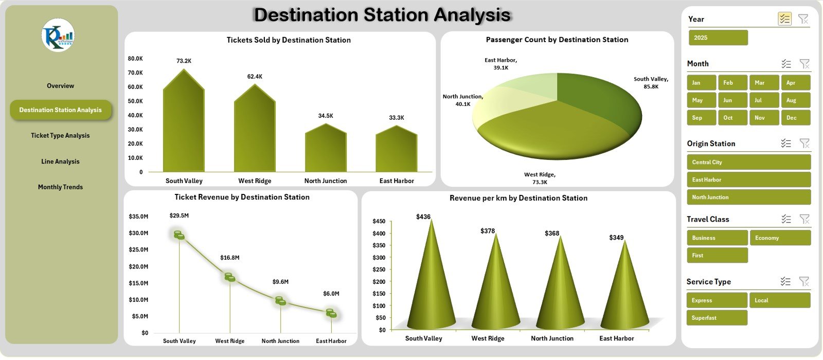
2️⃣ Destination Station Analysis – Station-Level Insights
Analyze demand and revenue station-wise through:
-
Tickets Sold
-
Passenger Count
-
Ticket Revenue
-
Revenue per Km
Ideal for route planning, fleet allocation, and scheduling improvements.
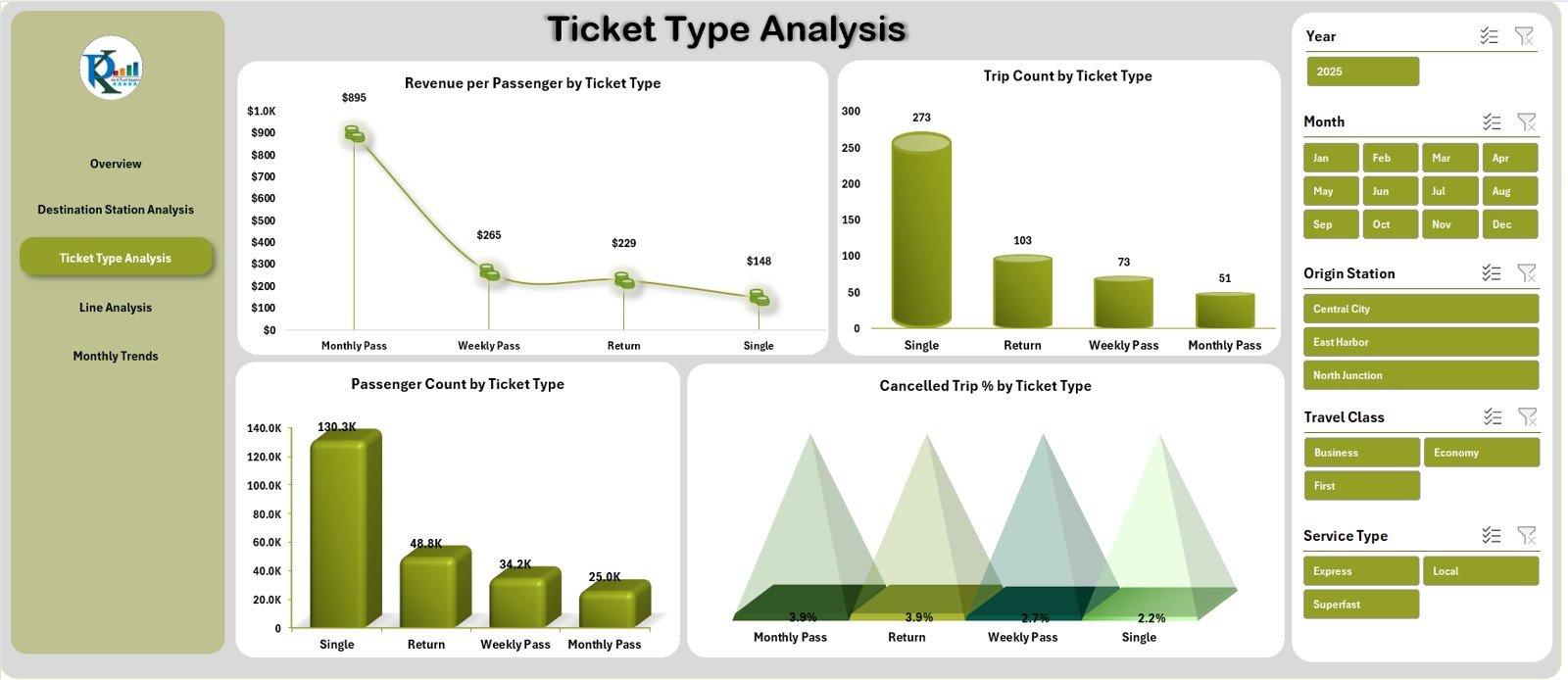
3️⃣ Ticket Type Analysis – Passenger Behaviour by Ticket Category
Understand which ticket types perform best using:
-
Revenue per Passenger
-
Trip Count
-
Passenger Count
-
Cancelled Trip %
This page is perfect for marketing, pricing, and customer behaviour analysis.
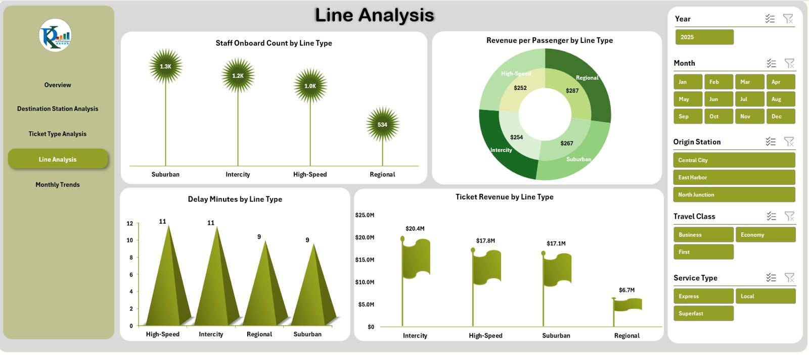
4️⃣ Line Analysis – Evaluate Performance by Line Type
Rail lines include Local, Express, Intercity, Metro, Overnight, and more.
This page shows:
-
Staff Onboard Count
-
Revenue per Passenger
-
Delay Minutes
-
Ticket Revenue
Helps identify high-performing and underperforming rail lines.
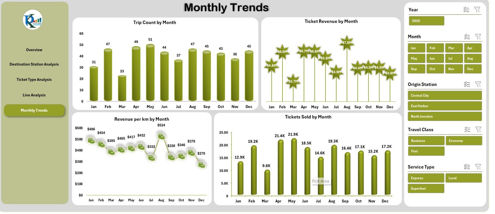
5️⃣ Monthly Trends – Performance Over Time
See seasonal patterns with charts for:
📅 Trip Count
💰 Ticket Revenue
📏 Revenue per Km
🎟️ Tickets Sold
Excellent for forecasting and budgeting.
🛠️ How to Use the Rail Passenger Transport Dashboard
Using this dashboard is simple:
👉 Step 1: Update the Data Sheet with your monthly rail data.
👉 Step 2: Switch between pages using the Page Navigator.
👉 Step 3: Use slicers to filter data by station, ticket type, line, or month.
👉 Step 4: Analyze KPIs, charts, and trends.
👉 Step 5: Export visuals for meetings and reports.
Everything updates automatically—no formulas to edit and no technical skills required.
👥 Who Can Benefit from This Dashboard
The dashboard is ideal for:
🚆 Rail Operators
Track daily and monthly train performance.
📊 Transport Planners
Understand demand and optimize schedules.
💰 Revenue Teams
Monitor earning patterns and route profitability.
🏢 Station Managers
View passenger and revenue trends station-wise.
📈 Rail Analytics Teams
Gain deep insights into travel class, delays, and ticket behaviour.
Anyone involved in rail passenger management will find this dashboard invaluable.


Reviews
There are no reviews yet.