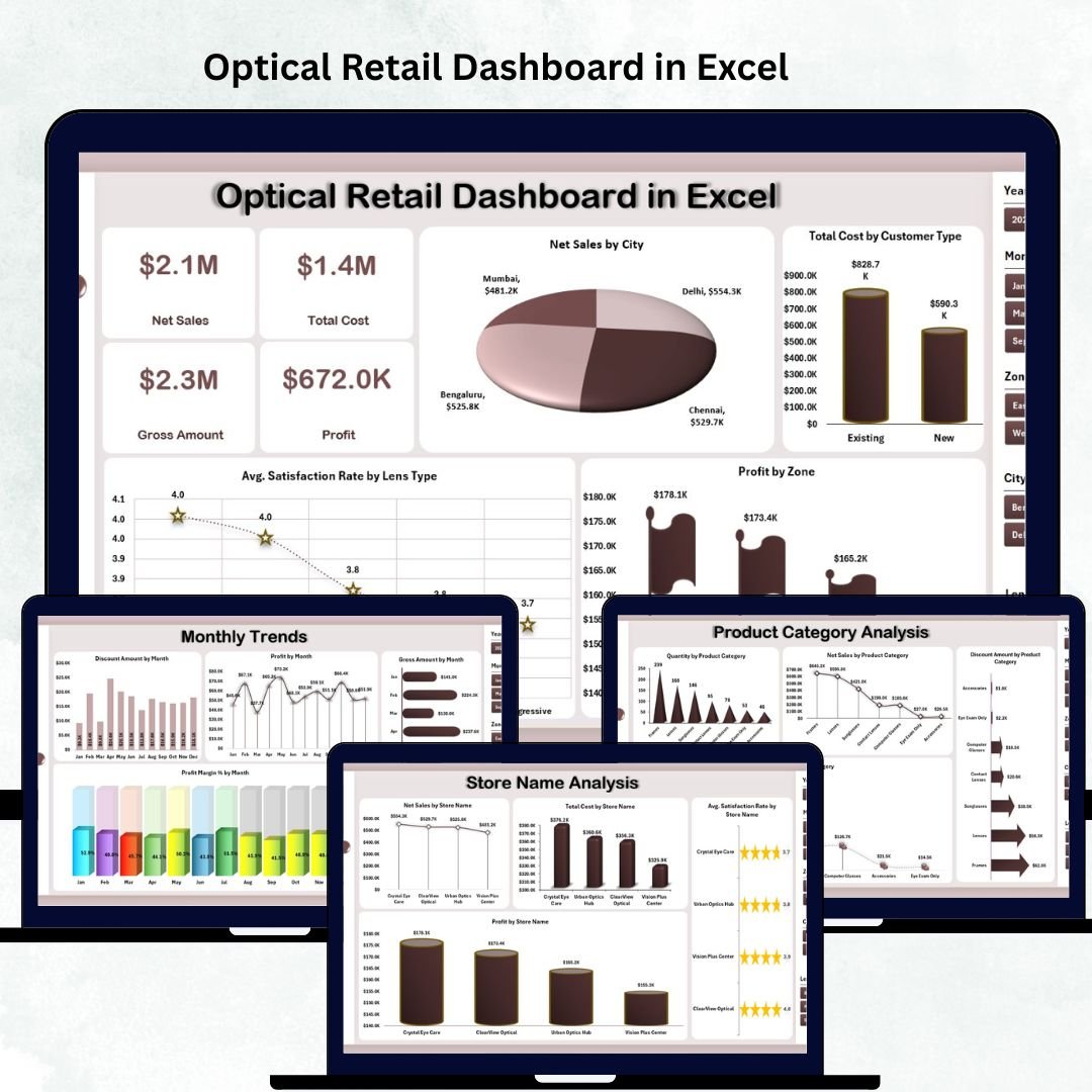


Running an optical retail business means dealing with fast-changing customer needs, product variations, and store-level decisions every day. From lenses and frames to brands, categories, customer types, and city-wise performance, optical retailers handle multiple data points at once. When this information is spread across scattered spreadsheets, decision-making becomes slow and confusing. That’s why we created the Optical Retail Dashboard in Excel — a ready-to-use, interactive, and visually powerful Excel tool that converts raw data into meaningful business insights.
This dashboard provides a clear, organized, and smart way to track sales performance, customer satisfaction, brand trends, cost structure, store-wise performance, and monthly growth — all from one place. Whether you manage a single store or multiple branches, this dashboard helps you make faster, data-driven decisions without expensive software or complex systems.
⭐ Key Features of the Optical Retail Dashboard in Excel
✨ Left-Side Page Navigator
Move between pages instantly using a modern navigation menu. No more searching through multiple sheets.
📊 Five Dedicated Analysis Pages
You get ready-to-use analytics sections for:
-
Overview
-
Store Name Analysis
-
Product Category Analysis
-
Brand Name Analysis
-
Monthly Trends
📁 Support Sheet + Data Sheet Included
Add your raw data once, and the entire dashboard updates automatically.
📈 Clear, Visual Charts & KPIs
Understand performance in seconds with clean charts, slicers, and visual indicators.
🔧 Fully Customizable in Excel
Modify KPIs, add new charts, or adjust formulas — complete flexibility with no coding required.
💼 Perfect for Daily, Weekly & Monthly Reviews
Ideal for store managers, franchise heads, owners, and business analysts.
⭐ What’s Inside the Optical Retail Dashboard in Excel
This dashboard includes five powerful analysis pages, each designed to deliver deep and actionable insights.
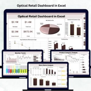
📌 1. Overview Page – Your Complete Business Snapshot

The Overview Page gives a 360° view of optical retail performance. It shows visual KPIs and charts that help you instantly understand:
-
Total sales performance
-
Store profitability
-
Cost distribution
-
Customer satisfaction trends
You get four essential charts:
✨ Net Sales by City – Find out which city generates the highest revenue.
✨ Total Cost by Customer Type – Identify where your spending goes.
✨ Average Satisfaction Rate by Lens Type – Evaluate service quality.
✨ Profit by Zone – Discover the most profitable regions.
📌 2. Store Name Analysis – Compare Store-Level Results
Every store performs differently, and this page helps you compare them effectively.
Charts include:
-
Net Sales by Store
-
Total Cost by Store
-
Average Satisfaction Rate by Store
-
Profit by Store
This page helps you identify top-performing stores, manage staffing better, and find improvement opportunities.
📌 3. Product Category Analysis – What Do Customers Prefer?
Understand which product categories are driving your business.
Charts include:
-
Quantity sold per category
-
Net sales per category
-
Discount amount per category
-
Total cost per category
Perfect for inventory planning, pricing adjustments, and product promotion decisions.
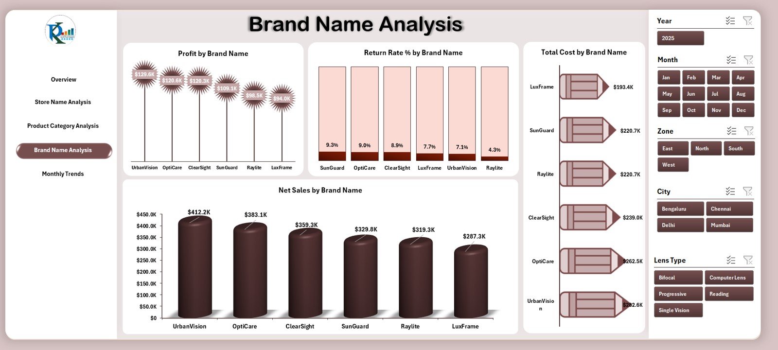
📌 4. Brand Name Analysis – Discover Brand-Level Trends
Some brands sell fast, while others struggle. This page helps you monitor brand performance with charts for:
-
Profit by Brand
-
Return Rate % by Brand
-
Total Cost by Brand
-
Net Sales by Brand
Use these insights to plan stocking strategies, negotiate with suppliers, and promote profitable brands.
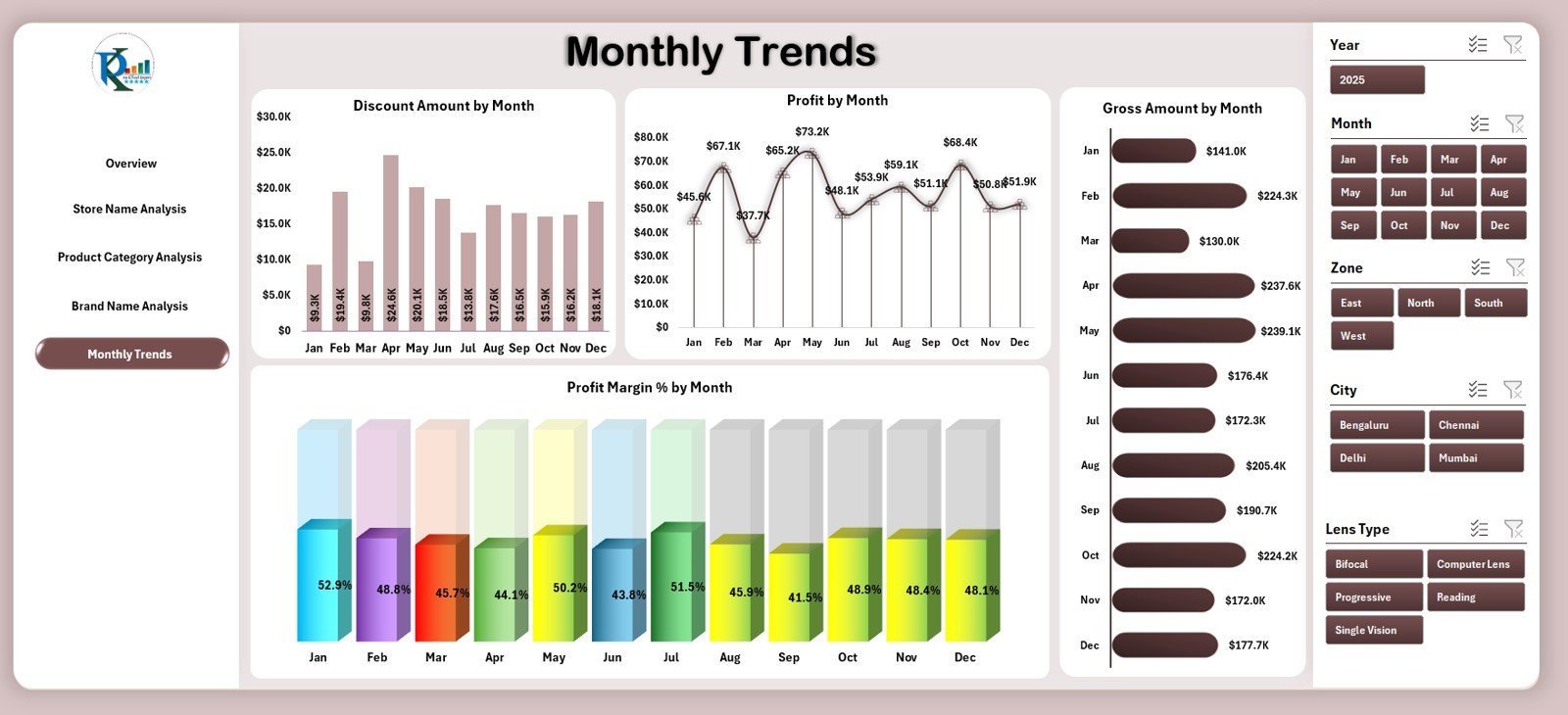
📌 5. Monthly Trends – Understand Seasonal Performance
This page highlights month-on-month growth using:
-
Profit by Month
-
Discount Amount by Month
-
Gross Amount by Month
-
Profit Margin % by Month
Identify peak seasons, lean months, and promotional periods easily.
📌 Support Sheet & Data Sheet
💠 Support Sheet – Contains lookup values, dropdowns, and structured logic.
💠 Data Sheet – Add or paste all your raw data here (sales, cost, quantity, category, brand, store, customer type, satisfaction, return rate).
The dashboard updates instantly after data entry.
⭐ How to Use the Optical Retail Dashboard in Excel
Using this dashboard is easy — no advanced Excel skills required.
🟦 Step 1: Add all sales, cost, and customer data into the Data Sheet
🟦 Step 2: Ensure your category, brand, and store names are consistent
🟦 Step 3: Go to the Overview Page to see instant insights
🟦 Step 4: Explore Store, Category, Brand, and Monthly pages for deeper analysis
🟦 Step 5: Use insights to improve pricing, stocking, staffing, and marketing
🟦 Step 6: Update data weekly or monthly for accurate results
⭐ Who Can Benefit from This Optical Retail Dashboard
This dashboard is perfect for:
🛍 Optical Store Owners – Stay updated on performance and growth.
🏬 Branch Managers – Compare store-level KPIs and improve operations.
📊 Business Analysts – Analyze trends, cost, and profitability easily.
🕶 Optical Retail Chains – Manage multi-store metrics from one file.
💼 Consultants & Analysts – Present insights to clients with clean visuals.
Whether you sell lenses, frames, contact lenses, sunglasses, or accessories — this dashboard helps you run your optical business smarter.


Reviews
There are no reviews yet.