Memes and viral content move the internet—but guesswork should not drive your strategy. Likes and shares alone do not tell the full story. Without clear KPIs, content teams struggle to understand what truly works, what fails, and why growth suddenly slows down.
That is where the Meme and Viral Content Creation KPI Dashboard in Power BI becomes a game-changing solution 🚀.
This ready-to-use dashboard transforms raw content data into clear KPIs, instant comparisons, and powerful trends, helping creators and marketers turn creativity into measurable success.
Built using Excel as the data source and Power BI for visualization, this dashboard allows you to track MTD and YTD performance, compare targets vs actuals, and analyze year-over-year growth—all from one interactive interface.
Whether you manage meme pages, viral campaigns, or brand-driven social content, this dashboard helps you replace assumptions with data-backed decisions.
🔑 Key Features of Meme and Viral Content Creation KPI Dashboard in Power BI
📊 Centralized KPI Performance Tracking
Monitor all meme and viral content KPIs in one structured Power BI dashboard.
📅 Dynamic Month & KPI Group Filters
Analyze performance by month and content category instantly.
🎯 Target vs Actual Comparison
Quickly identify which KPIs meet targets and which miss them.
📈 MTD & YTD Performance Monitoring
Track short-term campaign impact and long-term growth trends.
🔁 Current Year vs Previous Year Analysis
Understand how content performance evolves over time.
📉 Visual Trend Analysis
Spot spikes, drops, and patterns using MTD and YTD combo charts.
📘 LTB & UTB KPI Logic
Ensure correct interpretation of engagement, reach, and efficiency KPIs.
⚡ Excel + Power BI Integration
Simple Excel data entry with powerful Power BI visuals—no complex systems.
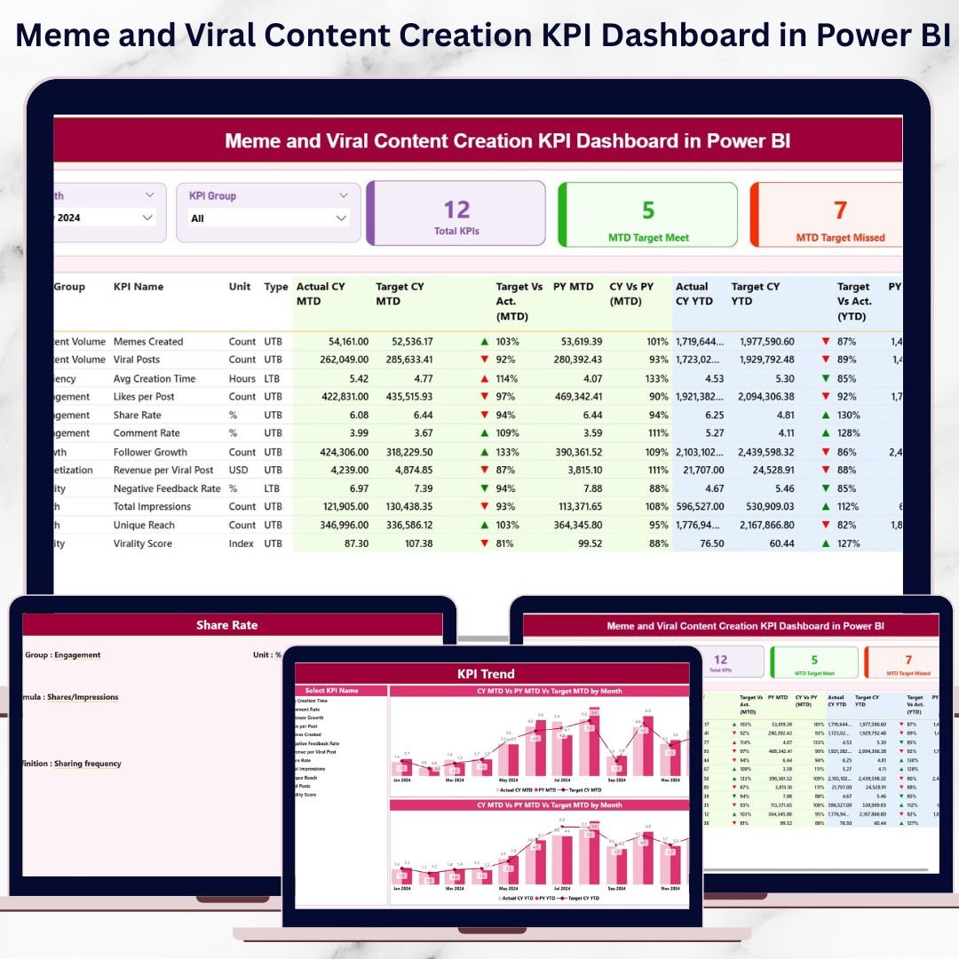
What’s Inside the Meme and Viral Content Creation KPI Dashboard in Power BI
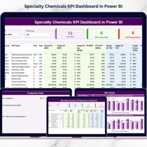
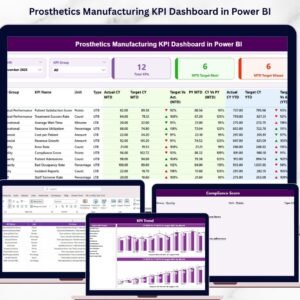
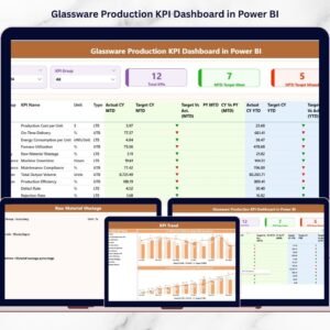
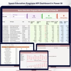
📌 Summary Page
The main control center with KPI cards, slicers, and a detailed KPI performance table.
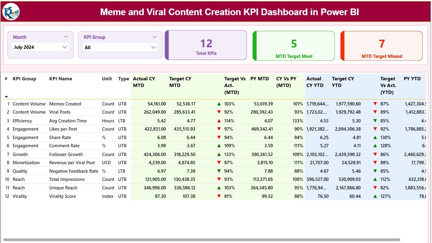
📊 KPI Performance Table
Displays KPI Group, KPI Name, Unit, Type (LTB/UTB), MTD and YTD actuals, targets, previous year values, and performance indicators.
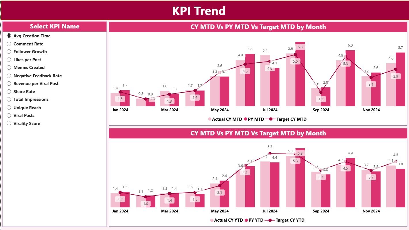
📈 KPI Trend Page
Analyze selected KPI trends over time using MTD and YTD combo charts.
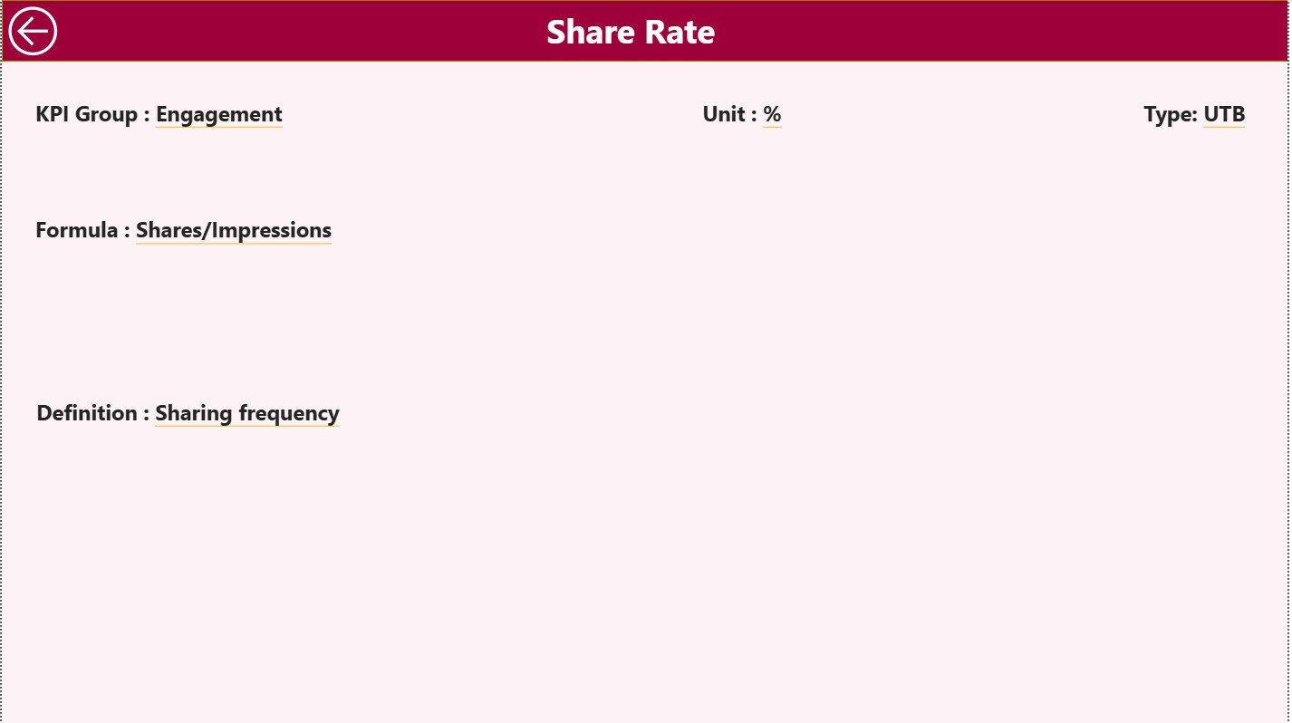
📘 KPI Definition Page
Drill-through page showing KPI formula, definition, and logic to avoid confusion.
📑 Excel Data Structure
-
Input_Actual Sheet
-
Input_Target Sheet
-
KPI Definition Sheet
This structure keeps data clean, consistent, and easy to update.
How to Use the Meme and Viral Content Creation KPI Dashboard in Power BI
📝 Step 1: Enter Data in Excel
Update actual values, targets, and KPI definitions in structured Excel sheets.
🔄 Step 2: Refresh Power BI
Power BI automatically updates all visuals and calculations.
📊 Step 3: Analyze Performance
Use slicers, KPI tables, and icons to identify top-performing and weak content.
📈 Step 4: Review Trends
Analyze MTD and YTD charts to understand virality patterns.
🎯 Step 5: Optimize Strategy
Refine content formats, timing, and campaigns using real insights.
👥 Who Can Benefit from This Meme and Viral Content Creation KPI Dashboard in Power BI
📱 Social Media Managers – Track engagement and viral performance clearly
🎭 Meme Marketing Teams – Measure impact beyond likes and shares
📊 Marketing Analysts – Monitor targets, trends, and performance gaps
🏷️ Brand Managers – Align creative output with business goals
🚀 Growth & Digital Marketing Teams – Scale winning content strategies
🔍 Click here to read the Detailed blog post
📺 Visit our YouTube channel to learn step-by-step video tutorials
👉 Youtube.com/@PKAnExcelExpert


Reviews
There are no reviews yet.