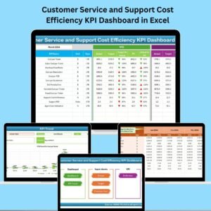
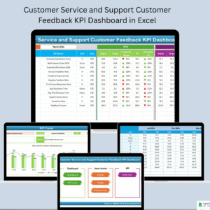
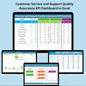
Exceptional customer service isn’t just a nice-to-have—it’s a competitive advantage. But how do you consistently measure, track, and improve service quality across your support team? 🤔 That’s where the Customer Service and Support Quality Assurance KPI Dashboard in Excel becomes your secret weapon. 📈💼
This all-in-one, ready-to-use Excel dashboard template transforms service data into actionable insights. Whether you’re managing a small helpdesk or a large customer support team, this tool will help you boost satisfaction, identify weak spots, and meet service-level expectations with confidence.
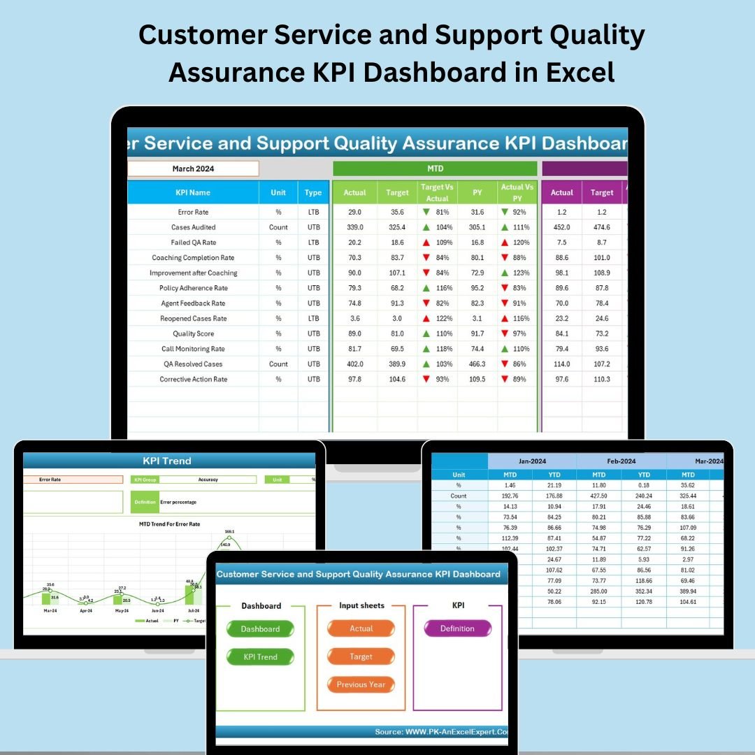
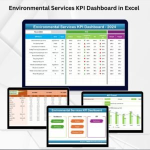
✅ Key Features of Customer Service & Support QA KPI Dashboard
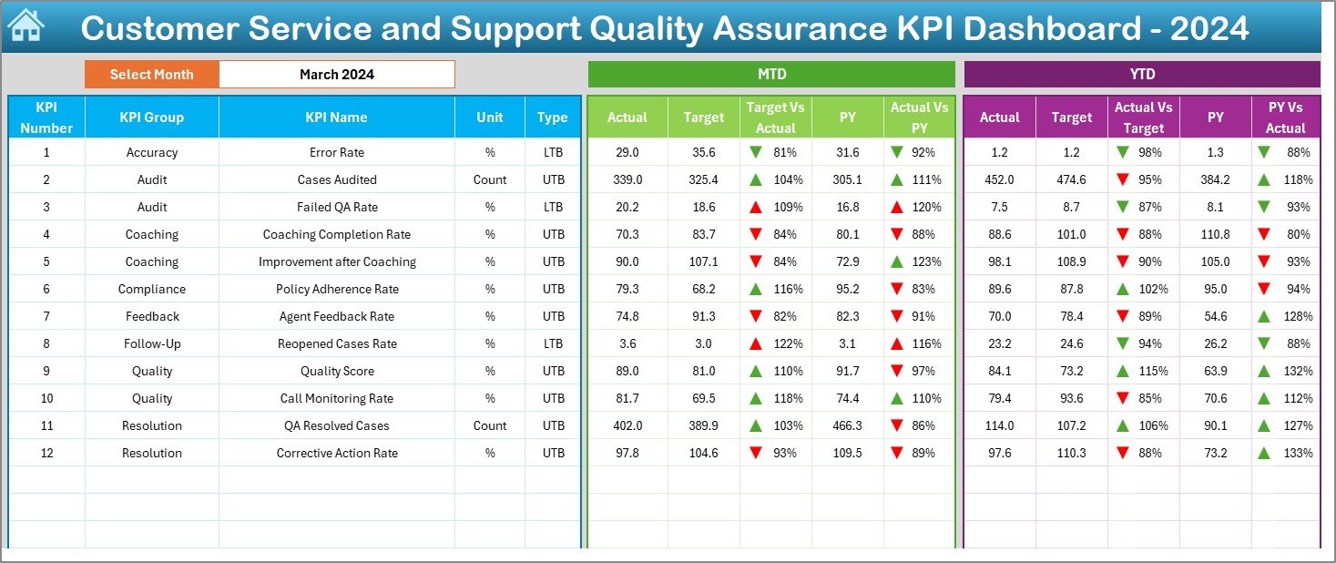
📅 Month Selector: Choose any month to instantly refresh MTD and YTD data.
📊 Dashboard Visuals: View KPIs with actual, target, and previous year comparisons.
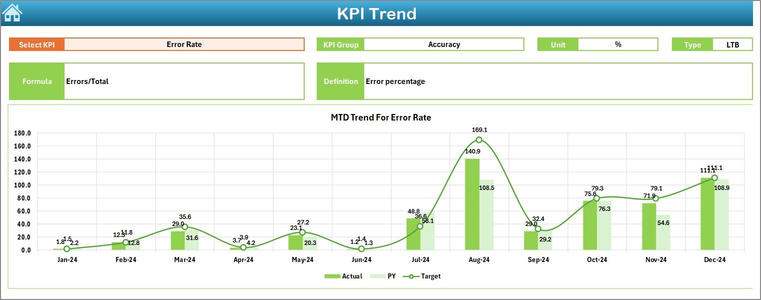
📉 Trend Analysis: Track KPI performance over time with MTD/YTD charts.
🧾 Auto Calculations: Real-time conditional formatting with arrows and color codes.
🗂️ 7 Structured Sheets: From input to dashboard and KPI definitions, everything’s built-in.
🧩 Flexible Setup: Easily add KPIs, update data, or customize visuals without coding.
✅ LTB & UTB Ready: Classify each KPI as Lower the Better or Upper the Better.
📁 Historical Comparison: Analyze performance against last year’s results.
📦 What’s Inside the Dashboard?
This Excel template includes 7 powerful, interlinked worksheet tabs:
🏠 Home Sheet
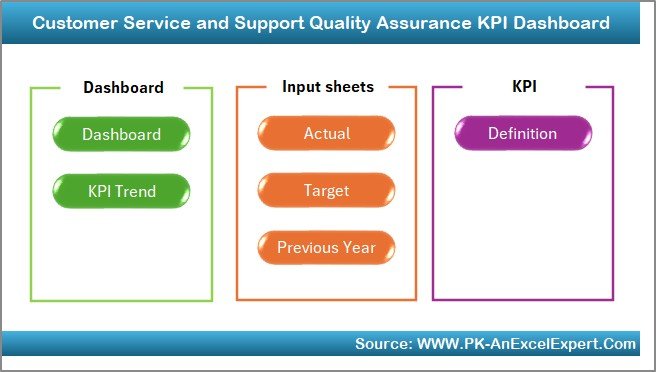
Your navigation hub with quick-click buttons to each main sheet.
📊 Dashboard Sheet
The visual summary. See MTD and YTD performance, track trends, and compare Actuals vs Targets and Previous Year values.
📈 KPI Trend Sheet
Select a KPI to analyze monthly progress with:
-
KPI Group, Unit, Formula, Type
-
Dynamic charts for MTD/YTD trends
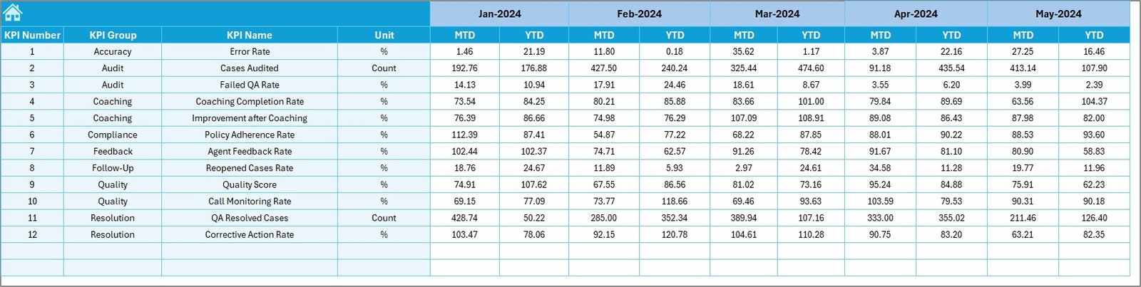
📥 Actual Numbers Input
Enter monthly actuals for each KPI. Use dropdowns and auto-updating logic to keep things simple.
🎯 Target Sheet
Define monthly MTD and YTD targets—compare against actuals to gauge team performance.
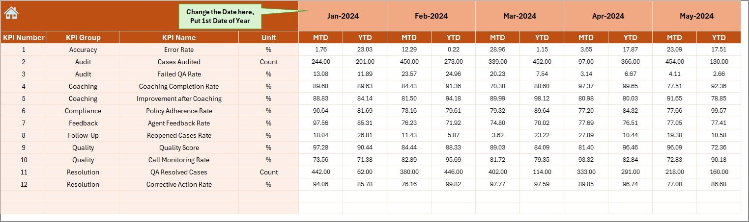
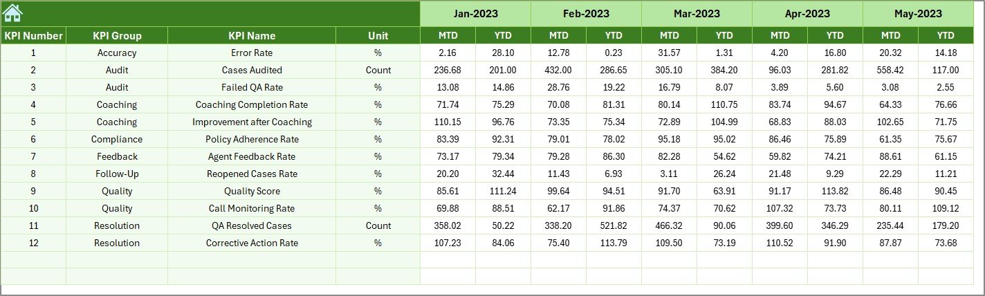
📆 Previous Year Sheet
Track historical MTD and YTD data to spot recurring issues or seasonal trends.
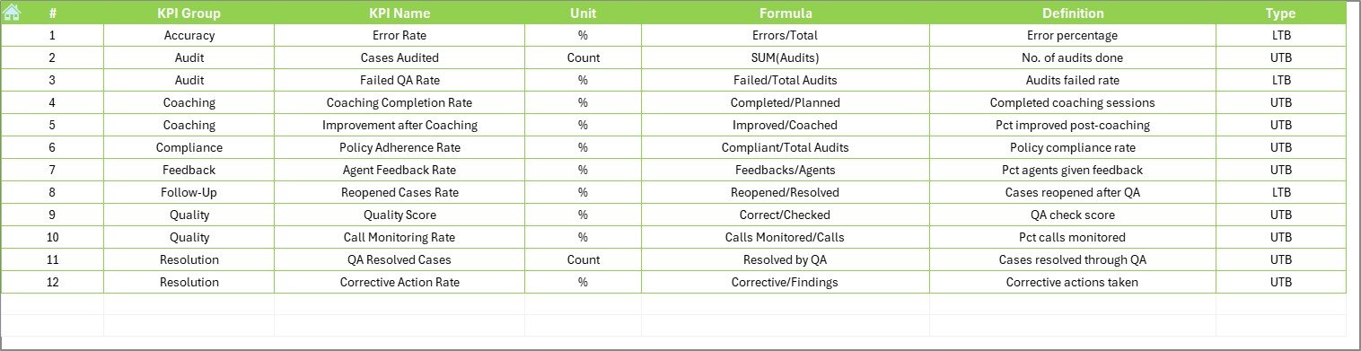
📖 KPI Definition Sheet
Document KPI Name, Group, Unit, Formula, Definition, and whether it’s LTB or UTB.
🛠️ How to Use the Dashboard
-
Enter Your KPIs in the Definition Sheet.
-
Input Actual, Target & PY Data in their respective sheets.
-
Select a Month from the dropdown in the Dashboard sheet.
-
Review Insights from trend charts, color codes, and arrows.
-
Analyze Trends to guide performance discussions and improvements.
-
Customize as Needed – add filters, KPIs, or extend monthly ranges.
👥 Who Can Benefit from This Dashboard?
👩💼 Customer Service Managers – Monitor agent and team performance.
📊 Operations Leads – Maintain SLA compliance and service quality.
🧑💻 Support Agents – Gain visibility into metrics that matter.
💼 Small Business Owners – Run efficient support without complex tools.
📈 Data Analysts – Generate QA reports with ease from structured data.
🔗 Click here to read the Detailed blog post
🔗 Visit our YouTube channel to learn step-by-step video tutorials


Reviews
There are no reviews yet.