Destination Management Companies (DMCs) operate in a highly dynamic environment. They coordinate destinations, vendors, logistics, events, client experiences, and budgets—often simultaneously. Because of this complexity, tracking performance using scattered Excel files or manual reports quickly leads to confusion, missed insights, and delayed decisions.
That is exactly where the Destination Management Companies KPI Dashboard in Excel becomes a powerful and practical management tool.
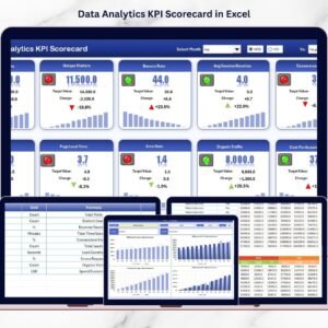
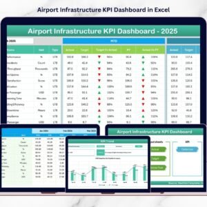
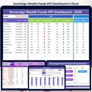
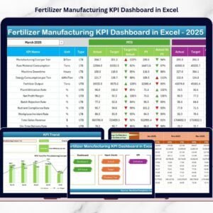
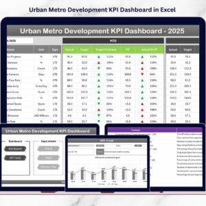
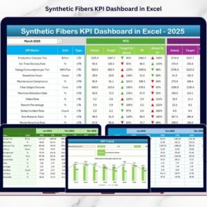
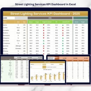
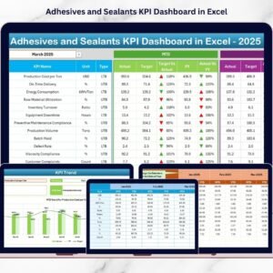
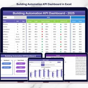
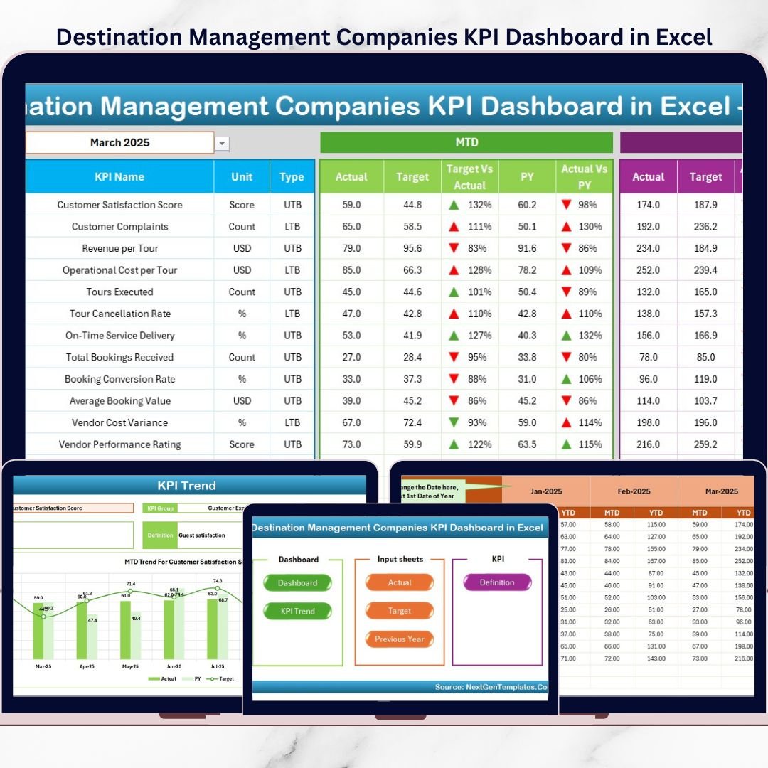
This ready-to-use Excel KPI Dashboard provides a structured and visual way to monitor destination management performance across operations, finance, service quality, and client outcomes. Instead of reviewing multiple spreadsheets, DMC teams can analyze all key performance indicators (KPIs) from one centralized Excel dashboard.
Because the dashboard is built entirely in Microsoft Excel, it offers flexibility, familiarity, and full control. Users can easily update actual values, targets, and previous year numbers without relying on complex software or technical skills. As a result, decision-makers gain instant clarity on how the business is performing month-to-date (MTD) and year-to-date (YTD).
📊 Key Features of Destination Management Companies KPI Dashboard in Excel
This dashboard is designed specifically for destination management and travel operations.
✔ Centralized KPI performance tracking
✔ MTD and YTD performance visibility
✔ Target vs Actual comparison
✔ Previous Year benchmarking
✔ Visual indicators using arrows and conditional formatting
✔ KPI trend analysis for deeper insights
✔ Fully customizable Excel structure
✔ No external software required
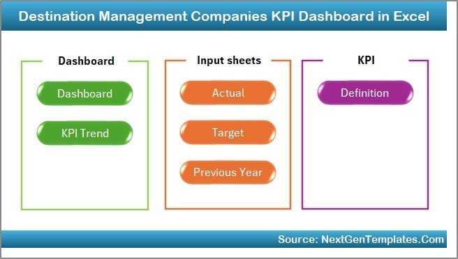
📂 Dashboard Structure & Worksheets
The Destination Management Companies KPI Dashboard in Excel includes 7 professionally designed worksheets, each serving a specific purpose.
🏠 1. Home Sheet (Index Sheet)
The Home Sheet acts as the navigation hub of the dashboard.
Key Highlights
-
Clean and professional index layout
-
6 navigation buttons
-
One-click access to all major sheets
This design improves usability and saves time for both operational teams and senior management.
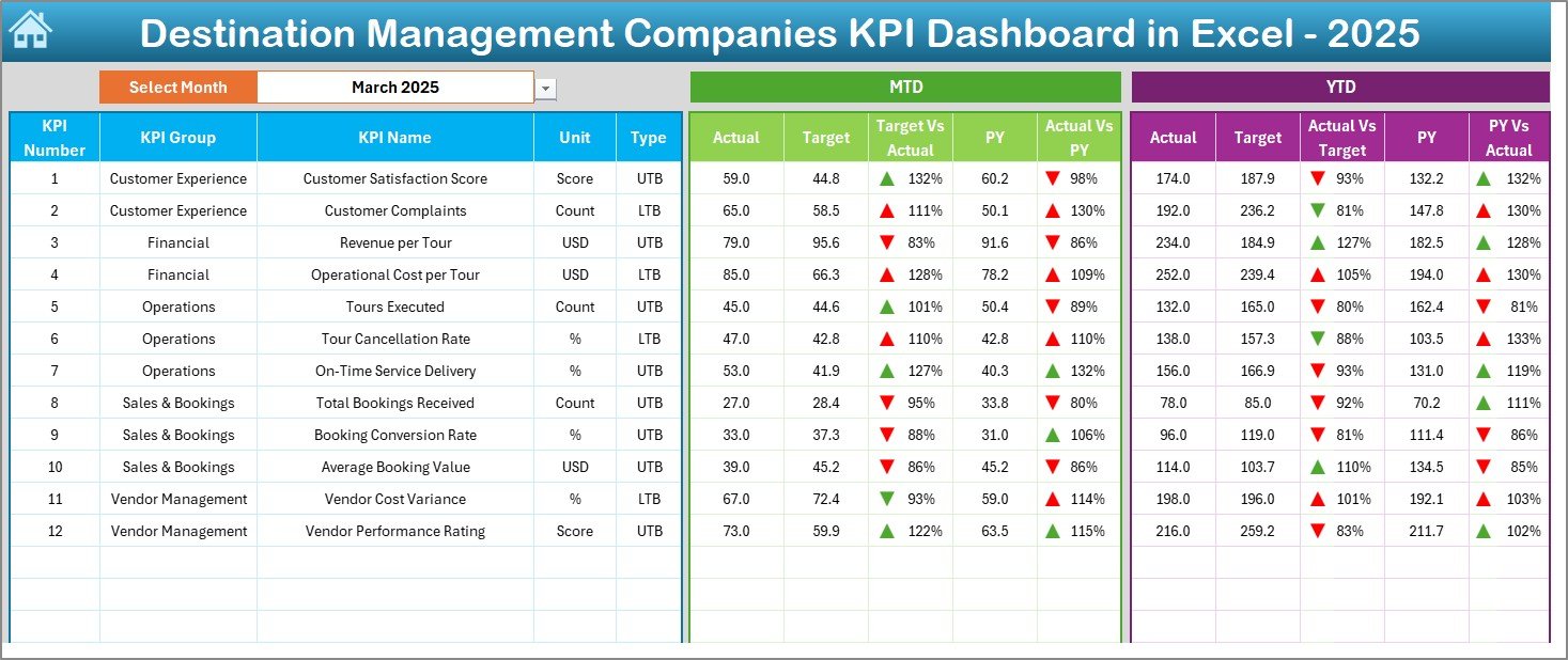
📈 2. Dashboard Sheet (Main KPI View)
The Dashboard Sheet is the heart of the KPI dashboard.
Key Capabilities
-
Month selection drop-down in cell D3
-
Automatic refresh of all KPIs based on selected month
-
Displays complete MTD and YTD performance
-
Shows Actual, Target, and Previous Year values
-
Target vs Actual variance
-
Previous Year vs Actual variance
-
Conditional formatting with up/down arrows
Because all KPIs appear on a single screen, management can instantly identify strong and weak performance areas.
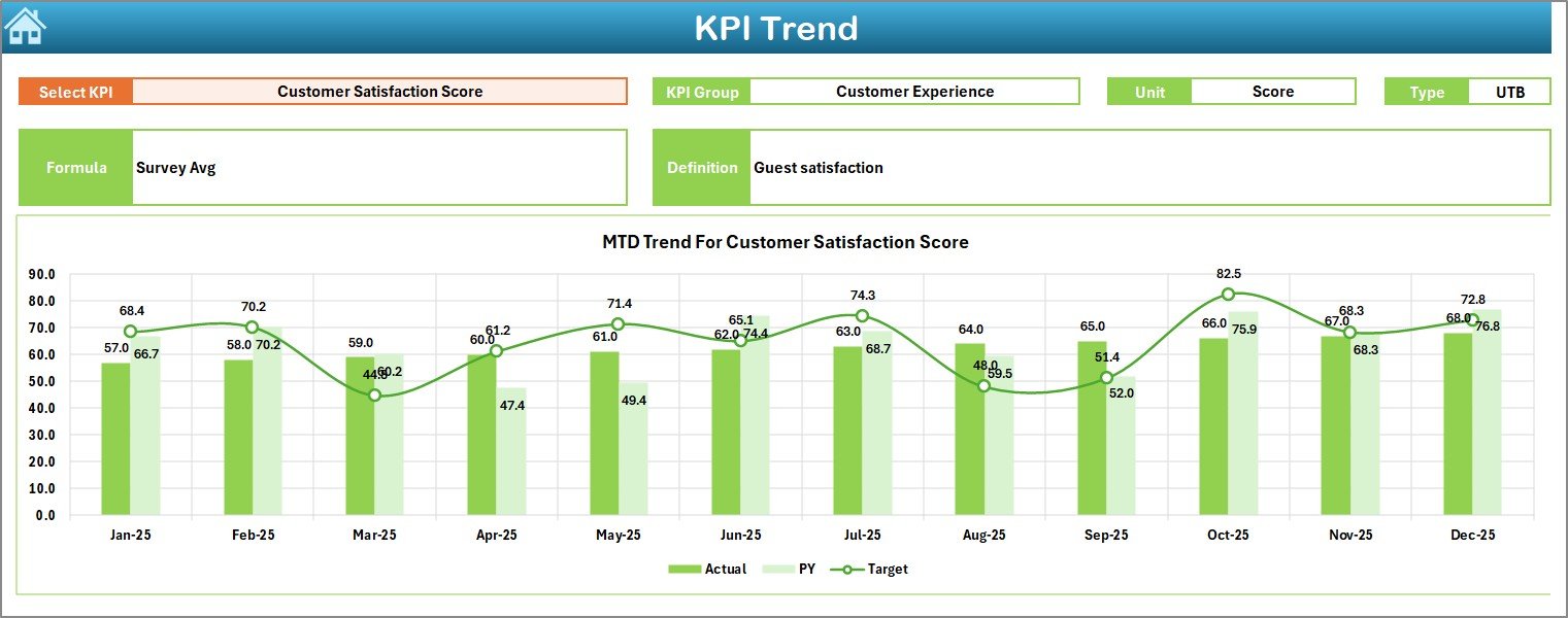
📉 3. KPI Trend Sheet
The KPI Trend Sheet enables detailed analysis of individual KPIs.
How It Works
-
Select KPI Name from drop-down in Cell C3
Information Displayed
-
KPI Group
-
Unit of Measurement
-
KPI Type (LTB / UTB)
-
KPI Formula
-
KPI Definition
Trend Analysis
-
MTD trend chart (Actual, Target, Previous Year)
-
YTD trend chart (Actual, Target, Previous Year)
This sheet helps identify patterns, seasonality, and long-term performance gaps.
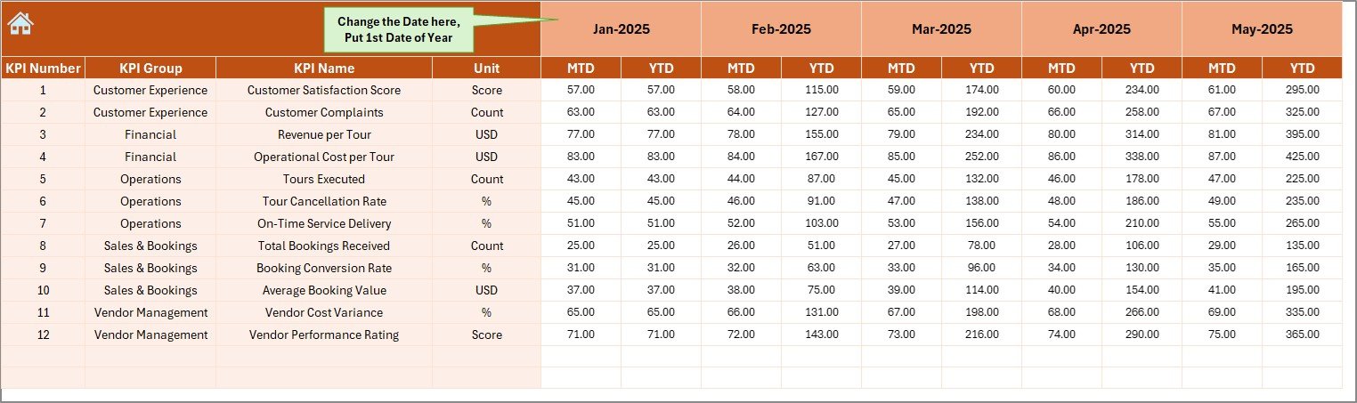
🧾 4. Actual Numbers Input Sheet
This sheet captures current year actual performance data.
Key Features
-
Enter MTD and YTD actual values
-
Select starting month of the year in Cell E1
-
Automatic dashboard calculations
It ensures clean and consistent data entry throughout the year.
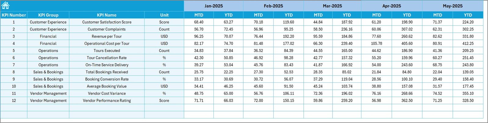
🎯 5. Target Sheet
The Target Sheet defines expected performance levels.
Purpose
-
Enter monthly MTD targets
-
Enter cumulative YTD targets
-
Enable accurate variance analysis
Targets automatically flow into dashboard and trend views.
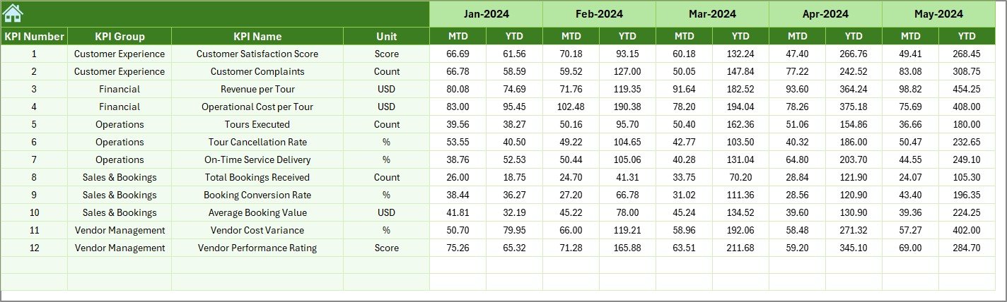
📅 6. Previous Year Number Sheet
This sheet stores historical KPI data.
Benefits
-
Enables year-over-year comparison
-
Highlights improvement or decline
-
Supports reviews and planning discussions
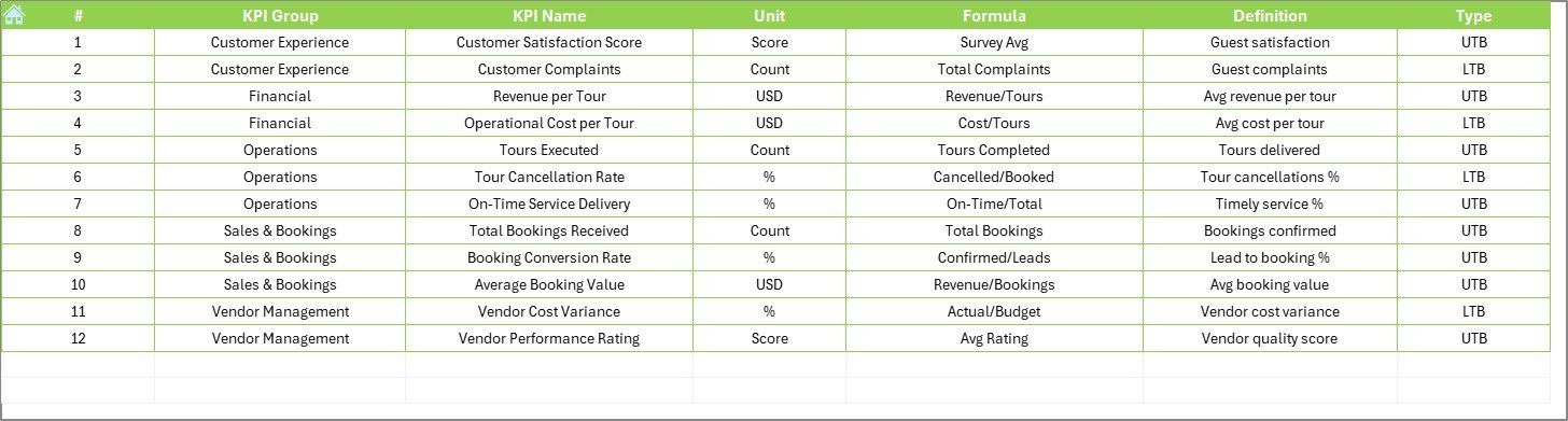
📘 7. KPI Definition Sheet
The KPI Definition Sheet ensures clarity and governance.
Includes
-
KPI Name
-
KPI Group
-
Unit
-
Formula
-
Definition
-
KPI Type (LTB / UTB)
This sheet acts as a single source of truth for all KPIs.
🎯 Who Should Use This Dashboard?
This KPI dashboard is ideal for:
✔ Destination Management Companies (DMCs)
✔ Event & travel management firms
✔ Tourism operators
✔ Operations managers
✔ Finance & reporting teams
✔ Business owners
Both small and large DMCs can use this dashboard effectively.
🚀 Business Benefits
Using this dashboard helps organizations:
-
Improve operational visibility
-
Control costs and margins
-
Track service quality consistently
-
Compare performance across time
-
Reduce manual reporting effort
-
Support strategic planning
As a result, teams move from reactive reporting to proactive management.
📺 Visit our YouTube channel to learn step-by-step video tutorials
👉 https://youtube.com/@PKAnExcelExpert
🔗 Click here to read the Detailed blog post