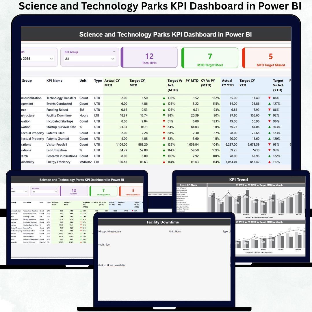
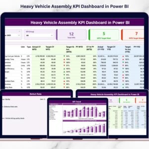
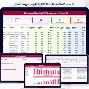
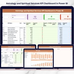
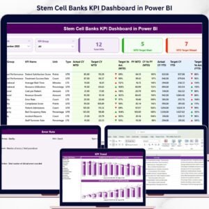
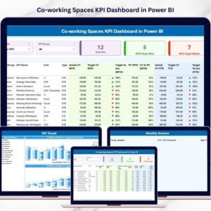
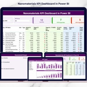
Managing a Science and Technology Park (STP) is complex—multiple research programs, startup incubation, innovation services, infrastructure, and collaborations all happening at the same time. Without a clear performance monitoring system, teams struggle to track progress, spot gaps, and make timely decisions. Science and Technology Parks KPI Dashboard in Power BI That’s why the Science and Technology Parks KPI Dashboard in Power BI is a must-have tool for every innovation ecosystem looking to improve efficiency, transparency, and growth.
Science and Technology Parks KPI Dashboard in Power BI This ready-to-use Power BI dashboard transforms raw Excel data into clean visuals, smart KPIs, and stunning trend charts. With just one click, managers can analyze performance, compare results with targets, monitor year-over-year progress, and instantly identify improvement areas. Whether you manage startups, research labs, innovation projects, or infrastructure, this dashboard gives you complete clarity in a single interface.
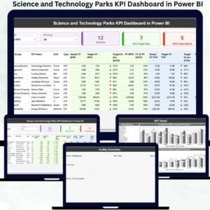
✨ Key Features of the Science and Technology Parks KPI Dashboard in Power BI
1️⃣ Smart Summary Page – At-a-Glance Visibility
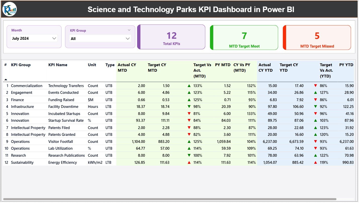
The Summary Page offers a powerful visual snapshot of all KPIs:
-
📊 Total KPIs Count
-
🎯 MTD Target Met Count
-
⚠️ MTD Target Missed Count
Below this, a detailed KPI table displays: KPI Group, KPI Name, Unit, Type (UTB/LTB), CY MTD, PY MTD, Target % Comparison, and YTD performance—all enhanced with green ▲ and red ▼ indicators.
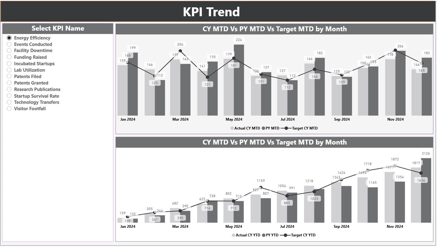
2️⃣ KPI Trend Page – Visualize Performance Over Time
This page includes two combo charts for each KPI:
-
📈 MTD Trend Chart: CY Actual vs PY Actual vs Target
-
📉 YTD Trend Chart: Yearly improvement tracking
The KPI slicer makes trend analysis smooth and interactive.
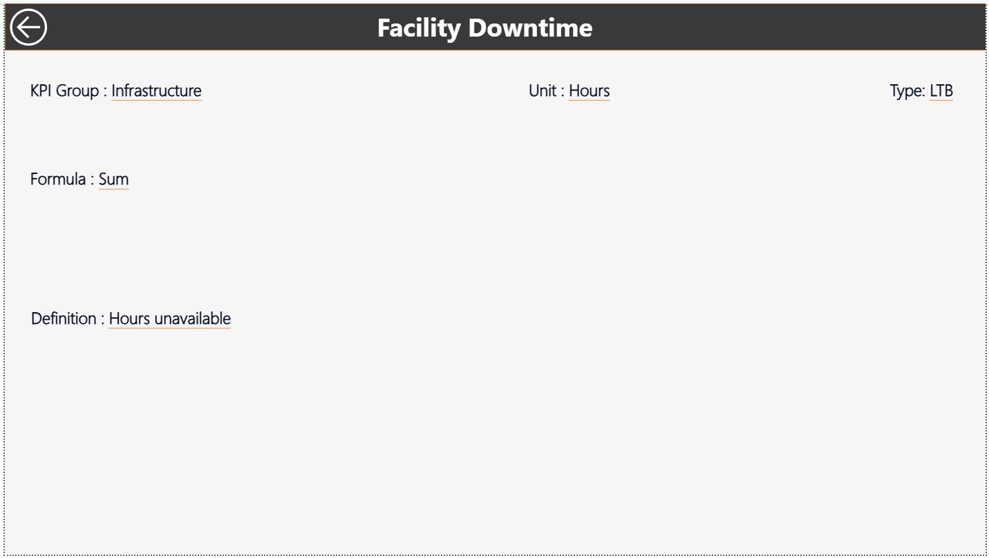
3️⃣ KPI Definition Page – 100% Clarity for All KPIs
Users can drill through any KPI to view:
-
🔍 Formula
-
📘 Definition
-
🧪 KPI Group
-
📏 Unit
-
⚖️ Type (UTB/LTB)
This ensures teams interpret KPIs consistently and accurately.
📦 What’s Inside the Science and Technology Parks KPI Dashboard?
Your dashboard comes with three interconnected Power BI pages:
-
✔️ Summary Performance Dashboard
-
✔️ KPI Trend Visuals Page
-
✔️ Drill-Through KPI Definition Page
Plus, it is powered by a structured Excel file containing:
-
🟦 Input Actual Sheet
-
🟩 Input Target Sheet
-
🟨 KPI Definition Sheet
Updating data is effortless—just refresh Power BI and insights appear instantly.
🧑💻 How to Use the Dashboard
Step 1:
Update KPI values in Excel (Actual & Target Sheets)
Step 2:
Refresh Power BI to pull updated data
Step 3:
Use slicers to filter by Month or KPI Group
Step 4:
Drill-through KPIs for deeper understanding
Step 5:
Use insights to make faster and better decisions
Perfect for managers, analysts, research leaders, and innovation teams!
👥 Who Can Benefit from This Dashboard?
-
🏢 Science & Technology Park Directors
-
🚀 Incubation & Acceleration Managers
-
🧪 R&D Teams & Researchers
-
📊 Strategy & Operations Teams
-
💼 Government Innovation Departments
-
🧭 Innovation Consultants
-
🧑💼 Admin, Finance & Planning Teams
Anyone handling research, innovation, technology transfer, or startup operations will benefit enormously.


Reviews
There are no reviews yet.