


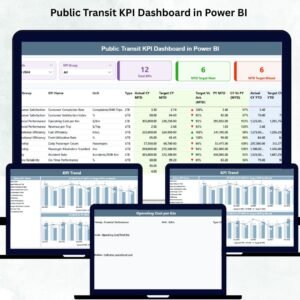
Public Transit KPI Dashboard in Power BI Managing a public transit network is not simple. Thousands of buses, trains, and metro services operate every day. A small delay, a missed trip, or a poor service hour can affect thousands of commuters. Public Transit KPI Dashboard in Power BI That’s why transit authorities need clear, real-time visibility to make smarter and faster decisions. The Public Transit KPI Dashboard in Power BI gives you exactly that—a powerful, interactive, and easy-to-use reporting system that simplifies how transit performance is monitored.
This dashboard converts raw Excel data into meaningful visuals. With just one refresh, you get instant clarity on MTD vs YTD performance, target achievements, monthly trends, ridership movement, service reliability, and operational gaps. Whether you’re a city transit department, bus operator, metro corporation, or transport planning team, this dashboard gives you the insights you need to improve service quality and passenger satisfaction.
🚍 Key Features of the Public Transit KPI Dashboard in Power BI
This dashboard is designed with simplicity and clarity in mind. It includes three powerful pages that capture every important aspect of public transit operations.
📊 What’s Inside the Public Transit KPI Dashboard
1️⃣ Summary Page — The Main Transit Control Center

This is where decision-makers begin their daily analysis.
You get:
✨ Month Slicer: Filter the entire dashboard by selecting a reporting month.
✨ KPI Group Slicer: Analyze KPIs by categories like ridership, delays, fleet reliability, or customer satisfaction.
✨ KPI Cards:
-
Total KPIs Count
-
MTD Target Met Count
-
MTD Target Missed Count
✨ Detailed KPI Table — The heart of the dashboard
This includes all essential fields:
-
KPI Number
-
KPI Group
-
KPI Name
-
Unit (%, minutes, count, etc.)
-
LTB/UTB Type
-
Actual CY MTD
-
Target CY MTD
-
MTD Icon (▲/▼ indicators)
-
Target vs Actual %
-
PY MTD
-
CY vs PY (MTD%)
-
Actual CY YTD
-
Target CY YTD
-
YTD Icon (▲/▼)
-
Target vs Actual (YTD%)
-
PY YTD
-
CY vs PY (YTD%)
This structured layout gives leaders a complete snapshot within seconds.
2️⃣ KPI Trend Page — Visualize Transit Performance Over Time
This page helps you identify patterns, seasonal demand, and service challenges.
📌 Includes two combo charts:
-
MTD Trend Chart: Actual CY, PY, and monthly target
-
YTD Trend Chart: Actual CY, PY YTD, and yearly targets
📌 KPI Selection Slicer:
Choose any metric (ridership, on-time %, breakdowns, average delay time, etc.) and watch both charts update instantly.
This page is essential for:
-
Monthly review meetings
-
Performance forecasting
-
Route planning
-
Service optimization
3️⃣ KPI Definition Page — Full Transparency for Every KPI
This drill-through page helps users understand every KPI with clarity.
It shows:
-
KPI Number
-
KPI Group
-
KPI Name
-
Unit
-
Formula
-
Definition
-
KPI Type (LTB or UTB)
A Back button helps users return to the Summary Page quickly.
This page is extremely useful for training teams and ensuring uniform KPI interpretation.
⚙️ How to Use the Public Transit KPI Dashboard
This dashboard runs on a simple Excel backend. Just update these sheets:
📄 Input Actual Sheet
-
KPI Name
-
Month (first date of the month)
-
Actual MTD
-
Actual YTD
📄 Input Target Sheet
-
KPI Name
-
Month
-
Target MTD
-
Target YTD
📄 KPI Definition Sheet
-
KPI Number
-
KPI Group
-
KPI Name
-
Unit
-
Formula
-
Definition
-
UTB/LTB indicator
Update → Refresh → Done.
Your entire dashboard updates instantly.
👥 Who Can Benefit from This Dashboard
This template is ideal for:
-
Public transport authorities
-
Bus depot managers
-
Metro/rail corporations
-
Transport planning departments
-
Municipal transport bodies
-
Operational analytics teams
-
Fleet performance managers
Anyone involved in improving transit services can use it without technical training.
📌 How to Use the Product (Step-by-Step)
1️⃣ Enter monthly actual values in the Input Actual sheet
2️⃣ Update MTD & YTD targets in the Target sheet
3️⃣ Maintain accurate KPI definitions
4️⃣ Open Power BI and refresh data
5️⃣ Use slicers to filter KPIs
6️⃣ Check red/green indicators for performance alerts
7️⃣ Review trend charts monthly
8️⃣ Drill-through to understand KPI formulas
🌟 Advantages of the Public Transit KPI Dashboard
-
🚍 Faster decisions with clear KPIs
-
📉 Better visibility into delays & service reliability
-
🔄 Accurate MTD/YTD comparisons
-
📈 Trend insights showing yearly progress
-
✔️ Target monitoring made simple
-
📊 Zero manual reporting
-
👥 Improved team accountability
-
🔧 Easy customization for any transit system


Reviews
There are no reviews yet.