In today’s fast-moving business environment, supply chain efficiency isn’t optional—it’s your competitive edge. With the Supply Chain and Logistics Process Improvement KPI Dashboard in Excel, you get a powerful, customizable, and easy-to-use tool to track performance, spot inefficiencies, and continuously improve your operations.
This dashboard helps you visualize Month-To-Date (MTD) and Year-To-Date (YTD) performance, benchmark against targets, and compare with previous year figures—all without the need for expensive software.
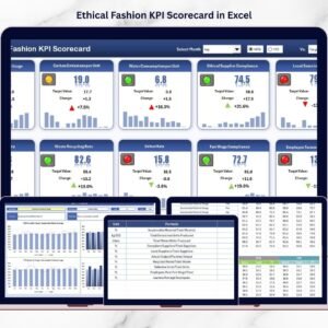
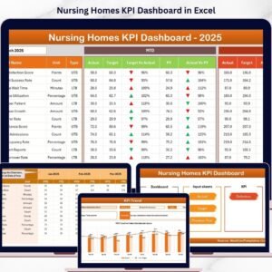
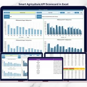
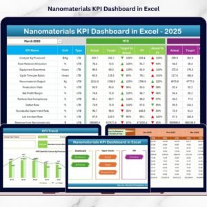
🧰 What’s Included in the Dashboard?
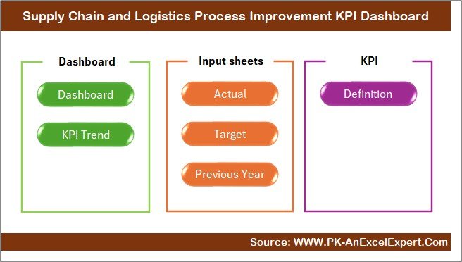
This Excel template is professionally structured into 7 essential sheets, each designed for specific functions:
1️⃣ Home Sheet – Quick Navigation Panel
📍 6 one-click buttons to jump between sheets
📊 Easy access to Dashboard, Trend, Inputs, Targets, and KPI definitions
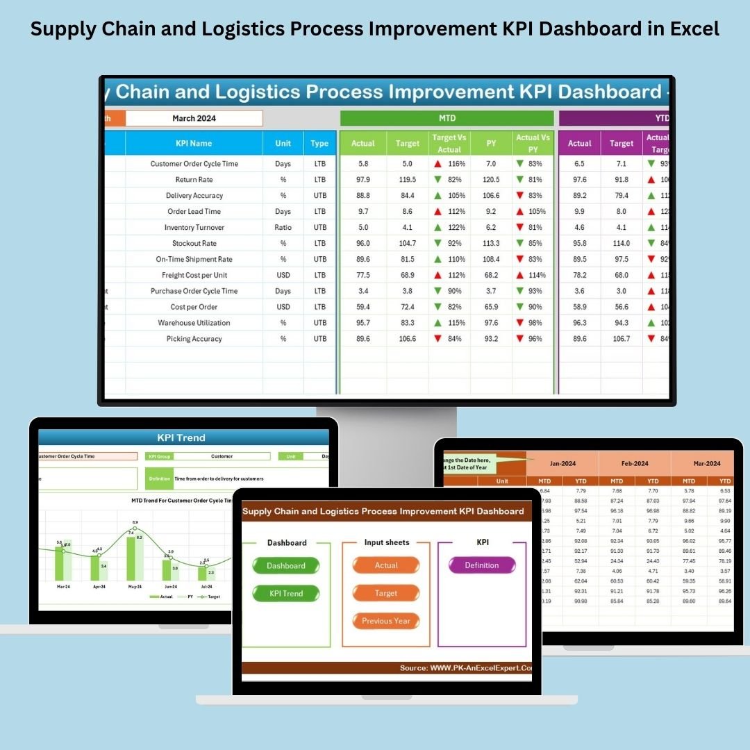
2️⃣ Dashboard Sheet – Real-Time KPI View
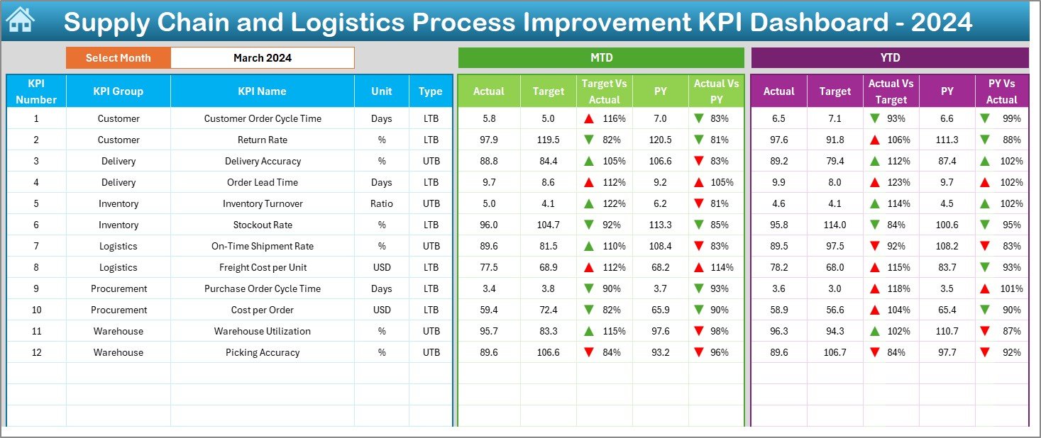
📅 Select any month using the dropdown in cell D3
📈 Automatically displays:
-
MTD: Actual vs Target, Actual vs Previous Year
-
YTD: Actual vs Target, Actual vs Previous Year
🎯 Includes color-coded arrows for visual performance insights
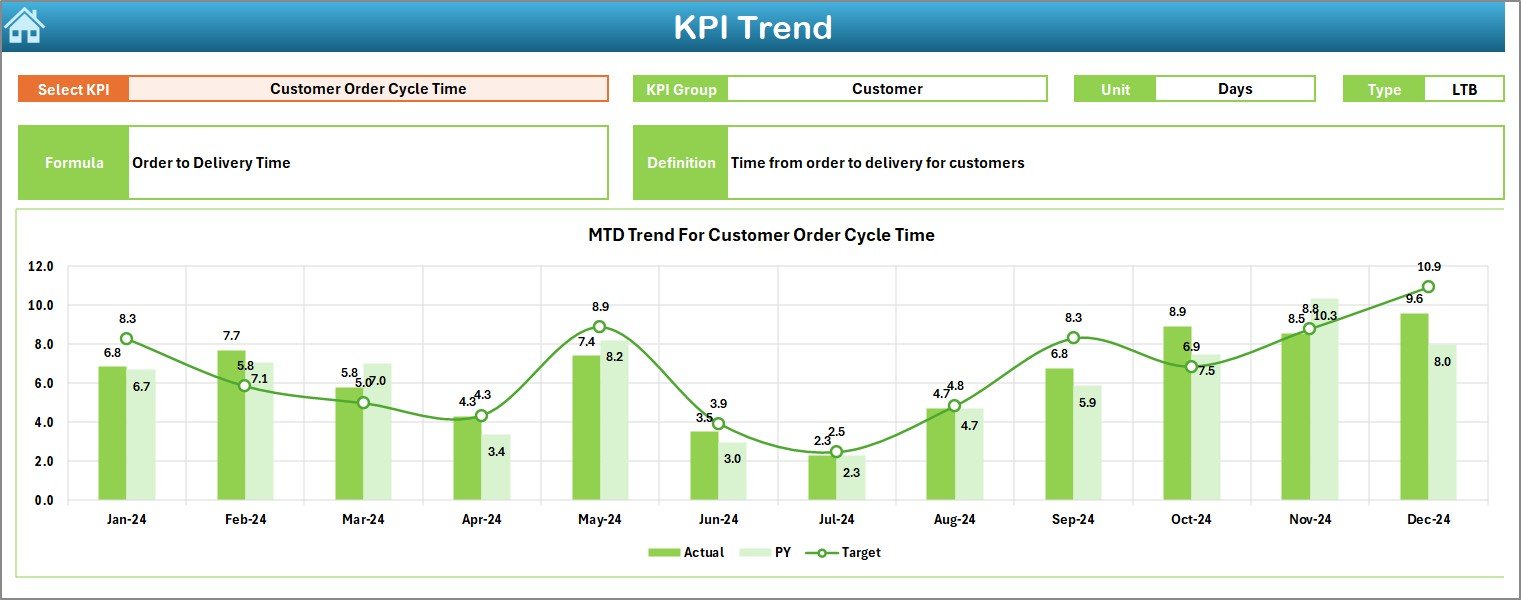
3️⃣ KPI Trend Sheet – Analyze Monthly Performance
🔽 Choose a KPI from a dropdown (cell C3)
📘 View KPI metadata: Name, Group, Unit, Type (UTB/LTB), Formula, Definition
📊 Visual line charts for MTD and YTD: Actual vs Target vs PY
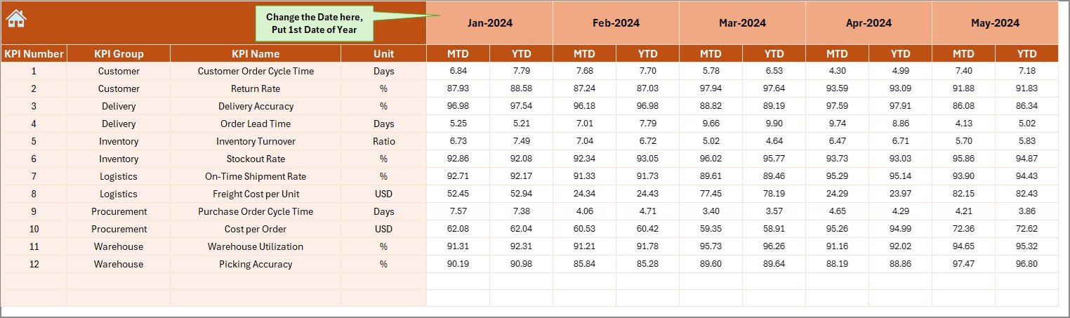
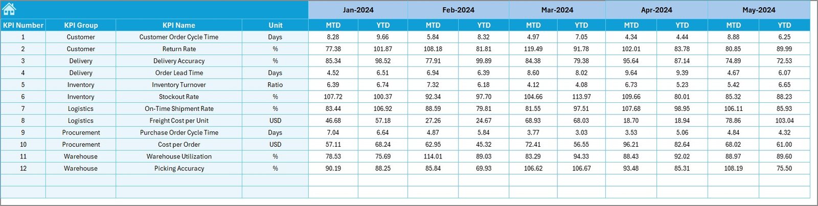
4️⃣ Actual Numbers Input Sheet – Enter Data with Ease
📆 Define the start month in cell E1
🖊 Enter monthly Actuals (MTD & YTD) per KPI
🔁 Feeds live data into dashboard and charts
5️⃣ Target Sheet – Set Clear Goals
🎯 Input your performance targets (MTD and YTD) for each KPI
📌 Keeps team aligned with measurable outcomes
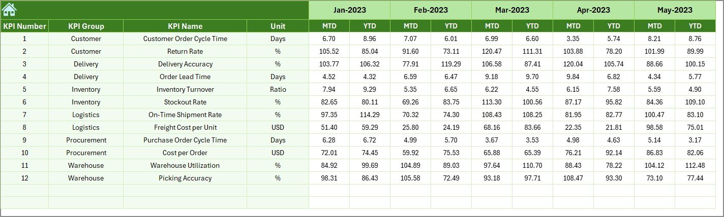
6️⃣ Previous Year Sheet – Historical Comparison
📅 Input last year’s performance data
📊 Enables quick side-by-side comparison and year-over-year trend analysis
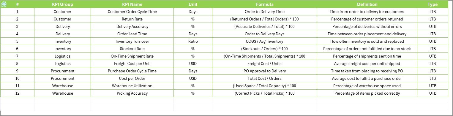
7️⃣ KPI Definition Sheet – Ensure Clarity
📚 Define each KPI with:
-
KPI Name
-
KPI Group (e.g., Delivery, Inventory, Cost)
-
Unit
-
Formula
-
Definition
-
Type (UTB = Upper the Better, LTB = Lower the Better)
📌 Keep reporting standardized and transparent
💡 Why Use Excel for Supply Chain KPIs?
✅ Familiar & Accessible – No learning curve
✅ Fully Customizable – Change colors, KPIs, logic
✅ No Monthly Fees – One-time setup, unlimited use
✅ Offline Access – Works without internet
✅ Perfect for Teams – Share via email, OneDrive, Teams, or Google Drive
🏆 Key Benefits of This Dashboard
🚀 Instant Visibility
Easily see which metrics are on track and where issues lie
🕒 Time-Saving
Automated dashboards reduce manual reporting work
💰 Budget-Friendly
Achieve enterprise-level insights without costly tools
📈 Promotes Continuous Improvement
Use monthly trends to fix inefficiencies proactively
👥 Enhances Accountability
Visual KPIs help align teams with operational goals
📌 Real Use-Case Example
You’re a logistics lead noticing rising shipping costs. With this dashboard, you discover a spike in transportation expense for Q2. Digging deeper, you find a vendor rate hike. You renegotiate and reduce costs—tracking a 12% improvement next month. Without this dashboard, the problem might’ve gone unnoticed.
🛡 Best Practices for Dashboard Usage
✔️ Keep it updated monthly
✔️ Use consistent units for accurate comparisons
✔️ Review with your team to uncover action items
✔️ Limit KPIs to the most impactful
✔️ Use color coding to highlight risk zones
📚 Frequently Asked Questions (FAQs)
Q1. Can I add more KPIs to the dashboard?
Yes, it’s fully editable. Add rows in the KPI Definition and Trend sheets.
Q2. Is Excel expertise required?
No! If you can type, use dropdowns, and filters—you’re good to go.
Q3. Is this suitable for small businesses?
Absolutely. It’s perfect for startups to mid-size companies.
Q4. Does it work in Google Sheets?
Basic features work, but dynamic charts and dropdowns are best in Excel.
Q5. Can I use this dashboard offline?
Yes. You can use it 100% offline without any online tools.
🔗 Click here to read the Detailed blog post
Visit our YouTube channel to learn step-by-step video tutorials


Reviews
There are no reviews yet.