In every organization, effective space management drives productivity, cost-efficiency, and employee satisfaction. The Space Utilization Dashboard in Google Sheets offers a complete, ready-to-use analytics solution that helps you track, analyze, and optimize how your spaces — meeting rooms, event halls, classrooms, or coworking areas — are used.
Built entirely in Google Sheets, this dashboard enables facility managers, administrators, and workspace planners to gain real-time insights into booking trends, utilization rates, costs, and user feedback — all through interactive visuals and automatically updating KPIs.
📘 What Is a Space Utilization Dashboard in Google Sheets?
A Space Utilization Dashboard is a data analytics tool designed to monitor how physical spaces are being booked, used, and rated. It provides insights into metrics like booking frequency, attendance, cost efficiency, and satisfaction scores.
Because it’s developed in Google Sheets, it requires no coding or complex BI software, making it ideal for offices, coworking spaces, universities, or event venues that need a flexible, cloud-based, and collaborative way to manage space performance.
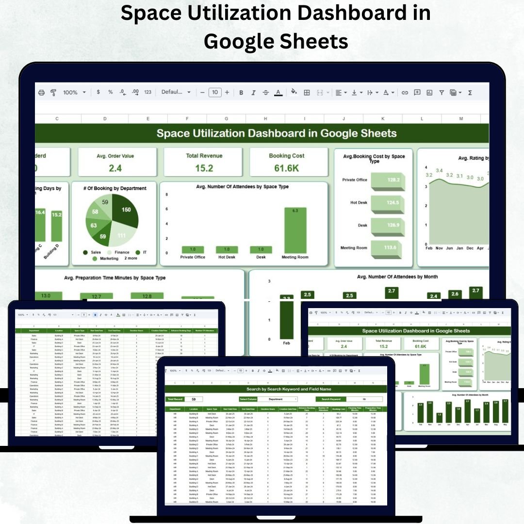
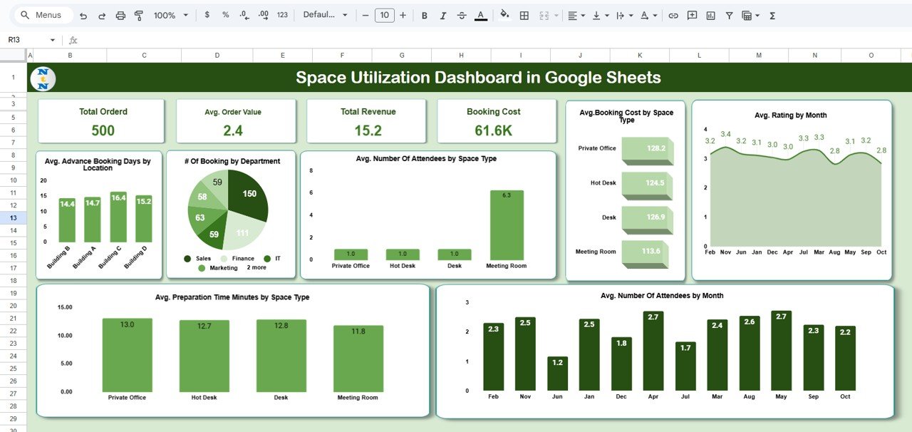
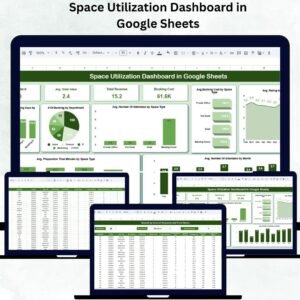
📊 Dashboard Overview
The Dashboard Sheet serves as the central hub where all key performance data is visualized through KPIs and charts.
🔹 KPI Cards
At the top of the dashboard, key performance cards provide instant summaries:
-
Total Orders: Number of bookings made.
-
Average Order Value: Average revenue generated per booking.
-
Total Revenue: Total income from all reservations.
-
Booking Cost: Overall maintenance and operational costs.
These indicators give leadership a snapshot of financial and operational performance.
🔸 Key Charts in the Dashboard
This dashboard is packed with dynamic visuals that provide multi-dimensional insights into space usage:
-
Avg. Advance Booking Days by Location: Reveals how far in advance bookings are made, helping predict demand peaks.
-
# of Bookings by Department: Identifies departments with high or low utilization.
-
Avg. Attendees by Space Type: Shows average attendance across rooms (e.g., Conference Room, Training Hall).
-
Avg. Booking Cost by Space Type: Highlights which spaces are most cost-efficient.
-
Avg. Rating by Month: Tracks user satisfaction over time.
-
Avg. Attendees by Month: Displays seasonal trends in space usage.
-
Avg. Preparation Time by Space Type: Measures setup time to improve scheduling and turnaround.
Each chart updates automatically as new booking data is entered, ensuring accurate, real-time insights.
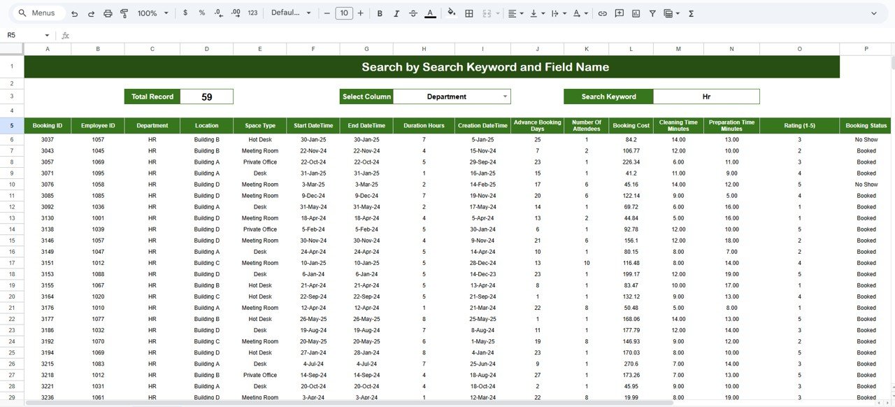
🔍 Search Feature
The Search Tab makes it simple to locate any booking record instantly.
You can filter by:
-
Keyword (e.g., “Conference Room”)
-
Department (e.g., “HR Department”)
-
Month or Location
This feature saves time and enhances accessibility, especially in large organizations managing multiple spaces.
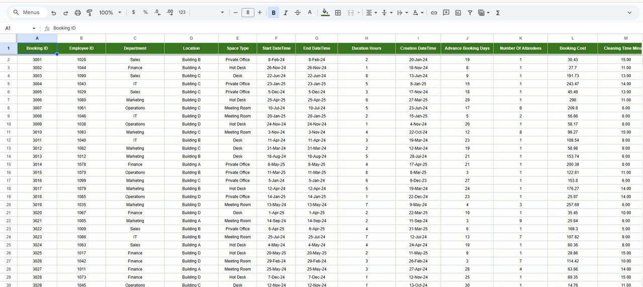
📄 Data Sheet Tab
The Data Sheet acts as the foundation of this dashboard — storing all booking details.
Typical Columns Include:
Booking ID | Department | Location | Space Type | Booking Date | Cost | Revenue | Attendees | Advance Booking Days | Preparation Time | User Rating
As soon as data is added or updated here, all KPIs and visuals across the dashboard refresh automatically — eliminating the need for manual recalculations.
🌟 Advantages of the Space Utilization Dashboard
-
📊 Centralized Analytics: Consolidate all space performance data in one place.
-
⏱️ Real-Time Updates: Charts and KPIs refresh automatically.
-
🧩 Fully Customizable: Add new KPIs, metrics, or visuals as needed.
-
💡 Operational Insights: Identify underused or overbooked spaces.
-
💸 Cost Control: Compare cost and revenue by space type for smarter budgeting.
-
👥 User Feedback Tracking: Analyze satisfaction trends by location or month.
-
🌐 Collaborative Access: Multiple users can edit or view simultaneously.
-
🔐 Secure & Shareable: Manage permissions to control visibility.
🚀 Opportunities for Improvement
Enhance your dashboard with advanced automation:
-
🔗 Data Integration: Link Google Forms or booking systems for live data entry.
-
📧 Email Notifications: Send automated booking or renewal alerts.
-
🗓️ Calendar View: Embed a visual schedule for daily or weekly bookings.
-
🗺️ Heat Map Visualization: Highlight high-demand areas using color-coded maps.
-
📊 Budget Comparison: Add variance charts for projected vs actual costs.
-
📱 Mobile Optimization: Convert to a Looker Studio view for smartphone access.
💡 Best Practices for Using the Dashboard
✅ Update data weekly to maintain real-time accuracy.
✅ Standardize categories (e.g., location names, space types) for consistency.
✅ Apply conditional formatting to flag low ratings or long prep times.
✅ Review monthly trends to identify usage inefficiencies.
✅ Limit access to sensitive cost data.
✅ Discuss insights in monthly facility planning meetings.
👥 Who Can Use This Dashboard
-
Facility Managers – Monitor and optimize workspace usage.
-
Office Administrators – Manage meeting and event room efficiency.
-
University/School Staff – Track classroom and lab utilization.
-
Coworking Operators – Measure booking frequency and revenue per client.
-
Event Venue Managers – Assess event space performance and profitability.
✅ Conclusion
The Space Utilization Dashboard in Google Sheets is your all-in-one tool for tracking, analyzing, and optimizing workspace usage. With interactive visuals, automated KPIs, and real-time collaboration, it eliminates guesswork from facility management.
Whether you’re overseeing offices, campuses, or venues, this dashboard delivers data-driven clarity that helps improve space efficiency, enhance user satisfaction, and reduce operational waste.
If you want to transform space data into actionable insights, this dashboard is the perfect fit.
🔗 Click here to read the detailed blog post
Watch the step-by-step video Demo:


Reviews
There are no reviews yet.