
Server uptime is the backbone of modern business operations. Even a few seconds of downtime can impact revenue, customer satisfaction, and internal productivity. That’s why this Server Uptime KPI Dashboard in Power BI is designed to help IT teams see every critical server metric in real time. With clear visuals, trend charts, KPI cards, and comparison tables, this dashboard helps you monitor stability, spot risks early, and maintain uninterrupted performance.
Whether you manage on-premises servers, cloud environments, hybrid systems, or distributed workloads, this dashboard gives you a complete picture of uptime reliability. It converts raw performance logs into insights you can use instantly—without manual calculations or spreadsheets.
This dashboard contains three powerful pages: a Summary Page for instant monitoring, a KPI Trend Page for long-term patterns, and a Definition Page to help new users and managers understand every KPI clearly.
📦 What’s Inside the Server Uptime KPI Dashboard in Power BI
This dashboard is neatly structured so IT teams can explore every metric with ease. Below is a breakdown of what’s included inside.
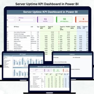
🔍 1. Summary Page – The Main Monitoring Hub
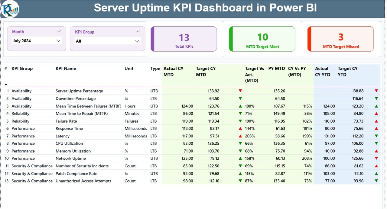
This page gives you the full picture of your server performance in one glance. It includes:
-
Month Slicer – Switch between months instantly.
-
KPI Group Slicer – Filter KPIs by availability, performance, reliability, SLA metrics, and more.
-
Top KPI Cards – View total KPIs, MTD target meets, and MTD target misses.
-
Detailed KPI Table – Track actual vs target, CY vs PY, and MTD/YTD performance.
With visual icons (green ▲ for good, red ▼ for poor), you instantly understand which servers meet SLA expectations and which need attention.
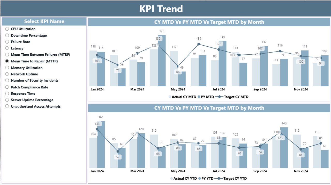
📈 2. KPI Trend Page – Understand Uptime Over Time
The KPI Trend Page gives you two powerful combo charts:
-
MTD Trend Chart
-
YTD Trend Chart
Both show a comparison of:
-
Actual CY
-
Previous Year
-
Target values
This helps you monitor long-term server behavior, discover seasonal issues, and analyze how uptime improves or declines over time. You can choose a specific KPI using slicers for deeper insights.
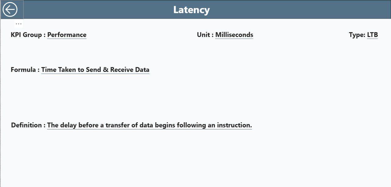
📘 3. KPI Definition Page – Clear Understanding for Every KPI
This page is designed as a drill-through page for detailed explanations. It includes:
-
KPI Name
-
KPI Group
-
Unit
-
Formula
-
Type
-
Definition
This makes onboarding easier for IT staff, auditors, and managers who need clarity on how uptime KPIs are calculated.
🛠️ How to Use the Server Uptime KPI Dashboard in Power BI
This dashboard runs on a structured Excel file, making updates extremely simple.
Here’s how to use it effectively:
➡️ Update actual uptime data in the Input_Actual Sheet
➡️ Enter target SLA values in the Input_Target Sheet
➡️ Maintain KPI definitions in the KPI Definition Sheet
➡️ Refresh Power BI to see updated visuals
➡️ Use slicers to explore server groups, months, KPIs, or categories
➡️ Drill through to KPI definitions for clarity
Thanks to Power BI’s automation, you no longer need multiple spreadsheets or manual calculations. Everything updates instantly.
👥 Who Can Benefit from This Server Uptime KPI Dashboard in Power BI
🎯 IT Infrastructure Teams
Monitor uptime, reliability, and SLA performance efficiently.
🎯 Server & Network Administrators
Track incidents, actual uptime %, and monthly trends.
🎯 Cloud Engineers & DevOps Teams
Compare uptime across environments—on-prem, cloud, or hybrid.
🎯 IT Managers & Technical Leaders
Get a high-level summary of server stability and performance.
🎯 Cybersecurity Teams
Use uptime data to strengthen system resilience and risk planning.
🎯 Internal Audit & Compliance Teams
Easily review defined KPIs, SLA performance, and historical uptime trends.
This dashboard serves every IT function that depends on reliable server operations.
### 📘 Click here to read the Detailed Blog Post
### 📺 Visit our YouTube channel to learn step-by-step video tutorials:
👉 Youtube.com/@PKAnExcelExpert


Reviews
There are no reviews yet.