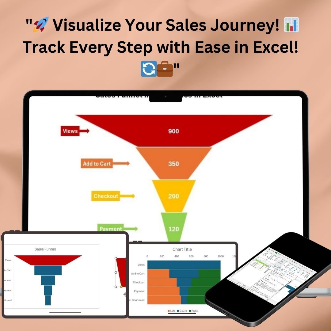


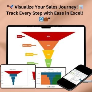
Transform your sales data into a visually engaging, easy-to-understand infographic with the Sales Funnel Infographic Chart in Excel. This dynamic tool allows you to track each step of your sales process, from initial views to confirmed orders, using a clear and customizable funnel design. Whether you’re presenting sales data to your team or clients, this chart provides a professional, insightful way to visualize your conversion process.

Key Features:
1. Dynamic Data Updates
The Sales Funnel Infographic Chart automatically updates in real-time as you input new sales data into the Excel spreadsheet. This ensures that you always have accurate, up-to-date information, which is vital for decision-making. With each stage of your sales process – from views to order confirmation – the chart dynamically reflects the latest data, making it easy to track performance and identify trends.
2. Customizable Design
The sales funnel chart is fully customizable, allowing you to adjust colors, shapes, and labels to suit your specific needs. You can tailor the funnel’s appearance to match your company’s branding or presentation style. Whether you want to highlight a specific stage or change the color scheme, this chart gives you the flexibility to design it exactly the way you envision it. The funnel design is sleek and professional, ensuring that your sales data is presented in an engaging and easily digestible format.
3. Step-by-Step Guide Included
Creating your own sales funnel infographic has never been easier. Included with the chart is a detailed, step-by-step tutorial that walks you through the process of setting up the chart in Excel. Whether you’re new to Excel or an advanced user, the guide will help you navigate the setup, ensuring that you get the most out of the tool. By following the tutorial, you’ll quickly be able to generate a sales funnel infographic, providing valuable insights into your sales process.
4. Clear Visual Representation
The Sales Funnel Infographic Chart provides a clear visual representation of your sales process. Each stage of the funnel is color-coded and labeled to clearly show how many leads have progressed through each step. With easy-to-read labels and a distinct shape for each stage, this chart makes it simple for stakeholders to understand your sales performance at a glance. This visual clarity is essential for presentations, making it easier to communicate complex data to a broad audience.
5. Tracking Sales Stages
This chart is designed to track key stages in the sales process, which can include:
- Views: The initial stage where users first interact with your product.
- Add to Cart: The stage where users show interest by adding products to their cart.
- Checkout: Where users proceed to the checkout page, demonstrating further interest.
- Payment: The stage where users complete the payment process.
- Order Confirmed: The final stage indicating that the sale has been completed successfully.
Each stage is represented as a separate segment in the funnel, providing a clear visual of where prospects are dropping off and where you can focus your efforts to improve conversion rates.
6. Track Conversion Rates
With the sales funnel infographic, you can easily track your conversion rates from one stage to the next. By comparing the numbers at each stage, you can quickly identify bottlenecks in your sales process. This allows you to focus on optimizing specific areas where prospects tend to drop off, improving your overall sales funnel efficiency.
7. Easy to Share and Present
This tool is perfect for sales presentations, reports, and meetings. The clean and professional design ensures that your audience will be engaged and will easily understand the flow of your sales process. Whether you are presenting to management, a client, or your team, the sales funnel infographic chart ensures that your message is clear and impactful.
8. Improves Decision Making
By providing a visual representation of your sales process, this chart aids in better decision-making. You can quickly see how each stage is performing and make data-driven decisions to optimize your sales funnel. Whether you need to increase visibility for certain stages or identify areas for improvement, the chart helps you take actionable steps to boost your sales.
Benefits:
- Real-Time Data Updates: Always have the latest information at your fingertips.
- Customizable: Easily adjust the design to match your branding.
- User-Friendly: With a step-by-step guide, even Excel beginners can set up the chart quickly.
- Professional and Engaging: Display sales data in an attractive and easy-to-understand way.
- Track and Optimize: Identify weak spots in your sales funnel and optimize your strategy.
- Easy to Share: Perfect for presentations and reporting to stakeholders.
Ideal for:
- Sales Teams: Visualize and track your team’s sales progress.
- Marketing Teams: Analyze how leads are progressing through the sales funnel.
- Business Owners: Make informed decisions based on clear, visual data.
- Consultants: Use the chart to present sales data and recommendations to clients.
Conclusion:
The Sales Funnel Infographic Chart in Excel is a powerful tool that brings clarity and insight to your sales process. Whether you are looking to analyze the effectiveness of your funnel, improve conversion rates, or simply present your sales data in a more engaging way, this tool has everything you need. With its dynamic updates, customizable design, and easy-to-follow guide, you can create a professional and impactful sales funnel infographic in no time. Start visualizing your sales journey today and make data-driven decisions that lead to better results.
Click here to read the detailed blog post
Visit our YouTube channel to learn step-by-step video tutorials


&url=https://nextgentemplates.com/product/slide-meter-chart-version-3/&media=https://nextgentemplates.com/wp-content/uploads/2025/03/Slide-Meter-Chart-Version-3-1024x1024.jpg)
&url=https://nextgentemplates.com/product/informative-kpi-indicator-chart-version-2/&media=https://nextgentemplates.com/wp-content/uploads/2025/03/Informative-KPI-Indicator-Chart-Version-2-1024x1024.jpg)
&url=https://nextgentemplates.com/product/informative-kpi-indicator-chart-version-1/&media=https://nextgentemplates.com/wp-content/uploads/2025/03/Informative-KPI-Indicator-Chart-Version-1-1024x1024.jpg)
&url=https://nextgentemplates.com/product/info-graphics-with-column-chart-part-2/&media=https://nextgentemplates.com/wp-content/uploads/2025/03/Info-graphics-with-Column-chart-Part-2-1024x1024.jpg)
Reviews
There are no reviews yet.