
🔑 Key Features of SaaS Metrics Dashboard in Google Sheets
SaaS Metrics Dashboard in Google Sheets is a professionally designed, interactive analytics template built for SaaS founders, product managers, subscription business analysts, and growth teams who need to monitor Monthly Recurring Revenue (MRR), Annual Recurring Revenue (ARR), Customer Lifetime Value (LTV), Customer Acquisition Cost (CAC), and Churn Rate — all from one powerful Google Sheets dashboard that works on any device. This template includes 6 interactive sheet tabs covering Overview, Revenue Analysis, Customers Analysis, Engagement Analysis, Search, and Data, making it one of the most comprehensive Google Sheets Dashboard Templates available for SaaS businesses.
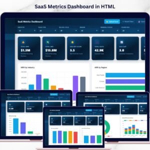
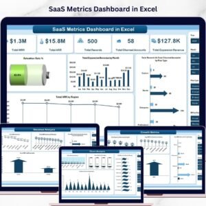
Whether you are running an early-stage startup or managing a mature subscription platform, this dashboard transforms your raw SaaS data into stunning, actionable visual insights. No software installation needed — simply open in Google Sheets and start tracking your SaaS performance metrics. If you have been searching for a modern, data-driven way to analyze SaaS growth and retention, the SaaS Metrics Dashboard in Google Sheets is the solution you need. Also explore our SaaS Metrics Dashboard in Excel and SaaS Metrics Dashboard in HTML for alternative platforms.
📦 What’s Inside the SaaS Metrics Dashboard in Google Sheets
This template includes 6 dedicated sheet tabs, each designed to give you deep insights into your SaaS business performance:
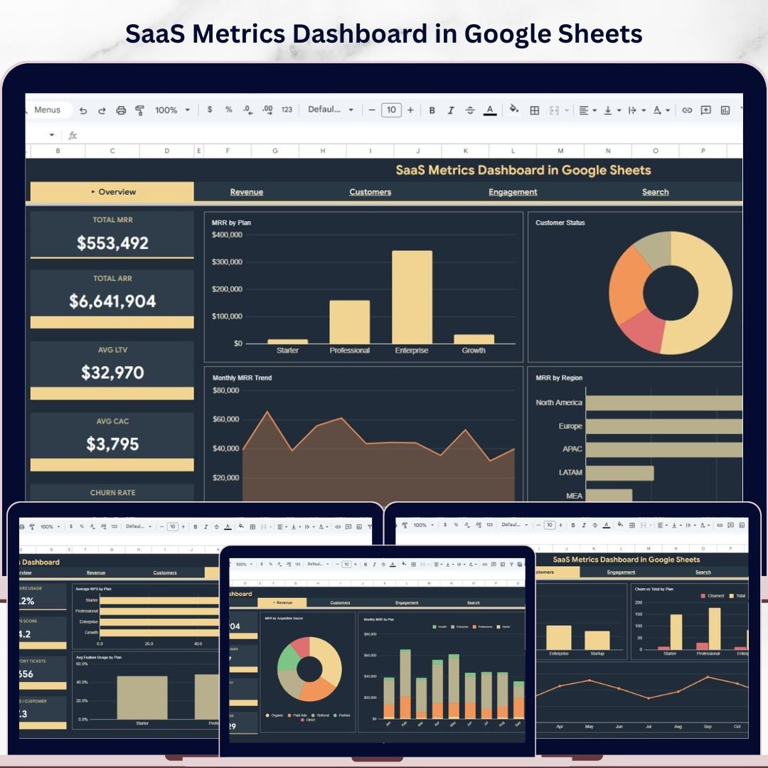
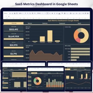
📊 Overview Page — The main dashboard view displays 5 high-level KPI cards: Total MRR, Total ARR, Avg LTV, Avg CAC, and Churn Rate. Below the cards, 4 interactive charts provide instant analysis: MRR by Plan, Customer Status by Category, Monthly MRR Trend by Month, and MRR by Region. Multiple slicers let you filter the entire dashboard by plan, region, status, and more for quick drill-down analysis.
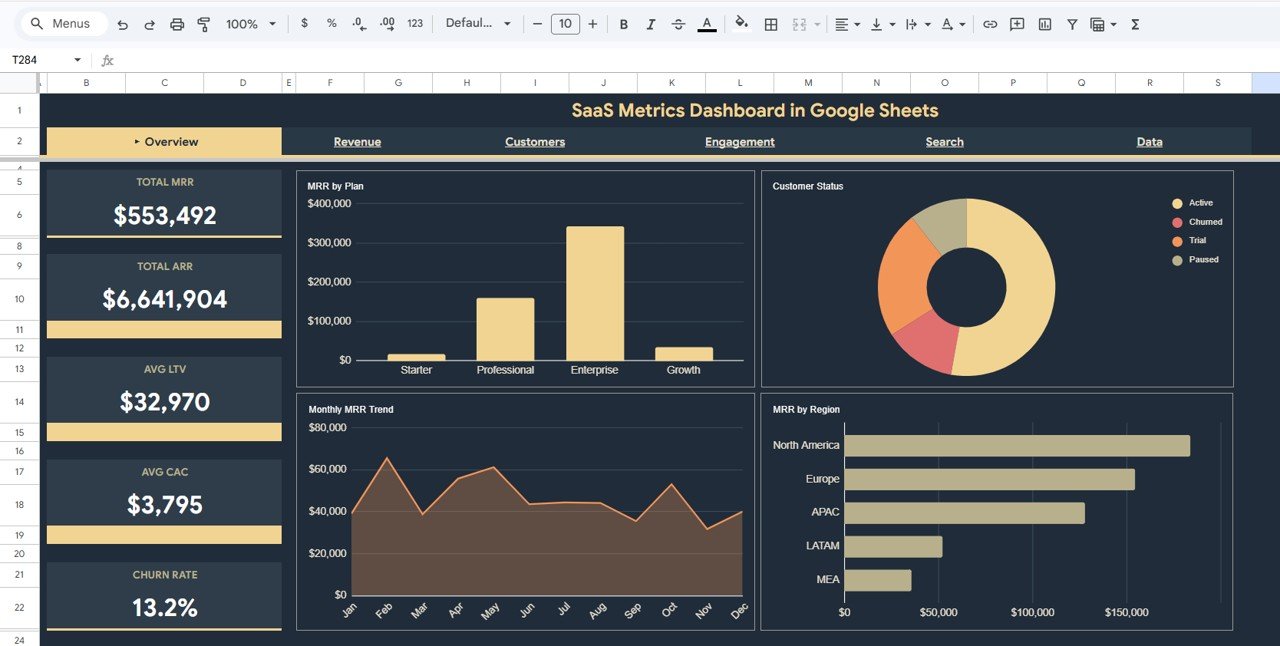 SaaS Metrics Dashboard in Google Sheets
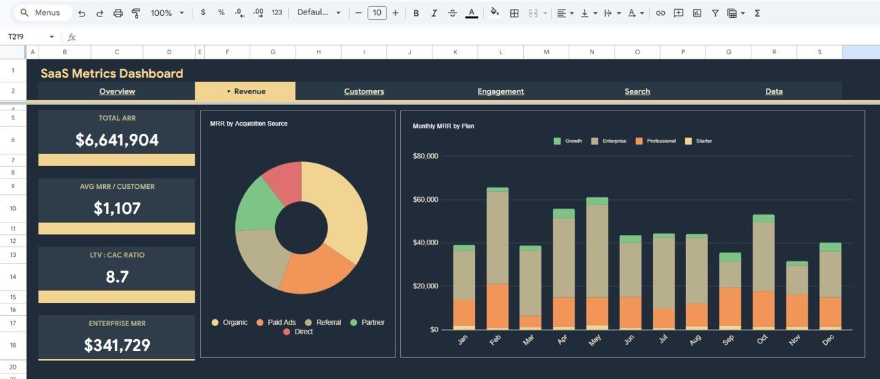
💰 Revenue Analysis Page — Dedicated revenue analysis with 2 powerful charts: MRR by Acquisition Source to understand which channels drive the most recurring revenue, and Monthly MRR by Plan to track how each subscription tier contributes to your monthly revenue growth over time.
 Revenue Analysis
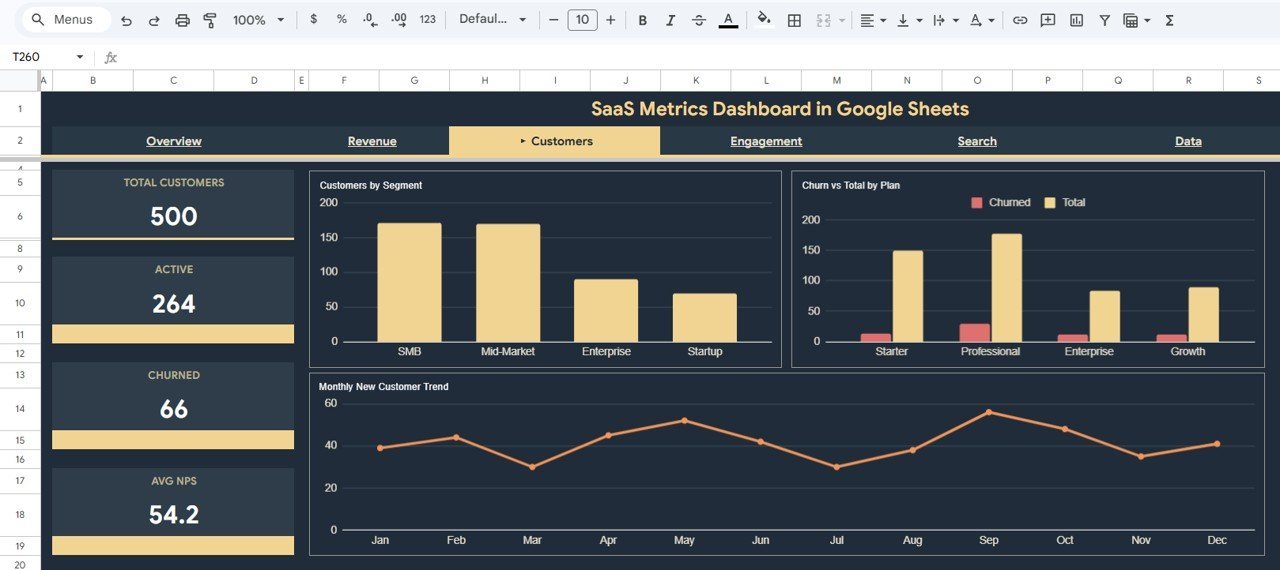
👥 Customers Analysis Page — Deep customer insights with 3 analytical charts: Customers by Segment to understand your customer composition, Churn vs Total by Plan to identify which plans have the highest attrition, and Monthly New Customer Trend by Month to track acquisition velocity and growth patterns.
 Customers Analysis
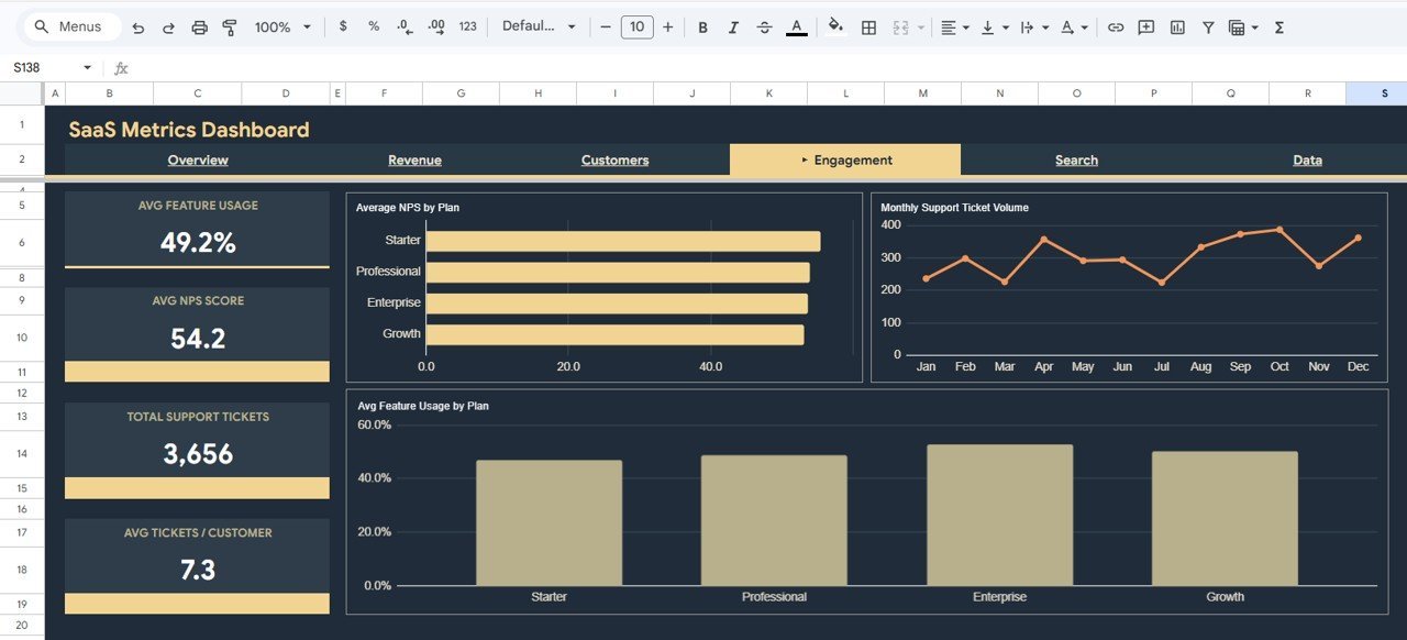
📈 Engagement Analysis Page — Product engagement and satisfaction tracking with 3 charts: Average NPS by Plan to measure customer satisfaction across subscription tiers, Monthly Support Ticket Volume by Month to monitor support load trends, and Avg Feature Usage by Plan to understand product adoption depth across different plans.
 Engagement Analysis
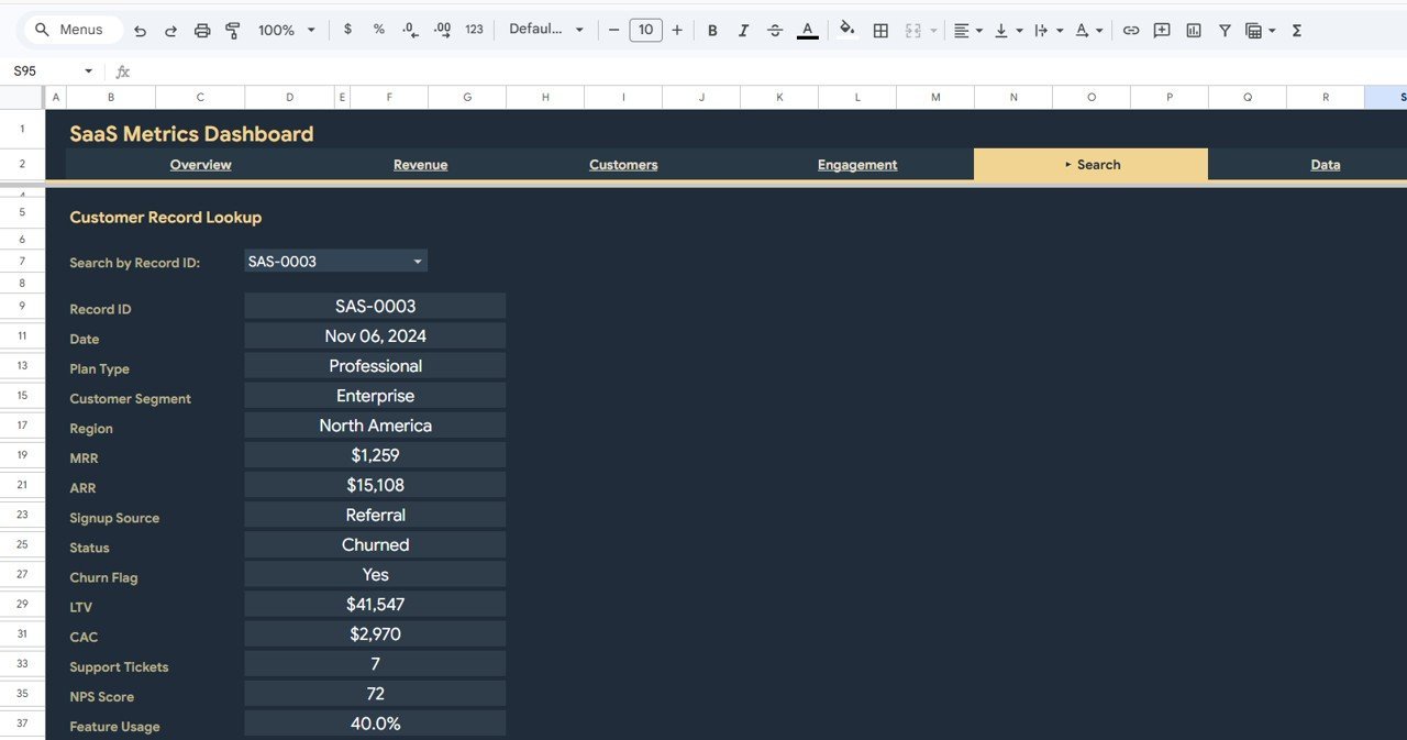
🔍 Search Page — A built-in Customer Record Lookup feature where you can search by Record ID using a dropdown. It instantly displays Record ID, Date, Plan Type, Customer Segment, Region, MRR, ARR, Signup Source, Status, Churn Flag, LTV, CAC, Support Tickets, NPS Score, and Feature Usage for the selected customer.
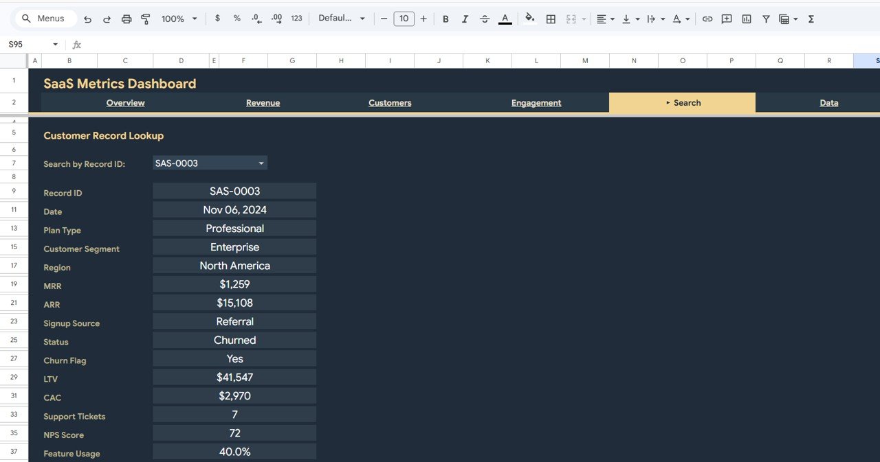 Search Sheet Tab
📋 Data Sheet — The raw data entry sheet where you add your SaaS customer and revenue data in the required format. Simply replace the sample data with your own records and the entire dashboard updates automatically.
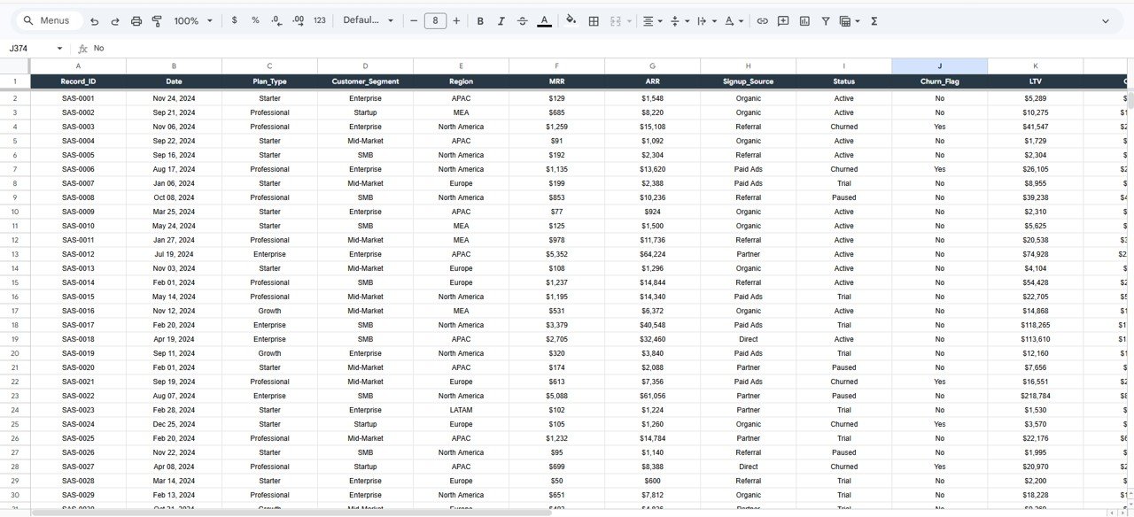 Data Sheet Tab
⚙️ How to Use the SaaS Metrics Dashboard in Google Sheets
1️⃣ Open the PDF guide included in your download and click the Google Sheets copy link to create your own editable copy in Google Drive.
2️⃣ Navigate to the Data sheet tab and replace the sample data with your actual SaaS customer records including date, plan type, customer segment, region, MRR, ARR, signup source, status, churn flag, LTV, CAC, support tickets, NPS score, and feature usage.
3️⃣ Once your data is entered, all 6 dashboard pages — Overview, Revenue Analysis, Customers Analysis, Engagement Analysis, Search, and Data — will auto-update with your real numbers, charts, and KPI cards.
4️⃣ Use the slicers and dropdown filters to drill down into specific plans, regions, customer segments, or time periods for targeted analysis.
👥 Who Can Benefit from This SaaS Metrics Dashboard in Google Sheets
🚀 SaaS Founders and CEOs — Monitor MRR, ARR, churn, and customer growth from a single cloud-based dashboard accessible from any device.
📊 Product Managers — Track feature usage, NPS scores, and engagement metrics to guide product development decisions.
💼 Growth and Marketing Teams — Analyze acquisition sources and monthly customer trends to optimize marketing spend and growth strategy.
📈 Finance and Revenue Operations — Monitor recurring revenue by plan and region, track LTV to CAC ratios, and forecast subscription revenue.
🎓 Business Analysts and Consultants — Deliver professional SaaS analytics reports to clients using this ready-made, customizable template.
❓ Frequently Asked Questions
What KPIs does the SaaS Metrics Dashboard in Google Sheets track?
The SaaS Metrics Dashboard in Google Sheets tracks 5 key performance indicators including Total MRR, Total ARR, Avg LTV, Avg CAC, and Churn Rate. It also provides detailed analysis of MRR by Plan, MRR by Region, Customer Segments, NPS Scores, Feature Usage, and Support Ticket Volume across 4 dedicated analysis pages.
Can I track multiple subscription plans in this dashboard?
Yes. The dashboard is designed for multi-plan SaaS businesses. Charts like MRR by Plan, Churn vs Total by Plan, Average NPS by Plan, and Avg Feature Usage by Plan let you compare performance across all your subscription tiers directly.
Do I need advanced Google Sheets skills to use this template?
No. Simply replace the sample data in the Data sheet with your own SaaS customer and revenue data and all charts, KPIs, and dashboard pages update automatically. No formulas to edit and no coding required.
What is the best Google Sheets template for tracking SaaS metrics?
The SaaS Metrics Dashboard in Google Sheets from NextGenTemplates is one of the best options available. It includes 6 dedicated pages covering Overview, Revenue Analysis, Customers Analysis, Engagement Analysis, Search, and Data entry — all with interactive charts and slicers for comprehensive SaaS business tracking.
How do I track customer churn using this dashboard?
The dashboard includes a Churn Rate KPI card on the Overview page and a dedicated Churn vs Total by Plan chart on the Customers Analysis page. Each customer record includes a Churn Flag field so you can instantly see which plans have the highest attrition rates and identify retention opportunities.
How is this different from the Excel or HTML version?
The Google Sheets version works entirely in your browser via Google Drive — no desktop software needed. It offers cloud-based collaboration, real-time sharing, and access from any device. For desktop-based reporting, check out the SaaS Metrics Dashboard in Excel or the HTML version.
🔗 Explore Related Templates
📌 SaaS Renewal KPI Dashboard in Google Sheets — Track SaaS renewal rates, retention metrics, and subscription lifecycle KPIs with a dedicated KPI scorecard.
📌 Revenue Growth KPI Dashboard in Google Sheets — Monitor revenue growth KPIs including MRR growth rate, expansion revenue, and net revenue retention.
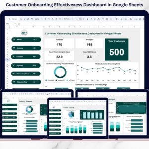
📌 Customer Onboarding Effectiveness Dashboard in Google Sheets — Analyze customer onboarding funnels, time-to-value, and activation metrics.
📖 Click here to read the Detailed Blog Post
Watch the step-by-step video tutorial:


Reviews
There are no reviews yet.