Public broadcasting organizations handle complex operations every day. They manage multiple channels, programs, languages, regions, funding sources, and advertising slots—all at the same time. However, when data stays scattered across multiple Excel files or manual reports, decision-making becomes slow, reactive, and uncertain.
That is exactly where the Public Broadcasting Dashboard in Excel becomes a game-changing solution 🚀.
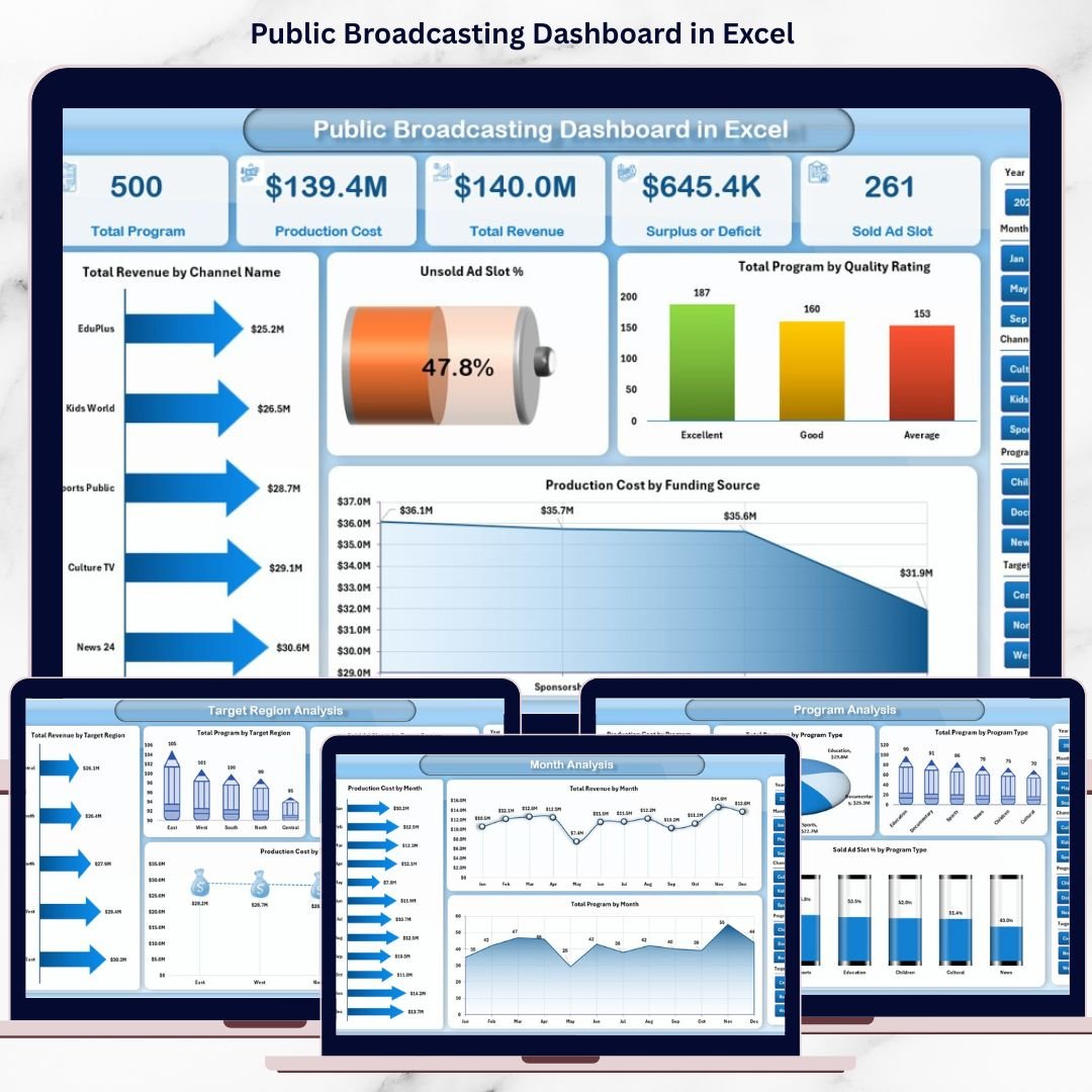
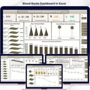
This ready-to-use dashboard transforms raw broadcasting data into clear, interactive, and actionable insights—all within Microsoft Excel. Instead of spending hours compiling reports, you gain instant visibility into revenue, production costs, program volumes, ad slot utilization, and performance trends. As a result, leadership teams can focus on strategy rather than spreadsheets.
Designed for real-world public broadcasting operations, this dashboard delivers professional analytics without requiring advanced technical skills.
🔑 Key Features of Public Broadcasting Dashboard in Excel
✨ Interactive Page Navigator – Easily move between analytical pages using a clean left-side navigation panel
📊 Dynamic KPI Cards & Charts – Instantly track revenue, costs, programs, and ad performance
🎯 Smart Slicers – Filter data by channel, program type, language, region, and time period
📈 Multi-Dimensional Analysis – Analyze performance from financial, operational, and content perspectives
🧩 Fully Excel-Based – No Power BI or external tools required
⚡ Auto-Refreshing Visuals – Update data once and refresh the entire dashboard instantly
🔍 Clear & Professional Design – Easy to understand for both technical and non-technical users
📂 What’s Inside the Public Broadcasting Dashboard in Excel
This digital product includes multiple structured analytical pages, each designed to answer a specific business question:
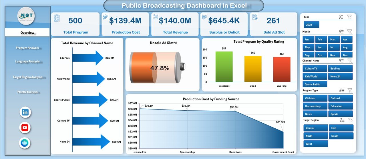
📌 Overview Page – A high-level snapshot of overall performance with KPI cards and summary charts
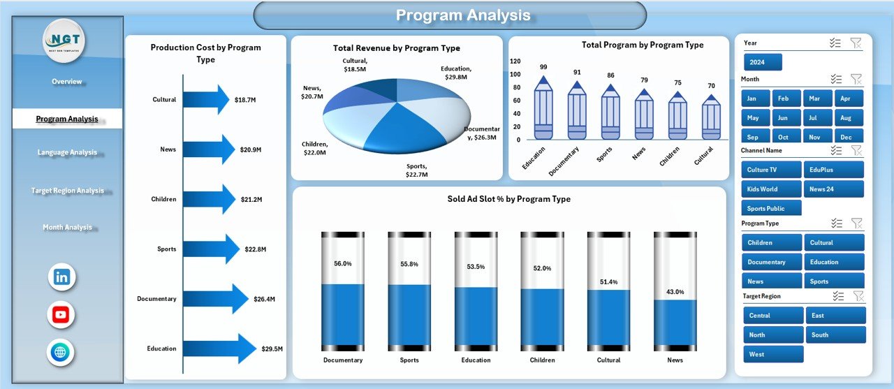
📌 Program Analysis Page – Deep dive into revenue, cost, volume, and ad efficiency by program type
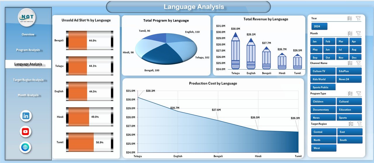
📌 Language Analysis Page – Compare multilingual performance to improve reach and inclusivity
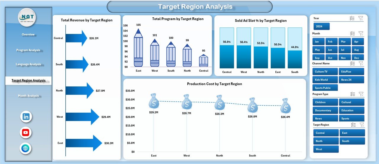
📌 Target Region Analysis Page – Evaluate regional performance for smarter budget allocation
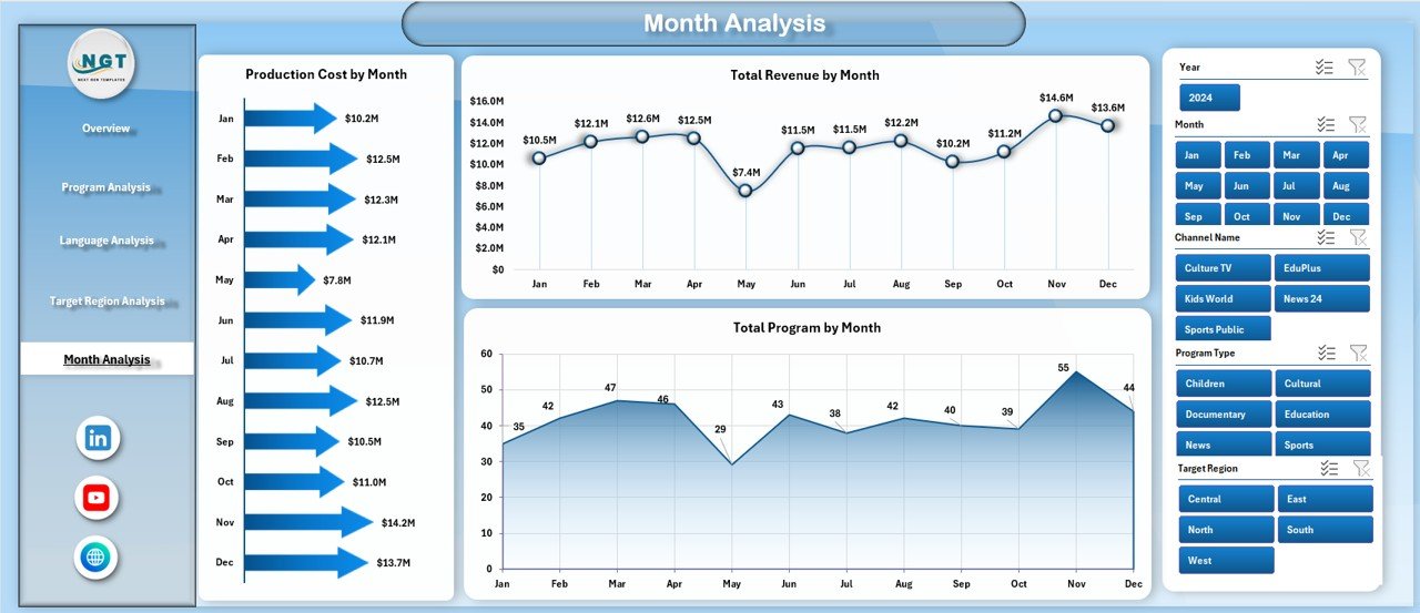
📌 Month Analysis Page – Track trends, seasonality, and growth patterns over time
📌 Data Sheet – Centralized raw data storage for seamless updates
📌 Support Sheet – Helper tables and calculations to keep the dashboard clean and efficient
Each page is interactive and connected, giving you a 360-degree view of broadcasting performance.
🛠️ How to Use the Public Broadcasting Dashboard in Excel
Using this dashboard is simple and intuitive—even if you are not an Excel expert:
1️⃣ Enter or paste your broadcasting data into the Data Sheet
2️⃣ Click Refresh to update all charts and KPIs automatically
3️⃣ Use slicers to filter by channel, program, language, region, or month
4️⃣ Start with the Overview Page to identify key insights
5️⃣ Drill down into specific pages for deeper analysis
6️⃣ Share insights with stakeholders using a single, professional dashboard
No complex setup. No macros required. Just actionable insights—instantly.
👥 Who Can Benefit from This Public Broadcasting Dashboard in Excel
This dashboard is ideal for:
🎯 Public Broadcasting Executives – Gain strategic visibility and accountability
📊 Finance & Accounting Teams – Monitor revenue, costs, and funding efficiency
🎬 Programming & Content Planners – Optimize program investments
📢 Advertising & Sponsorship Teams – Reduce unsold ad slots
🌍 Regional Operations Managers – Improve regional performance tracking
📈 Data & Reporting Teams – Eliminate repetitive manual reports
Whether you manage one channel or multiple regions, this dashboard adapts to your needs.


Reviews
There are no reviews yet.