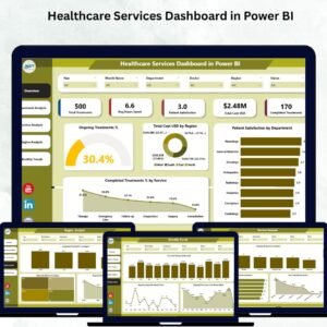
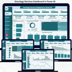
In today’s data-driven healthcare landscape, ophthalmology clinics and hospitals can no longer rely on manual reports, scattered Excel files, or delayed summaries. Eye care services generate large volumes of clinical, financial, and operational data every single day. However, without a centralized analytics system, this data often remains underutilized. That is exactly why the Ophthalmology Services Dashboard in Power BI is a game-changing digital product for modern eye care organizations.
This ready-to-use Power BI dashboard converts raw ophthalmology data into meaningful, interactive, and real-time insights. Instead of switching between multiple reports, clinic owners, administrators, and doctors can monitor OPD visits, surgeries, revenue, insurance cases, discounts, and service performance in one unified dashboard. As a result, decision-making becomes faster, more accurate, and completely data-driven.
🔑 Key Features of Ophthalmology Services Dashboard in Power BI
📌 Centralized KPI Monitoring – Track OPD activity, surgeries, revenue, insurance flags, discounts, and gross charges in one interactive Power BI report.
📌 Interactive Slicers & Filters – Analyze performance dynamically by region, doctor, service type, city, and time period.
📌 Multi-Level Analysis – Get insights at clinic, regional, doctor, and service levels without creating separate reports.
📌 Visual Performance Tracking – Use charts, cards, and trend visuals to instantly understand performance patterns.
📌 Automated Insights – Reduce manual reporting effort and eliminate calculation errors through Power BI automation.
📂 What’s Inside the Ophthalmology Services Dashboard in Power BI
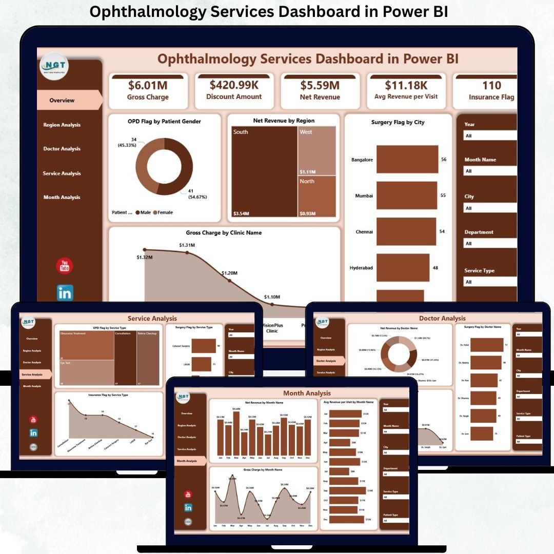
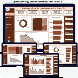
This professionally designed dashboard includes five structured analysis pages, each serving a specific decision-making purpose:
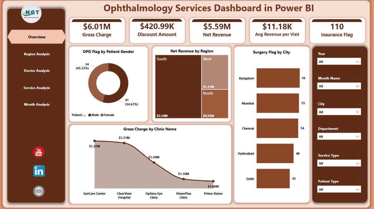
📊 Overview Page – A high-level snapshot with KPI cards and visuals such as OPD Flag by Patient Gender, Net Revenue by Region, Surgery Flag by City, and Gross Charge by Clinic Name.
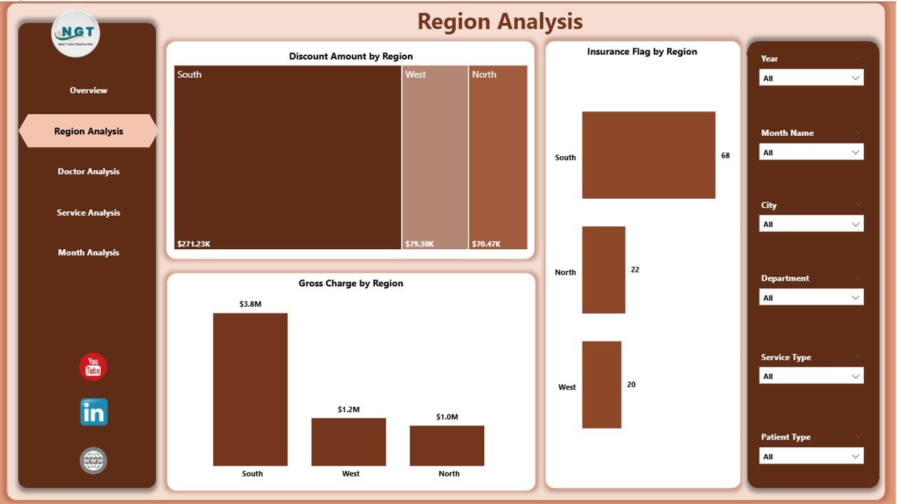
🌍 Region Analysis Page – Analyze Discount Amount by Region, Insurance Flag by Region, and Gross Charge by Region to understand geographical performance.
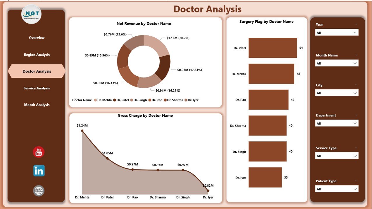
👨⚕️ Doctor Analysis Page – Track Net Revenue by Doctor Name, Surgery Flag by Doctor Name, and Gross Charge by Doctor Name for productivity analysis.
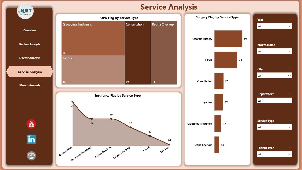
🛠️ Service Analysis Page – Monitor OPD, Surgery, and Insurance flags by service type to identify high-demand services.
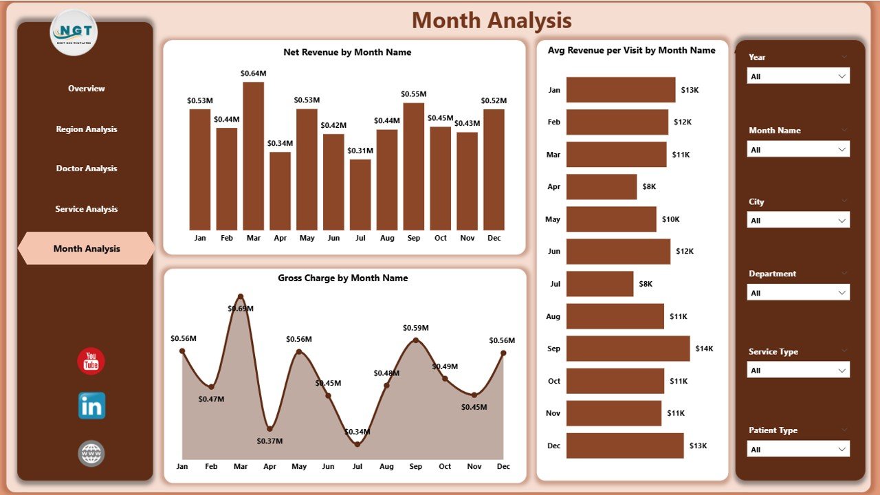
📈 Monthly Trends Page – Identify trends using Net Revenue by Month, Average Revenue per Visit by Month, and Gross Charge by Month.
Each page is optimized for clarity, usability, and actionable insights.
▶️ How to Use the Ophthalmology Services Dashboard in Power BI
Using this dashboard is simple and user-friendly:
1️⃣ Update your ophthalmology data in the provided Excel data structure or connect your existing data source.
2️⃣ Refresh the Power BI report to load the latest data.
3️⃣ Use slicers to filter results by region, doctor, service type, or month.
4️⃣ Analyze KPIs, charts, and trends to identify performance gaps and opportunities.
5️⃣ Use insights to improve operational efficiency, financial planning, and patient service strategies.
No advanced Power BI skills are required for end users.
👥 Who Can Benefit from This Ophthalmology Services Dashboard in Power BI
This dashboard is ideal for:
🏥 Ophthalmology clinic owners
📋 Hospital administrators
👨⚕️ Medical directors and senior doctors
💰 Finance and billing teams
⚙️ Operations managers
📊 Healthcare data analysts
Each stakeholder gains real-time visibility, better control, and confidence in decision-making.
### 👉 Click here to read the Detailed Blog Post
Visit our YouTube channel to learn step-by-step video tutorials.


Reviews
There are no reviews yet.