Managing oncology services requires absolute clarity across clinical performance, revenue, treatments, doctors, and patient trends. However, when oncology data is scattered across multiple Excel files and reports, hospital administrators and oncology heads struggle to get a real-time, reliable view of performance.
That is exactly where the Oncology Services Dashboard in Excel becomes an essential analytics solution 🚀.
The Oncology Services Dashboard in Excel is a ready-to-use, interactive Excel dashboard designed to monitor cancer-wise revenue, treatment performance, doctor analysis, regional outcomes, and monthly financial trends—all in one single, structured file.
Instead of spending hours compiling reports, this dashboard converts raw oncology data into clear KPI cards, interactive charts, and trend-based insights. As a result, healthcare leaders can make faster, confident, and data-driven decisions—without complex software or coding.
Because the solution is built entirely in Excel, it fits seamlessly into existing healthcare reporting workflows and requires no advanced technical skills.
✅ Key Features of Oncology Services Dashboard in Excel
🧬 Cancer-Wise Performance Tracking – Analyze revenue and surgeries by cancer type
💊 Treatment Analysis – Compare charges and net revenue by treatment type
👨⚕️ Doctor-Wise Performance – Transparent evaluation of doctors
🌍 Regional Revenue Visibility – Monitor oncology performance by geography
📅 Monthly Trends Analysis – Track growth and seasonal patterns
📊 KPI Cards for Instant Insights – High-level visibility at a glance
🔍 Interactive Slicers – Filter instantly by dimensions
📁 Fully Excel-Based & Customizable – No external tools required
📦 What’s Inside the Oncology Services Dashboard in Excel
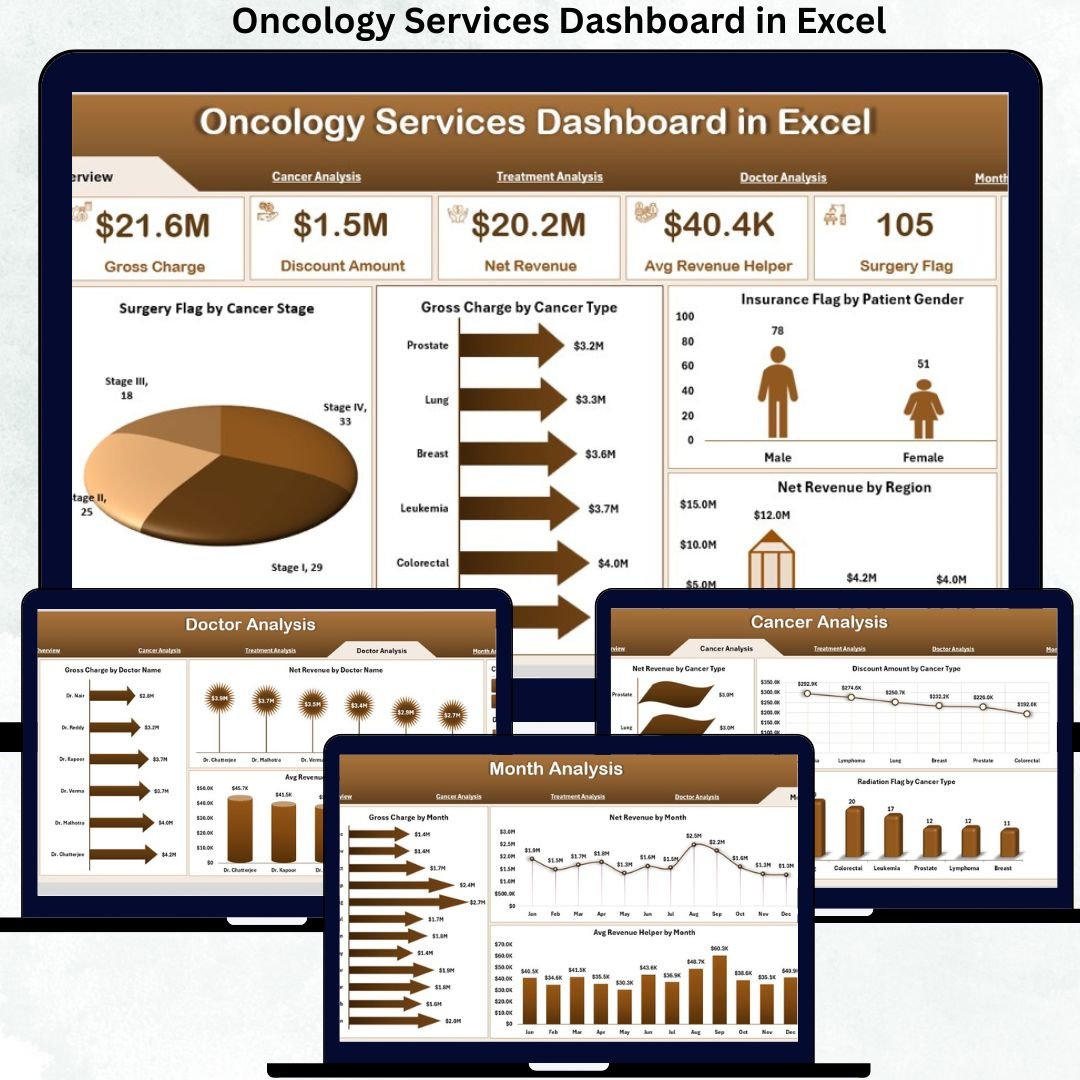
✅ Overview Page – Executive Oncology Performance Snapshot
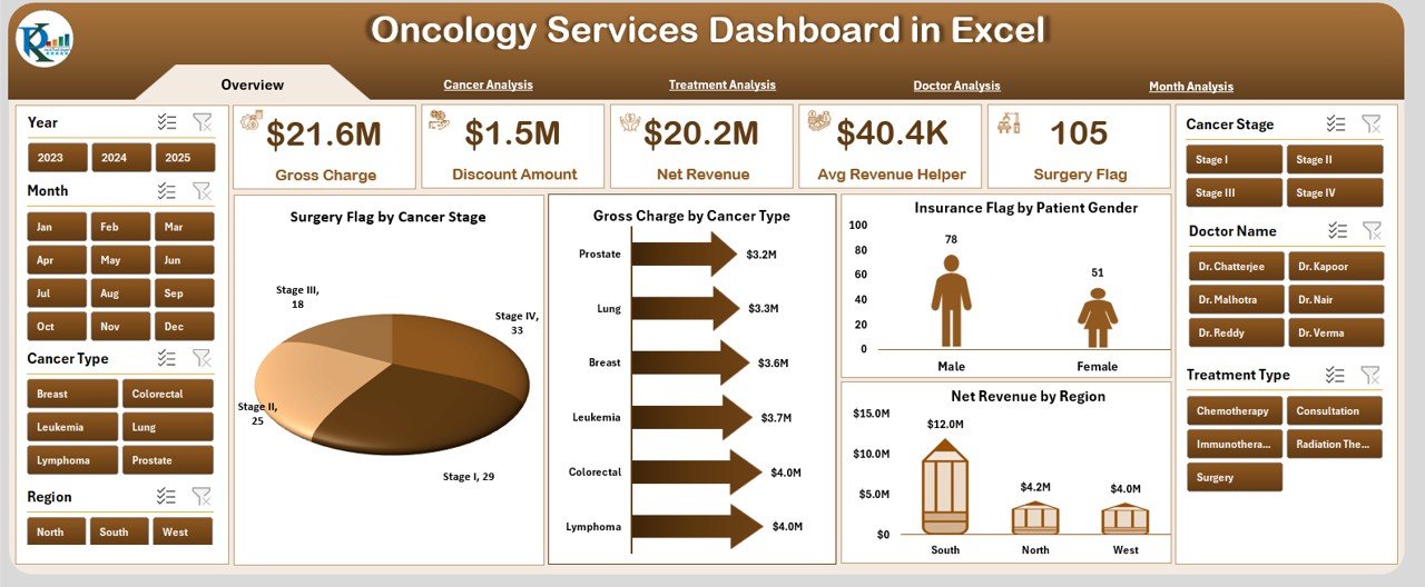
This page works as the control center of the dashboard.
Key Highlights
-
Right-side slicer for dynamic filtering
-
5 KPI cards summarizing key performance indicators
-
4 analytical charts for instant insights
Charts Included
-
🏥 Surgery Flag by Cancer Stage
-
💰 Gross Charge by Cancer Type
-
🧾 Insurance Flag by Patient Gender
-
🌍 Net Revenue by Region
➡️ This page gives leadership a quick and reliable overview of oncology operations.
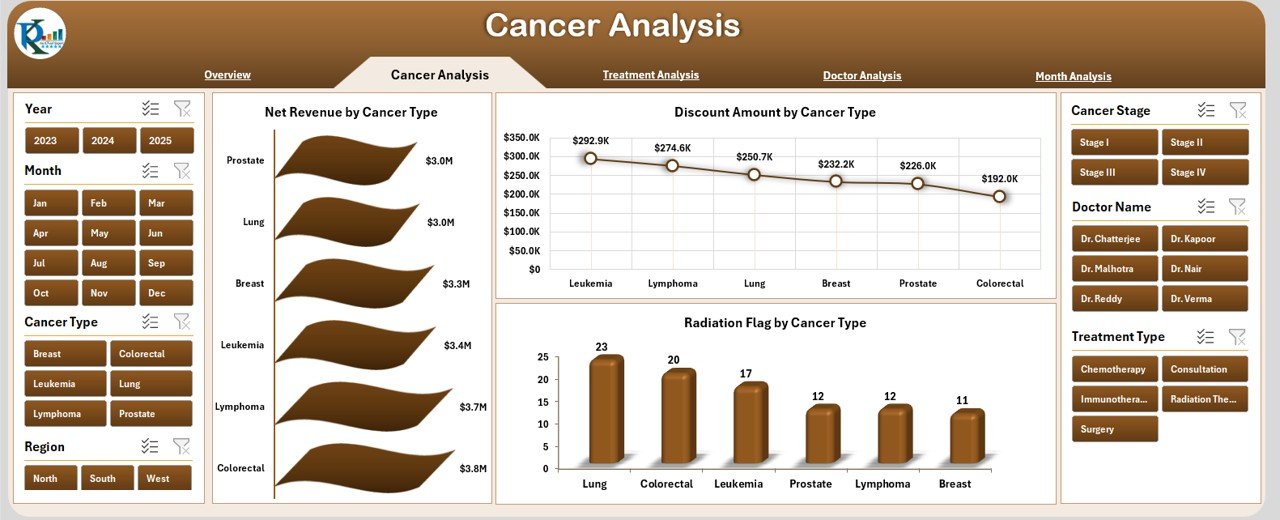
✅ Cancer Analysis Page
Focuses on cancer-specific financial and operational insights.
Charts Included
-
💵 Net Revenue by Cancer Type
-
💸 Discount Amount by Cancer Type
-
☢️ Radiation Flag by Cancer Type
Business Impact
✅ Identify high-revenue cancer categories
✅ Control discounts and cost leakage
✅ Understand radiation therapy distribution
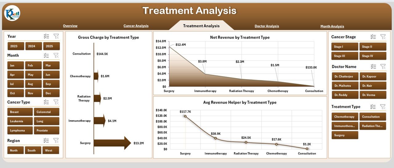
✅ Treatment Analysis Page
Helps evaluate performance across oncology treatments.
Charts Included
-
💊 Gross Charge by Treatment Type
-
💰 Net Revenue by Treatment Type
-
📊 Average Revenue Helper by Treatment Type
Why It Matters
✅ Compare profitability by treatment
✅ Improve treatment pricing strategies
✅ Balance clinical care with financial outcomes
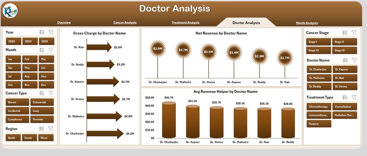
✅ Doctor Analysis Page
Ensures transparent, data-driven doctor performance evaluation.
Charts Included
-
👨⚕️ Gross Charge by Doctor
-
💵 Net Revenue by Doctor
-
📈 Average Revenue Helper by Doctor
Use Cases
✅ Support performance reviews
✅ Optimize doctor schedules
✅ Improve productivity planning
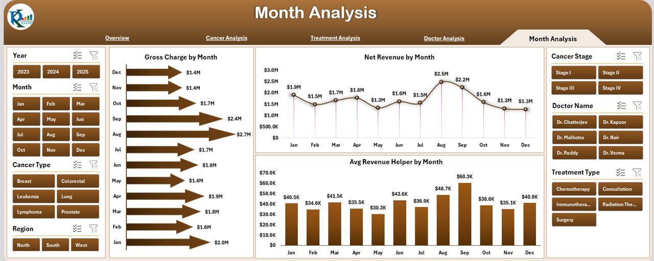
✅ Month Analysis Page
Tracks oncology performance over time.
Charts Included
-
📅 Gross Charge by Month
-
📈 Net Revenue by Month
-
📊 Average Revenue Helper by Month
Benefits
✅ Identify seasonal trends
✅ Track revenue growth patterns
✅ Support financial forecasting
🛠️ How to Use the Oncology Services Dashboard
1️⃣ Enter oncology data in the structured Data Sheet
2️⃣ Refresh pivot tables
3️⃣ Use slicers to filter by cancer, doctor, treatment, region, or month
4️⃣ Monitor revenue, discounts, and treatment performance
5️⃣ Share insights with finance and clinical leadership
✅ No VBA or advanced Excel knowledge required
👥 Who Can Benefit From This Dashboard
🏥 Oncology Department Heads
📊 Hospital Administrators
💼 Healthcare Finance Teams
👨⚕️ Medical Directors
📈 Operations Managers
🧪 Healthcare Analysts
If your organization manages oncology services, this dashboard becomes a decision-support powerhouse.
🚀 Why This Dashboard Adds Real Value
✅ Centralizes oncology data
✅ Eliminates manual reporting
✅ Improves revenue visibility
✅ Enhances doctor performance transparency
✅ Supports data-driven planning
✅ Saves time and reduces errors
This dashboard transforms oncology reporting into actionable intelligence.
📘 Click here to read the Detailed blog post
🎥 Visit our YouTube channel to learn step-by-step video tutorials
👉 https://youtube.com/@PKAnExcelExpert


Reviews
There are no reviews yet.