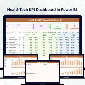
In the fast-paced world of healthcare, data saves time, money, and lives. Hospitals, clinics, and health-tech startups depend on precise, real-time analytics to enhance patient care and streamline operations. The HealthTech KPI Dashboard in Power BI transforms complex healthcare data into clear, interactive insights, empowering professionals to make smarter, data-driven decisions.
Built in Microsoft Power BI and powered by Excel data, this dashboard enables you to track performance, spot trends, and drive continuous improvement across your organization — from patient satisfaction to financial stability. Whether you run a small clinic or manage multiple hospital branches, this solution provides an all-in-one view of your healthcare ecosystem.
⚙️ Key Features of the HealthTech KPI Dashboard in Power BI
🏥 3 Interactive Pages – Summary, KPI Trend, and KPI Definition for complete analytics coverage.
📊 Dynamic Visuals – MTD (Month-to-Date) and YTD (Year-to-Date) analysis with instant updates.
🎯 Actual vs Target vs PY – Track performance metrics compared to targets and previous years.
🟢 Drill-Through Functionality – Dive deeper into each KPI to view formulas and definitions.
📈 Real-Time Filtering – Slice data by month, department, or KPI group.
💾 Excel-Powered Data Source – Easy to update and refresh without technical setup.
💡 Scalable & Customizable – Add new KPIs, departments, or hospitals anytime.
💰 Cost-Efficient Analytics – Leverage Power BI’s automation without expensive software.
🧩 What’s Inside the Dashboard
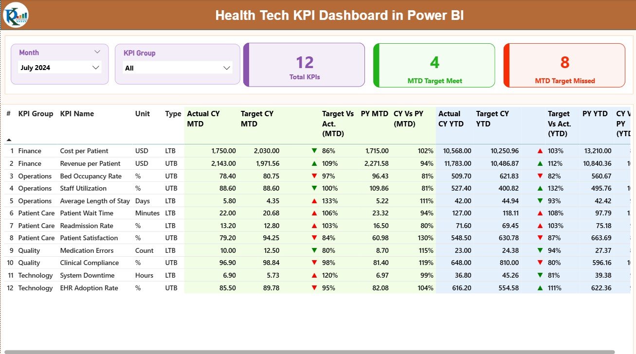
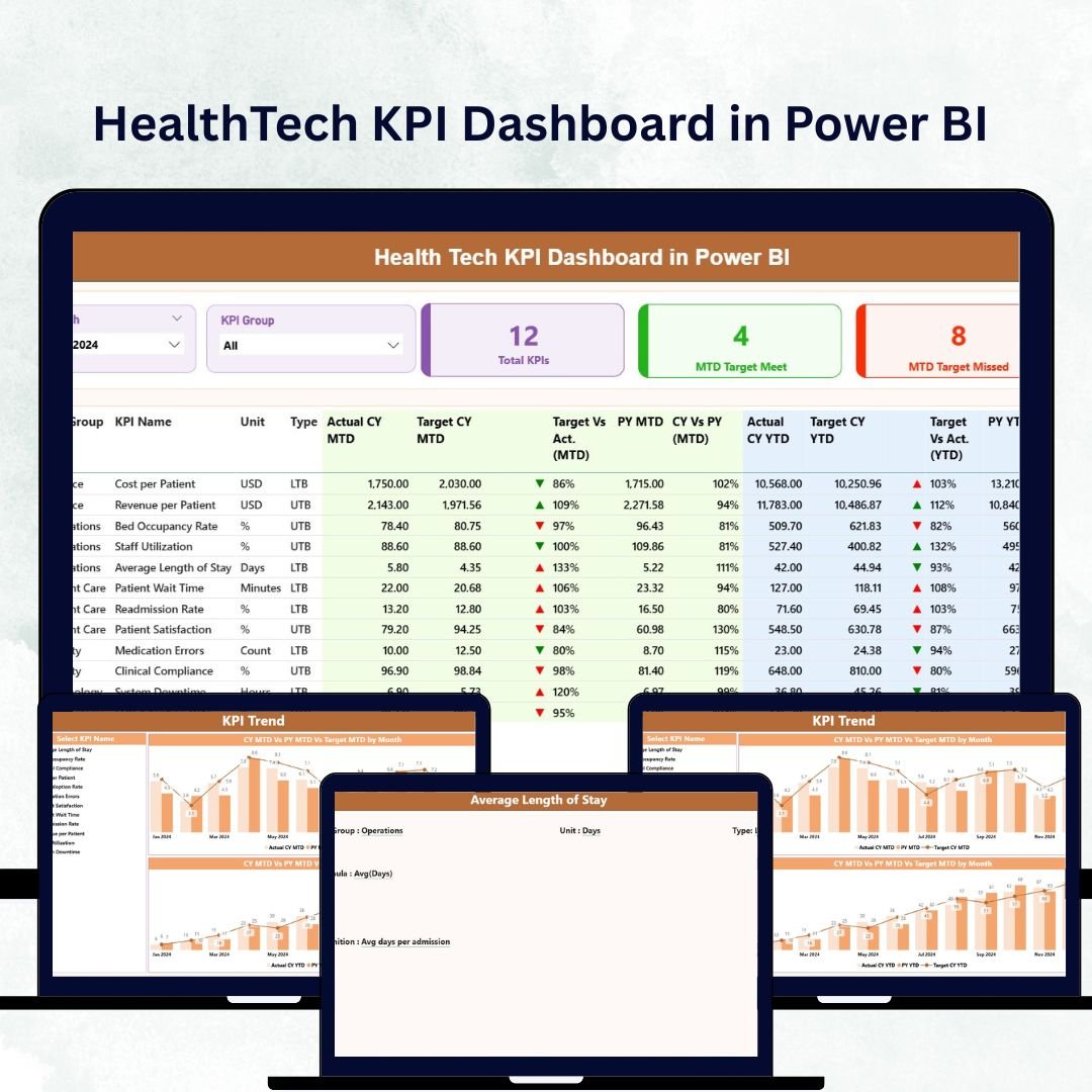
1️⃣ Summary Page – Central Overview
This is the heart of the dashboard — a real-time snapshot of all healthcare KPIs.
-
Month and KPI Group Slicers for focused analysis.
-
Performance Cards showing total KPIs, MTD Target Met, and MTD Target Missed.
-
Color-coded visuals and arrows for instant performance insight.
From patient flow to cost control, everything you need is displayed in one clean, professional view.
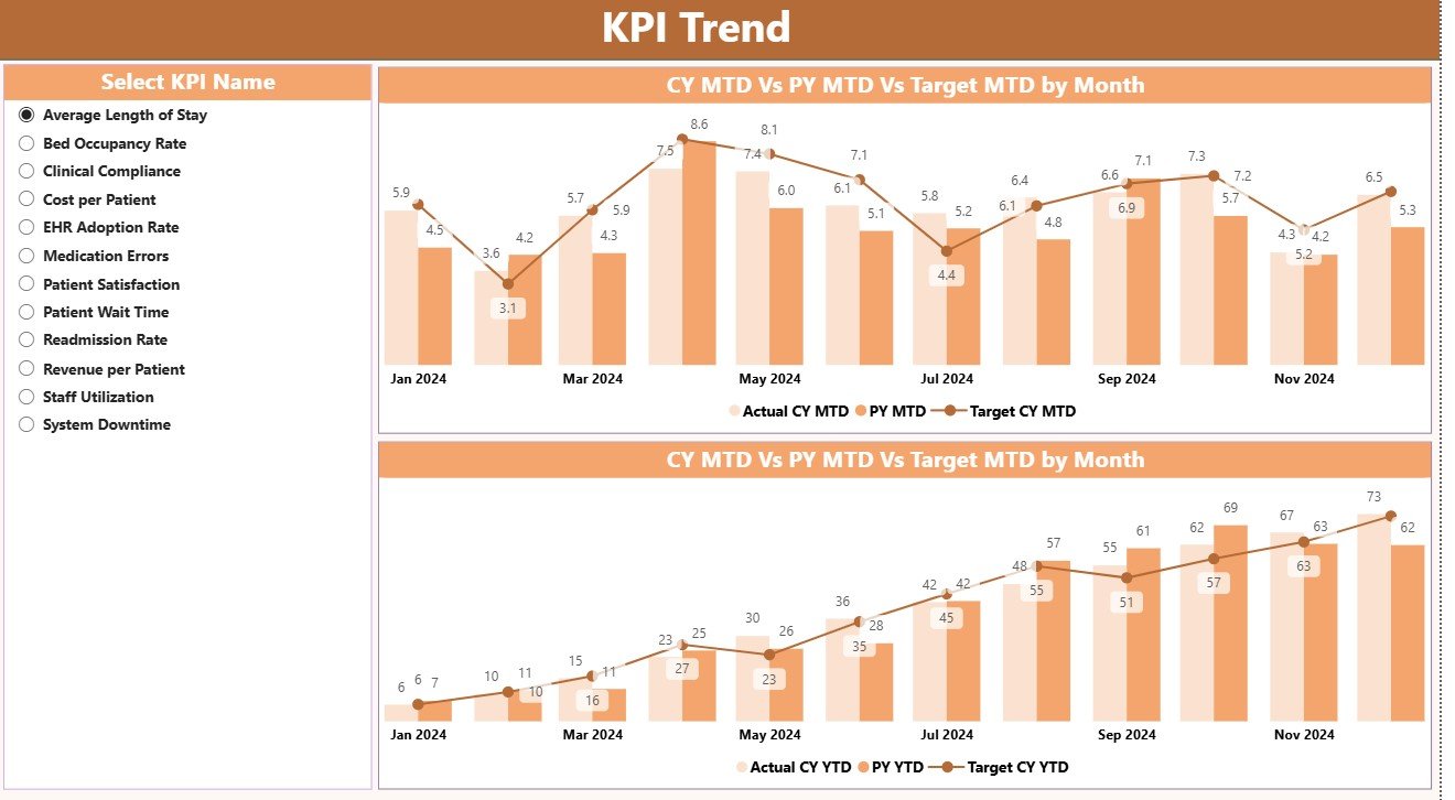
2️⃣ KPI Trend Page – Performance Over Time
Track the story behind every number 📈.
This page visualizes MTD and YTD trends for Actual, Target, and Previous Year metrics.
Use slicers to select any KPI and analyze its progress month by month — ideal for identifying seasonal patterns, operational bottlenecks, and improvement opportunities.
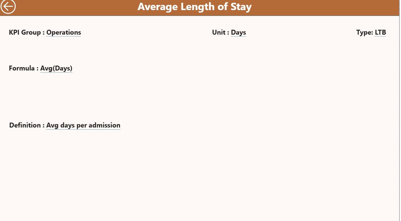
3️⃣ KPI Definition Page – Transparency & Clarity
Each KPI includes:
-
KPI Number and Name
-
Unit of Measurement
-
Type (UTB – Upper the Better / LTB – Lower the Better)
-
Formula and Definition
Users can right-click any KPI in the Summary Page to drill through for details, ensuring every stakeholder understands the data source and calculation logic.
📘 Excel Data Structure
This dashboard connects to a simple, well-organized Excel file containing three sheets:
1️⃣ Input Actual Sheet – Enter Actual performance values per month.
2️⃣ Input Target Sheet – Define monthly and yearly Target values.
3️⃣ KPI Definition Sheet – Document KPI Group, Unit, Formula, Definition, and Type (UTB/LTB).
Once the Excel file is linked, Power BI automatically refreshes visuals whenever the source data is updated.
🩺 Common KPIs Included
Clinical KPIs – Patient Wait Time, Bed Occupancy Rate, Readmission Rate, Emergency Response Time.
Operational KPIs – Staff Utilization, Appointment Cancellation Rate, Equipment Downtime, Turnaround Time.
Financial KPIs – Revenue, Cost per Patient, Claim Processing Time, Profit Margin.
Patient Experience KPIs – Satisfaction Score, Complaint Resolution Rate, Telehealth Completion Rate.
Technology KPIs – System Uptime, Data Accuracy %, Cybersecurity Compliance.
These KPIs combine to give a 360-degree view of healthcare performance — clinical, financial, and technological.
🌟 Advantages of Using the HealthTech KPI Dashboard in Power BI
✅ Real-Time Intelligence – Analyze live data from Excel or databases.
✅ Smarter Decisions – Track trends, forecast outcomes, and take corrective action early.
✅ Automation – Eliminate manual reporting; Power BI auto-calculates metrics.
✅ User-Friendly Visualization – Drilldowns, slicers, and charts simplify analysis.
✅ Collaboration Ready – Share dashboards securely with teams and management.
✅ Scalable Solution – Add new KPIs as your hospital network expands.
✅ Unified Reporting – One framework for finance, operations, and clinical care.
🧠 Best Practices for Effective Use
-
Focus on key KPIs that directly impact patient care and cost efficiency.
-
Maintain accurate and consistent data in the Excel source.
-
Use color coding (red/yellow/green) to highlight performance levels.
-
Refresh data weekly or monthly for real-time accuracy.
-
Encourage collaboration by publishing the dashboard in Power BI Service.
-
Use drill-throughs for KPI transparency and departmental accountability.
💡 Example: Real-World Healthcare Use Case
A hospital network, Medcore Hospitals, uses the HealthTech KPI Dashboard to track patient efficiency and financial health.
The Summary Page shows an increase in readmission rates.
The KPI Trend Page reveals a three-month upward trend in cardiac readmissions.
After analysis, the Drill-Through Page confirms that extended wait times in follow-up care are the cause.
Medcore implements a telehealth check-in program — resulting in a 25% drop in readmissions within one quarter.
📊 Result: Faster insights, better patient outcomes, and smarter operational planning.


Reviews
There are no reviews yet.