Managing health insurance operations effectively requires more than just collecting data — it requires understanding the story behind it. 🩺📊 The Health Insurance KPI Dashboard in Power BI is a powerful analytics tool designed to transform raw insurance data into meaningful, actionable insights.
This ready-to-use Power BI dashboard helps insurers, brokers, and healthcare administrators monitor, analyze, and optimize their key performance indicators (KPIs) — from claim settlement ratio and policy renewals to premium performance and loss ratios — all within a single interactive platform.
✨ Key Features of Health Insurance KPI Dashboard in Power BI
✅ Three Interactive Pages: Summary, KPI Trend, and KPI Definition — each designed for easy navigation and in-depth analysis.
✅ Excel Data Source Integration: Connect your Excel sheets for automated monthly updates.
✅ Dynamic Filters: Slice data by Month and KPI Group to view insights instantly.
✅ MTD & YTD Tracking: Compare Month-to-Date and Year-to-Date performance at a glance.
✅ Conditional Formatting: Green and red arrows indicate performance improvement or decline.
✅ Drill-Through Analysis: Click any KPI to view its formula, definition, and logic.
✅ Customizable Design: Add your company logo, color theme, or KPI categories easily.
✅ Cross-Device Compatibility: View the dashboard on desktops, tablets, or mobile devices.
This Power BI dashboard delivers an end-to-end performance management system that simplifies reporting, enhances accuracy, and promotes data-driven decision-making. 🚀
📂 What’s Inside the Health Insurance KPI Dashboard in Power BI
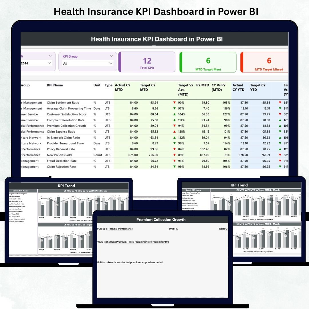
📘 1. Summary Page – The Main Dashboard
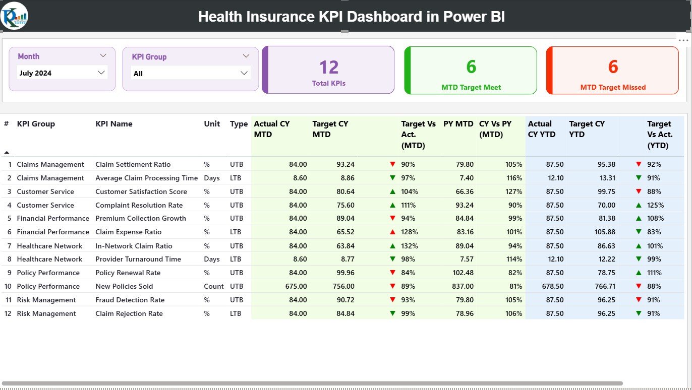
This is your high-level performance snapshot. It displays:
-
KPI Cards: Total KPIs Count, MTD Target Met, and MTD Target Missed.
-
Interactive Filters: Select Month and KPI Group for instant updates.
-
Detailed KPI Table: Shows KPI Number, Group, Unit, Type (UTB/LTB), and performance comparisons.
-
MTD & YTD Indicators: Color-coded arrows and percentages to visualize performance changes.
The Summary Page gives leaders and managers a real-time overview of claims, premiums, and operational efficiency.
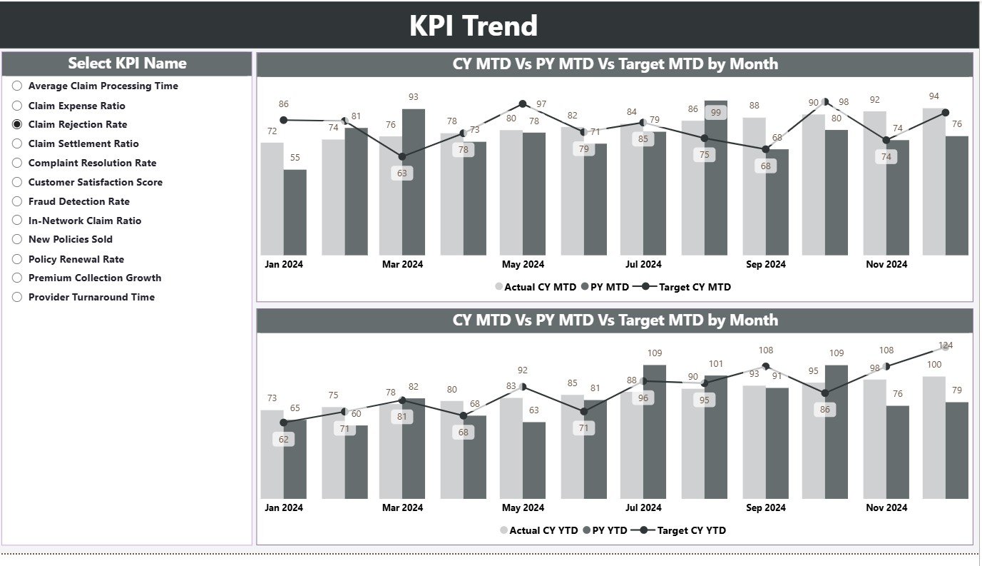
📈 2. KPI Trend Page – Visual Performance Analysis
Track KPI progress over time using combo charts for both MTD and YTD.
-
Compare Actual vs Target vs Previous Year data.
-
Use the KPI Name slicer to drill down into specific KPIs.
-
Identify seasonal trends and improvement areas.
Perfect for analysts and executives who want to understand year-on-year performance and long-term growth patterns.
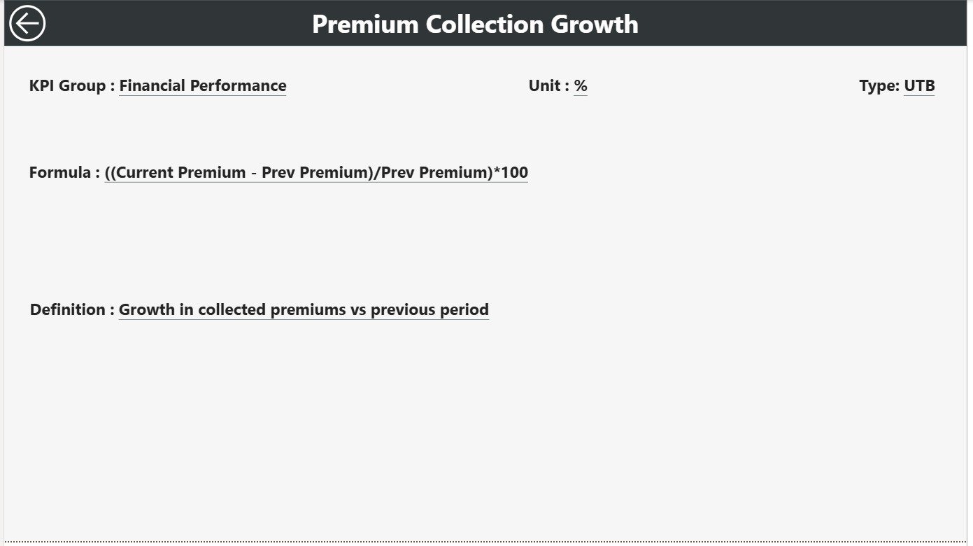
📄 3. KPI Definition Page – In-Depth Reference Section
Drill through from the Summary Page to view KPI details.
-
Displays KPI Number, Formula, Definition, and Calculation Logic.
-
Keeps your metrics transparent and standardized.
-
Includes a “Back” button for smooth navigation.
This page acts as built-in documentation — ensuring clarity and consistency across departments.
📊 4. Excel Data Source (Backend)
The dashboard is powered by a structured Excel workbook containing:
-
Input Actual Sheet: Actual MTD and YTD data by month.
-
Input Target Sheet: Target values for each KPI.
-
KPI Definition Sheet: Full details on metric formulas, units, and descriptions.
Simply update Excel each month and refresh Power BI — all visuals update automatically.
🧭 How to Use the Health Insurance KPI Dashboard in Power BI
1️⃣ Open the Power BI (.pixy) file.
2️⃣ Connect the Excel data source included in the package.
3️⃣ Click Refresh to update the visuals with new KPI values.
4️⃣ Use Month & KPI Group filters on the Summary Page for quick navigation.
5️⃣ Drill through to the KPI Definition Page for detailed metric insights.
6️⃣ Use the KPI Trend Page to identify performance patterns.
Within minutes, you’ll have a complete, visual overview of your health insurance performance. 🩺📉
👥 Who Can Benefit from This Health Insurance KPI Dashboard in Power BI
🏢 Insurance Companies: Track claims, policies, and customer satisfaction in real-time.
🤝 TPAs (Third-Party Administrators): Monitor claim processing times and rejections.
💼 Brokers & Agents: Analyze sales, renewals, and premium growth performance.
🧠 Business Analysts: Present data-driven insights to management with clarity.
🏥 Healthcare Providers: Evaluate insurance collaborations and reimbursement timelines.
👔 Corporate HR Teams: Manage and assess group insurance utilization trends.
This dashboard is perfect for anyone managing or analyzing health insurance data — helping you turn numbers into strategic decisions.


Reviews
There are no reviews yet.