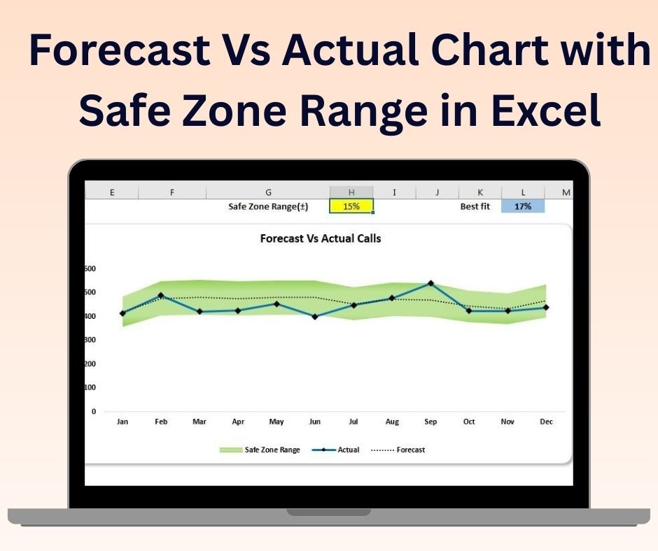
The Forecast vs Actual Chart with Safe Zone Range in Excel is an essential tool designed to help businesses, analysts, and project managers visually compare forecasted data against actual performance, while highlighting the range of acceptable performance (the “safe zone”). This dynamic chart allows you to track key performance indicators (KPIs), budgets, sales figures, or project milestones, providing an easy way to visualize how well you are meeting your forecasts and where you might need adjustments.
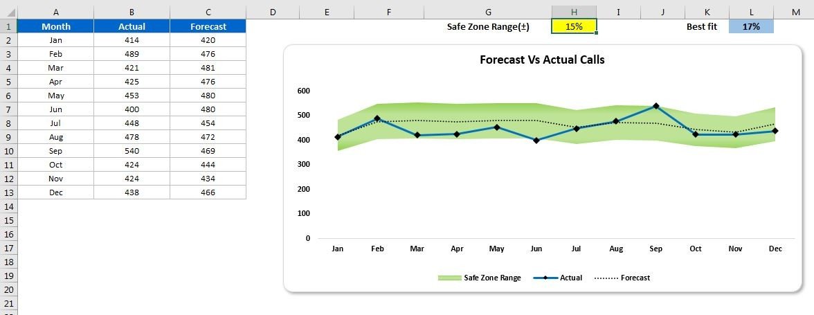
The chart includes a safe zone, which acts as a benchmark to display acceptable variations between forecasted and actual performance. If the actual value falls within the safe zone, it indicates that performance is on track. However, if it falls outside the range, the chart visually highlights the areas that need attention, allowing for quick decision-making.
This tool is highly customizable, enabling you to adjust the forecasted and actual data, safe zone range, and color schemes, making it suitable for various industries and business needs.
Key Features of the Forecast vs Actual Chart with Safe Zone Range:
📊 Compare Forecasted vs Actual Data
Easily compare your forecasted values with actual performance in a clear and visual format. This helps identify discrepancies, gaps, and areas that require corrective action.
📈 Safe Zone Range
The chart includes a “safe zone” range to visualize acceptable variations between forecasted and actual data. If the actual data is within this zone, it indicates on-track performance, while deviations are easily visible.
🔄 Real-Time Data Updates
The chart dynamically updates as you modify or input new data. This allows you to get real-time insights into your forecast accuracy and actual performance.
🎨 Customizable Design
Customize the chart’s colors, data labels, and safe zone thresholds to fit your specific needs or company branding.
📅 Multiple Applications
Use the chart for a variety of purposes, including budgeting, sales performance tracking, project progress monitoring, or any area where forecasting is essential.
Why You’ll Love the Forecast vs Actual Chart with Safe Zone Range:
✅ Clear Comparison – The chart provides an easy-to-understand visual comparison between forecasted and actual performance, helping you track progress and identify issues quickly. ✅ Actionable Insights – The safe zone feature highlights whether your actual performance is within acceptable limits, making it easier to take corrective actions when necessary. ✅ Real-Time Updates – Data is automatically reflected in the chart, so you can track performance in real-time and adjust your strategies accordingly. ✅ Customizable for Your Business – Tailor the safe zone, color scheme, and chart design to meet the unique requirements of your industry or company. ✅ Easy to Use – With its intuitive design, this tool is simple to set up and requires no advanced Excel skills to use.
What’s Inside the Forecast vs Actual Chart with Safe Zone Range:
- Visual Comparison – Compare forecasted vs actual data with a clear visual representation of performance.
- Safe Zone Range – Display acceptable performance ranges to easily track variances and deviations.
- Customizable Design – Tailor the chart’s appearance to fit your business needs or reporting requirements.
- Real-Time Data Integration – Automatically update the chart when new data is entered or modified.
How to Use the Forecast vs Actual Chart with Safe Zone Range:
1️⃣ Download the Template – Access the Excel file instantly after purchase. 2️⃣ Input Your Data – Add your forecasted and actual performance data into the designated fields. 3️⃣ Customize the Safe Zone – Adjust the safe zone range to reflect acceptable performance thresholds. 4️⃣ Visualize Performance – Use the chart to track variances and performance trends, and make data-driven decisions accordingly.
Who Can Benefit from the Forecast vs Actual Chart with Safe Zone Range:
- Business Analysts
- Financial Analysts
- Project Managers
- Sales Teams
- Marketing Teams
- Operations Managers
- Anyone tracking performance or comparing forecasts to actual outcomes
The Forecast vs Actual Chart with Safe Zone Range is a powerful tool that helps businesses and teams visualize performance, track variances, and make more informed decisions. Whether you’re monitoring sales performance, budgeting, or project progress, this tool ensures you stay on track and take corrective action when necessary.
Click here to read the Detailed blog post
https://www.pk-anexcelexpert.com/forecast-vs-actual-chart-with-safe-zone-range-in-excel/


&url=https://nextgentemplates.com/product/spotlight-visualization-in-excel-part-1/&media=https://nextgentemplates.com/wp-content/uploads/2025/03/Spotlight-Visualization-in-Excel-Part-1-1024x1024.jpg)
&url=https://nextgentemplates.com/product/info-graphics-with-column-chart-part-1/&media=https://nextgentemplates.com/wp-content/uploads/2025/03/Info-graphics-with-Column-chart-Part-1-1024x1024.jpg)
&url=https://nextgentemplates.com/product/analog-clock-in-excel-pie-chart-doughnut-chart/&media=https://nextgentemplates.com/wp-content/uploads/2025/03/Analog-Clock-in-Excel-Pie-Chart-Doughnut-Chart-1-1.jpg)
&url=https://nextgentemplates.com/product/info-graphics-with-column-chart-part-2/&media=https://nextgentemplates.com/wp-content/uploads/2025/03/Info-graphics-with-Column-chart-Part-2-1024x1024.jpg)
&url=https://nextgentemplates.com/product/informative-kpi-indicator-chart-version-1/&media=https://nextgentemplates.com/wp-content/uploads/2025/03/Informative-KPI-Indicator-Chart-Version-1-1024x1024.jpg)
&url=https://nextgentemplates.com/product/informative-kpi-indicator-chart-version-2/&media=https://nextgentemplates.com/wp-content/uploads/2025/03/Informative-KPI-Indicator-Chart-Version-2-1024x1024.jpg)
&url=https://nextgentemplates.com/product/spotlight-visualization-in-excel-part-2/&media=https://nextgentemplates.com/wp-content/uploads/2025/03/Spotlight-Visualization-in-Excel-Part-2.jpg)
Reviews
There are no reviews yet.