Field service businesses live and die by response time, technician efficiency, and customer satisfaction. If you cannot see performance clearly, you cannot improve it.
Still using disconnected spreadsheets to track service calls, revenue, and technician productivity? That’s costing you time and money.
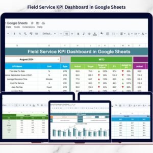
Introducing the Field Service KPI Dashboard in Google Sheets — a ready-to-use, structured performance tracking system designed specifically for field service operations.
This powerful dashboard centralizes technician performance, SLA compliance, revenue tracking, cost control, and operational KPIs — all in one dynamic Google Sheets file.
No complex software. No manual consolidation. Just smart, organized reporting.
🚀 Key Feature of Field Service KPI Dashboard in Google Sheets
📊 6 Structured Worksheets – Organized performance monitoring system with clear data flow.
📅 Dynamic Month Selection (Cell D3) – Instantly switch between months for analysis.
🎯 MTD & YTD Tracking – Monitor both short-term and cumulative performance.
📈 Target vs Actual Comparison – Identify service gaps immediately.
🔄 Previous Year Benchmarking – Measure growth trends and improvement.
📉 Conditional Formatting Arrows – Visual up/down indicators for quick interpretation.
🧑🔧 Technician Productivity Insights – Monitor utilization and service efficiency.
💰 Revenue & Cost Monitoring – Maintain financial control across operations.
📦 What’s Inside the Field Service KPI Dashboard in Google Sheets
This ready-to-use Google Sheets dashboard includes 6 structured worksheets:
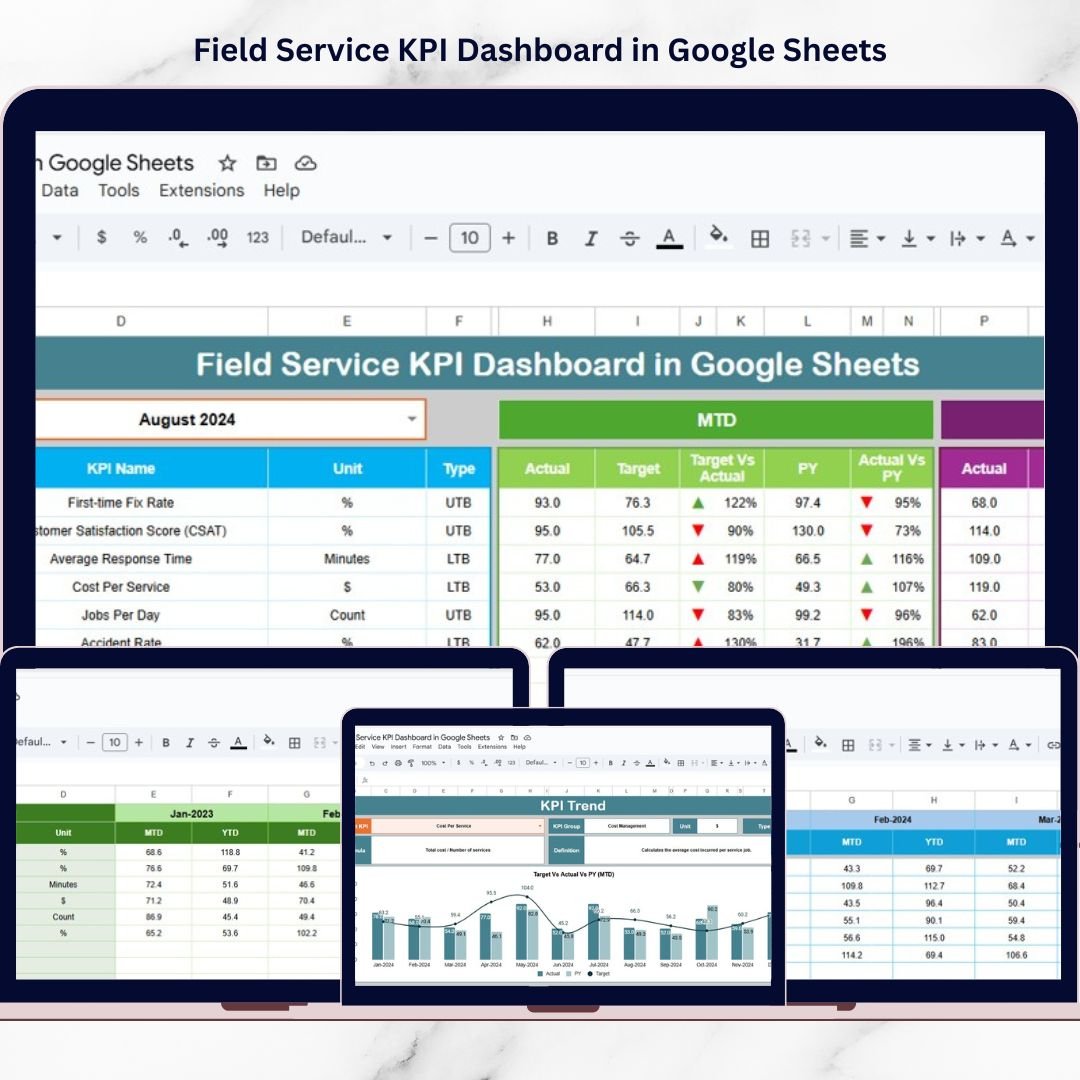
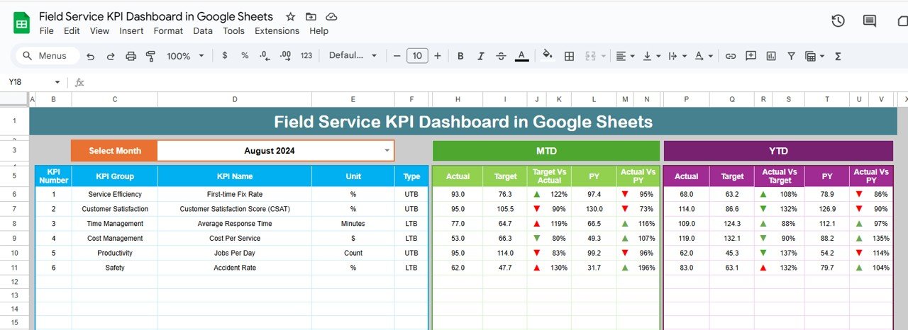
1️⃣ Dashboard Sheet (Main Page)
The central performance monitoring page includes:
-
Month selection dropdown in Cell D3
-
MTD vs Target vs Previous Year comparison
-
YTD vs Target vs Previous Year comparison
-
Target vs Actual % variance
-
Previous Year vs Actual % growth
-
Conditional formatting arrows for performance signals
This page gives managers instant clarity on operational performance.
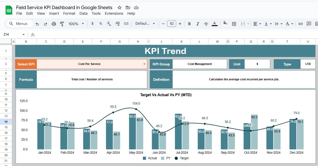
2️⃣ KPI Trend Sheet
Deep KPI analysis page where you can:
-
Select KPI from dropdown
-
View KPI Group
-
Check KPI Unit
-
See KPI Type (LTB / UTB)
-
Review KPI Formula
-
Read KPI Definition
-
Analyze monthly trend chart
Perfect for identifying long-term performance patterns.
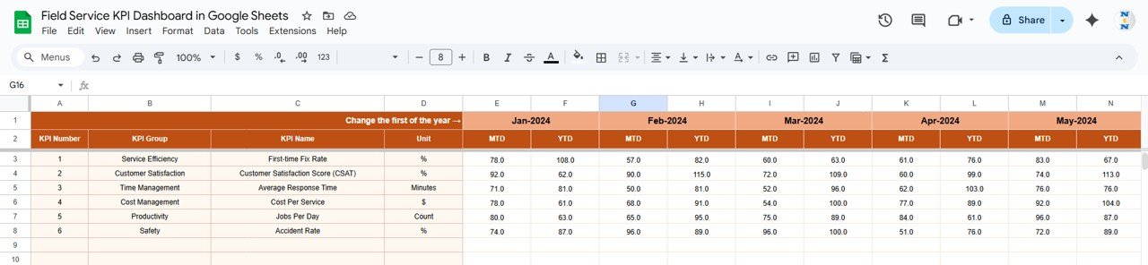
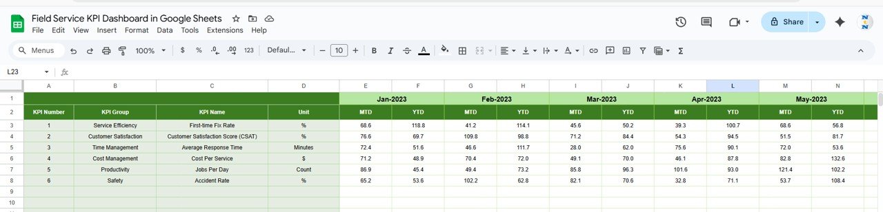
3️⃣ Actual Number Sheet
Structured data entry page where you:
-
Enter first month in Cell E1
-
Input MTD values
-
Allow YTD values to calculate (based on cumulative logic)
Clean structure ensures automatic dashboard updates.
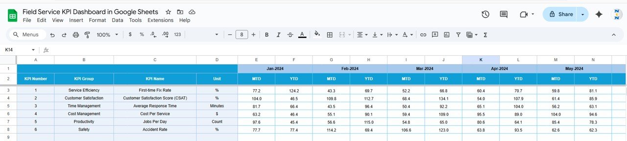
4️⃣ Target Sheet
Define performance benchmarks by entering:
-
Monthly MTD targets
-
YTD cumulative targets
Helps align service goals with business strategy.
5️⃣ Previous Year Number Sheet
Enter historical data to compare:
-
Previous Year MTD
-
Previous Year YTD
Supports year-over-year growth tracking.
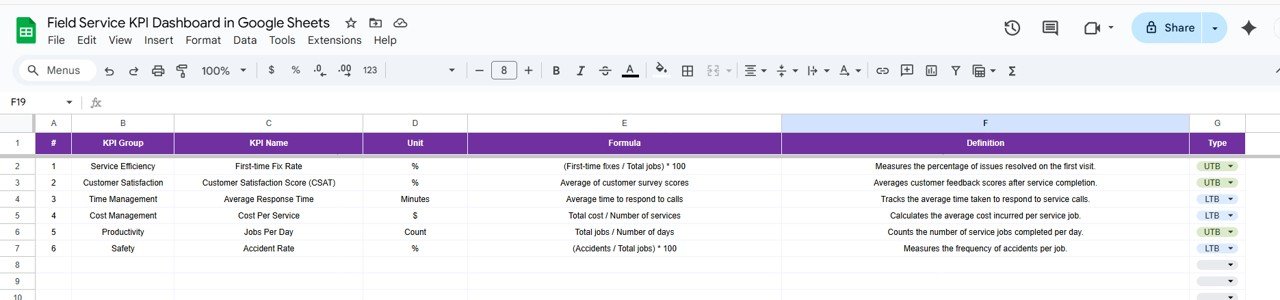
6️⃣ KPI Definition Sheet
Central documentation sheet including:
-
KPI Name
-
KPI Group
-
Unit
-
Formula
-
Definition
-
Type (Lower the Better / Upper the Better)
Ensures reporting consistency and clarity across teams.
🛠 How to Use the Field Service KPI Dashboard in Google Sheets
Using the dashboard is simple:
1️⃣ Enter monthly MTD data in the Actual Sheet.
2️⃣ Update targets in the Target Sheet.
3️⃣ Add previous year data in the PY Sheet.
4️⃣ Select the month from Cell D3 on the Dashboard.
5️⃣ Review KPI arrows and variance percentages.
6️⃣ Use KPI Trend Sheet for detailed analysis.
Because everything updates dynamically, reporting becomes fast and accurate.
👥 Who Can Benefit from This Field Service KPI Dashboard in Google Sheets
✔ Field Service Managers
✔ Facility Management Companies
✔ HVAC Service Providers
✔ IT Support Teams
✔ Telecom Field Operations
✔ Maintenance Service Organizations
✔ Operations & Finance Managers
Whether you manage 10 technicians or 500, this dashboard brings structure to your performance tracking.
Why This Dashboard Is a Game-Changer
Instead of manually compiling reports, you analyze results instantly.
Instead of guessing technician performance, you measure productivity clearly.
Instead of reacting to SLA violations late, you detect issues early.
From response time and first-time fix rate to revenue per job and technician utilization — every KPI becomes visible, measurable, and actionable.
If you want improved service quality, stronger financial control, and faster decision-making, this dashboard delivers exactly that.
Click here to read the Detailed blog post
Watch the step-by-step video tutorial:
Visit our YouTube channel to learn step-by-step video tutorials
👉 YouTube Channel – NeotechNavigators