


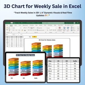
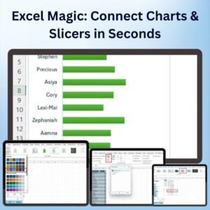
The Excel Magic: Connect Charts & Slicers in Seconds is an incredibly powerful tool that allows you to quickly connect multiple charts with slicers, making your Excel reports and dashboards more interactive and visually engaging. By linking slicers to multiple charts, you can filter and analyze data dynamically with just a click, providing a seamless user experience and improving data insights.
This template takes your Excel charts to the next level, offering a simple and efficient way to connect multiple charts to a single slicer. Whether you’re working with sales data, financial performance, or any other type of metric, this tool will help you easily explore trends and insights across different data points, all in one view.

Key Features of Excel Magic: Connect Charts & Slicers in Seconds
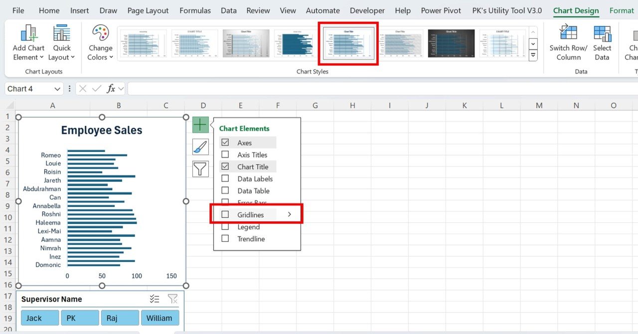
📌 Instant Chart and Slicer Connectivity
With this template, you can instantly link multiple charts to a slicer, allowing you to filter data and see updates in real-time. No need for complex formulas or manual adjustments—everything connects seamlessly with just a few clicks.
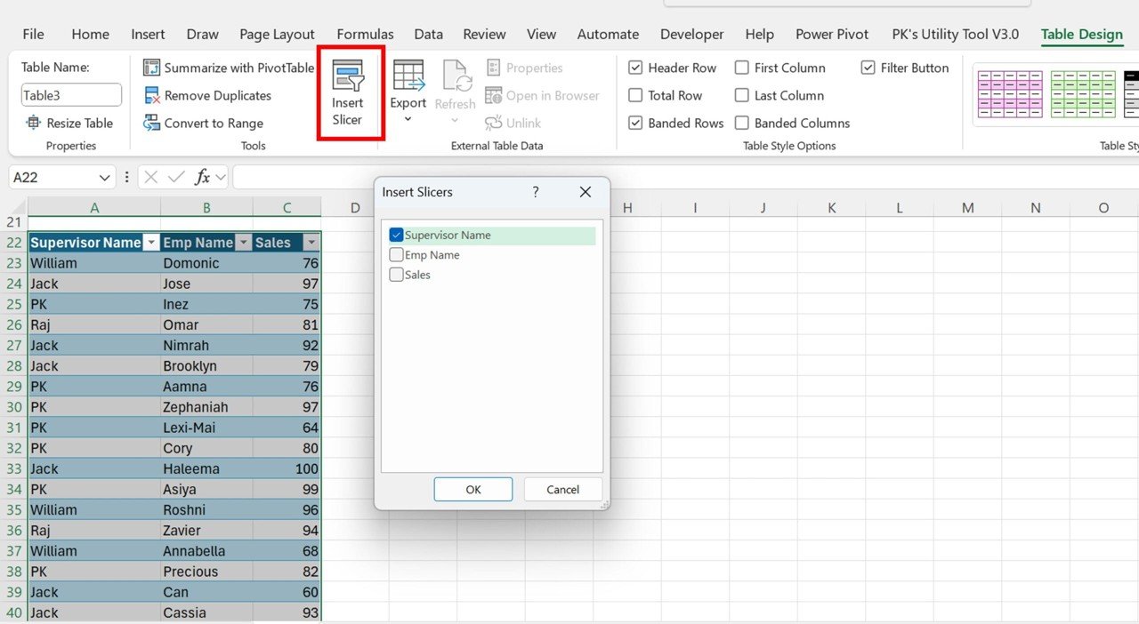
🛠 Customizable Slicers
You can easily customize the slicers to filter data based on categories, dates, or any other dimensions relevant to your analysis. Adjust the slicer settings to match the specific data fields you want to work with.
💡 Real-Time Data Filtering
The slicer instantly updates the data across all connected charts, giving you a real-time view of your performance metrics. Whether you’re monitoring sales, marketing metrics, or financial performance, this dynamic interactivity makes it easy to explore trends.
🔢 Multiple Chart Types
Connect a variety of chart types, such as bar charts, line charts, pie charts, and more. The flexibility to link different chart types to slicers makes it easy to create comprehensive, interactive dashboards.
🚀 Dynamic Dashboards
Enhance your Excel dashboards by incorporating slicers that control multiple charts at once. This functionality gives you the power to create highly dynamic, user-friendly reports that can be customized with ease.
📊 Visual Comparison Across Charts
With all your charts connected to a single slicer, you can easily compare different data series and spot trends, outliers, and performance gaps. It’s a powerful way to gain insights without needing to switch between different charts manually.
⚙ Easy Setup and Customization
Setting up slicers and connecting them to multiple charts is easy with this template. You don’t need any advanced Excel skills to get started. The process is simple, and the instructions guide you every step of the way.
🚀 Why You’ll Love Excel Magic: Connect Charts & Slicers in Seconds
✅ Seamless Interactivity – Link multiple charts to slicers with just a few clicks. ✅ Real-Time Filtering – Automatically filter data across all charts with slicer selections. ✅ Multiple Chart Types – Connect different chart types to slicers for dynamic analysis. ✅ Customizable and Flexible – Tailor slicers and charts to your specific data needs. ✅ Easy to Set Up – Quick and simple setup with clear instructions for customization.
📂 What’s Inside Excel Magic: Connect Charts & Slicers in Seconds?
- Instant Chart & Slicer Connectivity: Link multiple charts to a single slicer for dynamic filtering.
- Customizable Slicers: Adjust slicers to filter data based on any category or dimension.
- Real-Time Data Filtering: See updates across all charts instantly as you adjust slicer selections.
- Multiple Chart Types: Use a variety of chart types, all connected to slicers for interactive analysis.
- Simple Setup Instructions: Easy-to-follow steps to set up slicers and link them to your charts.
🔍 How to Use Excel Magic: Connect Charts & Slicers in Seconds
1️⃣ Download the Template – Get instant access to the Excel file upon purchase. 2️⃣ Customize Your Data – Enter your data and choose the charts you want to connect to the slicer. 3️⃣ Set Up the Slicer – Add the slicer to filter data across multiple charts with ease. 4️⃣ Interact and Filter Data – Use the slicer to see real-time updates across all connected charts. 5️⃣ Present and Share – Use the interactive charts and slicers in reports, dashboards, and presentations.
🎯 Who Can Benefit from Excel Magic: Connect Charts & Slicers in Seconds? 🔹 Business Analysts 🔹 Project Managers 🔹 Marketing Teams 🔹 Financial Analysts 🔹 Sales Teams 🔹 Anyone looking to create dynamic, interactive dashboards
Take your Excel reporting and dashboarding to the next level with Excel Magic: Connect Charts & Slicers in Seconds. This powerful tool makes it easy to create interactive charts and dashboards that help you gain insights, make data-driven decisions, and present data in a more engaging way.
Click here to read the Detailed blog post
https://www.pk-anexcelexpert.com/excel-magic-connect-charts-slicers-in-seconds/


Reviews
There are no reviews yet.