Customer experience is the foundation of long-term business success. Customer Experience (CX) KPI Dashboard in Power BI When customers feel appreciated, they stay longer, trust more, and happily recommend the brand to others. Customer Experience (CX) KPI Dashboard in Power BI But without the right metrics, CX teams cannot understand performance gaps or fix issues quickly. Customer Experience (CX) KPI Dashboard in Power BI Many organizations still depend on manual reports, scattered spreadsheets, and slow processes—making it difficult to build a customer-centric culture.
The Customer Experience (CX) KPI Dashboard in Power BI transforms this challenge. Customer Experience (CX) KPI Dashboard in Power BI This ready-to-use dashboard gives your business complete visibility into satisfaction levels, support quality, retention patterns, and escalation trends. Customer Experience (CX) KPI Dashboard in Power BI Using automated visuals, real-time metrics, and intuitive charts, it helps CX teams make faster, smarter, and proactive decisions.
Customer Experience (CX) KPI Dashboard in Power BI Designed for CX professionals, customer support teams, marketing departments, and business leaders, this dashboard removes the complexity of manual reporting and replaces it with instant, reliable insights.
✨ Key Features of the Customer Experience (CX) KPI Dashboard in Power BI
This dashboard includes three analytical pages, each designed to deliver actionable CX intelligence.
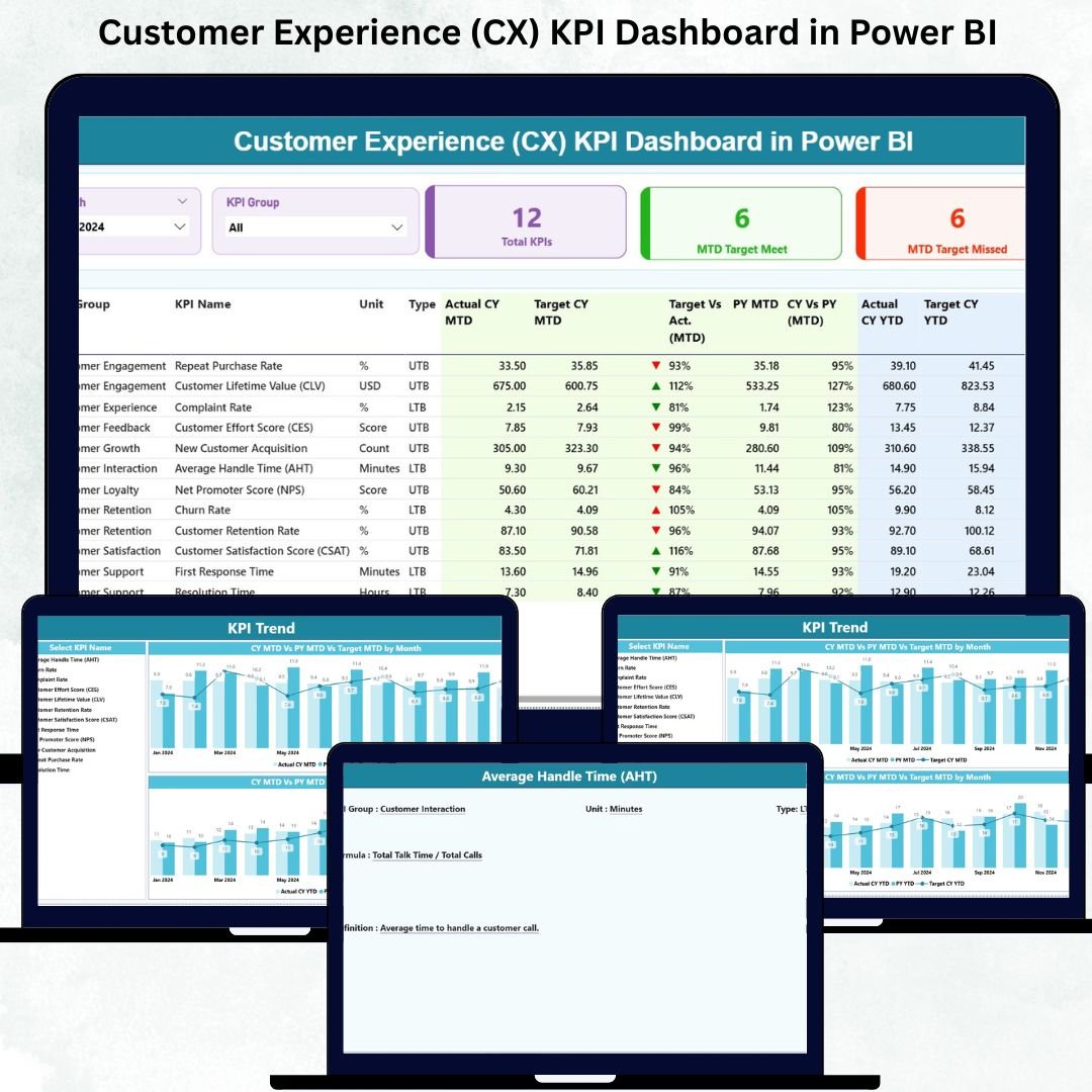
📌 Summary Page – Complete CX Overview at a Glance
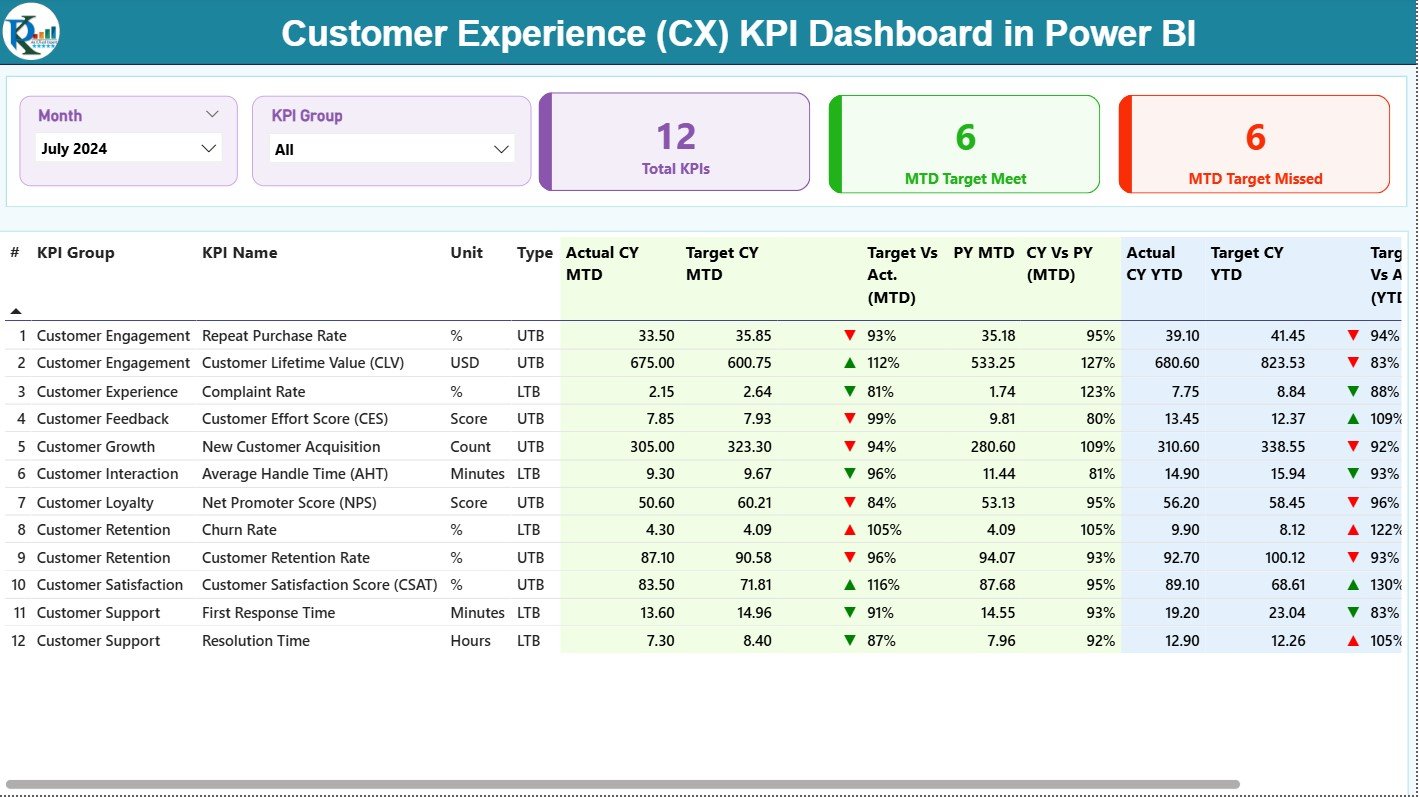
The Summary Page is the heart of the dashboard, giving a full picture of CX performance.
🔹 Smart Filters & Slicers
Users can select:
✔ Month
✔ KPI Group (Support, Satisfaction, Quality, Retention, etc.)
Filters instantly update all visuals.
🔹 KPI Cards for Quick Snapshot
You see three major cards:
✔ Total KPIs Count
✔ MTD Target Met
✔ MTD Target Missed
This helps teams monitor performance health in seconds.
🔹 Comprehensive KPI Table
The KPI table shows detailed metrics such as:
-
KPI Number
-
KPI Group
-
KPI Name
-
Unit
-
Type (UTB/LTB)
-
Actual CY MTD
-
Target CY MTD
-
MTD Status (▲/▼ with red/green)
-
Target vs Actual (MTD %)
-
PY MTD
-
CY vs PY MTD (%)
-
Actual CY YTD
-
Target CY YTD
-
YTD Status (▲/▼)
-
Target vs Actual (YTD %)
-
PY YTD
-
CY vs PY YTD (%)
This table provides complete transparency for performance tracking.
📌 KPI Trend Page – Visual Storytelling of CX Performance
The KPI Trend Page reveals monthly and yearly patterns using two trend charts:
📈 MTD Trend Chart
Shows:
✔ Current Year MTD Actual
✔ Previous Year MTD
✔ MTD Target
📊 YTD Trend Chart
Shows:
✔ Current Year YTD Actual
✔ Previous Year YTD
✔ YTD Target
With the KPI Name slicer, you can instantly view the monthly journey of any KPI such as CSAT, NPS, response time, or retention.
This page helps teams identify:
✔ Sudden drops
✔ Seasonal spikes
✔ Long-term improvement
✔ Underperforming areas
📌 KPI Definition Page – Deep Understanding of CX Metrics
This hidden drill-through page provides clarity on every KPI.
It includes:
✔ KPI Number
✔ KPI Group
✔ Unit
✔ KPI Formula
✔ KPI Definition
✔ KPI Type (LTB/UTB)
Teams use this page to understand how every KPI is calculated. A Back button lets you easily return to the Summary Page.
📦 How the CX KPI Dashboard Works (Excel-Powered & Automated)
The dashboard is connected to a structured Excel file containing three sheets:
1️⃣ Input Actual Sheet
Contains:
✔ Month
✔ KPI Name
✔ MTD Actual
✔ YTD Actual
2️⃣ Input Target Sheet
Contains:
✔ Month
✔ KPI Name
✔ MTD Target
✔ YTD Target
3️⃣ KPI Definition Sheet
Contains:
✔ KPI Name
✔ KPI Number
✔ KPI Group
✔ Unit
✔ Formula
✔ Definition
✔ Type (LTB/UTB)
Update the dataset → refresh Power BI → all visuals update automatically.
🎯 Why Every Business Should Use a CX KPI Dashboard
1. Real-Time CX Insights
Track satisfaction, NPS, retention, escalations, and support performance instantly.
2. Faster Decision-Making
Identify issues proactively and take corrective action.
3. Accurate KPI Tracking
Avoid manual errors and get reliable numbers every month.
4. Year-Over-Year Comparison
CY vs PY comparisons show whether CX efforts are improving.
5. Improved Service Quality
Response time, ticket resolution, and escalation metrics help teams improve support performance.
6. Easy to Maintain
Only the Excel file needs updating Power BI BI does the rest.
🎓 Who Can Benefit from This CX Dashboard?
✔ Customer Support Teams
✔ CX Managers
✔ Service Quality Teams
✔ Marketing & Retention Teams
✔ Business Leaders & Directors
✔ BPOs & Customer-First Organizations
Any business aiming to improve customer happiness and reduce churn will benefit from this dashboard.


Reviews
There are no reviews yet.