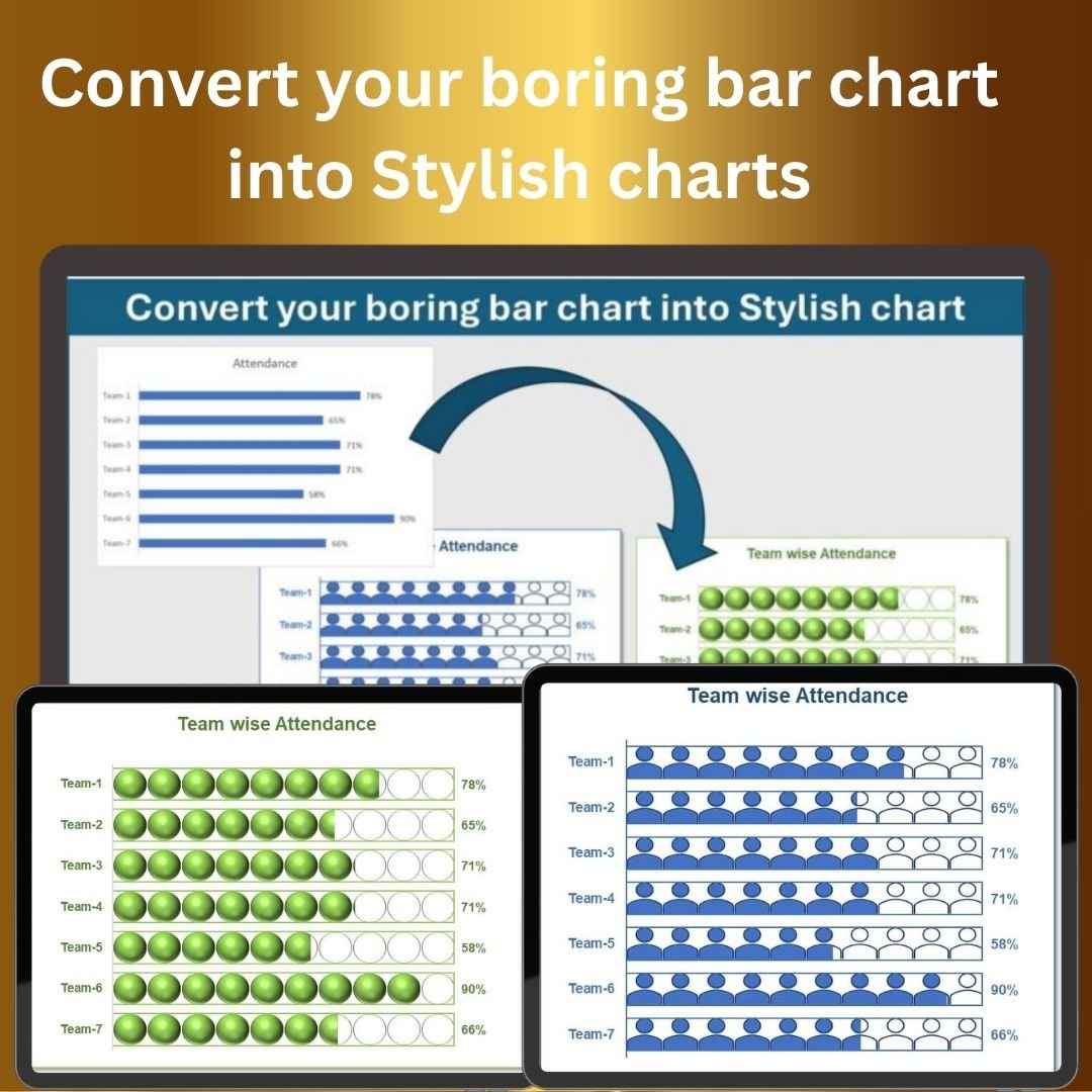


The Convert Your Boring Bar Chart into Stylish Charts in Excel template is designed to help you turn traditional bar charts into visually appealing, dynamic presentations. Whether you are presenting financial data, sales reports, or project progress, this template allows you to elevate your charts and make them more engaging and professional. The unique design options available in this template transform simple bar charts into creative and stylish visualizations that can capture the attention of your audience.
This Excel-based solution offers various customization options, allowing you to change chart colors, add gradients, and adjust styles to match your brand or presentation theme. It is perfect for business professionals, analysts, and anyone looking to enhance their data presentations with impactful visuals that are both informative and aesthetically pleasing.

Key Features of the Stylish Charts Template in Excel
📌 Transform Boring Bar Charts into Eye-Catching Designs
Take your basic bar charts and make them pop with dynamic colors, gradients, and advanced formatting. Turn standard charts into stunning visual representations of your data.
🛠 Fully Customizable Design
Customize colors, add textures, gradients, and special effects to your charts. Adjust the chart style, labels, and axes to suit your presentation needs and match your branding.
💡 Interactive Elements
Add interactive features such as data labels, hover effects, and dynamic highlighting to make your charts more engaging. This makes it easier for your audience to focus on key data points and trends.
🔢 Real-Time Data Updates
As your data changes, the stylish charts automatically update in real-time, ensuring that your presentation always reflects the most current information.
🚀 Multiple Chart Styles
Choose from various chart styles such as 3D bars, stacked bars, and more to create a unique and visually appealing chart for any type of data.
📊 Comprehensive Data Visualization
Use this template for a wide range of data types, from project timelines and budgets to sales figures and performance metrics. The stylish charts work with all kinds of data.
⚙ Easy-to-Use Interface
The template is simple to use, with easy-to-follow instructions. You don’t need to be an advanced Excel user to create these beautiful charts—just a few clicks, and you’re ready to go.
🚀 Why You’ll Love This Stylish Charts Template in Excel
✅ Enhanced Visual Appeal – Transform plain bar charts into dynamic and stylish data visuals. ✅ Customizable Design – Tailor the charts to fit your presentation or branding needs. ✅ Engaging Features – Make your charts interactive and highlight important data points. ✅ Real-Time Updates – Automatically update charts as your data changes. ✅ User-Friendly – Simple setup and easy-to-use interface.
📂 What’s Inside the Stylish Charts Template in Excel?
- Customizable Bar Charts: Easily modify bar charts with gradients, textures, and colors.
- Interactive Features: Add hover effects and dynamic highlighting.
- Real-Time Data Updates: Automatically adjust charts as data changes.
- Various Chart Styles: Choose from multiple chart types to best represent your data.
- Step-by-Step Instructions: Clear instructions to guide you through the customization process.
🔍 How to Use the Stylish Charts Template in Excel
1️⃣ Download the Template – Get immediate access to the Excel file upon purchase. 2️⃣ Input Your Data – Enter your data into the template and see the charts update in real-time. 3️⃣ Customize the Design – Modify the colors, gradients, and effects to make your chart stylish. 4️⃣ Review Your Chart – Watch as your simple bar chart transforms into a stunning visual. 5️⃣ Present and Share – Use the stylish charts for reports, presentations, or team meetings.
🎯 Who Can Benefit from the Stylish Charts Template in Excel? 🔹 Business Professionals 🔹 Data Analysts 🔹 Project Managers 🔹 Sales Teams 🔹 Marketing Professionals 🔹 Anyone looking to create impactful and visually engaging data presentations
Transform your standard Excel charts into vibrant, engaging visuals with the Stylish Charts Template in Excel. Enhance your presentations, reports, and meetings with visually appealing charts that make data analysis more exciting and impactful.
Click here to read the Detailed blog post Convert your boring bar chart into Stylish charts
https://www.pk-anexcelexpert.com/convert-your-boring-bar-chart-into-stylish-charts/


Reviews
There are no reviews yet.