In an unpredictable business world, even a single disruption can cause massive financial, operational, and reputational damage. Cyberattacks, system outages, natural disasters, or workforce unavailability can strike without warning. That is why organizations need more than just a continuity plan—they need clear visibility, measurable KPIs, and real-time insights.
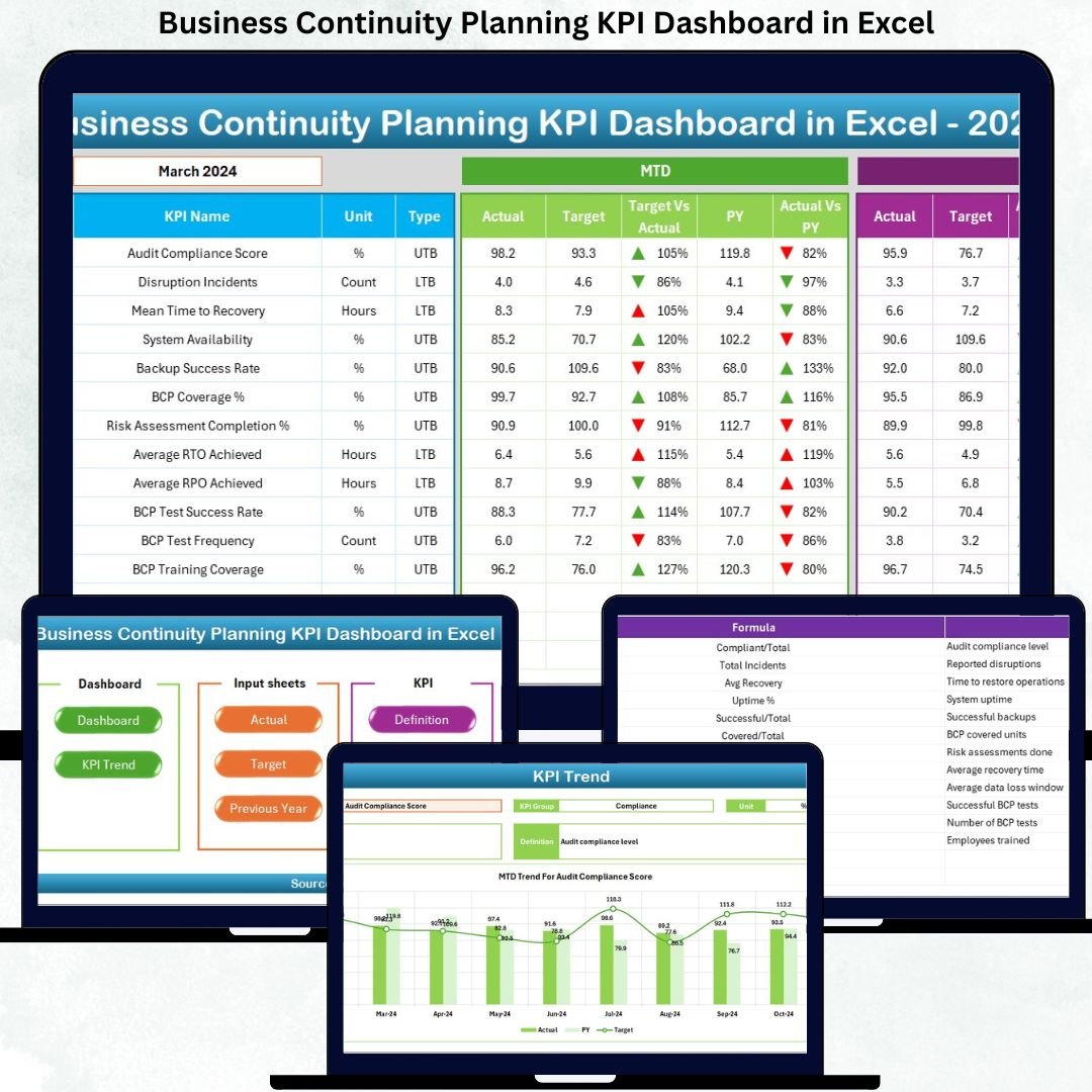
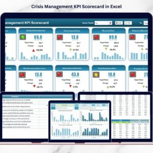
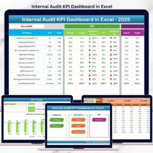
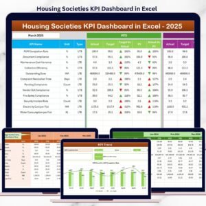
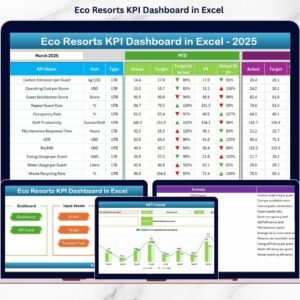
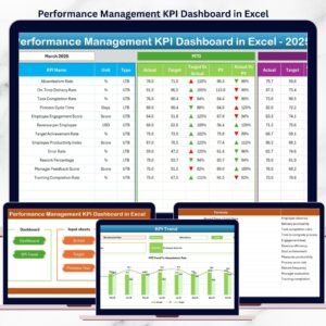
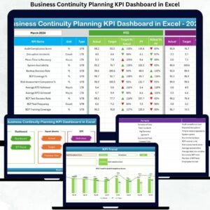
The Business Continuity Planning KPI Dashboard in Excel is a powerful, ready-to-use Excel solution designed to help organizations track preparedness, measure resilience, and improve recovery performance using structured KPIs. Built entirely in Microsoft Excel, this dashboard transforms complex continuity data into actionable insights—without expensive software or technical complexity.
Whether you manage risks, IT recovery, compliance, or operations, this dashboard gives you confidence, control, and clarity when it matters most.
✅ Key Features of Business Continuity Planning KPI Dashboard in Excel
📌 Centralized KPI Monitoring – Track all business continuity KPIs in one consolidated Excel dashboard
📌 MTD & YTD Performance Tracking – Instantly monitor Month-to-Date and Year-to-Date performance
📌 Target vs Actual Comparison – Identify gaps using automated comparisons and visual indicators
📌 Previous Year Analysis – Measure improvement trends with PY vs Actual comparisons
📌 Conditional Formatting Indicators – Up/down arrows highlight performance changes instantly
📌 Interactive Month Selection – Change months using a simple dropdown and auto-refresh results
📌 Trend Analysis by KPI – Analyze historical KPI trends with dynamic charts
📌 Executive-Friendly Design – Clean layout with navigation buttons for quick access
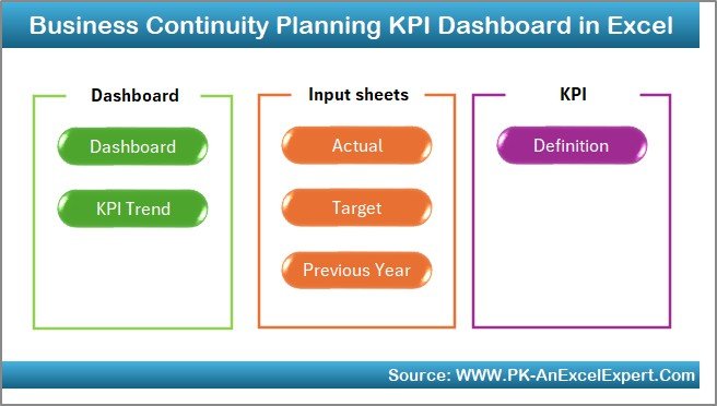
📁 What’s Inside the Business Continuity Planning KPI Dashboard
This digital product includes a professionally structured Excel workbook with 7 dedicated worksheets, each serving a specific purpose:
📊 Summary Page (Index Sheet)
A clean entry page with 6 navigation buttons for quick access to all sections—perfect for executives.
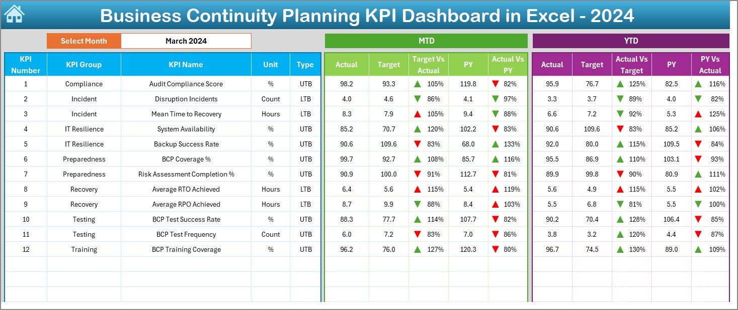
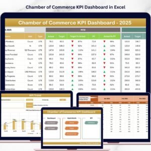
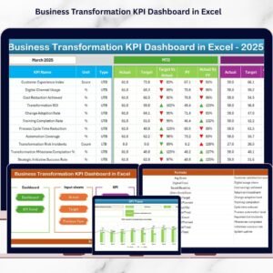
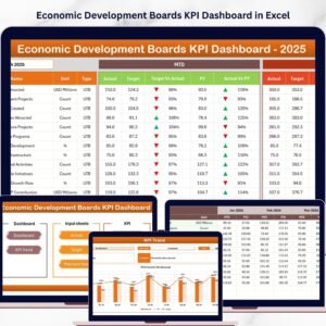
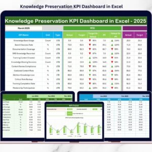
📊 Dashboard Sheet
The main KPI view showing:
-
MTD, YTD, Target, and Previous Year values
-
Target vs Actual & PY vs Actual comparisons
-
Conditional formatting arrows for instant insights
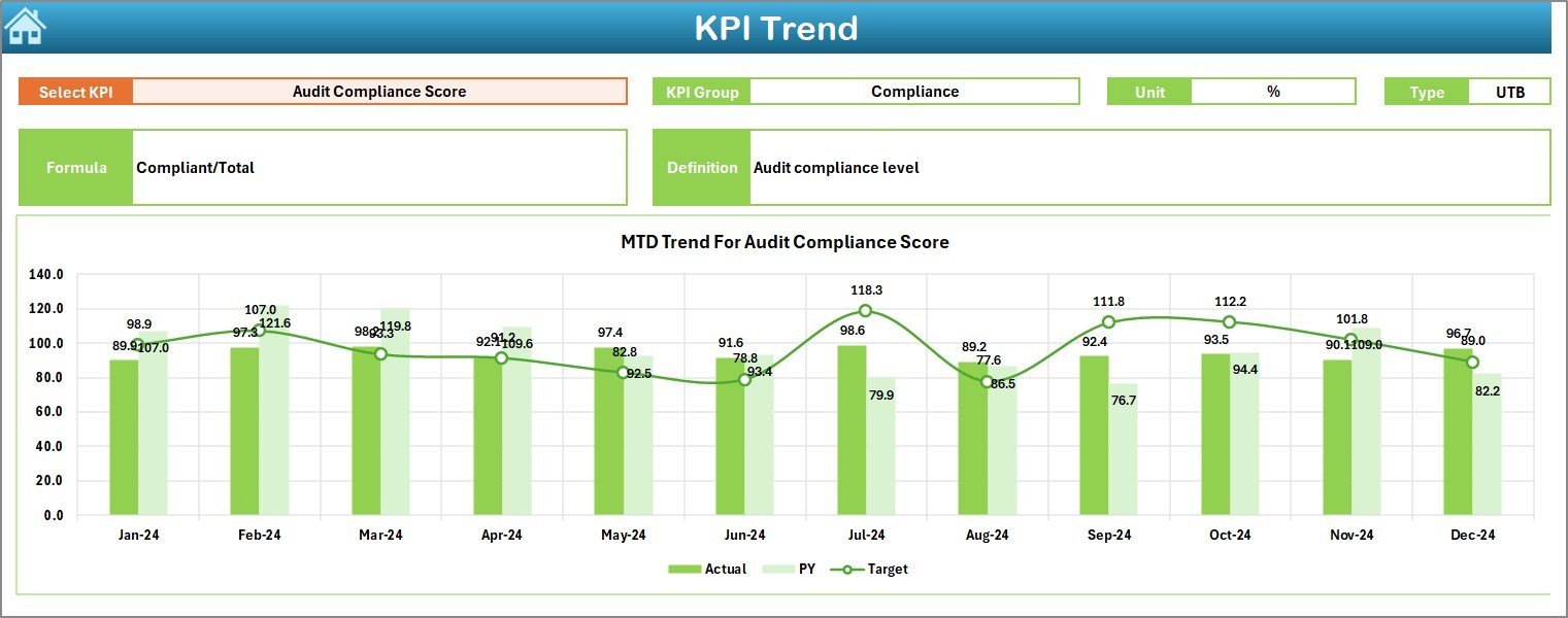
📈 Trend Sheet
Analyze KPI performance over time with:
-
KPI details (Group, Unit, Formula, Type)
-
MTD and YTD trend charts
-
Actual vs Target vs PY analysis
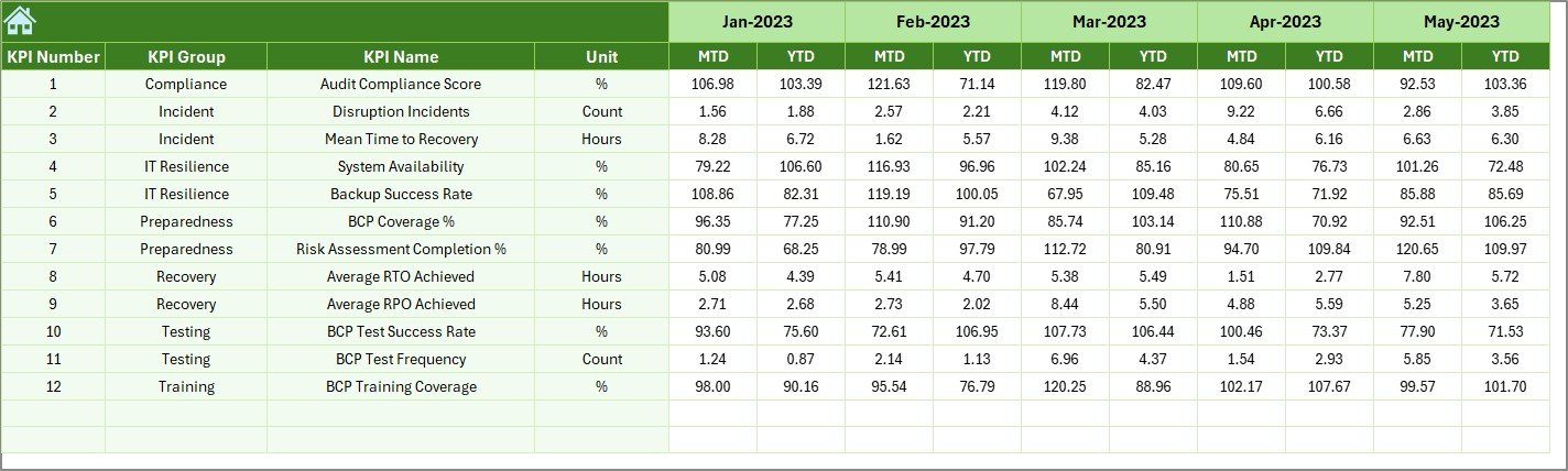
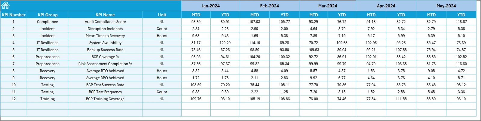
🧮 Actual Numbers Input Sheet
Enter monthly MTD and YTD actual values. All visuals update automatically.
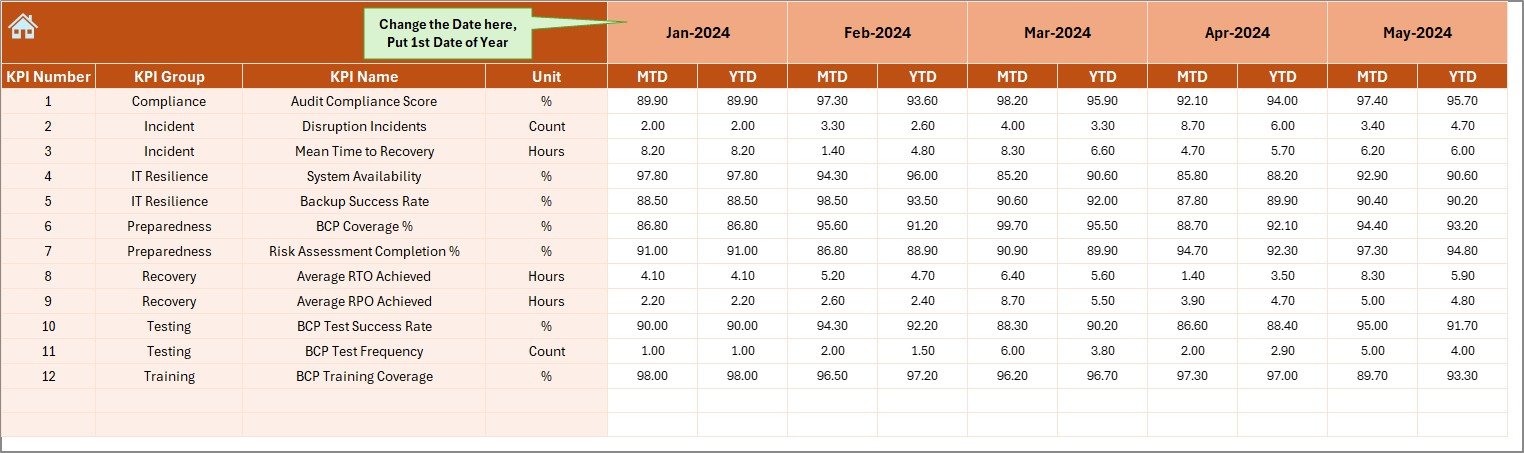
🎯 Target Sheet
Maintain monthly and cumulative KPI targets separately for clean benchmarking.
📅 Previous Year Numbers Sheet
Store historical data to evaluate year-over-year improvement.
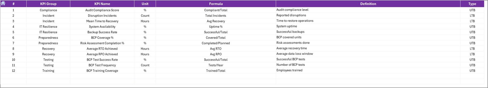
📘 KPI Definition Sheet
Clearly defines each KPI with name, group, unit, formula, and definition—ensuring clarity for all users.
🛠️ How to Use the Business Continuity Planning KPI Dashboard
Using this dashboard is simple and practical—even for non-technical users:
1️⃣ Define your continuity KPIs in the KPI Definition sheet
2️⃣ Enter target values in the Target sheet
3️⃣ Add previous year data for comparison
4️⃣ Update actual KPI values monthly
5️⃣ Select the month from the dashboard dropdown
6️⃣ Review insights, trends, and performance gaps instantly
No macros. No coding. Just structured Excel intelligence.
🎯 Who Can Benefit from This Business Continuity KPI Dashboard?
This dashboard is ideal for:
👔 Business Continuity Managers – Monitor readiness and recovery metrics
🛡️ Risk & Compliance Teams – Support audits and regulatory reporting
💻 IT & Disaster Recovery Teams – Track system availability and response time
🏭 Operations Managers – Identify continuity gaps before disruptions occur
📋 Internal Auditors – Access structured KPI definitions and historical trends
📊 Senior Leadership – Make data-driven resilience decisions with confidence
Click here to read the Detailed blog post
Watch the step-by-step video tutorial:
Visit our YouTube channel to learn step-by-step video tutorials


Reviews
There are no reviews yet.