If your HR reporting still starts with an HRIS export and a blank spreadsheet, the dashboard format matters. Excel vs Google Sheets vs Power BI US employers are still managing millions of hires, quits, and separations each month, so HR leaders need fast answers on turnover, engagement, staffing, training, and workforce cost. A payroll and HR platform such as Gusto lists its Simple plan at $49 per month plus $6 per person per month; for a 100-employee company, that is $649 per month before add-ons. The highest-priced template in this roundup is a one-time $17.99.
That price gap does not mean a template replaces an HRIS. It means a template can become the reporting layer you use after exporting data from BambooHR, Gusto, ADP, Workday, Excel, or Google Sheets. This head-to-head guide compares HR dashboard Excel vs Google Sheets and HR analytics Power BI options across setup time, sharing model, features, and cost. We will compare 8 NextGenTemplates HR dashboard templates across Excel, Google Sheets, and Power BI, with product links and screenshots for every format.
Why This Comparison Matters in 2026
- Labor movement remains high: The BLS March 2026 JOLTS release reported 6.9 million job openings, 5.6 million hires, 5.4 million total separations, and 3.2 million quits. HR teams need dashboards that can turn workforce movement into a monthly action plan.
- Engagement is still fragile: Gallup’s State of the Global Workplace 2026 data reports that 20% of employees globally are engaged. Engagement tracking belongs in the same reporting conversation as turnover, training, and performance.
- HR software costs scale every month: Gusto’s 2026 pricing lists Simple at $49/month plus $6/person, Plus at $80/month plus $12/person, and Premium at $180/month plus $22/person. For small and mid-market teams, a dashboard template can be a low-cost analytics layer.
- Power BI sharing has a seat cost: Microsoft lists Power BI Pro at $14 per user/month, paid yearly, so the template price is only one part of the Power BI ownership cost.
- Template cost is fixed: The 8 HR dashboard templates in this guide range from $6.99 to $17.99 one-time, making them practical for HR teams that need better reports before they are ready for a full BI implementation.
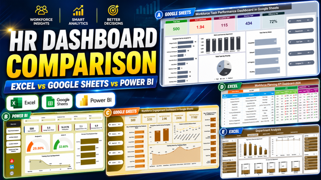
Compare the 8 HR Dashboard Templates Excel vs Google Sheets vs Power BI
| Template | Format | Best For | Price |
|---|---|---|---|
| HR KPI Scorecard in Excel | Excel | Monthly MTD/YTD HR KPI scorecards | $12.99 |
| HR Dashboard in Excel | Excel | 5-page workforce analytics from HRIS exports | $17.99 |
| Workforce Planning KPI Dashboard in Excel | Excel | Staffing, capacity, productivity, and labor cost planning | $12.99 |
| Workforce Engagement Dashboard in Google Sheets | Google Sheets | Cloud-based engagement and satisfaction tracking | $6.99 |
| Workforce Planning KPI Dashboard in Google Sheets | Google Sheets | Shared workforce planning with MTD/YTD targets | $9.99 |
| Workforce Task Performance Dashboard in Google Sheets | Google Sheets | Task workload, efficiency, and overdue task visibility | $6.99 |
| HR Dashboard in Power BI | Power BI | Interactive HR analytics across departments, roles, locations, and employment types | $17.99 |
| HR KPI Dashboard in Power BI | Power BI | Interactive KPI drill-downs for HR performance, engagement, and retention | $11.99 |
The same dashboard workflow appears across the formats: bring in HR roster or KPI data, review KPI cards, compare departments or roles, then share the findings. Excel gives the fastest offline setup. Google Sheets gives live collaboration. Power BI gives the strongest interactive analytics layer when your HR data is growing beyond static workbooks.
Excel HR Dashboards: Best for Fast Offline Analysis
Excel wins when the HR team already lives in Microsoft 365, exports data from an HRIS, and needs a clean report without learning a new platform. It is also the safest choice when the dashboard owner wants to control formulas, charts, filters, and data refresh manually.
HR KPI Scorecard in Excel

The HR KPI Scorecard in Excel is built for HR leaders who need a clear MTD/YTD scorecard instead of another overloaded workbook. It focuses on actual vs target performance, previous-year comparison, and KPI-level trends, making it a practical format for monthly leadership reviews where the question is not just “what happened?” but “are we on target?”
Screenshot walkthrough: The product image shows a scorecard-style dashboard with KPI indicators, trend views, and structured KPI definitions. Inside, you get a Scorecard sheet, KPI Trend sheet, Input Data sheet, and KPI Definition sheet. The setup is simple: enter actuals and targets, select the month or reporting view, and review the dashboard.
Use cases: monthly CHRO reviews, employee turnover tracking, training completion reporting, absenteeism monitoring, recruitment efficiency analysis, and cost-per-hire conversations with finance. The format is strongest when HR owns a fixed KPI list and wants a consistent target-based view every month.
Format advantage: Excel is familiar to most HR analysts, easy to customize, and strong for controlled calculations. If your team does not need multi-user editing, this scorecard is one of the fastest ways to standardize HR KPI reporting.
Price: $12.99 one-time. Download the HR KPI Scorecard in Excel.
HR Dashboard in Excel
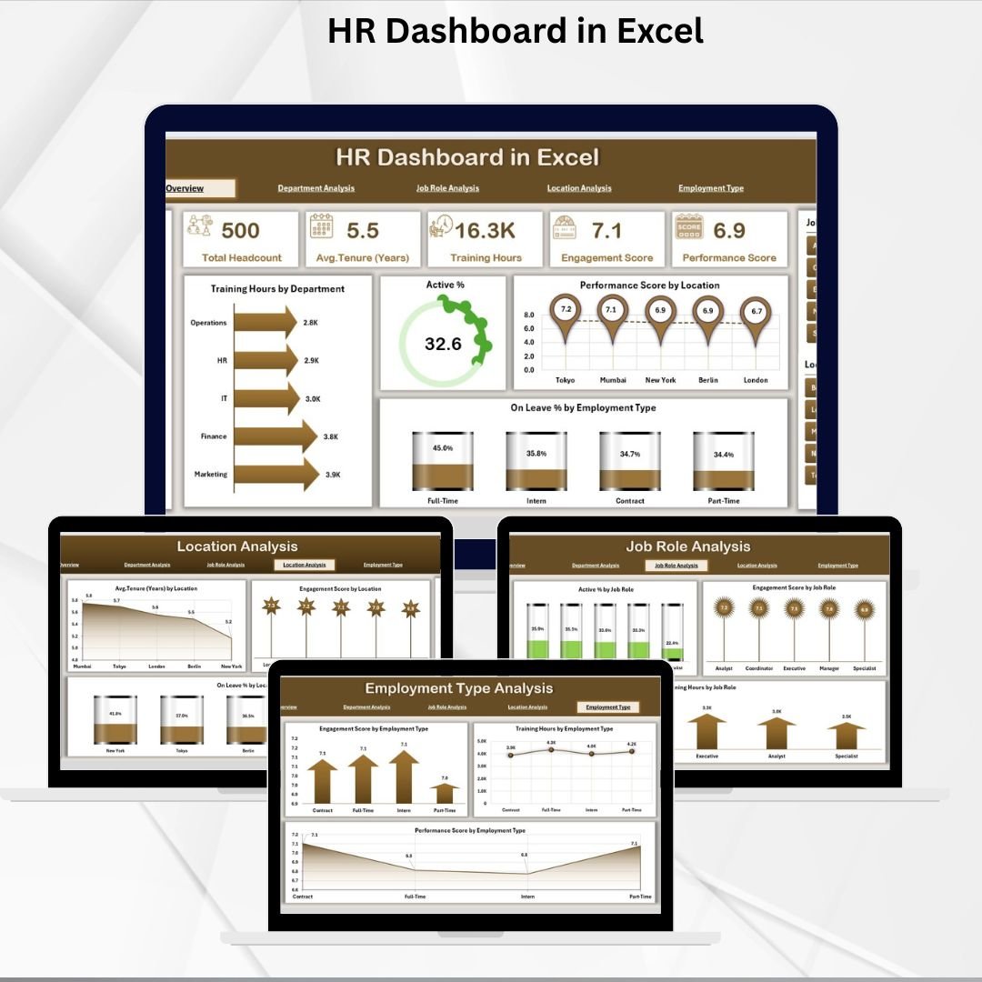
The HR Dashboard in Excel is the most complete Excel option in this comparison. It uses 5 analytical pages: Overview, Department, Job Role, Location, and Employment Type. That makes it useful when HR needs more than top-level KPIs and wants to answer deeper questions such as which department has the highest training hours, which location has lower engagement, or which employment type has the strongest performance pattern.
Screenshot walkthrough: The featured image previews a polished HR dashboard package. Inside the workbook, a Support sheet stores the backend employee roster, while the dashboard pages turn that data into KPI cards and charts for training hours, active percentage, performance score, leave percentage, engagement, and tenure.
Use cases: board-ready HR reporting, monthly people analytics, department performance reviews, location comparison, training impact analysis, and HRIS export visualization. It is especially useful for teams that already export from BambooHR, Gusto, ADP, Workday, or another HRIS into Excel.
Format advantage: This is the easiest pick when your team wants the same HR dashboard concept in the format people already know. The workbook can be saved locally, stored in SharePoint, or refreshed from a recurring export without introducing Power BI governance.
Price: $17.99 one-time. Download the HR Dashboard in Excel.
Workforce Planning KPI Dashboard in Excel
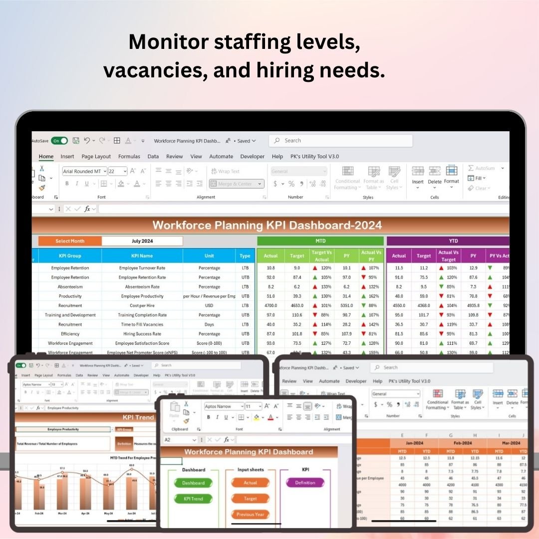
The Workforce Planning KPI Dashboard in Excel is built for the HR-finance planning conversation. Instead of only asking what happened last month, it helps you monitor staffing levels, turnover, employee productivity, workforce costs, and capacity planning so leaders can forecast whether they have the right people in the right roles.
Screenshot walkthrough: The image introduces the workforce planning dashboard, and the workbook includes sections for staffing level monitoring, vacancy tracking, turnover and retention, productivity metrics, workforce cost analysis, capacity planning, and custom reporting. It is made for data entry and refresh rather than a static one-page chart.
Use cases: annual headcount planning, hiring demand forecasting, labor cost tracking, retention planning, capacity risk monitoring, and workforce productivity reviews. It works well for HR managers, workforce planners, operations leaders, recruitment teams, and finance partners.
Format advantage: Excel is a good home for workforce planning because finance teams can inspect assumptions, formulas, and supporting data directly. If your planning cycle still depends on spreadsheets, this template brings structure without forcing a platform change.
Price: $12.99 one-time. Download the Workforce Planning KPI Dashboard in Excel.
Need the fastest path from HRIS export to leadership-ready reporting?
Start with the Excel format if your team already works in Microsoft 365 and wants same-day setup. Browse more HR reporting tools in the HR and Payroll template catalog.
Google Sheets HR Dashboards: Best for Live Collaboration
Google Sheets wins when your HR team needs shared access, browser-based editing, and no local workbook version conflicts. It is a strong fit for remote teams, HR consultants, and small businesses where managers need to review the same dashboard without emailing files around.
Workforce Engagement Dashboard in Google Sheets
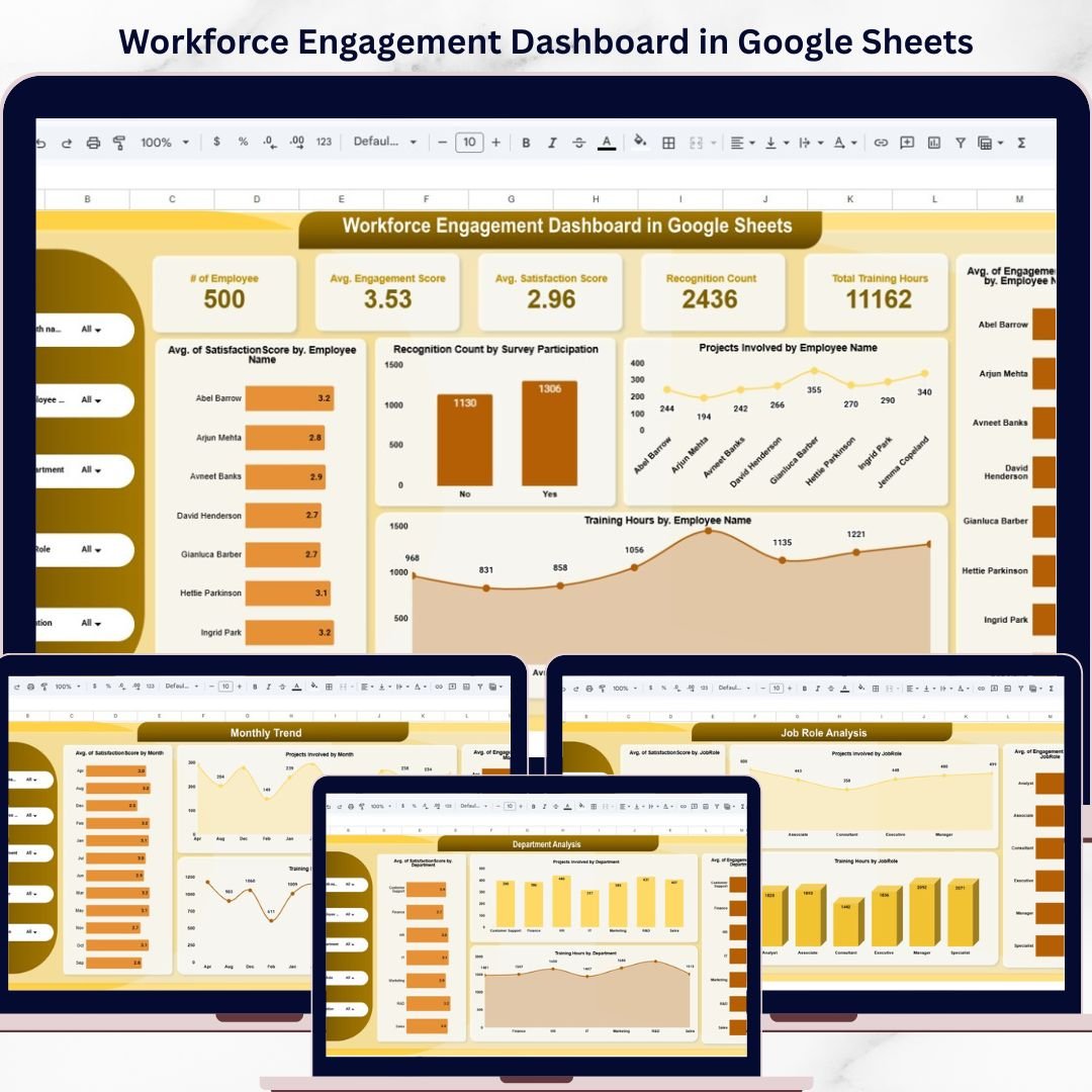
The Workforce Engagement Dashboard in Google Sheets is built around employee engagement, satisfaction, performance, training hours, and participation. It is the best Google Sheets option when HR wants a cloud-based view of workforce sentiment and productivity without moving into a full survey analytics platform.
Screenshot walkthrough: The featured image shows a Google Sheets dashboard package designed for real-time HR visibility. Inside, you get a Main Dashboard sheet, Location Analysis, Job Role Analysis, Department Analysis, Monthly Trend sheet, Data sheet, KPI cards, and dynamic charts. Filters help users analyze by month, employee, department, job role, and location.
Use cases: employee engagement survey reporting, department-level satisfaction analysis, training participation tracking, team manager reviews, and organizational development check-ins. It is a good match for teams already using Google Workspace or consultants who need to share a dashboard with clients quickly.
Format advantage: Engagement work often involves HR, managers, and leaders reviewing the same numbers. Google Sheets makes that easier because stakeholders can access the file from a browser, leave comments, and see updates without sending a new workbook version.
Price: $6.99 one-time. Download the Workforce Engagement Dashboard in Google Sheets.
Workforce Planning KPI Dashboard in Google Sheets

The Workforce Planning KPI Dashboard in Google Sheets is the collaborative version of workforce planning. It tracks headcount, staffing levels, hiring performance, labor cost, capacity, utilization, MTD/YTD results, targets, and previous-year benchmarks in a cloud-native spreadsheet environment.
Screenshot walkthrough: The product image highlights the Google Sheets workforce planning format. Inside, the template includes a Dashboard sheet, KPI Trend sheet, Actual Number sheet, Target sheet, Previous Year sheet, and KPI Definition sheet. The month selector refreshes the dashboard view, while trend charts help HR compare actual performance against targets and prior-year results.
Use cases: shared HR-finance planning, multi-location staffing reviews, labor cost monitoring, hiring target tracking, and leadership reporting from any browser. It works well when more than one stakeholder needs to maintain or review workforce planning data.
Format advantage: Google Sheets is useful when HR, finance, and operations need to update workforce planning inputs together. Instead of merging workbook versions, the team can maintain one shared planning file with live changes and browser-based access.
Price: $9.99 one-time. Download the Workforce Planning KPI Dashboard in Google Sheets.
Workforce Task Performance Dashboard in Google Sheets
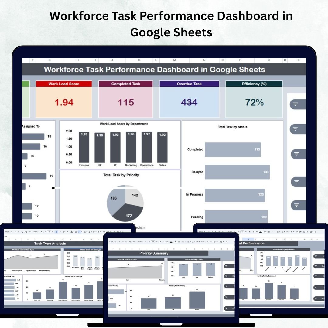
The Workforce Task Performance Dashboard in Google Sheets is more operational than a classic HR scorecard. It connects task workload, completion rate, overdue tasks, efficiency, department performance, priority, and monthly trends. That makes it useful for HR teams that work closely with operations, project managers, or department heads.
Screenshot walkthrough: The product image opens the section with a Google Sheets dashboard preview. Inside, you get an Overview tab with total tasks, workload score, completed tasks, overdue tasks, and efficiency percentage, plus Task Type Analysis, Department Performance, Priority Summary, Monthly Trends, and a Data sheet.
Use cases: workload balancing, overdue task reduction, employee productivity reviews, department bottleneck analysis, priority management, and task accountability. It is a strong fit for managers who need live task visibility but do not want a full project management SaaS subscription.
Format advantage: Task performance changes constantly, so a cloud spreadsheet is a practical reporting surface. Managers can update task data, HR can review workload risk, and leadership can see overdue patterns without waiting for a monthly export.
Price: $6.99 one-time. Download the Workforce Task Performance Dashboard in Google Sheets.
Power BI HR Dashboards: Best for Scalable HR Analytics
Power BI wins when the HR team needs interactive reporting, multiple data sources, scheduled refresh, and executive-friendly visuals. The template price is low, but the full workflow may include Power BI Pro licenses for sharing, plus time to configure data refresh and permissions.
HR Dashboard in Power BI
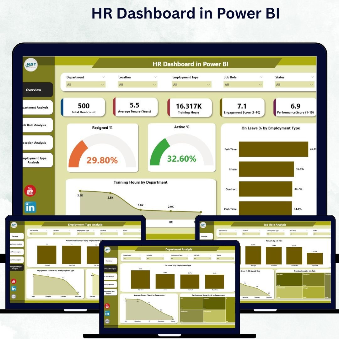
The HR Dashboard in Power BI brings the full HR analytics experience into Microsoft’s BI environment. It covers Overview, Department, Job Role, Location, and Employment Type analysis, using Power BI visuals and slicers to help leaders explore workforce data more interactively than a static workbook.
Screenshot walkthrough: The featured image previews the Power BI dashboard format. Inside, the report includes KPI cards for resigned percentage, active percentage, and on-leave percentage, plus charts for employee type distribution, training hours by department, tenure, performance score, engagement score, and location-level comparisons. It is powered by Excel data, so HR teams can maintain a familiar data source while improving the visualization layer.
Use cases: executive HR analytics, interactive department reviews, multi-location reporting, HRIS export visualization, engagement and training analysis, and workforce performance storytelling. It is best for HR analysts who already know Power BI or are ready to learn it.
Format advantage: Power BI is strongest when the dashboard needs slicers, governance, scheduled refresh, and a polished executive experience. It also gives HR analytics teams room to expand later with additional data sources, DAX measures, and role-based sharing.
Price: $17.99 one-time. Download the HR Dashboard in Power BI.
HR KPI Dashboard in Power BI
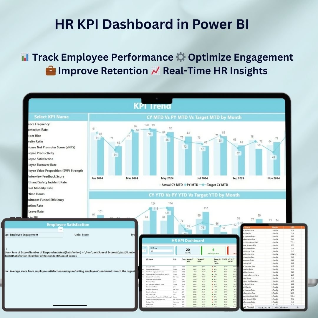
The HR KPI Dashboard in Power BI is the lower-cost Power BI option for HR teams that want KPI drill-downs without starting from a blank report. It focuses on employee performance, recruitment, retention, engagement, absenteeism, training effectiveness, and time-based HR trends.
Screenshot walkthrough: The product image shows the Power BI KPI dashboard package. Inside, the dashboard supports real-time employee monitoring, customizable KPIs, workforce efficiency analysis, time-based insights, retention and turnover tracking, and interactive dashboard exploration. It is designed for HR managers, talent acquisition teams, employee engagement leads, and business executives.
Use cases: Power BI pilot projects, recruitment performance reporting, turnover trend analysis, employee engagement review, training effectiveness reporting, and executive KPI dashboards. It is a sensible first Power BI HR template if your team wants to test the format before building a bigger HR analytics model.
Format advantage: This template is a lower-cost way to prove whether Power BI belongs in your HR reporting stack. If leaders like the drill-downs and interactivity, the team can later expand the report with more HRIS, ATS, payroll, or engagement data.
Price: $11.99 one-time. Download the HR KPI Dashboard in Power BI.
How to Choose and Frequently Asked Questions
Decision Framework: Which Format Should You Pick?
| Decision Factor | Choose Excel | Choose Google Sheets | Choose Power BI |
|---|---|---|---|
| Setup Time | Fastest: paste data and review | Fast: share and edit in browser | Moderate: connect data source and refresh |
| Collaboration | Good with OneDrive or SharePoint | Best for live edits | Best for report sharing and governance |
| Best User | HR manager or analyst | Remote HR team or consultant | HR analytics or BI team |
| Cost Model | Template price only if Excel is already available | Template price only if Google Workspace is already available | Template price plus possible Power BI Pro licenses for sharing |
| Best Fit | Under 5,000 employees, workbook-native reporting | Remote teams, shared updates, light analytics | Larger teams, multiple data sources, executive analytics |
Simple rule: choose Excel if you need control and speed, Google Sheets if collaboration is the priority, and Power BI if you need scalable analytics and governed sharing. Many HR teams use more than one: Excel for data prep, Google Sheets for shared planning, and Power BI for executive dashboards.
Which HR dashboard format is cheapest in 2026?
Google Sheets is the cheapest format in this roundup, with two templates at $6.99 and one at $9.99. Excel ranges from $12.99 to $17.99, and Power BI ranges from $11.99 to $17.99. The one-time template price is much lower than monthly HR SaaS pricing, but Power BI sharing may add per-user licensing cost.
Can these templates replace BambooHR, Gusto, ADP, or Workday?
No. These templates are reporting and analytics layers, not systems of record. They do not process payroll, manage benefits, store official employee records, or run compliance workflows. They are best used after you export data from an HRIS, payroll system, ATS, survey tool, or spreadsheet.
Which format is best for a small HR team?
Excel is usually best for a small HR team that already uses Microsoft 365 and needs fast reporting. Google Sheets is better if several managers need to update or view the same dashboard in real time. Power BI is better if the team already has BI skills or wants interactive dashboards for leadership.
Which format is best for HR analytics Power BI use cases?
Use Power BI when your data comes from multiple systems, when leadership wants slicers and drill-downs, or when the dashboard needs scheduled refresh and controlled sharing. The HR Dashboard in Power BI is the stronger all-around HR analytics option, while the HR KPI Dashboard in Power BI is a lower-cost KPI-first choice.
How long does setup take?
Excel and Google Sheets templates are fastest because the first step is usually entering data or pasting an export. Power BI setup takes more care because you need to open the report, connect or refresh the data source, and test slicers. For most HR analysts, the first setup is still much faster than building from a blank workbook or blank Power BI file.
Which format is easiest for non-technical HR users?
Excel is easiest for most HR teams because the interface is familiar. Google Sheets is nearly as easy if the company already uses Google Workspace. Power BI is more technical, but it produces stronger interactive reporting once the analyst understands data sources, relationships, visuals, and refresh settings.
Can I customize the KPIs, colors, and charts?
Yes. The templates are designed to be editable. Excel and Google Sheets users can adjust charts, formulas, KPI names, colors, and layouts. Power BI users can edit visuals, theme colors, pages, fields, and measures in Power BI Desktop.
Which dashboard should I choose for engagement tracking?
For engagement-only reporting, start with the Workforce Engagement Dashboard in Google Sheets. For a broader HR view that also includes performance, leave, training, and employee type, choose the HR Dashboard in Excel or the HR Dashboard in Power BI.
Which dashboard should I choose for workforce planning?
Choose the Workforce Planning KPI Dashboard in Excel if planning is owned by one analyst or HR-finance partner. Choose the Workforce Planning KPI Dashboard in Google Sheets if several stakeholders need live shared access.
Where can I see more templates and tutorials?
Browse the HR and Payroll template category for more workforce, attendance, payroll, and HR reporting tools. You can also watch walkthroughs and dashboard tutorials on the NextGenTemplates YouTube channel.
Final Verdict: Which HR Dashboard Format Wins?
Excel wins for fast offline analysis and spreadsheet-native HR teams. Google Sheets wins for shared cloud reporting and lightweight collaboration. Power BI wins for scalable HR analytics, multi-source reporting, and executive dashboards. The best format is the one your team will actually maintain every month.
If you are still choosing, use this practical path: start with HR Dashboard in Excel for the fastest complete HR analytics setup, choose Workforce Engagement Dashboard in Google Sheets for collaborative engagement reporting, and choose HR Dashboard in Power BI when leadership needs interactive analytics.
Ready to stop rebuilding HR dashboards every month?
Pick the format that matches your team: Excel for speed, Google Sheets for collaboration, or Power BI for interactive HR analytics. Every product above is a one-time purchase with a direct NextGenTemplates product page.
About the Author
Built by PK – Microsoft Certified Professional with 15+ years of Excel, Google Sheets, and Power BI experience. Founder of NextGenTemplates, reaching 300K+ subscribers across YouTube channels. Every template is hand-built and tested before release.
Last updated: June 2, 2026.