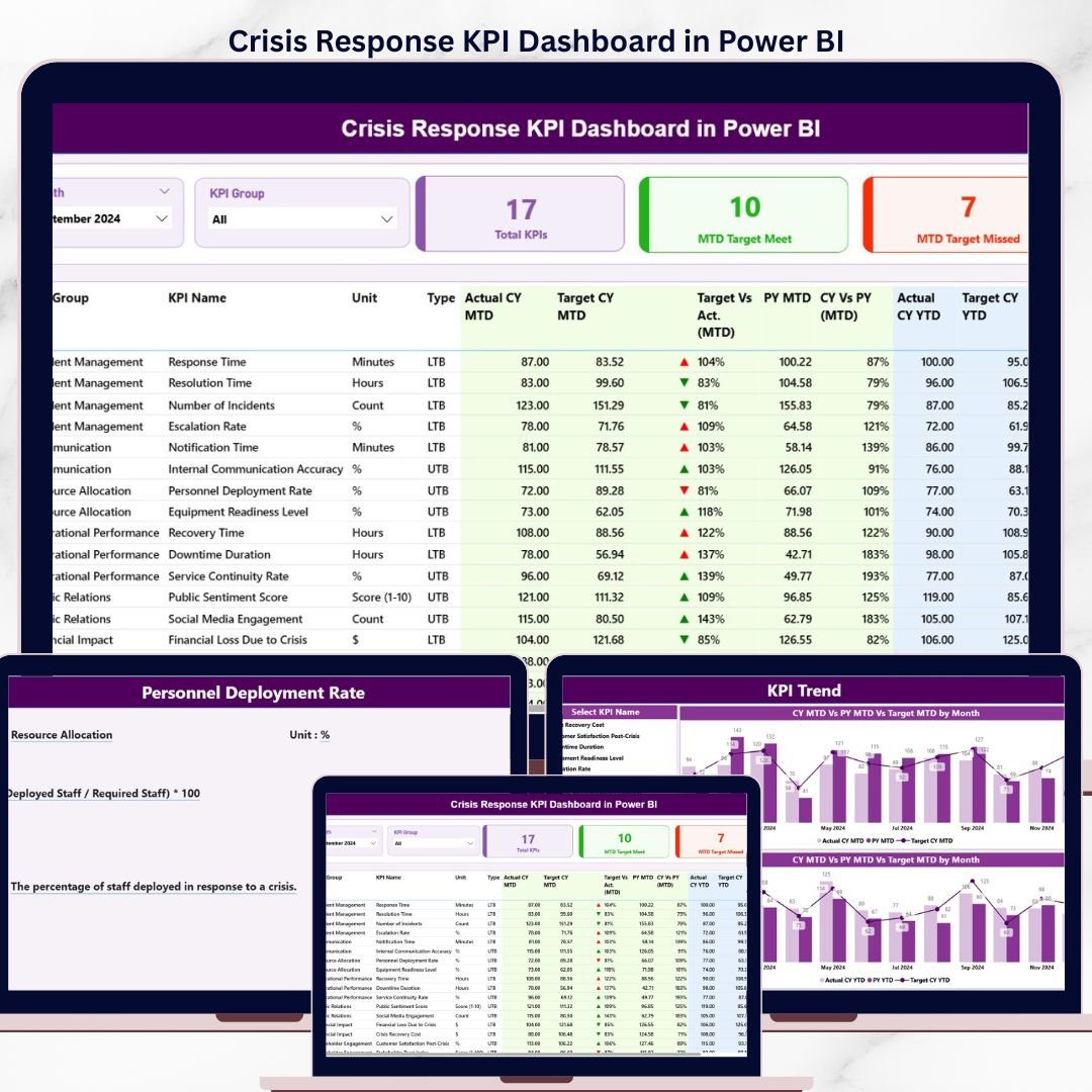

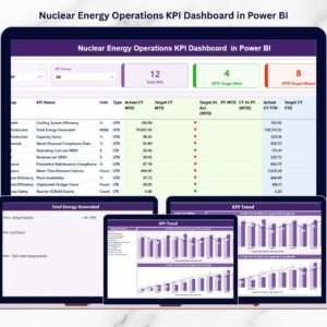
The Crisis Response KPI Dashboard in Power BI tracks unlimited crisis KPIs across 3 interactive report pages, with Month and KPI Group slicers plus 3 status cards showing Total KPIs, MTD Target Met, and MTD Target Missed counts. Setup takes under 10 minutes — fill 3 Excel sheets (Input_Actual, Input_Target, KPI Definition), point the .pbix file at the data source, click Refresh, and every card, table, and chart recalculates automatically. No DAX rebuilds, no monthly subscriptions to renew.
🌍 Join 8,400+ teams across 40+ countries using NextGenTemplates to run their crisis response, emergency operations, and business continuity programs without paying $39–$199 per user per month for SaaS tools like Resolver, Everbridge, or D4H. This Power BI Dashboard runs locally on Power BI Desktop, the free Microsoft application — one-time purchase, lifetime access, no per-seat fees.
✅ Instant download · One-time payment · No subscription · No per-user fees · Lifetime access
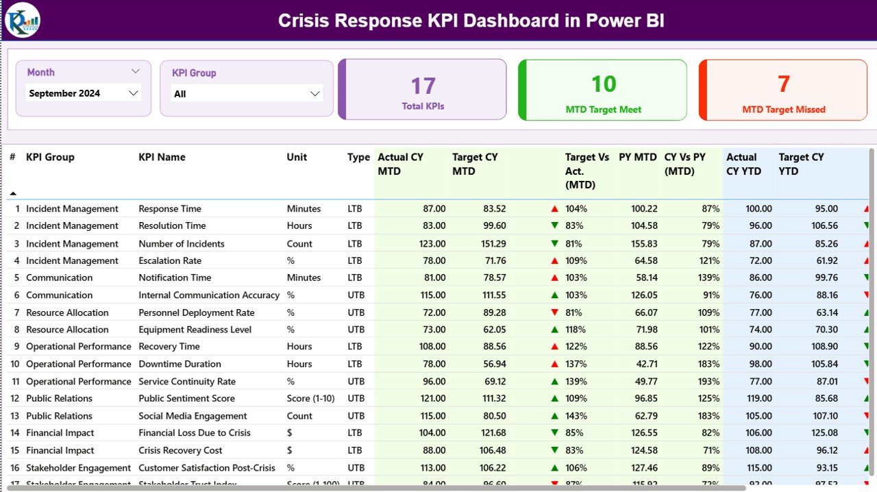
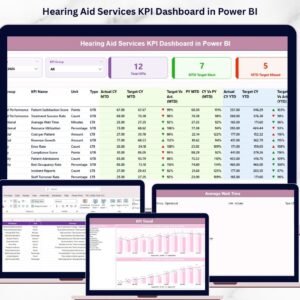
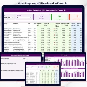
Crisis Response KPI Dashboard in Power BI – Summary Page
🔑 Key Features of the Crisis Response KPI Dashboard in Power BI
📌 3 Pre-Built Power BI Pages – Summary Page, KPI Trend Page, and a hidden KPI Definition drill-through page. Each is filterable by Month and KPI Group through slicers placed at the top, so an emergency operations manager can move from a high-level snapshot to a specific KPI’s monthly trend in two clicks.
📌 3 KPI Status Cards on the Summary Page – Total KPIs, MTD Target Met, and MTD Target Missed sit at the top of the Summary page and refresh the moment any slicer is applied. The Crisis Response KPI Dashboard in Power BI surfaces the three numbers a crisis manager checks every morning — without scrolling through a workbook.
📌 16-Column Detailed KPI Table – Tracks KPI Number, KPI Group, KPI Name, Unit, Type (LTB/UTB), Actual CY MTD, Target CY MTD, MTD Status Icon, Target vs Actual MTD %, PY MTD, CY vs PY MTD %, Actual CY YTD, Target CY YTD, YTD Status Icon, Target vs Actual YTD %, PY YTD, and CY vs PY YTD %. Both MTD and YTD live on the same row.
📌 Red/Green ▼▲ Status Icons – LTB (Lower the Better) and UTB (Upper the Better) KPI types are interpreted automatically. A “Mean Time to Acknowledge” KPI shows green only when actual is lower than target, while “Drills Conducted” shows green when actual exceeds target — no manual conditional formatting.
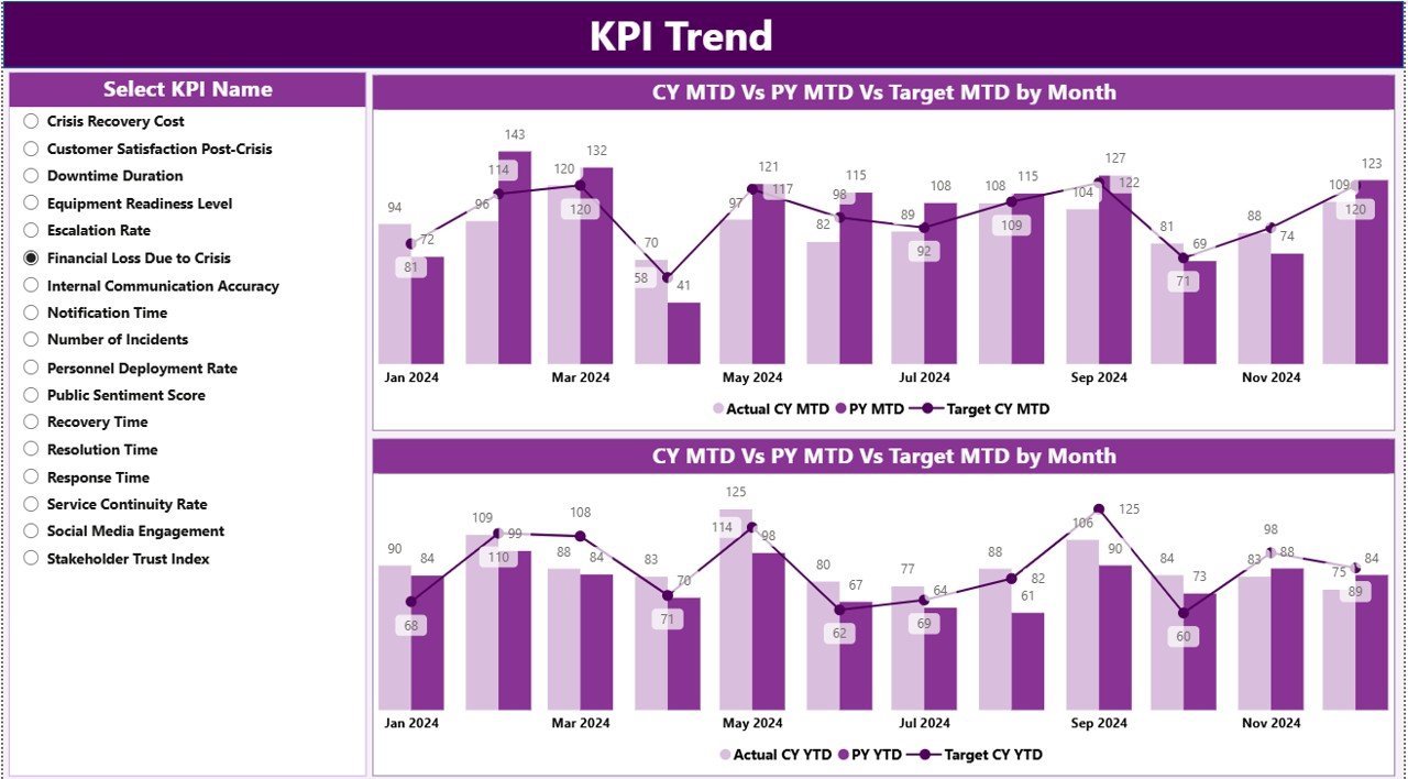
📌 KPI Trend Page with 2 Combo Charts – Compares Current Year Actual, Previous Year Actual, and Target for both MTD and YTD. A KPI Name slicer on the left lets responders pivot through every metric in the dashboard one at a time.
📌 Drill-Through KPI Definition Page – Right-click any KPI in the Summary table, choose “Drill through”, and land on a hidden page showing that KPI’s Group, Unit, Formula, Definition, and Type. A back button at the top-left returns the user to the Summary. Documentation lives inside the dashboard, not in a separate PDF.
📌 Excel-Based Data Entry – All actuals, targets, and KPI metadata are filled in three Excel sheets. Point the .pbix at the file once, then refresh whenever new data lands. No Power BI editing required.
📦 What’s Inside the Crisis Response KPI Dashboard in Power BI
📁 Power BI Desktop (.pbix) file with 3 fully wired pages — Summary, KPI Trend, and the hidden KPI Definition drill-through page.
📁 Excel data source with 3 worksheets:
📊 Input_Actual – KPI Name, Month (first date of month), MTD number, YTD number.
📊 Input_Target – KPI Name, Month (first date of month), MTD target, YTD target.
📊 KPI Definition – KPI Number, KPI Group, KPI Name, Unit, Formula, Definition, Type (LTB or UTB).
📁 Slicers, cards, ▼▲ icons, drill-through buttons, and back navigation — fully wired, no rebuild needed.

Crisis Response KPI Dashboard in Power BI – KPI Trend Page
📊 Crisis Response KPI Dashboard vs. Excel Equivalent vs. Resolver/Everbridge — Where This Fits
| Feature | Crisis Response KPI Dashboard (Power BI) | Excel KPI Scorecard | Resolver / Everbridge / D4H |
|---|---|---|---|
| Cost | $11.99 one-time | $10–15 one-time | $39–199 / user / month |
| Platform | ✅ Power BI Desktop (free) | Microsoft Excel | Cloud SaaS, login required |
| Setup time | ✅ Under 10 minutes | 10–15 minutes | 2–6 weeks vendor onboarding |
| MTD + YTD on same row | ✅ Yes | Yes | Often separate views |
| LTB / UTB status logic | ✅ Built-in red/green ▼▲ icons | Manual conditional formatting | Yes |
| Drill-through KPI definitions | ✅ Yes — hidden page | Separate KPI sheet | Yes |
| Slicers (Month + KPI Group) | ✅ Native Power BI slicers | Pivot table slicers | Yes |
| Year-1 cost at 5 users | ✅ $11.99 total | $10–15 total | $2,340–$11,940 |
| Vendor lock-in | ✅ None — own the .pbix | None | High |
For crisis managers who want SaaS-grade reporting without paying SaaS-grade subscription fees, the Crisis Response KPI Dashboard in Power BI sits in the sweet spot.
👥 Who This Template Is For — and Who It’s Not For
✅ This template is built for:
- Crisis managers and emergency operations leads at organizations with 50–5,000 staff
- Business continuity teams reporting MTD/YTD response KPIs to executive committees
- Public safety departments, fire and rescue, and EMS agencies tracking response time, drill participation, and recovery KPIs
- Corporate risk and resilience teams already standardized on Power BI Desktop
- Consultants delivering crisis response benchmarking reports to client boards
❌ This template is NOT for:
- Teams that need real-time alerting, two-way SMS, or geofenced notifications — use Everbridge or AlertMedia
- Organizations requiring SOC 2 Type II + SSO + audit trails — use a SaaS GRC platform like Resolver
- Mac-only teams without access to Power BI Desktop on Windows or a virtualized environment
- Use cases needing live ingestion from CAD systems or ServiceNow — this dashboard is refresh-based, not streaming
⚙️ How to Use the Crisis Response KPI Dashboard in Power BI
1. Download the .zip and unzip — you get a .pbix file and an Excel data file.
2. Open the Excel file. Fill the Input_Actual sheet with KPI Name, Month (first date of month), MTD, and YTD values.
3. Fill the Input_Target sheet with the matching MTD and YTD targets per month.
4. Fill the KPI Definition sheet with KPI Number, Group, Name, Unit, Formula, Definition, and Type (LTB or UTB).
5. Open the .pbix file in Power BI Desktop and click Refresh — every card, table, and chart updates.
6. Use the Month and KPI Group slicers on the Summary page to filter, then right-click any KPI to drill through to its definition.
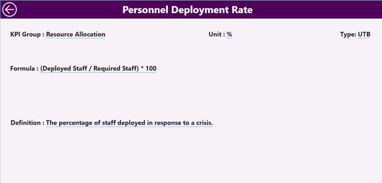
Crisis Response KPI Dashboard in Power BI – Drill-Through KPI Definition Page
💼 Real-World Use Cases
Maya runs the crisis response program at a 1,200-employee fintech. Each month she fills the Input_Actual sheet with response time, drill completion rate, and tabletop participation, refreshes the .pbix, and exports the Summary page to PDF for her quarterly resilience steering committee — replacing a $99-per-user-per-month Resolver seat with a $11.99 one-time download.
Carlos manages emergency operations at a county fire department. He uses the Crisis Response KPI Dashboard in Power BI to track 14 KPIs across Response, Communication, Recovery, and Training KPI Groups. The MTD ▲ and YTD ▼ icons let his chief see at a glance which KPIs need attention before the monthly all-hands, without reading a 30-page report.
Priya is an internal auditor at a multinational manufacturer. She uses the dashboard’s drill-through KPI Definition page to validate that every reported metric has a documented formula and definition before the ISO 22301 surveillance audit — a control point her external auditors cite favorably.
❓ Frequently Asked Questions
What KPIs does the Crisis Response KPI Dashboard in Power BI track?
The Crisis Response KPI Dashboard in Power BI tracks any KPIs you define in the Input_Actual, Input_Target, and KPI Definition Excel sheets. Common crisis response KPIs include mean time to acknowledge, mean time to resolve, drill completion rate, tabletop participation rate, recovery time objective, and after-action review closure rate.
How long does setup take?
Setup takes under 10 minutes. Open the .pbix file, point Power BI to the included Excel data source, fill the three sheets (Input_Actual, Input_Target, KPI Definition), click Refresh, and every visual in the Crisis Response KPI Dashboard in Power BI updates automatically.
How does this compare to Resolver or Everbridge?
Resolver and Everbridge are SaaS platforms that cost $39–$199 per user per month. The Crisis Response KPI Dashboard in Power BI is a one-time $11.99 download with no per-user fees, no subscription, and no vendor lock-in. It does not replace SaaS for real-time alerting, but it covers reporting and KPI tracking at a fraction of the cost.
Do I need a Power BI Pro license to use this dashboard?
No. The Crisis Response KPI Dashboard in Power BI runs entirely on Power BI Desktop, which Microsoft offers free of charge. A Pro license is only needed if you want to publish the .pbix to the Power BI Service for cloud sharing — local use does not require it.
Can I add my own KPIs and KPI Groups?
Yes. Add new rows to the KPI Definition sheet with a unique KPI Number, the desired KPI Group, Name, Unit, Formula, Definition, and Type (LTB or UTB). Add the corresponding monthly numbers in Input_Actual and Input_Target, then refresh — the Crisis Response KPI Dashboard in Power BI picks up new entries automatically.
What is the difference between LTB and UTB KPI types?
LTB (Lower the Better) is for KPIs where a lower number is good — such as Mean Time to Acknowledge or Number of Repeat Incidents. UTB (Upper the Better) is for KPIs where a higher number is good — such as Drill Participation Rate. The dashboard uses this Type field to decide whether ▼ or ▲ should be green or red.
Will the dashboard work on my Mac?
Power BI Desktop is Windows-only, so the Crisis Response KPI Dashboard in Power BI requires a Windows machine, a Windows VM (Parallels, VMware Fusion, UTM), or Power BI Service in the cloud. The Excel data source itself opens fine in Excel for Mac.
👤 About the Author
Built by PK — Microsoft Certified Professional with 15+ years of Excel, Google Sheets, and Power BI experience. Founder of NextGenTemplates, reaching 300K+ subscribers across YouTube channels (@PK-AnExcelExpert, @NextGenTemplates, @NeoTechNavigators). Every template is hand-built and tested before release.
🔗 Explore Related Templates
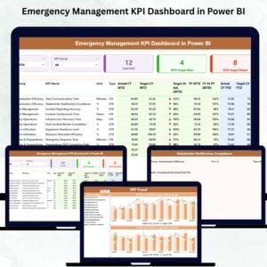
📌 Emergency Management KPI Dashboard in Power BI — Sister template tracking emergency response, communication, and recovery KPIs in the same 3-page Power BI format.
📌 Business Continuity Planning KPI Dashboard in Power BI — For BCP teams tracking RTO/RPO, plan testing frequency, and recovery exercises.
📌 Crisis Management KPI Scorecard in Excel — The Excel scorecard companion if you prefer cell-based reporting over Power BI visuals.
📌 Incident Response and Downtime Analysis Dashboard in Google Sheets — Google Sheets alternative for cloud-first teams.
💎 Save 40% — Get all 8 safety templates in the Safety & Compliance Commander Bundle →
Browse more Power BI Dashboard Templates.
📖 Click here to read the Detailed Blog Post
🎥 Visit our YouTube channel for step-by-step video tutorials
👉 YouTube.com/@NextGenTemplates


Reviews
There are no reviews yet.