In today’s competitive industrial and manufacturing landscape, automation units are no longer optional—they are essential. However, automation without proper performance tracking leads to inefficiencies, missed targets, and delayed decisions. That is exactly why the Automation Units KPI Dashboard in Power BI is designed—to help organizations monitor automation performance clearly, accurately, and in real time.
This powerful, ready-to-use Power BI dashboard transforms raw automation data into meaningful KPIs, visual trends, and performance insights. Instead of struggling with scattered Excel files or static reports, decision-makers can instantly track targets, analyze month-to-date (MTD) and year-to-date (YTD) results, and compare current performance with previous years—all from a single interactive dashboard.
Built with a simple Excel-to-Power BI data model, this dashboard ensures ease of use for non-technical users while delivering enterprise-grade analytics for leadership teams. Whether your goal is improving automation efficiency, ensuring reliability, or meeting production targets, this dashboard becomes your centralized performance control system.
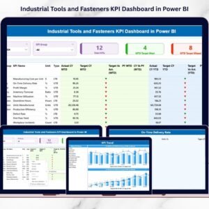
🔹 Key Features of Automation Units KPI Dashboard in Power BI
🚀 Centralized KPI Monitoring – Track all automation KPIs from one interactive dashboard without switching files.
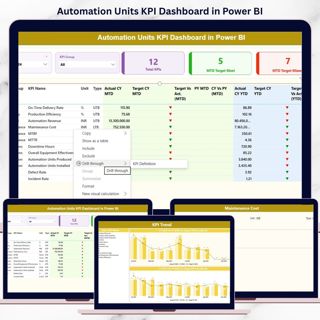
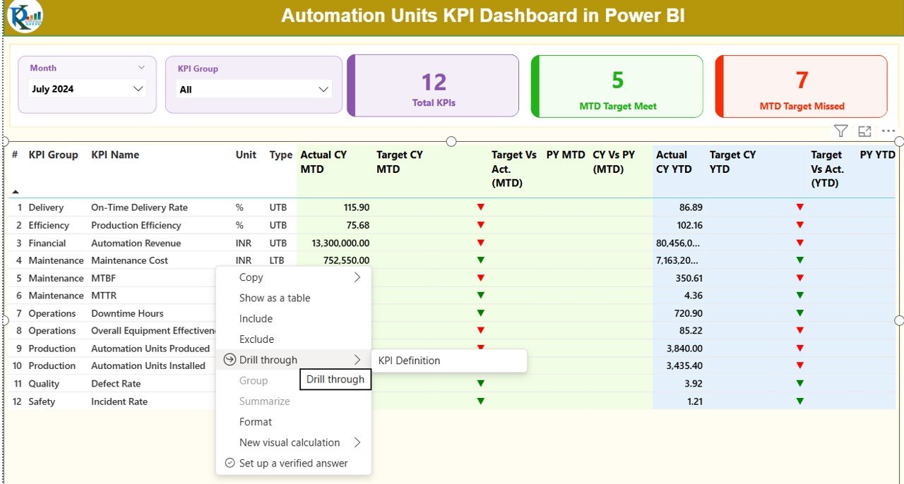
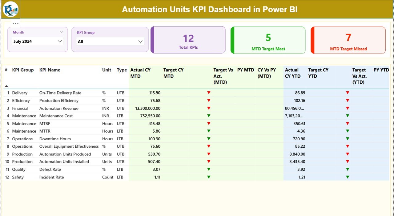
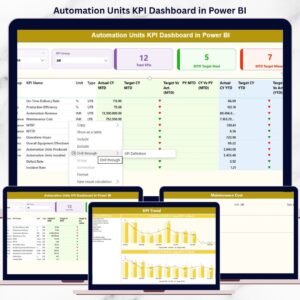
📊 Dynamic KPI Cards – Instantly view Total KPIs, MTD Target Met, and MTD Target Missed.
🎯 MTD & YTD Performance Tracking – Monitor short-term and long-term performance side by side.
📈 Target vs Actual Analysis – Clearly identify gaps using icons, percentages, and comparisons.
📅 Previous Year Comparisons – Analyze trends with CY vs PY insights for better forecasting.
🧩 KPI Group & Month Slicers – Filter data instantly for focused analysis.
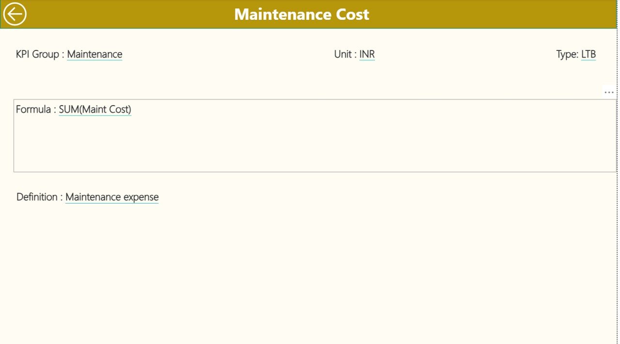
🔍 Drill-Through KPI Definitions – Understand formulas, units, and KPI logic in one click.
⚡ Excel-Based Data Entry – Update data easily without technical complexity.
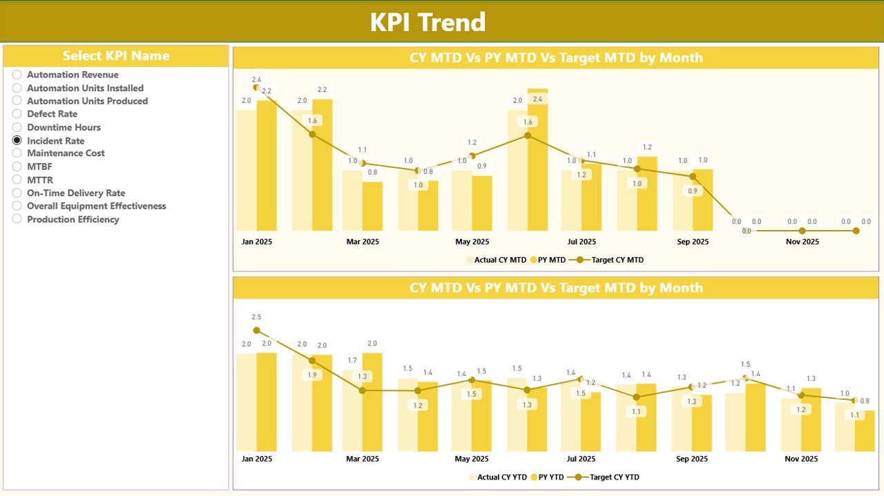
📉 Trend Analysis with Combo Charts – Compare actuals, targets, and historical data visually.
🔄 Scalable & Flexible Design – Add new KPIs without redesigning the dashboard.
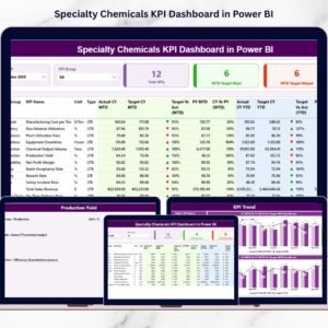
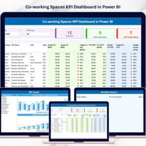
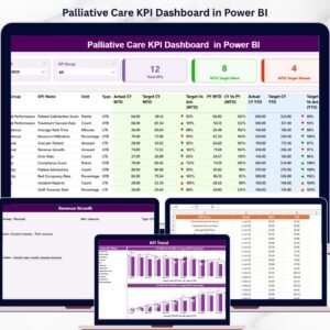
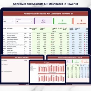
🔹 What’s Inside the Automation Units KPI Dashboard
📂 Power BI Dashboard File with three structured pages:
-
Summary Page – High-level snapshot with KPI cards, slicers, and a detailed KPI table
-
KPI Trend Page – MTD and YTD combo charts showing actuals, targets, and previous year trends
-
KPI Definition Page – Drill-through page with KPI formulas, definitions, units, and KPI types
📑 Excel Data Source File with three worksheets:
-
Input_Actual – Enter MTD and YTD actual values
-
Input_Target – Define MTD and YTD targets
-
KPI Definition – Maintain KPI master data (number, group, unit, formula, type)
This structure ensures clean data flow and automatic refresh in Power BI whenever Excel is updated.
🔹 How to Use the Automation Units KPI Dashboard
📝 Step 1: Enter actual and target values in the Excel input sheets
🔗 Step 2: Refresh the Power BI dashboard
📊 Step 3: Use slicers to filter by month or KPI group
📈 Step 4: Analyze MTD and YTD performance with cards, tables, and charts
🔍 Step 5: Drill through KPI definitions for clarity and governance
No complex setup. No coding. Just update Excel and analyze instantly.
🔹 Who Can Benefit from This Automation Units KPI Dashboard
👷 Automation Managers – Monitor system efficiency and reliability
🏭 Plant & Operations Managers – Track automation performance against targets
📉 Continuous Improvement Teams – Identify improvement opportunities quickly
📊 Data Analysts – Perform structured KPI analysis with ease
👔 Senior Leadership – Get high-level visibility for strategic decisions
This dashboard balances operational detail with executive-level clarity.
Click here to read the Detailed blog post
Watch the step-by-step video tutorial:
Visit our YouTube channel to learn step-by-step video tutorials:
YouTube.com/@PKAnExcelExpert


Reviews
There are no reviews yet.