
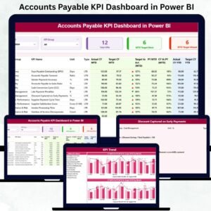
Accounts Payable KPI Dashboard in Power BI directly impact cash flow stability, vendor relationships, audit readiness, and overall financial discipline. Every finance team tracks multiple KPIs such as invoice cycle time, overdue payments, payment accuracy, compliance rates, and target achievement. However, when this information lives in scattered Excel files, emails, and manual reports, visibility drops and risks increase. This is exactly why an Accounts Payable KPI Dashboard in Power BI becomes a critical tool for modern finance teams.
The Accounts Payable KPI Dashboard in Power BI is a ready-to-use analytical solution that transforms raw AP data into clear visuals, real-time KPIs, and actionable insights. Built using Power BI with Excel as the data source, this dashboard helps finance managers, CFOs, auditors, and AP teams monitor performance without manual calculations or complex reporting processes. Instead of chasing numbers, teams focus on insights, trends, and corrective actions.
With interactive slicers, KPI status icons, trend charts, and drill-through definitions, this dashboard delivers both high-level visibility and detailed analysis—all in one place.
✨ Key Features of the Accounts Payable KPI Dashboard in Power BI
This professionally designed dashboard includes three powerful analytical pages, each serving a specific finance objective.
⭐ Summary Page – Complete AP Performance Overview
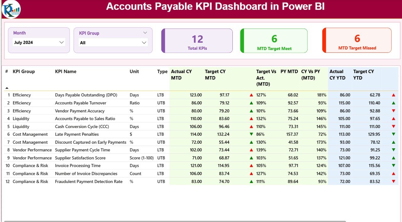
✔ Month slicer for selecting reporting period
✔ KPI Group slicer for category-wise analysis
✔ Three KPI cards showing:
-
Total KPIs Count
-
MTD Target Met Count
-
MTD Target Missed Count
✔ A detailed KPI performance table covering:
-
Actual vs Target (MTD & YTD)
-
Status indicators (▲ ▼)
-
Current Year vs Previous Year comparisons
-
KPI Type (LTB / UTB)
This page gives finance leadership instant clarity on where AP performance stands.
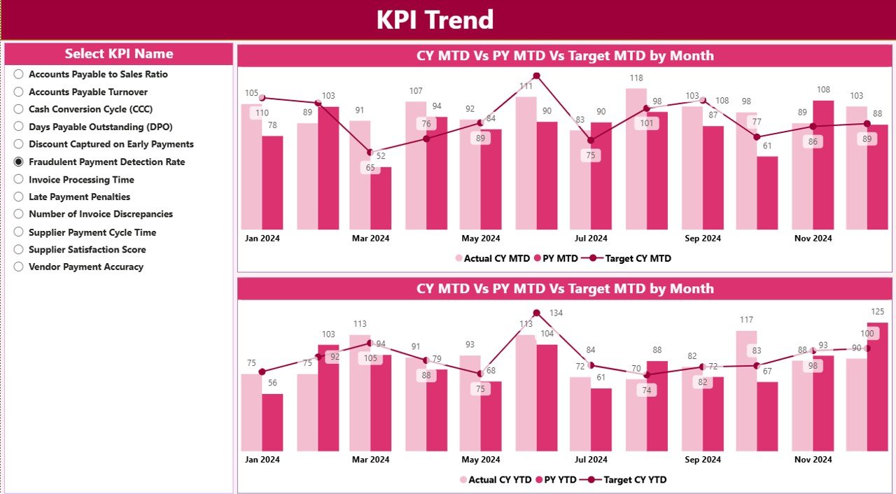
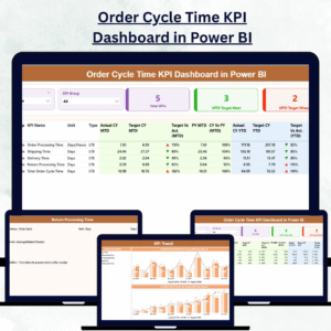
⭐ KPI Trend Page – Track Performance Movement Over Time
✔ KPI selector slicer on the left
✔ MTD Trend combo chart (CY Actual, PY Actual, Target)
✔ YTD Trend combo chart (CY Actual, PY Actual, Target)
This page helps teams identify trends, performance gaps, and early warning signs before risks escalate.
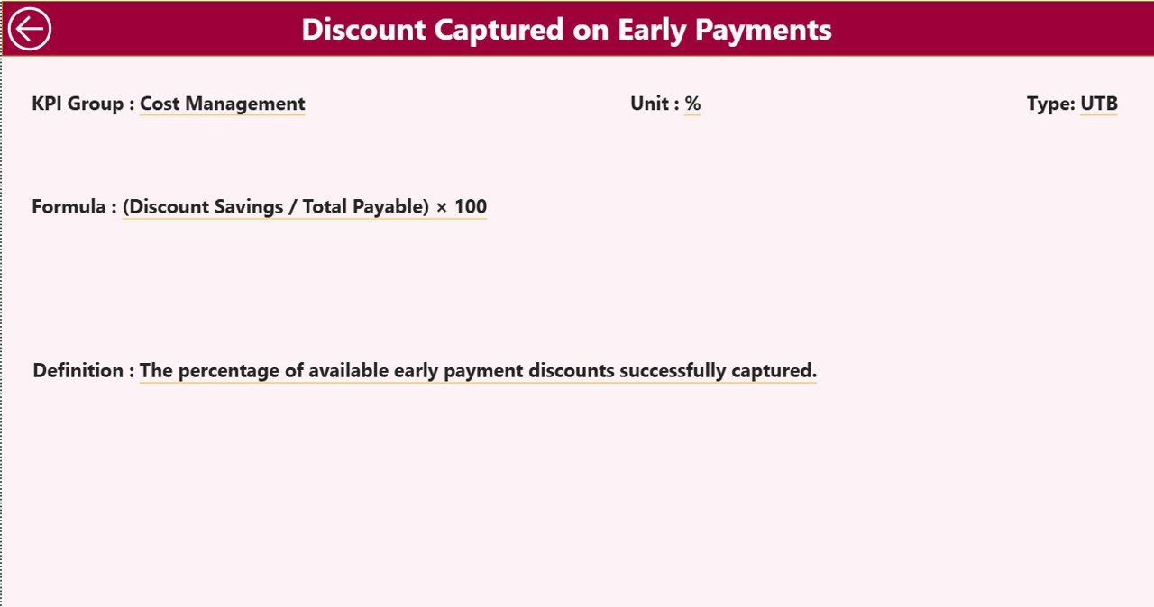
⭐ KPI Definition Page – Zero Confusion, Full Transparency
✔ Drill-through page from Summary
✔ Displays KPI Formula, Definition, Unit, and Type
✔ Back navigation button for seamless user flow
This ensures that every stakeholder understands what each KPI means and how it is measured.
📦 What’s Inside the Accounts Payable KPI Dashboard in Power BI
When you download this product, you receive:
✨ A ready-to-use Power BI dashboard (.pbix)
✨ Executive-friendly layout and visuals
✨ Interactive slicers and drill-through functionality
✨ Automated MTD & YTD calculations
✨ Status icons for quick performance review
✨ Excel-based data model for easy updates
✨ Scalable KPI framework for future growth
Everything is designed for reliability, accuracy, and ease of use.
🛠️ How to Use the Accounts Payable KPI Dashboard in Power BI
1️⃣ Update actual values in the Input_Actual Excel sheet
2️⃣ Maintain targets in the Input_Target Excel sheet
3️⃣ Manage KPI details in the KPI Definition sheet
4️⃣ Refresh the Power BI dashboard
5️⃣ Select Month and KPI Group using slicers
6️⃣ Review KPI cards and performance table
7️⃣ Analyze trends and drill into KPI definitions
No Power BI expertise is required—Excel does all the backend work.
👥 Who Can Benefit from This Accounts Payable KPI Dashboard in Power BI
This dashboard is ideal for:
✔ Accounts Payable Teams
✔ Finance Managers
✔ CFOs and Controllers
✔ Internal & External Auditors
✔ Compliance and Risk Teams
✔ Shared Services Centers
✔ Enterprise Finance Departments
Both operational teams and leadership gain immediate value.
### 📘 Click here to read the Detailed blog post
🎥 Visit our YouTube channel to learn step-by-step video tutorials
👉 Youtube.com/@PKAnExcelExpert


Reviews
There are no reviews yet.